
How many people are killed by sharks each year? 100,000? 10,000? 1,000? 100? 10? As you can see above, it’s much lower. Only 7 people in the entire world were killed by sharks in 2014.
Yet, how many sharks were killed by people?
Making Sense Of The World, One Map At A Time
How many people are killed by sharks each year? 100,000? 10,000? 1,000? 100? 10? As you can see above, it’s much lower. Only 7 people in the entire world were killed by sharks in 2014.
Yet, how many sharks were killed by people?
Note the first paragraph was written when the post was first published in 2015:
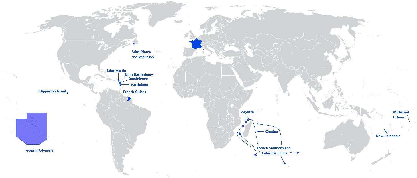
As France and the world continue to come to terms with the aftermath of France’s darkest night since World War 2, it’s perhaps worth remembering that France is the only Republic on which the sun never sets.
The true map of France above shows that France is more than just a European country, but one that stretches around the globe. And as the world stands with France in this dark time, it’s important to know that the light of the sun has not abandoned it.
“Darkness cannot drive out darkness; only light can do that. Hate cannot drive out hate, only love can do that.” – Martin Luther King, Jr
If you would like to support victims of the Paris attacks consider donating to the Red Cross and/or to Doctors Without Borders

The map above shows the Facebook friendships from the approximately 1.1 billion active Facebook users in 2013.
Amazingly, that number has grown by another 450 million people, with Facebook now claiming to have 1.55 billion active users and this despite some rather obvious black holes above.

The Platypus is native to Australia, and was not encountered by Europeans until as late as 1798. Yet despite their relatively recent discovery, there is no agreed upon etymology for their name across European languages, as you can see in the map above.
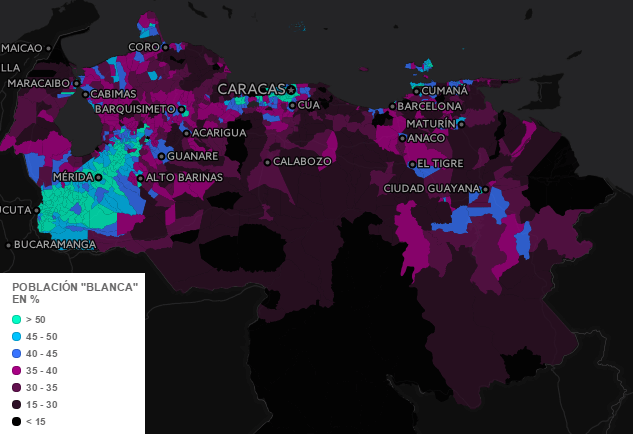
I think it’s fairly safe to say that most people who read Brilliant Maps, probably have little to no idea about the ethnic make-up of Venezuela. Fortunately, geographer Gabriel S. Dávila was kind enough to share his beautiful interactive map with us.
The screenshot above shows the percentage of Blancos (Whites) by region in Venezuela, but also includes layers for Amerindios (Indigenous people), Morenos (Brown / Mestizos) and Negros (Blacks). Just click on “Visible layer” in order to activate/deactivate one of the previous layers or have a look at the maps below:

It’s official (well at least if Google can be trusted) the US prefers dogs over cats. We arrived at this conclusion simply by comparing monthly Google searches for the term ‘dog’ compared to ‘cat.’
However, the map above does not tell the whole story.

When you think about potatoes, where do you imagine they’re grown? Popular locations might include Ireland, Idaho or maybe Poland. But would you also think of India, China and North Korea as being major producers?

The Central Treaty Organization (CENTO), also known as the Baghdad Pact or the Middle East Treaty Organization (METO), was one of Cold War’s weirdest and ultimately least successful alliances. This was largely the result of the improbable quintet of nations making up the Organization: Iran, Iraq, Pakistan, Turkey, and the United Kingdom.
Yet an alliance made up of these unlikely allies is not the only interesting thing to note about CENTO.

If you’re not following @sadtopographies on Instagram, you should. The account shows the places with saddest and most depressing names on earth.
Examples include everything from Cape Disappointment to Point No Point to Sad Road. And while Americans and Australians are usually thought to have sunny dispositions they also have a lot of unfortunate place names.
21 of our favourites are included below:

While the 49th parallel is often thought of as the border between the US and Canada, the vast majority of Canadians (roughly 72%) live below it, with 50% of Canadians living south of 45°42′ (45.7 degrees) north or the red line above.