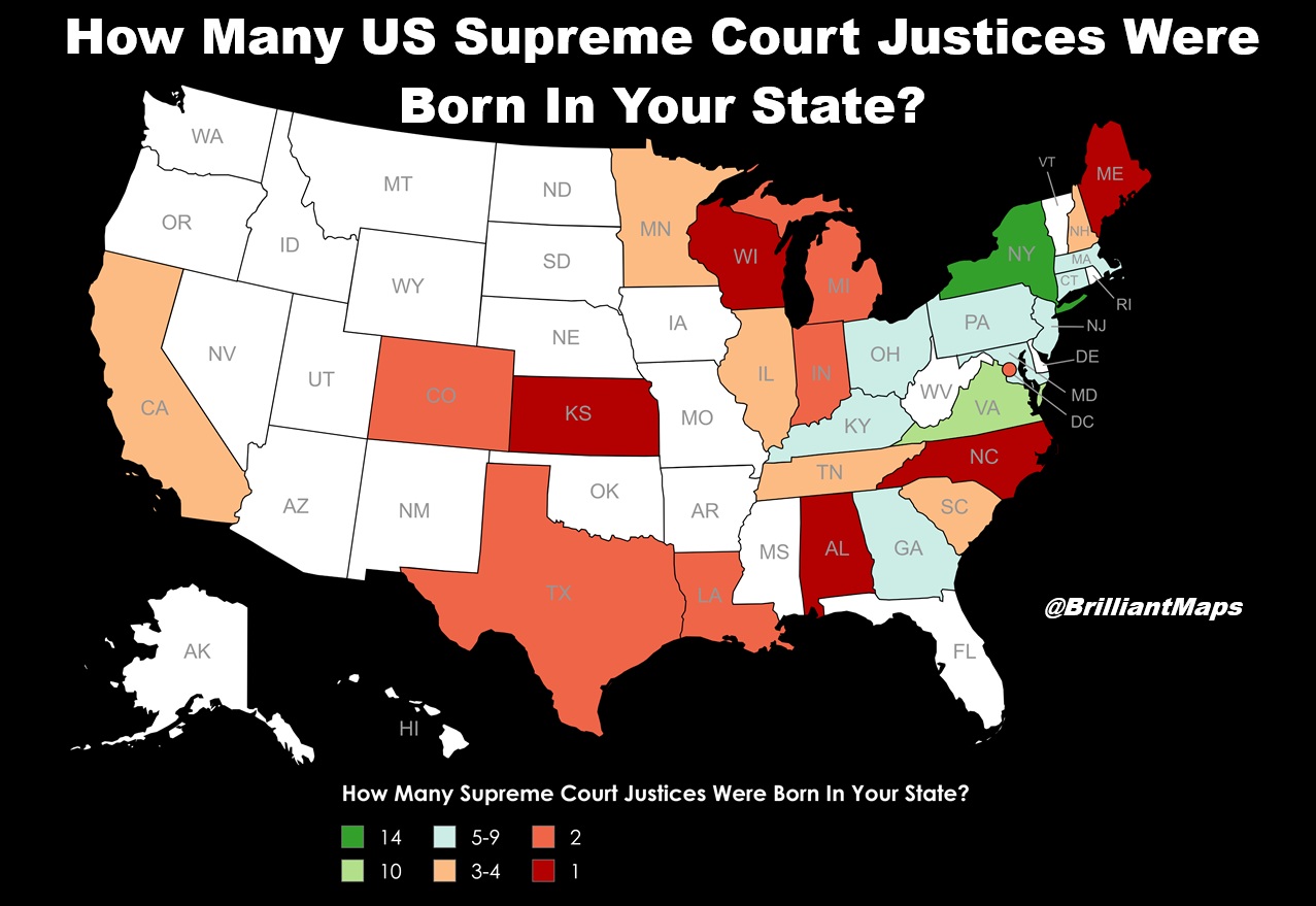
The maps below compare Europe’s 5 biggest countries (outside of Russia). They were created by the wonderful geo.universe who you should 100% go and follow.
Now for the maps:
Making Sense Of The World, One Map At A Time
Last Updated: Leave a Comment
The maps below compare Europe’s 5 biggest countries (outside of Russia). They were created by the wonderful geo.universe who you should 100% go and follow.
Now for the maps:
Last Updated: Leave a Comment

The map above shows the distribution of Grey vs Red Squirrels In The UK & Ireland Between 1945 & 2022.
I’m not 100% sure of the original source of the map a version with 1945 & 2010 can be found on Research Gate here, and I found this version on reddit.
If you created this version of the map please do get in touch so I can provide proper credit.
In the meantime here’s what happened and why:
Last Updated: Leave a Comment
The maps below look at how long each state has voted for the same party in US Presidential elections. The maps come from 270toWin and I highly recommend you visit to play around with all their tools.
It should be noted that the states show the current number of electoral college votes as of 2024, not the number of votes they had that year.
Now on to the maps:
Last Updated: Leave a Comment

The map above shows the rapidly shifting alliances during the 1910s in the Balkans. Over the course of the decade three different wars were fought there with very different alliances and outcomes.
More about them below:
Last Updated: Leave a Comment

The hidden text: ‘Well, there’s speculation that it’s due to a mantle hotspot.’ –a geologist who’s trying to cover up the fact that they didn’t hear your question
And for more here’s an explanation from Explain XKCD:
Last Updated: 1 Comment

The map above shows the 10 happiest countries in the world based on the World Happiness Report 2026.
And as you can see all but 2 are European countries. From the report:
Last Updated: Leave a Comment
Last Updated: 1 Comment
The following 5 maps show just how big a geographic area Iran covers compared to the United State’s other major post-WW2 wars.
All size comparisons come from TrueSize.net
Last Updated: Leave a Comment

The map above shows an interesting fact. While the majority of Sikhs live in India and Sikhism itself comes from there, the country with the highest share of Sikhs is not India but Canada.
The map below shows that only 3 countries have a Sikh population above 1%:
Last Updated: Leave a Comment

You can learn more about each section on the National Trails website here.
More about it below: