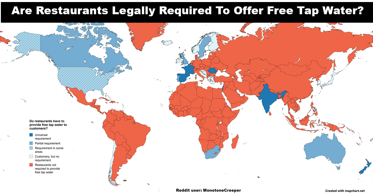
The 19 maps below were all created by AI image tool Midjourney. I asked it to create a world map in the style of each artist and here’s what it came up with:
Number of Prisoners Per 100,000 People Around The World
The map above shows the number of prisoners in each country around the world per 100,000 people. The data comes from The thirteenth edition of the World Prison Population List for October 2021.
The United States is the outlier at the high-end with 629 prisoners per 100,000 people or 0.629% of Americans are in prison t any given moment. At the other extreme is San Marino which has 0 prisoners per 100,000 people.
The map above doesn’t actually seem to use the latest data available which is as follows:
Systems of Government List 2023: Presidents, Monarchies & More
The map above shows the systems of government used by each country around the world in 2023. These include the following:
A World Map Centered on Argentina
Ever wondered, what would a world map look like if it were centered on Argentina? Well wonder no more. Just have a look at the map above. Of course everything else is incredibly distorted because of the Mercator projection used.
What do you think? Leave your comments below:
How The World Might Look In 250 Million Years With Current International Borders
The map is a fun look at what the world might look like in 250 million years time assuming no international borders change between now and then.
Where You Can & Can’t Flush Toilet Paper Around The World
The map above shows where in the world you can and can’t flush your toilet paper in a toilet. The data comes from Where do I put the paper? which describes itself as A handy guide to the world’s toilets.
World Toilet Paper Map Showing Spending On Tissue & Hygiene
The map above shows the estimated incremental value growth in the tissue and hygiene industry between 2013 and 2018. This includes toilet paper,
Sanitary Protection, nappies/diapers/pants and incontinence products.
The Roman Empire vs. The Mongol Empire At Their Respective Peaks
The Countries In Red Have As Many Murders Combined As The US
The map above shows a rather surprising fact, the US (population: 327 million) has roughly the same number of murders as all the countries in red combined (total population: over 2.3 billion): 17,250 vs 17,324.
The Known World According To Herodotus In The 5th Century BC
The map above is a modern depiction of ancient Greek historian Herodotus’ view of the Ecumene (or oecumene), literally the the known or the inhabited world, in the 5th Century BC. And while obviously far from fully accurate it clearly shows Europe, Africa and Asia.
- 1
- 2
- 3
- …
- 11
- Next Page »