
TeaDranks, creator of the widely popular World Population Cartogram, is back again with 4 new population inspired maps.
Making Sense Of The World, One Map At A Time
TeaDranks, creator of the widely popular World Population Cartogram, is back again with 4 new population inspired maps.

Depending on where you live, football and soccer can refer to completely different games. For example, in America football refers to American football whereas in the UK it refers to association football, which in America would be called soccer.
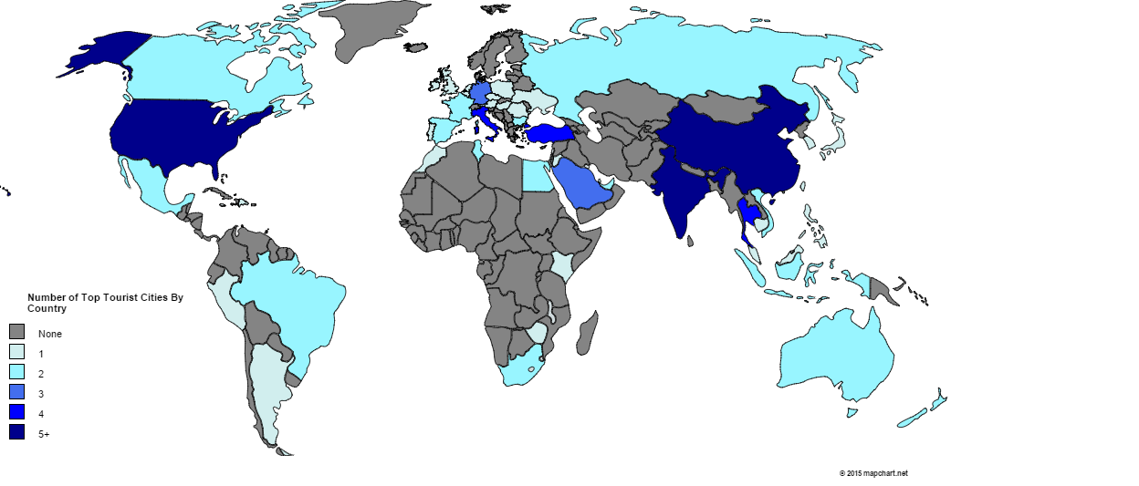
Which city is the most popular international tourist destination? Surprisingly, it’s not Paris, London or New York.
[Read more…]

The map above shows the world’s military camouflages. It’s based on the country’s primary camo and does not taken into account different branches of the military in each country. Moreover, the original map creators are aware that there are a few inaccuracies and out-of-date designs included.

I’ve seen a lot of bad maps in my time, but the one above has to be among the worst. Vexillology or flag maps can be a beautiful thing when done right. The map above, on the other hand, is hilarious in its randomness.

The cartogram above is an updated version of this one from 10 years ago. Since that time a few things have changed.
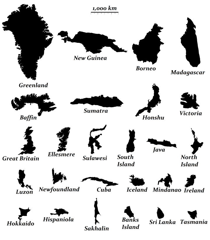
If you’re curious to learn a bit more about them, below you can find their names, what country (or countries) they belong to, their areas and the population of each island (data from Wikipedia):

In numbers:

Here’s the last post for awhile about flag colours. Previous posts have looked at The Shade of Red Each Country Has On Its Flag and Countries Whose Flags Contain Red and/or Blue. The map above looks at what happens when you blend all the colours from each country’s flag proportionally.
Somewhat surprisingly there is a relatively large variety of colours, given that red and blue so often appear on flags.
Below you can see what happens when you do the same thing for individual US state flags:

As we saw in a previous post, the vast majority of the world’s countries have at least some red in their flag. The next most popular colour is blue, with only a handful of countries having neither colour in their flag.
The following countries have neither red or blue, but do all have green: