Brilliant Maps

Making Sense Of The World, One Map At A Time

  • BOOK!
  • Newsletter
  • Board Games
  • Posters
  • Scratch Maps

Olympus Mons (Mars) Largest Volcano In The Solar System Compared to France

July 4, 2017 5 Comments

Olympus Mons On Mars Compared to France

Created by amapaday

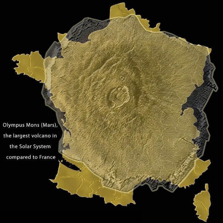
Olympus Mons is the tallest mountain and largest volcano on any planet in the solar system.

Its height from base to peak is 21.9 km (13.6 mi or 72,000 ft) or 26 km (16.2 miles) above the northern plains. This makes it at least two and a half times taller than Mount Everest’s height above sea level.

[Read more…]

Filed Under: Space Tagged With: comparison

Luxembourg Is Not A Microstate!

June 8, 2017 6 Comments

Luxembourg Is Not A Microstate!

Map created by reddit user issoweilsosoll

The map above shows how big Luxembourg is compared to Singapore, Andorra, Malta, Liechtenstein, San Marino, Monaco, and the Vatican.

[Read more…]

Filed Under: Europe Tagged With: comparison

Population of the Metro Tokyo Area Compared To US Cities

September 9, 2015 5 Comments

Population of the Metro Tokyo Area Compared To US Cities

Map created by Max Galka via Metrocosm

According to the UN, Tokyo is the world’s most populous metropolitan area with an estimated 37.8 million people in 2014. The next closest is the Seoul National Capital Area with a population of 25.6 million people or over 10 million fewer than Tokyo!

So how does this compare to US cities?

[Read more…]

Filed Under: Japan Tagged With: comparison, population

The True Size of Africa

September 8, 2015 6 Comments

The True Size of Africa

Map created by reddit user edtheredted using thetruesize.com

While it doesn’t look it, Africa is big, really big. In fact, Africa’s true size is 30 million square km, just under twice the size of Russia or bigger than Canada, the United States and China put together!

[Read more…]

Filed Under: Africa Tagged With: comparison, projections

Holland Is Not A Dense Country, But An Empty City

September 2, 2015 33 Comments

Holland Is Not A Dense Country, But An Empty City

Map created by City design – designing the city found via reddit

The Netherlands (aka Holland) is the 30th most densely populated country or territory in the world and the densest country in Europe with a over 10 million people. So it’s understandable that the Dutch might think that their country is a little bit crowded.

However, the map above flips this idea on its head.

[Read more…]

Filed Under: Netherlands Tagged With: comparison

Major European Cities On A Map Of Texas

September 1, 2015 6 Comments

Major European Cities On A Map Of Texas

Map created by reddit user daysleeperrr

The map above shows the relative position of major European cities if they were suddenly moved to Texas. Depending on your point of view, it either shows that Texas is really big or Europe is very small.

[Read more…]

Filed Under: Other Tagged With: comparison

Pluto vs Alaska Size Comparison

July 20, 2015 6 Comments

Pluto-vs-Alaska

Map created by Alaska Climate Info

With the New Horizons probe putting Pluto back in the news, just how big is it?

[Read more…]

Filed Under: Other Tagged With: comparison

All The Water on Europa vs All The Water On Earth

May 21, 2015 2 Comments

europa water vs earth water

Map found via reddit by user JanssenDalt

Most of us tend to think of Earth as being the sole planet in the solar system with water. Water exists on Mars, but almost exclusively as ice.

For the time being, Earth remains the lone planet in the universe to have stable bodies of liquid water on its surface. However, it may not be the celestial body with the most water or even the most liquid water within our own solar system.

[Read more…]

Filed Under: Space Tagged With: comparison

The 26 Largest Islands In The World Compared

January 8, 2015 36 Comments

relative size of the 24 largest islands in the world

The relative size of the 24 largest islands in the world, map by reddit user evening_raga

The map above shows the relative size of the world’s 26 largest islands. Combined they cover 7.7 million square km (roughly the size of Australia) and have 540 million people living on them (behind only China and India).

If you’re curious to learn a bit more about them, below you can find their names, what country (or countries) they belong to, their areas and the population of each island (data from Wikipedia):

[Read more…]

Filed Under: World Maps Tagged With: area, comparison, islands

California, Sweden and Madagascar Are Surprisingly Similar in Size

January 7, 2015 3 Comments

California vs Madagascar

California vs Madagascar, by Reddit user Mattho via mapfrappe.com

Did you know that California, Sweden and Madagascar are all quite similar in size? Don’t believe me? Well look at the map above comparing California and Madagascar or the one below comparing Sweden and Madagascar. Here are a few comparisons between the 3 based on data from Wikipedia:

In terms of total area:

[Read more…]

Filed Under: Other Tagged With: area, comparison, population

  • 1
  • 2
  • Next Page »


World Atlas · Settlers of Catan · Risk · Game of Thrones · Coloring Books · Globes
Monopoly · Star Wars · Game of Life · Pandemic · Ticket To Ride · Drinks Cabinets
Copyright © 2023 · Privacy Policy · Fair Use, Attribution & Copyright · Contact Us
Follow Us: E-mail · Twitter · Facebook · Pinterest · Flipboard