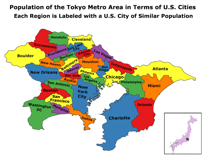
Please note this map was made in 2014:
According to the UN, Tokyo is the world’s most populous metropolitan area with an estimated 37.8 million people in 2014 (38,140,000 in 2026).
The next closest is the Seoul National Capital Area with a population of 25.6 million people or over 10 million fewer than Tokyo!
So how does this compare to US cities?
The map does a good job of demonstrating how many US cities you’d need to equal one Tokyo. Before continuing it should be noted that the map is comparing apples to oranges. It’s comparing the Greater Tokyo Metro Area to US cities boundaries (not metro areas!).
Still, its crazy to think that the same number of people live in Greater Tokyo as live within the city boundaries of the following US cities ranked by population:
- New York – 8,491,079
- Los Angeles – 3,928,864
- Chicago – 2,695,598
- Houston – 2,099,451
- Philadelphia – 1,560,297
- Phoenix – 1,445,632
- San Antonio – 1,436,697
- San Diego – 1,381,069
- Dallas – 1,197,816
- San Jose – 1,015,785
- Austin – 912,791
- San Francisco – 852,469
- Indianapolis – 820,445
- Charlotte – 809,958
- Washington D.C. – 658,893
- Boston – 655,884
- Memphis – 646,889
- Baltimore – 620,961
- Denver – 600,158
- Las Vegas – 583,756
- Sacramento – 466,488
- Kansas City (Missouri) – 459,787
- Atlanta – 447,841
- Miami – 399,457
- Cleveland – 396,815
- Honolulu – 390,738
- New Orleans – 384,320
- Durham – 245,550
- Orlando – 238,300
- Salt Lake City – 186,440
- Providence – 178,042
- New Haven – 130,741
- Boulder – 97,385
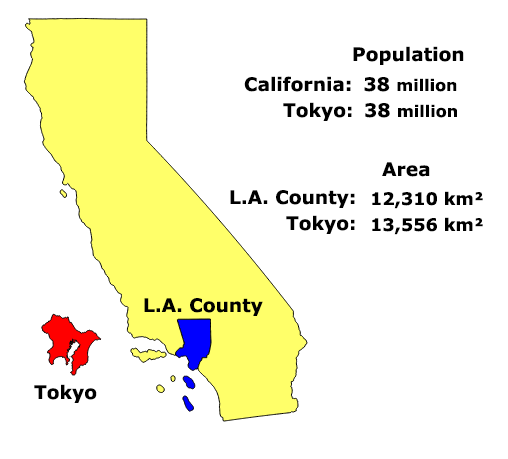
And altogether they total only 36,436,396 people or still 1.4 million fewer than Tokyo. To put it another way, Tokyo has about the same population as California, in an area the size of LA county.
Also you can see how Greater Tokyo compares to the UK:

To learn more about Tokyo and urbanization in general have a look at the following books:
- Tokyo City Atlas: A Bilingual Guide
- Tokyo: The Extraordinary Guide: An Insider Tour of Art, Food, and Culture
- A History of Tokyo 1867-1989: From EDO to SHOWA: The Emergence of the World’s Greatest City
Surprised by this map? Then share it with a friend:


Andrew says
Why do you compare the population of the Tokyo *metropolitan* area with the population of american cities, and not their metropolitan areas.
New York and Los Angeles alone have metropolitan areas that are (combined) almost as large as the tokyo metropolitan area. NY is 20 million, LA is 13 million, which is 33 million in those two metropolitan areas alone.
The says
It wouldn’t be click-bait fabulous.
대한민국 says
Seoul is about 25-36 Million. What counts Seoul is technically all of Kyung-Ki-Do Province.
Jason Taraval says
The borders in the Tokyo area don’t even match the real map… What ward of Tokyo does “Los Angeles” correspond to?
Richard T Peterson says
Where’s Milwaukee on the list?
Kent Chrisman says
Canada