Brilliant Maps

Making Sense Of The World, One Map At A Time

  • BOOK!
  • Newsletter
  • Board Games
  • Posters
  • Scratch Maps

The Pacific Ocean is Larger Than All Land On Earth

Last Updated: September 17, 2025 4 Comments

Click To Get My 10 Best Brilliant Maps For Free:

All land on earth compared to pacific ocean

Map by Chris Stephens, from naturalearthdata.com
While I’m sure you know the Pacific Ocean is big, I’d say there’s a good chance you hadn’t realized how big, until you look at the map above. As difficult as it may be to believe, the Pacific Ocean is larger than the landmass of every single continent and island combined.

In numbers:

[Read more…]

Filed Under: World Maps Tagged With: comparison, oceans

How The Population of North America Fits Into Europe

Last Updated: March 3, 2023 19 Comments

Click To Get My 10 Best Brilliant Maps For Free:

North America In Europe

Created by: reddit user Tom1099

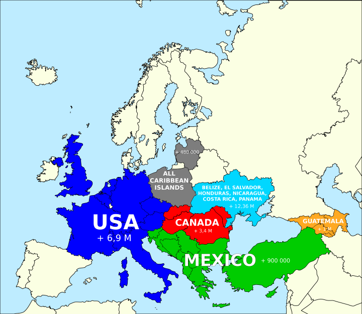
Based on this popular post around the idea of how you can fit the population of the United States into various countries. The map above looks at how you could fit the population of North America into Europe, and still have several million people left over.

[Read more…]

Filed Under: Europe Tagged With: comparison, population

8 Maps Showing How The US Fits Into The Rest Of The World

Last Updated: October 8, 2024 3 Comments

Click To Get My 10 Best Brilliant Maps For Free:

How The US Population Fits In Europe

How the US Population Fits in Europe by reddit user jackblack2323
Note: This post was originally written in 2014, and so some of the population figures will have changed somewhat compared to the most recent estimates. 

The US is the third most populous country on earth, with over 320 million people according the current U.S. Census Population Clock. Yet, only around 4.4% of the world’s people live in the country and considering it’s only the 180th most densely populated country on earth, it’s rather sparsely populated.

Moreover, if the US ever wanted to catch-up with China (most populated) or India (soon to be most populated), it would have to increase its population fourfold (1.2 billion+). Even then, this would still only make it the 89th most densely populated country on earth (assuming of course no population changes in any other country).

However, all this can be rather difficult to visualize. Wouldn’t it be easier to just see how the current US population fits into the rest of the world? Well the clever users of reddit have done just that. They’ve created all the maps on this page that help show how large (or not) America’s population really is.

[Read more…]

Filed Under: United States Tagged With: comparison, population

The UK Has More People Than The 27 Least Populous US States Combined

Last Updated: March 3, 2023 6 Comments

Click To Get My 10 Best Brilliant Maps For Free:

How to fit the population of the UK into the United States in two different ways

Created by: reddit user superjoden

The United States has a population that is nearly five times greater than the United Kingdom. Yet, the UK still has more people than the 27 least populated states combined. On the other hand, the UK has fewer people than the two most populous states.

The map above shows how each of these combinations would look. In red, you can see that the UK has more people than the following states combined:

[Read more…]

Filed Under: United States Tagged With: comparison, population

  • « Previous Page
  • 1
  • 2


Product Reviews · World Atlas · Settlers of Catan · Risk · Game of Thrones · Coloring Books
Globes · Monopoly · Star Wars · Game of Life · Pandemic · Ticket To Ride · Drinks Cabinets
US Locations · UK Locations· Fleet Management
Copyright © 2026 · Privacy Policy · Fair Use, Attribution & Copyright · Contact Us
Follow Us: Newsletter · Facebook · Youtube · Twitter · Threads · BlueSky · LinkedIn · Instagram · Pinterest · Flipboard