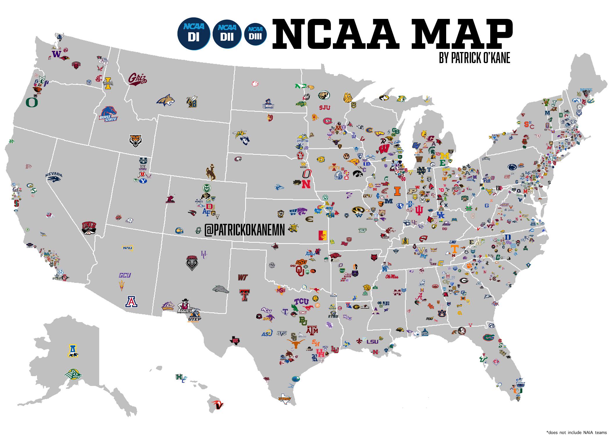
“I created a NCAA map that consists of every D1 D2 and D3 team in the country. Took me around 3 weeks to complete.”
Making Sense Of The World, One Map At A Time
“I created a NCAA map that consists of every D1 D2 and D3 team in the country. Took me around 3 weeks to complete.”
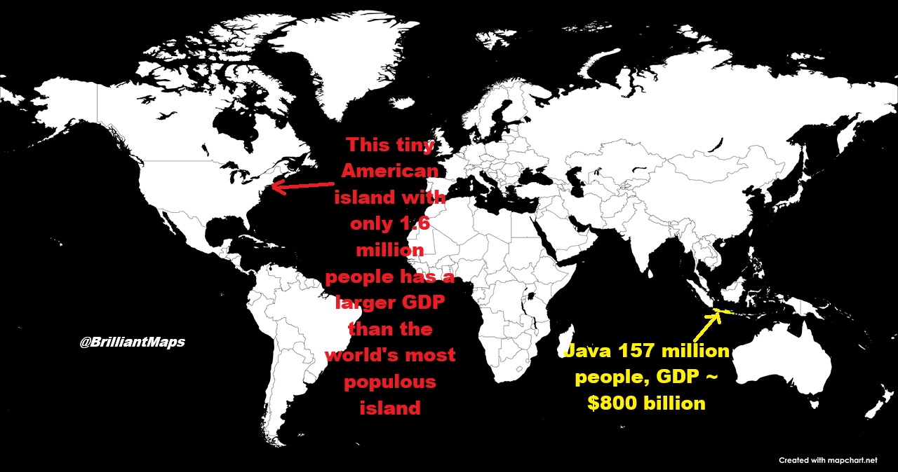
The map above above shows a surprising fact. Manhattan has an estimated total GDP just over $1 trillion USD but only 1,665,510 residents meaning GDP per capita is a staggering $604,619.
All of these maps come from reddit user DM_me_fun_stuff_pls who also did a survey on 24 Ways Redditors Would Divide Europe.
For these maps he explains:
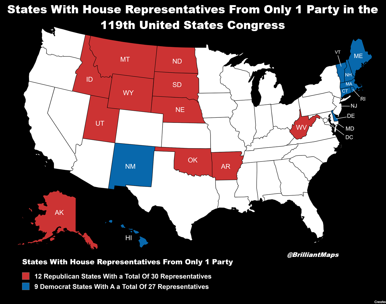
The map above shows which US states have House Representatives from only 1 party as of the 119th Us Congress. Below is a full list of numbers for all states:
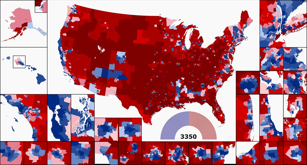
The map above shows what the US House would look like if it had 100k people per district vs the over 750k people per district today.
Overall, you’d have a house with 3,350 members, which in this map would mean 1692 Democrats and 1658 Republicans.
About the inserst:
Ok so the title is a little confusing but hopefully when you look at the maps it will make a bit more sense.
The first map shows who the reigning British Monarch was when the US state became a state.
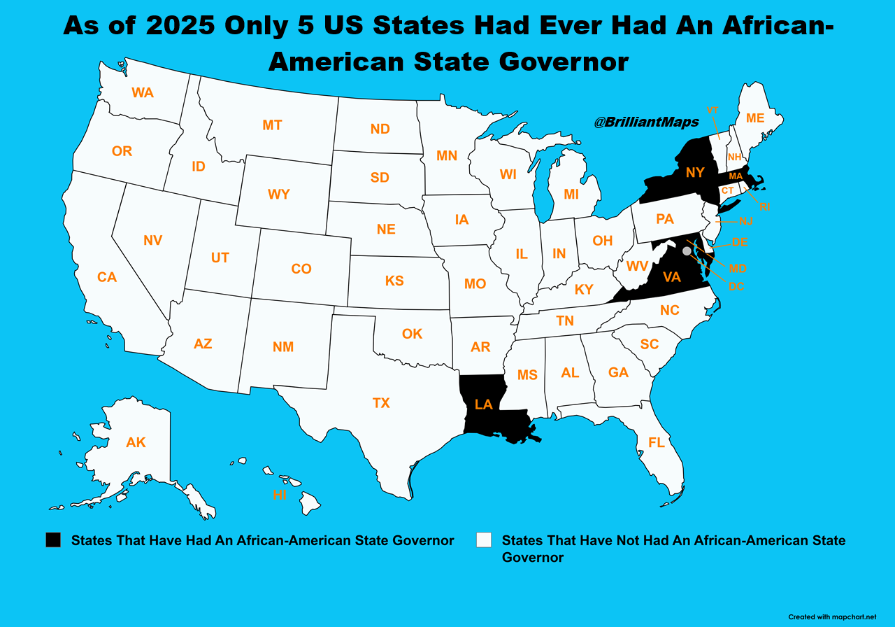
The map above shows a rather shocking state as of 2025, only 5 US states had ever had an African-American State Governor (all men), and in the case of Louisiana that was well over a century ago during the era of reconstruction.
More about the the 5/6 men below:
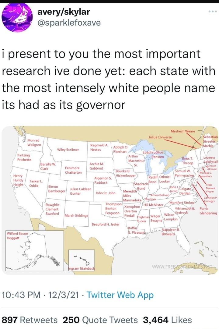
The tweet above, shows of the funniest (or as the tweet states whitest) names for governors from each US state.
Here is the map in slightly larger size below with a summary of each of them: