Brilliant Maps

Making Sense Of The World, One Map At A Time

  • BOOK!
  • Newsletter
  • Board Games
  • Posters
  • Scratch Maps

The True Size of Africa

Last Updated: March 3, 2023 6 Comments

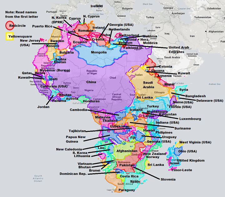
The True Size of Africa

Map created by reddit user edtheredted using thetruesize.com

While it doesn’t look it, Africa is big, really big. In fact, Africa’s true size is 30 million square km, just under twice the size of Russia or bigger than Canada, the United States and China put together!

As map nerds and/or West Wing fans already know, this is due to the common use of the Mercator projection, which makes countries near the poles look bigger and those at the equator look smaller.

So for example while Greenland and Africa look about the same on a Mercator map, Africa is in fact 14X larger than Greenland in real life. You can learn more about various map projections here.

The map was created using The True Size of, an awesome new tool that allows for quick and easy comparisons of countries true sizes. As you can clearly see, it would take a lot of countries and US states to fully fill Africa.

However, in terms of population, China with 1.36 billion people, has larger population than the entire continent of Africa, which has roughly 1.11 billion. So if you added up all the countries listed here, you’d easily have more than twice Africa’s population.

To learn more about Africa’s future have a look at the following books:

  • Africa Unchained: The Blueprint for Africa’s Future
  • Africa’s Future: Darkness to Destiny
  • The Next Africa: An Emerging Continent Becomes a Global Powerhouse

Surprised by this map? Then please share it with a friend:
Filed Under: Africa Tagged With: comparison, projections

Other Popular Maps

  • Building The World Country By Country In Order of Population Density [Lowest to Highest]

    Building The World Country By Country In Order of Population Density [Lowest to Highest]

  • 200 Years Of Us Population Growth In 2 Minutes

    200 Years Of Us Population Growth In 2 Minutes

  • The Map That Shows Why Microsoft Is Killing Off Internet Explorer (2015)

    The Map That Shows Why Microsoft Is Killing Off Internet Explorer (2015)

  • Most Popular Migrant Destinations By Country

    Most Popular Migrant Destinations By Country

  • The UK Has More People Than The 27 Least Populous US States Combined

    The UK Has More People Than The 27 Least Populous US States Combined

  • 10 Pandemic Board Game Versions & Expansions Ranked Best To Worst

    10 Pandemic Board Game Versions & Expansions Ranked Best To Worst

  • England’s North/South Divide Based Only On Population

    England’s North/South Divide Based Only On Population

  • Map of The United States in Esperanto

    Map of The United States in Esperanto

Comments

  1. stevebennett says

    March 8, 2017 at 9:43 pm

    Huh, I’d never heard of RedCircle and YellowSquare until this map…

    Reply
    • Kathie Cole says

      October 25, 2020 at 8:42 pm

      yellowsquare is a thing in italy and redcircle is a club

      Reply
    • Hussein Aman says

      August 9, 2022 at 8:37 pm

      The reliability is very doubtful

      Reply
  2. Vlade says

    January 7, 2020 at 12:10 pm

    Kosovo is Serbia

    Reply
  3. Kaia says

    August 28, 2020 at 5:36 pm

    Nice map super helpful

    Reply
  4. Kabungo Kamanga says

    December 7, 2021 at 10:56 am

    please advise what other than (Mercator) methode to draw globe

    Reply

Leave a Reply Cancel reply

Your email address will not be published. Required fields are marked *

This site uses Akismet to reduce spam. Learn how your comment data is processed.


World Atlas · Settlers of Catan · Risk · Game of Thrones · Coloring Books · Globes
Monopoly · Star Wars · Game of Life · Pandemic · Ticket To Ride · Drinks Cabinets
Copyright © 2023 · Privacy Policy · Fair Use, Attribution & Copyright · Contact Us
Follow Us: E-mail · Twitter · Facebook · Pinterest · Flipboard