The map above shows the number of times each country’s name appears in the Epstein files. I had an idea to do a similar map, but then I saw that reddit user Extreme-Shopping74 had beat me to.
Here are a few key things from the map:
Making Sense Of The World, One Map At A Time
Last Updated: Leave a Comment

The map above shows the number of times each country’s name appears in the Epstein files. I had an idea to do a similar map, but then I saw that reddit user Extreme-Shopping74 had beat me to.
Here are a few key things from the map:
Last Updated: Leave a Comment
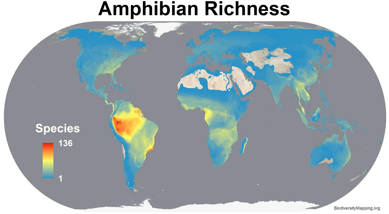
The following 18 biodiversity maps all come biodiversitymapping.org, with the help of BirdLife International, IUCN, NatureServe, and USGS.
Enjoy:

Last Updated: 3 Comments

The map above shows you can quite easily split the world into 50% of GDP and 50% of population without
any overlapping countries. Here’s a full list of countries from each group:
Last Updated: Leave a Comment

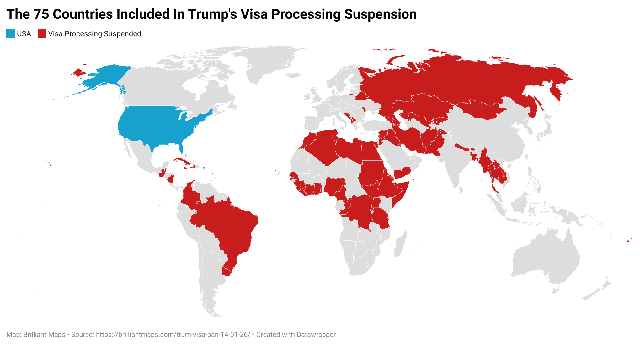
On January 14, 2026, the U.S. State Department, under President Donald Trump’s administration, announced it would indefinitely suspend processing of immigrant visas (permanent/residency visas) for citizens of 75 countries, effective January 21, 2026.
The map above shows which countries are affected. The Full list:
Last Updated: Leave a Comment
Last Updated: Leave a Comment

More about them:
Last Updated: Leave a Comment

The map above shows the share of world GDP for each continent in the world based on nominal exchange rates.
In total, World GDP was $117.165 Trillion $ USD. (Or $208 Trillion in PPP)
Below you can see data in PPP $ and maps and data based on UN Subregions.
Last Updated: 1 Comment

The map above shows the top 10 oil producing countries in 1939. Three big things stand out to me:
Last Updated: Leave a Comment

Support for remaining a Monarchy was strongest in:
Last Updated: Leave a Comment

The map above shows the most streamed English speaking artists in each country where Spotify publishes data in 2025. And fun fact 3 of the 7 are from my home province of Ontario!
Also for the UK, no British artists made the top 10, all were either Canadian or American.
Here is the most popular song based on YouTube views for each artist: