
The map above shows you can quite easily split the world into 50% of GDP and 50% of population without
any overlapping countries. Here’s a full list of countries from each group:
Note:
Total of World GDP in nominal USD was $117.2 Trillion according to the IMF in 2025.
World population was 8.2 billion according to various estimates from Wikipedia.
50% of World GDP
Just 4 countries now make up 50% of world GDP.
| Country | GDP Nominal (USD) | Share of World GDP | Population | Share of World Pop |
|---|---|---|---|---|
| United States | $30.6 Trillion | 26.1% | 340,110,988 | 4.1% |
| China | $19.4 Trillion | 16.6% | 1,408,280,000 | 17.1% |
| Germany | $5.0 Trillion | 4.3% | 83,497,147 | 1.0% |
| Japan | $4.3 Trillion | 3.7% | 123,160,000 | 1.5% |
| Total | $59.3 Trillion | 50.6% | 1,955,048,135 | 23.7% |
You can actually do it in less space as these two maps show from The World In Maps:

50% of World Population
If you exclude the 4 countries above, you need to take the next 25 most populous countries to get to 50% of world population.
And they are:
| Country | Population | Share of World Pop | GDP Nominal (USD) | Share of World GDP |
|---|---|---|---|---|
| India | 1,417,492,000 | 17.20% | $4.13 | 3.5% |
| Indonesia | 284,438,782 | 3.50% | $1.44 | 1.2% |
| Pakistan | 241,499,431 | 2.90% | $0.41 | 0.4% |
| Nigeria | 223,800,000 | 2.70% | $0.29 | 0.2% |
| Brazil | 213,421,037 | 2.60% | $2.26 | 1.9% |
| Bangladesh | 169,828,911 | 2.10% | $0.48 | 0.4% |
| Russia | 146,028,325 | 1.80% | $2.54 | 2.2% |
| Mexico | 130,760,049 | 1.60% | $1.86 | 1.6% |
| Philippines | 114,123,600 | 1.40% | $0.49 | 0.4% |
| Democratic Republic of the Congo | 112,832,000 | 1.40% | $0.08 | 0.1% |
| Ethiopia | 111,652,998 | 1.40% | $0.11 | 0.1% |
| Egypt | 107,271,260 | 1.30% | $0.35 | 0.3% |
| Vietnam | 102,300,000 | 1.20% | $0.48 | 0.4% |
| Iran | 86,563,000 | 1.10% | $0.36 | 0.3% |
| Turkey | 85,664,944 | 1.00% | $1.57 | 1.3% |
| United Kingdom | 69,487,000 | 0.80% | $3.96 | 3.4% |
| France | 68,736,000 | 0.80% | $3.36 | 2.9% |
| Tanzania | 68,153,004 | 0.80% | $0.09 | 0.1% |
| Thailand | 65,826,149 | 0.80% | $0.56 | 0.5% |
| South Africa | 63,100,945 | 0.80% | $0.43 | 0.4% |
| Italy | 58,947,569 | 0.70% | $2.54 | 2.2% |
| Kenya | 53,330,978 | 0.60% | $0.14 | 0.1% |
| Colombia | 53,057,212 | 0.60% | $0.44 | 0.4% |
| Sudan | 51,662,000 | 0.60% | $0.04 | 0.0% |
| Myanmar | 51,375,327 | 0.60% | $0.06 | 0.1% |
| Total | 4,151,352,521 | 50.3% | $28.45 | 24.3% |
The Rest
Countries not included in either list still make up 23.2% of world population (1.9 billion people) and 25.1% of World GDP ($29.42 Trillion).
And while making this map I wondered how many countries it would take to just match US GDP. And I created the following map:

Here are a list of the 173 countries in Red who have a combined population of 5.8 billion people, but a combined GDP of just $31 trillion, which is the same as the United States:
- Afghanistan
- Albania
- Algeria
- American Samoa
- Angola
- Anguilla
- Antigua and Barbuda
- Argentina
- Armenia
- Azerbaijan
- Bahrain
- Bangladesh
- Barbados
- Belarus
- Belize
- Benin
- Bhutan
- Bolivia
- Bosnia and Herzegovina
- Botswana
- Brazil
- Brunei
- Bulgaria
- Burkina Faso
- Burundi
- Cabo Verde
- Cambodia
- Cameroon
- Central African Republic
- Chad
- Chile
- Colombia
- Comoros
- Congo
- Cook Islands
- Costa Rica
- Croatia
- Cuba
- Curaçao
- Cyprus
- Czech Republic (Czechia)
- Côte d’Ivoire
- Djibouti
- Dominica
- Dominican Republic
- DR Congo
- Ecuador
- Egypt
- El Salvador
- Equatorial Guinea
- Eritrea
- Estonia
- Eswatini
- Ethiopia
- Faeroe Islands
- Fiji
- Finland
- French Polynesia
- Gabon
- Gambia
- Georgia
- Ghana
- Greece
- Greenland
- Grenada
- Guatemala
- Guinea
- Guinea-Bissau
- Guyana
- Haiti
- Honduras
- Hungary
- India
- Indonesia
- Iran
- Iraq
- Jamaica
- Jordan
- Kazakhstan
- Kenya
- Kiribati
- Kuwait
- Kyrgyzstan
- Laos
- Latvia
- Lebanon
- Lesotho
- Liberia
- Libya
- Lithuania
- Madagascar
- Malawi
- Malaysia
- Maldives
- Mali
- Marshall Islands
- Mauritania
- Mauritius
- Mexico
- Micronesia
- Moldova
- Mongolia
- Montenegro
- Montserrat
- Morocco
- Mozambique
- Myanmar
- Namibia
- Nauru
- Nepal
- New Caledonia
- New Zealand
- Nicaragua
- Niger
- Nigeria
- North Korea
- North Macedonia
- Northern Mariana Islands
- Oman
- Pakistan
- Palau
- Panama
- Papua New Guinea
- Paraguay
- Peru
- Philippines
- Poland
- Portugal
- Romania
- Russia
- Rwanda
- Saint Kitts & Nevis
- Saint Lucia
- Samoa
- Sao Tome & Principe
- Saudi Arabia
- Senegal
- Serbia
- Seychelles
- Sierra Leone
- Slovakia
- Slovenia
- Solomon Islands
- Somalia
- South Africa
- South Sudan
- Sri Lanka
- St. Vincent & Grenadines
- State of Palestine
- Sudan
- Suriname
- Syria
- Tajikistan
- Tanzania
- Thailand
- Timor-Leste
- Togo
- Tonga
- Trinidad and Tobago
- Tunisia
- Turkey
- Turkmenistan
- Tuvalu
- Uganda
- Ukraine
- Uruguay
- Uzbekistan
- Vanuatu
- Venezuela
- Vietnam
- Yemen
- Zambia
- Zimbabwe


Non-Dairy Canary says
Hi there.
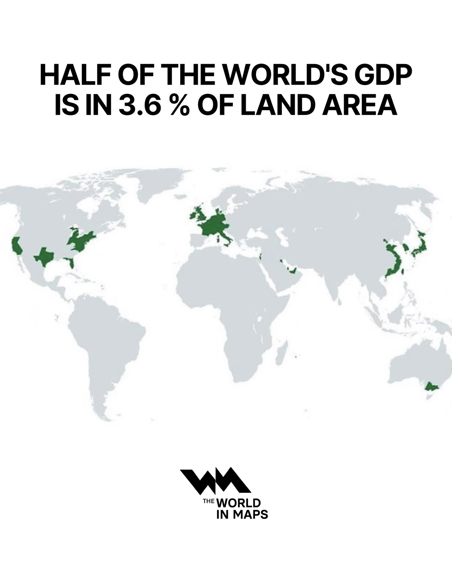
A question about your map headed ‘Half of the World’s GDP is in 3.6% of land area’. I am engaged in a debate about this map on BlueSky, where I post as @nondairycanary.bsky.social.
I figure that the whole point of the map is to demonstrate how GDP is concentrated in a small land area, so the countries / territories you have highlighted are those with the highest GDP density.
However, @kwelaman.bsky.social argues that the territories have been cherry-picked to add up to a neat 50% GDP. I figure this doesn’t make sense, as it implies that half of the world’s GDP might well actually be LESS than 3.6% of land area, so why didn’t you go for the lower % figure in the first place?
Can you shed any light on your process please? Many thanks!
Brilliant Maps says
I didn’t originally create the map, but it’s roughly based on GDP figures at the subnational level. You could of course get less land to add up to a higher share of GDP. E.g. the City of London (aka the square mile) is responsible for 2.5% of UK GDP, you could scale that across major economies and probably find something similar. The problem of course is getting reliable data at the city level across multiple different countries. If anyone reading this wants to do the work, I’d be happy to publish and promote it.
Roberto says
All of the Australian component to GDP comes from Victoria, and non from New South Wales? Utterly nonsensical.