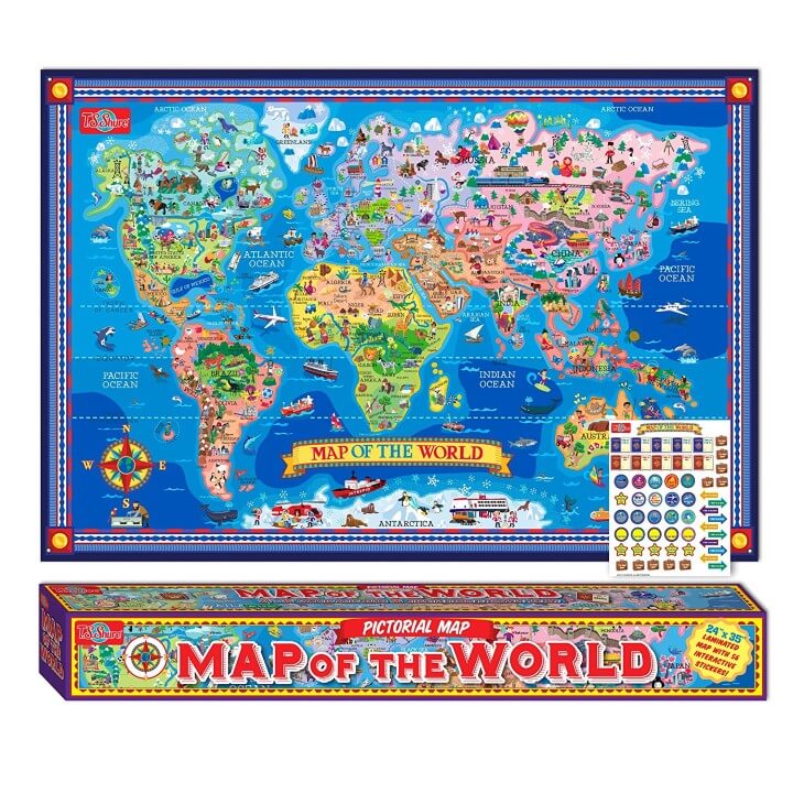
Looking for the perfect world map poster to hand on your wall? The 37 eye-catching posters below include all types of different styles and designs. From children’s maps to vintage to black & white to large maps and even map art.
Making Sense Of The World, One Map At A Time
Last Updated: 30 Comments
Last Updated: 9 Comments
Owning a least one good world atlas is a must for any cartophile or map lover. But why stop at one? Below we’ve profiled 27 brilliant world atlases all map lovers would be happy to own.
To make your life a little easier we’ve broken them down into 5 categories:
Last Updated: 2 Comments
The map above shows the world divided into two regions with approximately equal military expenditures. The area in blue represents countries that are NATO members aka the “West,” who account for 51% of the world’s militarily spending. And the red countries make up the “Rest.”
Last Updated: 6 Comments

The map above shows countries that lack a single river within their borders. In case you’re wondering they are:
Last Updated: 5 Comments
The map above is a screenshot of world wind patterns from Windyty, an absolutely stunning interactive website, that allows you to see global wind and weather patterns.
Last Updated: 4 Comments
While North Korea (officially: Democratic People’s Republic of Korea; DPRK) remains one of the world’s most isolated states, it does have numerous embassies in many countries around the world also hosts many foreign embassies in Pyongyang.
The map above shows which countries host a North Korean embassy, with the map below showing which countries have embassies in North Korea:
Last Updated: Leave a Comment
The map above shows countries where the head of state, politicians, public officials, public figures and/or their close family/associates are implicated in the Panama Papers (so far).
Last Updated: 1 Comment

The map above shows the habit range of Pangolins (aka scaly anteaters) in Asia and Africa.
There are 8 species in total, 4 in Asia and 4 in Africa. They range in size from from 30 to 100 cm (12 to 39 in).
Last Updated: Leave a Comment

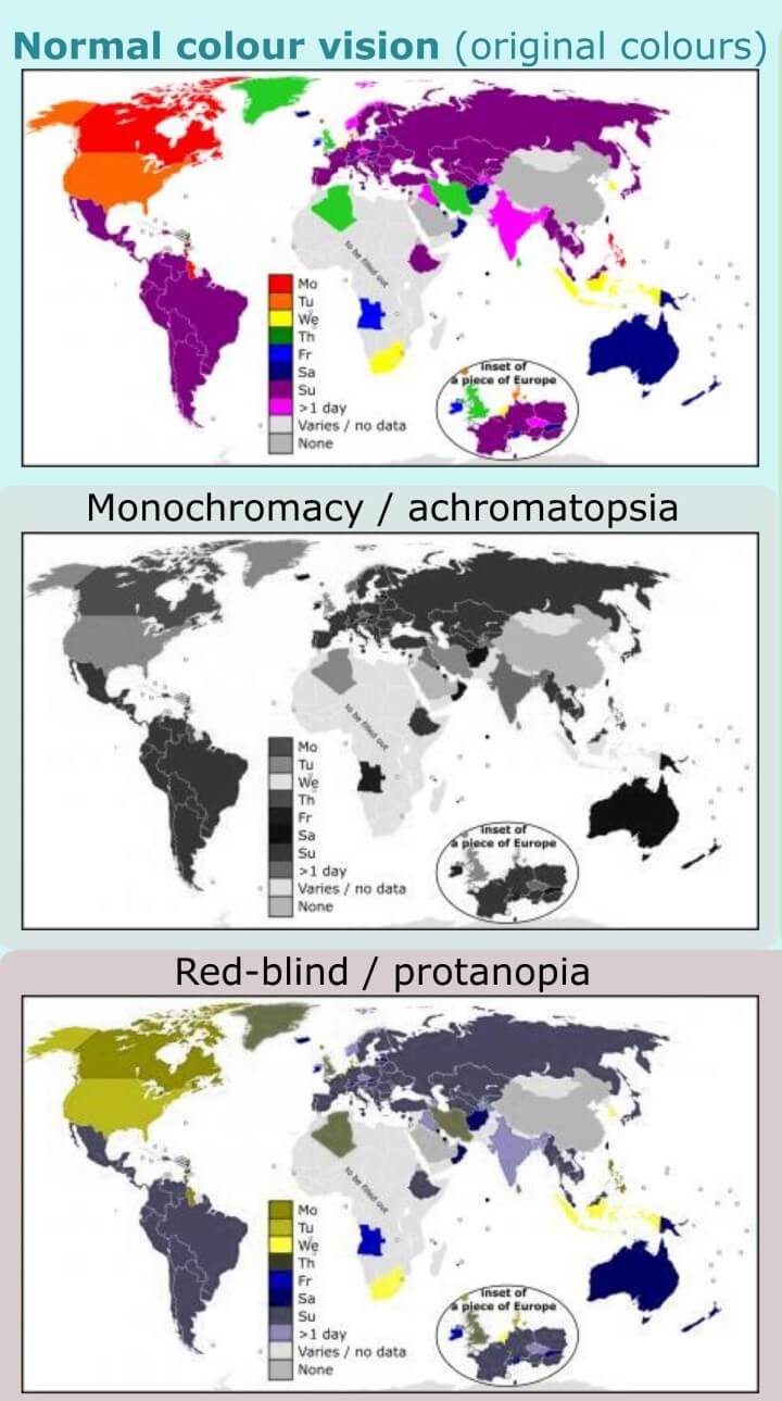
The maps above and below show how the world looks to people with different types of colour blindness.
Up to 8% of men and 0.4% of women in the world may have some colour blindness. In absolute numbers, this translates into as many as 296 million men and 15 million women.
Last Updated: Leave a Comment
The map above shows what day of the week elections are normally held, but doesn’t say anything about whether the elections are free and/or fair.