
TeaDranks, creator of the widely popular World Population Cartogram, is back again with 4 new population inspired maps.
Making Sense Of The World, One Map At A Time
TeaDranks, creator of the widely popular World Population Cartogram, is back again with 4 new population inspired maps.

For example:
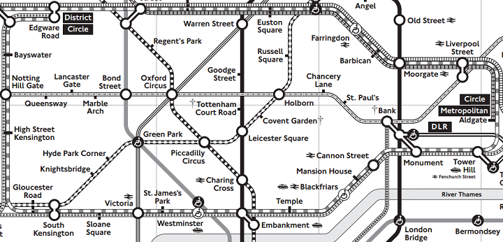
Ever think London’s tube map looks confusing? Now imagine trying to use it, but you couldn’t easily distinguish between the colours of each line.
Well for hundreds of thousands of colour blind Londoners, this is their reality each and every day.

Depending on where you live, football and soccer can refer to completely different games. For example, in America football refers to American football whereas in the UK it refers to association football, which in America would be called soccer.
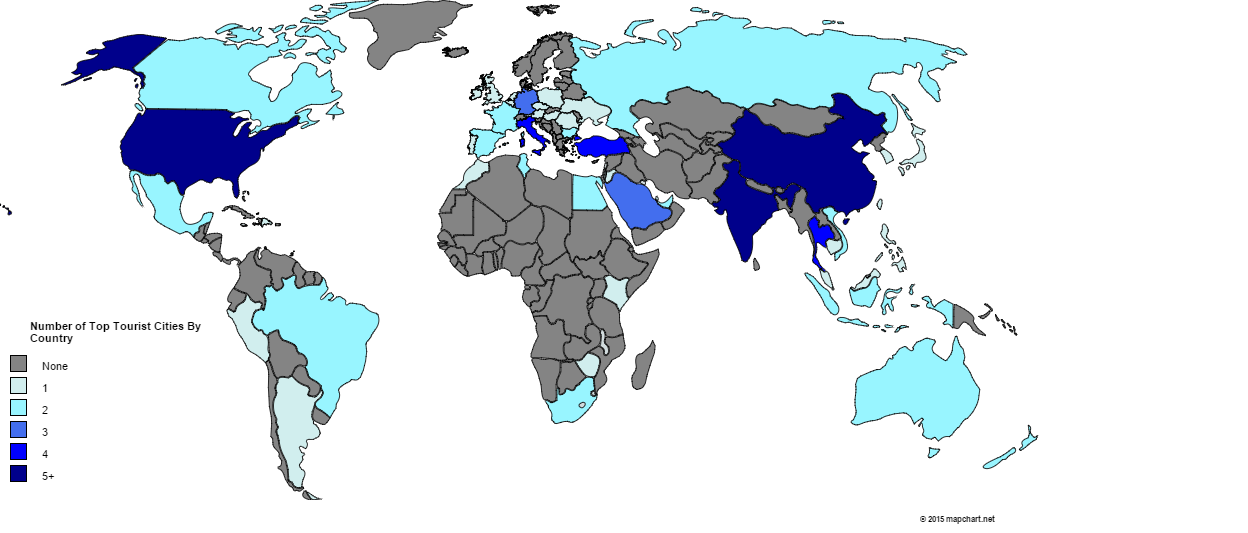
Which city is the most popular international tourist destination? Surprisingly, it’s not Paris, London or New York.
[Read more…]
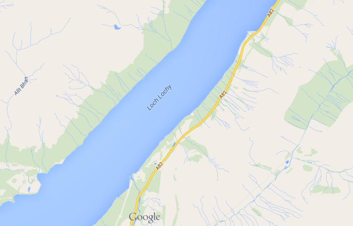
As unoriginal place names go, Loch Lochy (in Lochaber) has to be at the top of the list. I imagine whoever named it was at the end of a long day of loch naming and said to himself, “fuck it, I’m off to the pub.”

While we tend to think of the Vikings as being based in and around Scandinavia, their activities took them a lot far further afield than that. The map above shows just how far.

The map above shows the world’s military camouflages. It’s based on the country’s primary camo and does not taken into account different branches of the military in each country. Moreover, the original map creators are aware that there are a few inaccuracies and out-of-date designs included.

I’ve seen a lot of bad maps in my time, but the one above has to be among the worst. Vexillology or flag maps can be a beautiful thing when done right. The map above, on the other hand, is hilarious in its randomness.

The cartogram above is an updated version of this one from 10 years ago. Since that time a few things have changed.