Brilliant Maps

Making Sense Of The World, One Map At A Time

  • BOOK!
  • Newsletter
  • Board Games
  • Posters
  • Scratch Maps

The True Size of Africa

Last Updated: March 3, 2023 7 Comments

Click To Get My 10 Best Brilliant Maps For Free:

The True Size of Africa

Map created by reddit user edtheredted using thetruesize.com

While it doesn’t look it, Africa is big, really big. In fact, Africa’s true size is 30 million square km, just under twice the size of Russia or bigger than Canada, the United States and China put together!

[Read more…]

Filed Under: Africa Tagged With: comparison, projections

European Food According to Italians

Last Updated: April 10, 2025 35 Comments

Click To Get My 10 Best Brilliant Maps For Free:

European Food According to Italians

Map created by Yanko Tsvetkov at Atlas of Prejudice
Yanko Tsvetkov, the man behind the Culinary Horrors of Europe Map, has created another food related map titled: The Culinary Map of Europe According to Italians.

[Read more…]

Filed Under: Europe Tagged With: food

1853 Japanese Map Of The World By Suido Nakajima

Last Updated: March 3, 2023 4 Comments

Click To Get My 10 Best Brilliant Maps For Free:

1853 Japanese Map Of The World By Suido Nakajima

Map created by Suido Nakajima found via reddit.

The map above is interesting not because it looks beautiful, which it does, but because of where and when it was published.

[Read more…]

Filed Under: History, World Maps

Where Are Winters The Worst? The Winter Severity Index Has The Answer

Last Updated: March 3, 2023 2 Comments

Click To Get My 10 Best Brilliant Maps For Free:

winter-severity-index

Map created by reddit user Climatologist49

The map above shows how bad winters are around the United States using the The Accumulated Winter Season Severity Index. The circles on the map represent the weather stations used to collect the data.

[Read more…]

Filed Under: United States Tagged With: weather

Why are there so many “X” in “European Country”? Google Autocomplete Map

Last Updated: March 3, 2023 2 Comments

Click To Get My 10 Best Brilliant Maps For Free:

Why are there so many

Original map crated by reddit user crazyPainCake

Why are there there so many immigrants in France & the UK, so many Irish in Portugal and Portuguese in Luxembourg, so many dashcams in Russia and so many cats everywhere?

[Read more…]

Filed Under: Europe Tagged With: google

Holland Is Not A Dense Country, But An Empty City

Last Updated: February 27, 2026 36 Comments

Click To Get My 10 Best Brilliant Maps For Free:

Holland Is Not A Dense Country, But An Empty City

Map created by City design – designing the city found via reddit

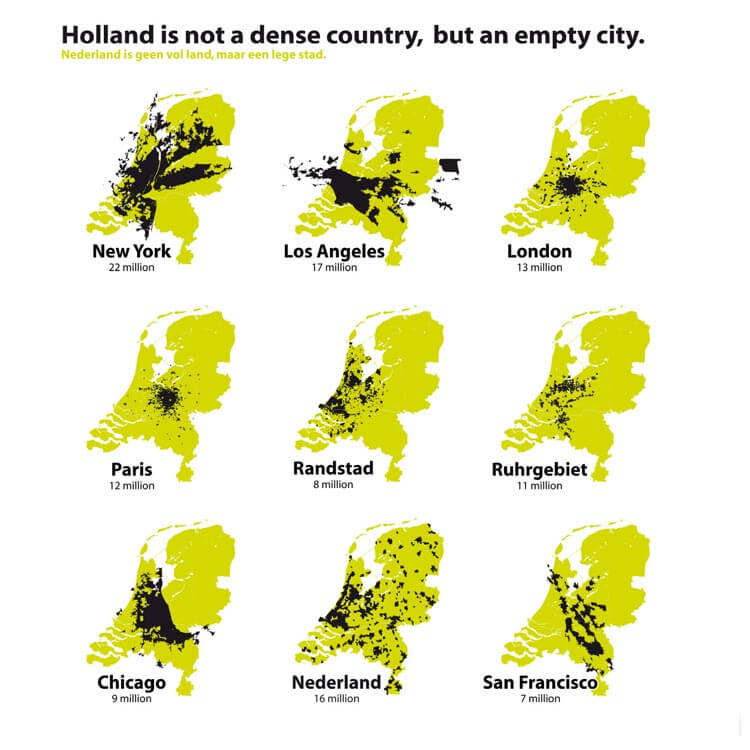
The Netherlands (aka Holland) is the 30th most densely populated country or territory in the world and the densest country in Europe with a over 10 million people. So it’s understandable that the Dutch might think that their country is a little bit crowded.

However, the map above flips this idea on its head.

[Read more…]

Filed Under: Netherlands Tagged With: comparison

Least Useful (And Vaguely Racist) Ethnic Map Ever

Last Updated: March 3, 2023 8 Comments

Click To Get My 10 Best Brilliant Maps For Free:

Least Useful (And Vaguely Racist) Ethnic Map Ever

Map from the 1911 Historical Atlas by William R. Shepherd

The map above is possibly one of the least useful (and also vaguely racist) ethnic maps ever created. Titled “Present Distribution of Europeans, Chinese, Japanese and Negroes,” it was published in William R. Shepherd’s 1911 Historical Atlas.

[Read more…]

Filed Under: World Maps

Major European Cities On A Map Of Texas

Last Updated: March 3, 2023 6 Comments

Click To Get My 10 Best Brilliant Maps For Free:

Major European Cities On A Map Of Texas

Map created by reddit user daysleeperrr

The map above shows the relative position of major European cities if they were suddenly moved to Texas. Depending on your point of view, it either shows that Texas is really big or Europe is very small.

[Read more…]

Filed Under: Other Tagged With: comparison

World’s Best Schools: Number of Top-500 Universities by Country (2015)

Last Updated: July 23, 2024 5 Comments

Click To Get My 10 Best Brilliant Maps For Free:

Number of Top-500 Universities by Country

Map created by reddit user Quackattackaggie

The map above tells a few interesting stories. On the surface it shows that the US is the clear leader in higher education, with 146 out of the world’s top 500 universities (29.2%). This is over 3 times more than China, the next closest country.

However, that’s not the only thing that’s interesting.

[Read more…]

Filed Under: World Maps Tagged With: education

Simplified Map Of Africa’s Religions

Last Updated: March 24, 2026 11 Comments

Click To Get My 10 Best Brilliant Maps For Free:

Simple-africa-religion

Map created by reddit user Kurupt4Ever
Want to understand religion in Africa? Then the map above is a good place to start.

Basically, Islam dominates the North and East of the continent, while Christianity dominates the South and West, with other native and folk religions being scattered throughout.

[Read more…]

Filed Under: Africa Tagged With: religion

  • « Previous Page
  • 1
  • …
  • 141
  • 142
  • 143
  • 144
  • 145
  • …
  • 155
  • Next Page »


Product Reviews · World Atlas · Settlers of Catan · Risk · Game of Thrones · Coloring Books
Globes · Monopoly · Star Wars · Game of Life · Pandemic · Ticket To Ride · Drinks Cabinets
US Locations · UK Locations· Fleet Management
Copyright © 2026 · Privacy Policy · Fair Use, Attribution & Copyright · Contact Us
Follow Us: Newsletter · Facebook · Youtube · Twitter · Threads · BlueSky · LinkedIn · Instagram · Pinterest · Flipboard