The maps below all come this CIA album on Flicker. They describe the maps in the following ways:
CIA Cartography Center has been making vital contributions to our Nation’s security, providing policymakers with crucial insights that simply cannot be conveyed through words alone.
2000 Arctic Region Map
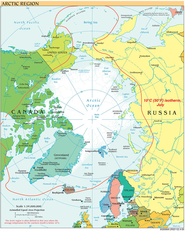
This 2000 CIA Arctic Region map depicts the strategic geography of the Arctic Region at the beginning of the twenty-first century, emphasizing climate boundaries, sea ice extent, and the proximity of the world’s major Arctic powers.
Centered on the North Pole using an azimuthal equal-area projection, the map highlights the interconnected northern territories of the United States, Canada, Russia, Greenland, and the Nordic countries while illustrating the Arctic Ocean as a shared geopolitical space rather than a distant frontier.
A defining feature of the map is the red 10°C July isotherm, commonly used to delineate the Arctic region climatologically.
The map also marks the average minimum extent of sea ice, emphasizing how climate conditions shape navigation, settlement, and resource access.
Major Arctic settlements, ports, islands, and maritime zones are identified, including strategic chokepoints such as the Bering Strait and northern sea routes along the Russian coast.
Created in 2000, the map emerged during a transitional period in Arctic geopolitics.
Following the end of the Cold War, military tensions in the High North had eased, but new strategic concerns were developing around climate change, energy resources, and emerging shipping lanes.
Russia was rebuilding its Arctic posture after the collapse of the Soviet Union, while the United States, Canada, and Nordic states increasingly focused on sovereignty claims, environmental monitoring, and scientific cooperation.
At the same time, declining sea ice projections were beginning to transform the Arctic from a remote military frontier into a region of growing economic and geopolitical importance.
Today, the map remains highly relevant because many of the issues it foreshadowed now define global Arctic politics.
Melting sea ice has intensified competition over shipping routes, fisheries, hydrocarbons, and territorial claims. The Arctic has also re-emerged as a zone of strategic rivalry between Russia and NATO members.
This map captures an important historical moment just before the Arctic became central to twenty-first-century discussions about climate change, energy security, and great-power competition.
Also see: Human Settlements That Have No Settlement Further North With A Greater Population
2000 Central Balkan Region Map
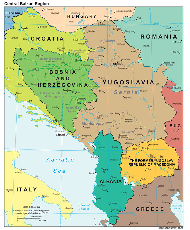
This 2000 CIA Central Balkan Region map captures the political geography of the Balkans immediately after the violent breakup of Yugoslavia in the 1990s.
Produced only a few years after the Bosnian War and shortly after the Kosovo conflict, the map reflects a region still undergoing major political, territorial, and ethnic transformation following the collapse of communist rule in Eastern Europe.
The map emphasizes the newly reconfigured states and disputed political arrangements that emerged from the Yugoslav wars.
It identifies the internal divisions of Bosnia and Herzegovina established under the Dayton Accords, including the Federation of Bosnia and Herzegovina and Republika Srpska, as well as the Inter-Entity Boundary Line.
It also shows Kosovo as part of Serbia within the Federal Republic of Yugoslavia, reflecting the unsettled political status of the territory before Kosovo’s later declaration of independence in 2008.
The map further highlights regional capitals, transportation corridors, rivers, and neighboring states including Croatia, Albania, North Macedonia, Greece, Romania, Bulgaria, and Hungary.
Historically, the map was created during a fragile postwar period when NATO peacekeeping forces, international diplomats, and intelligence agencies were heavily involved in stabilization efforts across the Balkans.
Ethnic conflict, refugee movements, border disputes, and questions of sovereignty remained central strategic concerns. The region’s geography, mountainous terrain, narrow transport corridors, and ethnically mixed populations, had played a major role in both the conflicts and subsequent peace agreements.
Today, the map remains important because many of the political and ethnic issues visible in 2000 continue to influence Balkan geopolitics.
Questions surrounding Kosovo, ethnic autonomy, regional nationalism, and European integration still shape relations across South-eastern Europe.
The map also serves as a historical snapshot of the Balkans at the moment when the post-Cold War European order was still being redefined after one of the continent’s most significant conflicts since World War II.
Also see: Animated Map Of The Breakup of Yugoslavia 1989 – 2008
2000 Map Of Hurricane Mitch (1998)
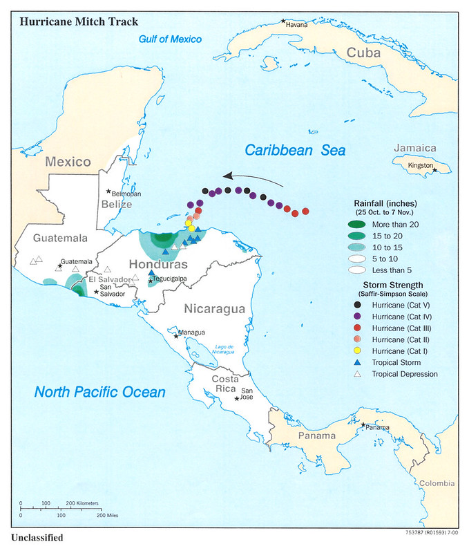
This 2000 CIA map documenting the track of Hurricane Mitch illustrates one of the deadliest and most destructive natural disasters in modern Atlantic history.
The map traces the hurricane’s path across the Caribbean and Central America in late October and early November 1998, while also showing rainfall intensity and storm strength as the system evolved from a tropical depression into a Category 5 hurricane.
The visualization emphasizes the catastrophic impact on Honduras and neighboring states, particularly Nicaragua, Guatemala, and El Salvador.
Rainfall totals exceeding 20 inches are highlighted across large sections of Honduras and parts of Central America, reflecting the flooding and landslides that caused the majority of deaths and infrastructure destruction.
Rather than rapid coastal wind damage alone, the map demonstrates how prolonged rainfall over mountainous terrain transformed the disaster into a humanitarian catastrophe.
Historically, Hurricane Mitch struck during a period when many Central American countries were still recovering from decades of civil conflict, economic instability, and weak infrastructure. Entire communities were isolated as roads, bridges, and agricultural lands were destroyed.
Honduras suffered especially severe damage, with major impacts to transportation networks, crops, and urban centers. The disaster caused thousands of deaths and displaced millions, making Mitch one of the most consequential weather events in the Western Hemisphere during the twentieth century.
The map remains important today because Hurricane Mitch became a defining case study in disaster preparedness, climate vulnerability, and humanitarian response.
It highlighted how geography, poverty, deforestation, and inadequate infrastructure can magnify the effects of extreme weather.
In the decades since, the region has continued to face increasingly intense hurricanes and rainfall events linked to broader climate trends.
The map also reflects how intelligence and government cartography evolved to integrate meteorological tracking, population risk, and regional analysis into products supporting emergency planning, international aid coordination, and long-term environmental assessment.
Also see: A Hurricane By Any Other Name: What Tropical Cyclones Are Called Around The World
2001 Afghanistan Konar Valley 3D Map
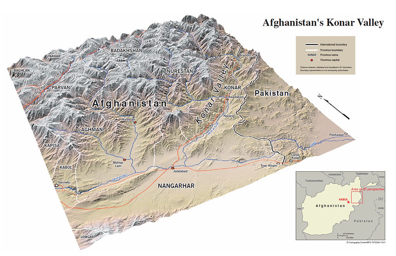
This 3D relief map of Afghanistan’s Konar Valley is one of the clearest visual explanations of why eastern Afghanistan became such a difficult battleground during both the Soviet–Afghan War and the post-2001 U.S. war in Afghanistan.
The map highlights the extreme terrain along the Afghanistan–Pakistan border.
The Konar Valley cuts through towering ridges of the Hindu Kush, with steep side valleys branching into isolated mountain communities. Roads are limited and funnel through narrow corridors, making movement predictable and vulnerable to ambushes.
Strategically, the region sits directly beside Pakistan, near routes leading toward Peshawar and the tribal areas.
This allowed insurgents to move across the porous border, regroup, and exploit the difficulty of enforcing control in the mountains. During the 1980s, the CIA-backed mujahideen used this terrain against Soviet forces; after 2001, Taliban and al-Qaeda fighters used many of the same routes against NATO troops.
The map also shows why places like Jalalabad and Asadabad were strategically important. They served as logistical gateways between the relatively open Nangarhar plain and the mountainous interior of Konar and Nuristan.
This geography became infamous during battles such as:
- Battle of Wanat
- Battle of Kamdesh
- Operation Red Wings
In many of these engagements, insurgents held the high ground while coalition forces occupied exposed valley outposts.
The 3D perspective is especially important because ordinary flat maps often fail to communicate just how vertical this terrain is. Valleys that look close together on a political map may actually be separated by massive ridgelines requiring hours or days of travel. That isolation historically weakened centralized Afghan control and strengthened local tribal and militant networks.
Also see: Countries That Lost Citizens On 9/11
2001 Africa Flag Cartogram Map
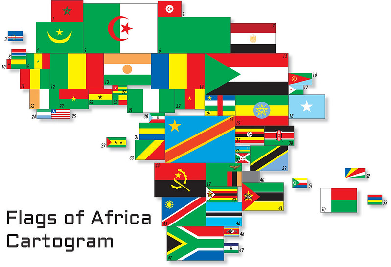
This “Flags of Africa” cartogram is a clever mix of vexillology and geography.
Instead of showing countries in their real geographic shapes, each African country is resized and represented by its national flag, with the size roughly corresponding to its area.
The result immediately changes how people visually perceive Africa.
It also accidentally highlights one of the most visually striking features of African flags: how many use Pan-African colors, especially red, green, yellow, and black. Those colors were heavily influenced by Ethiopia, one of the few African states never fully colonized, and later became symbols of independence and anti-colonialism.
You can also see remnants of Cold War and post-colonial symbolism:
- Libya still uses its pre-2011 plain green flag.
- South Africa has its post-apartheid multicolored flag.
- Democratic Republic of the Congo is massive, reflecting its huge size and population even in the early 2000s.
Also see: Flag Map of The World In 1988
2002 Kurdish Areas Map
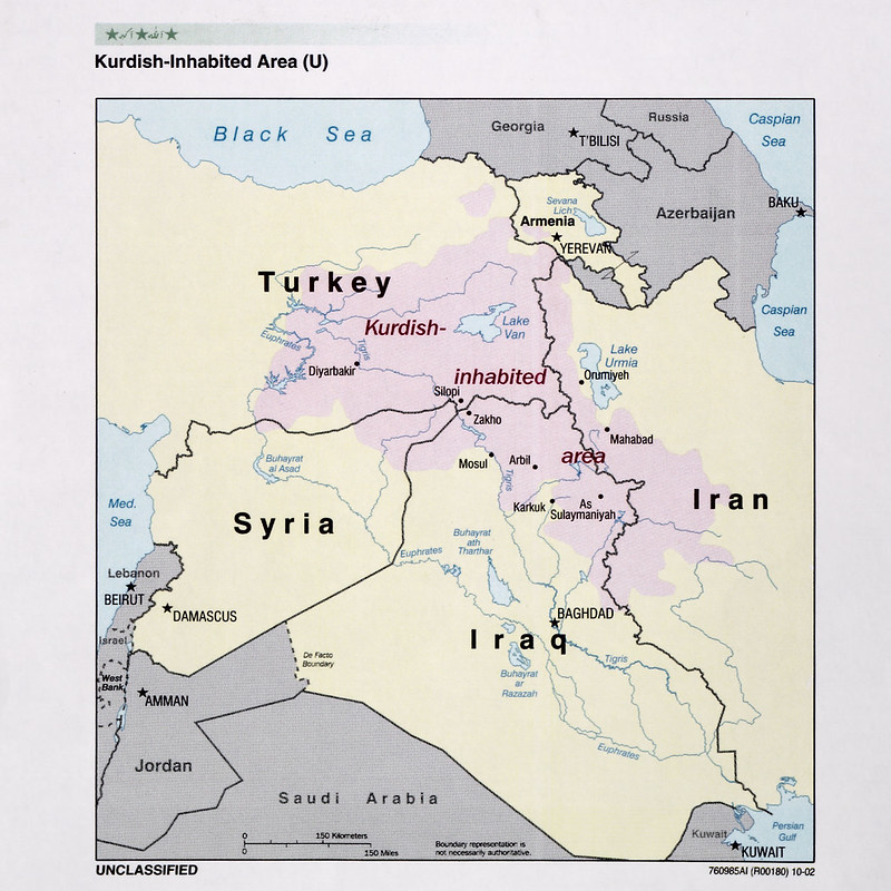
This 2002 “Kurdish-Inhabited Area” map is a classic example of early post-Iraq War CIA and military-intelligence cartography focused on ethnicity, insurgency, and regional geopolitics.
A few notable things about it:
- It depicts the Kurdish population as a cross-border ethnic region spanning southeastern Turkey, northern Iraq, northwestern Iran, and northeastern Syria emphasizing that the Kurdish issue is inherently transnational rather than confined to one state.
- The shaded area is intentionally fuzzy rather than sharply bounded, reflecting the mixed and dispersed nature of Kurdish settlement patterns.
- Major Kurdish cities and political centers are highlighted, including Diyarbakir in Turkey, Arbil/Erbil and Sulaymaniyah in Iraq, and Mahabad in Iran, all historically important to Kurdish nationalism.
- The map predates many later developments:
- the 2003 Iraq War,
- the consolidation of the Kurdistan Regional Government (KRG),
- the Syrian Civil War and Rojava,
- and ISIS-era Kurdish territorial expansion.
- Iraq’s Kurdish region is shown before the later de facto autonomy became firmly institutionalized under the Iraqi constitution.
- Syria’s Kurdish regions appear comparatively small and fragmented on this map, which contrasts with how strategically important they became after 2011.
The map also reflects the geopolitical sensitivities of the time:
- Turkey is shown containing the largest Kurdish population,
- but the map avoids implying an independent Kurdistan by using the softer phrase “Kurdish-inhabited area” instead of drawing political borders.
Also see: The State Of The Kurds
2003 Baghdad Map
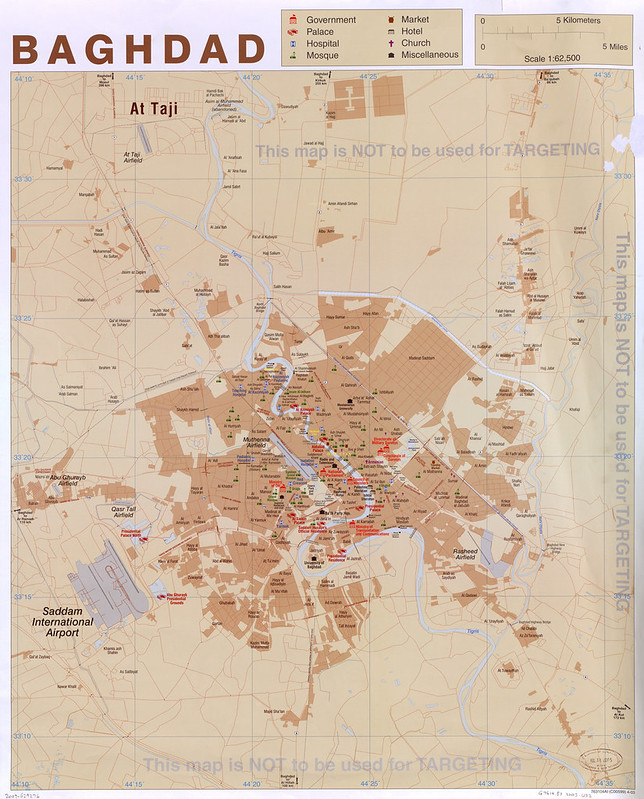
This 2003 CIA city map of Baghdad is one of the most revealing examples of wartime intelligence cartography from the Iraq War era.
Produced around the time of the U.S.-led invasion of Iraq, the map blends civilian city geography with strategic and regime-related infrastructure in a way clearly intended for military and government use.
The most striking feature is the concentration of political and security sites in central Baghdad.
Government ministries, presidential palaces, military compounds, and Saddam Hussein-era institutions are heavily marked around the city core and the Green Zone area along the Tigris River.
The map essentially visualizes Baghdad as both a civilian metropolis and the administrative heart of Saddam Hussein’s regime.
Another important detail is the repeated warning stamped across the map: “This map is NOT to be used for TARGETING.”
That disclaimer reflects the legal and operational distinction between general reference mapping and precise military targeting materials. Even though the map contains strategic infrastructure, it was likely intended for navigation, orientation, planning, logistics, and situational awareness rather than direct weapons guidance.
The map also captures Baghdad before many of the transformations brought by the occupation and later sectarian conflict.
Names like “Saddam International Airport” and “Saddam Hussein Official Residence” place it firmly in the final days of Ba’athist Iraq before many locations were renamed after 2003.
Geographically, the map highlights how Baghdad is structured around the Tigris River, with bridges, highways, and airfields playing enormous strategic importance.
Locations such as Rasheed Airfield, Al Muthenna Airfield, Abu Ghraib Airfield, and At Taji appear prominently because they were key military and logistical nodes during and after the invasion.
Also see: Baghdad Before & After 2006-2007 Sectarian Violence
2003 Kashmir Region Map
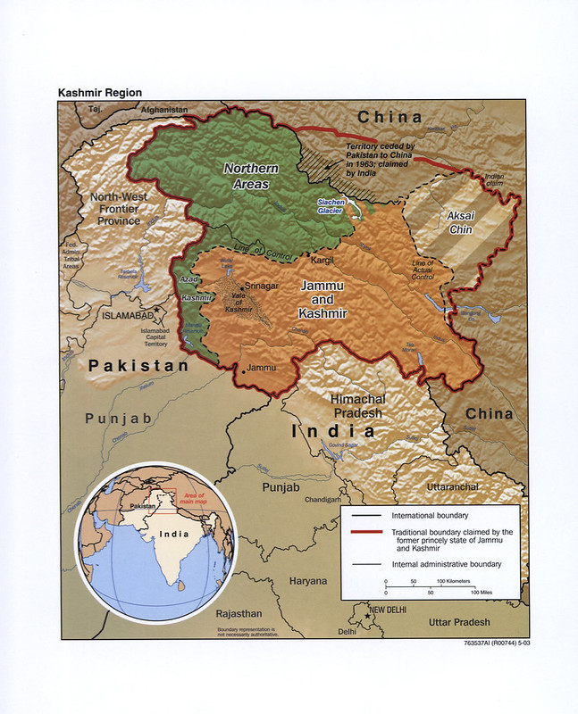 This 2003 CIA map of the Kashmir captures one of the world’s most complicated and militarized territorial disputes, the division of the former princely state of Jammu and Kashmir between India, Pakistan, and China.
The map emphasizes competing claims rather than internationally recognized sovereignty.
The thick red outline shows the borders of the old princely state as it existed before partition in 1947, while the black dashed lines mark the de facto control lines that emerged after wars and ceasefires.
By 2003, India controlled Jammu, the Kashmir Valley, and Ladakh; Pakistan controlled Azad Kashmir and the Northern Areas (today called Gilgit-Baltistan); and China controlled Aksai Chin.
Terrain is central to understanding the conflict, and the map makes that very clear.
Nearly the entire region consists of extreme mountain geography dominated by the Himalayas and Karakoram ranges. This is especially important around the Siachen Glacier, shown near the India-Pakistan-China junction, where India and Pakistan have maintained some of the world’s highest-altitude military deployments.
The map also highlights how strategic the region is geographically.
Kashmir sits at the crossroads of South Asia, Central Asia, and western China. Control of mountain passes, river headwaters, and transport corridors has made the dispute far more than just a local territorial issue.
A particularly notable detail is the label noting territory ceded by Pakistan to China in 1963 but still claimed by India, reflecting how the Kashmir dispute intersects with broader Sino-Indian tensions as well.
Stylistically, this is a very typical early-2000s CIA geopolitical map: relief shading used to stress terrain, muted colors for contested regions, and careful labeling intended to avoid taking an overt position on sovereignty while still clearly depicting control realities on the ground.
Also see: Britain In The Late 1940s
2004 Syria Reference Poster Map
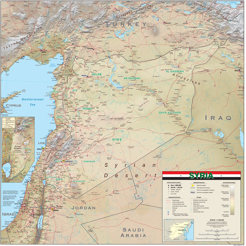
This 2004 CIA reference map of Syria is a classic example of a strategic “all-purpose” intelligence map, designed not for tourists or schools, but for military planners, diplomats, and analysts who needed a detailed understanding of Syria’s geography, infrastructure, and regional position before the outbreak of the Syrian Civil War.
The map emphasizes how Syria’s population and transportation networks are heavily concentrated in the western part of the country.
Major cities like Damascus, Aleppo, Homs, Hama, and Latakia form a dense urban corridor tied together by highways and rail lines along the Mediterranean-facing side of the country. In contrast, eastern Syria is shown as sparsely populated desert crossed mainly by river valleys and long transport routes toward Iraq.
One of the most important geographic features visible is the Euphrates River system running through Raqqah and Dayr az-Zawr provinces. These river valleys are the primary agricultural and settlement zones in eastern Syria and later became strategically crucial during both the Iraq War spillover and the fight against ISIS.
The map also highlights Syria’s extremely sensitive geopolitical position.
It borders Turkey, Iraq, Jordan, Lebanon, and Israel, with the inset specifically noting the disputed Golan Heights. The reference to the “1949 Armistice Line” reflects the unresolved territorial status between Syria and Israel.
Terrain is another major theme.
The western mountain ranges and coastal region contrast sharply with the vast Syrian Desert. This geographic divide later shaped the Syrian Civil War, with different factions controlling dense western urban centers versus isolated eastern territory.
Stylistically, the map reflects early-2000s CIA cartography at its peak: highly detailed, muted earth-tone relief shading, dense transportation data, and strategic labeling intended for operational awareness rather than visual simplicity.
Also see: Watch The Entire 13-Year Syrian Civil War In Just 60 Seconds
2005 Singapore Map
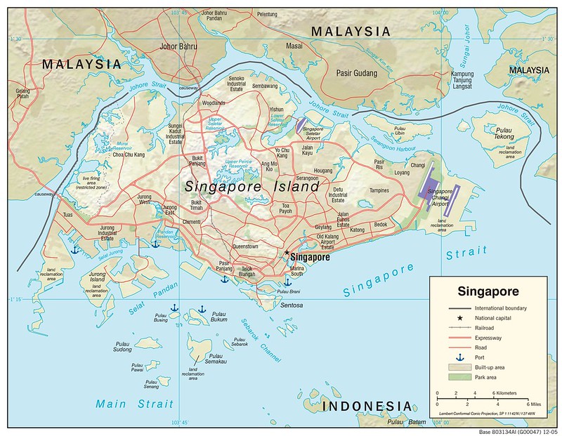
This 2005 CIA map of Singapore highlights just how geographically constrained, yet strategically vital, the city-state is.
Unlike many national maps focused on terrain or political regions, this one emphasizes infrastructure, maritime access, and urban density, which are the foundations of Singapore’s power.
The map shows Singapore Island almost completely urbanized, with an extensive web of expressways, ports, industrial estates, reservoirs, and airport facilities packed into a very small area.
It also illustrates Singapore’s position between the Strait of Malacca and the South China Sea shipping lanes, one of the most important maritime chokepoints in the world. Nearly all trade between East Asia, the Middle East, and Europe passes nearby.
A major theme visible on the map is land reclamation. Areas around Changi Airport, Jurong Island, Tuas, and the southern coastline are marked as reclaimed land, reflecting Singapore’s long-running strategy of literally expanding the country’s territory into the sea.
Jurong Island itself was created by merging smaller islands into a massive petrochemical and industrial hub.
The map also reveals Singapore’s dependence on surrounding Malaysia and nearby Indonesian waters.
The Johor Strait separates Singapore from Malaysia by only a narrow channel crossed by causeways, while reservoirs and protected catchment areas demonstrate how carefully the country manages scarce freshwater resources.
Stylistically, this is classic mid-2000s CIA cartography: functional, infrastructure-focused, and designed to communicate economic and strategic geography rather than political narrative.
Also see: Singapore vs US GDP
2006 Peru Coca Cultivation Map
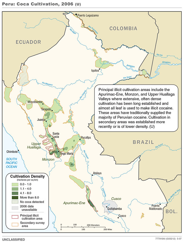
This 2007 CIA map of Peru focuses on coca cultivation patterns and the geography of Peru’s cocaine-producing regions during the mid-2000s.
Like similar CIA and DEA narcotics maps from the era, it combines agricultural data, terrain realities, and counterdrug priorities into a single strategic overview.
The map identifies the major coca-growing valleys especially the Apurímac-Ene Valley (often called the VRAE today), the Upper Huallaga Valley, and the Monzón Valley, which had long histories of coca production and insurgent activity.
Darker green shading indicates denser coca cultivation, while outlined regions distinguish “principal illicit cultivation areas” from newer or secondary growing zones.
One of the most striking features is how concentrated coca cultivation is along Peru’s eastern Andean slopes and jungle transition zones rather than deep within the Amazon Basin itself.
These rugged valleys provided ideal conditions for illicit production: isolation, weak state control, river transport routes, and terrain difficult for government forces to monitor. Many of these same regions had also been centers of activity for the Maoist insurgency group Shining Path during the 1980s and 1990s.
The map reflects a broader shift in the Andean drug trade after aggressive eradication campaigns in Colombia pushed some coca production back into Peru and neighboring Bolivia.
By the mid-2000s, Peru was again emerging as one of the world’s largest coca producers.
Stylistically, the map is very characteristic of post-Cold War CIA thematic cartography: clean borders, sparse colors, and functional intelligence-oriented labeling designed less for public education and more for quickly communicating operational geography, trafficking hotspots, and state-control limitations.
Also see: Map Of Peru Created By The CIA
2007 Burma Population Map
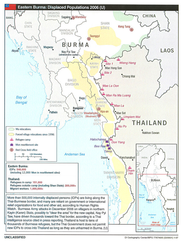
This 2007 CIA map of eastern Myanmar, still called “Burma,” by the CIA and the name preferred by many Western governments at the time focuses on displacement, refugee flows, and forced relocations along the Thai-Burmese border.
Rather than emphasizing military operations directly, the map visualizes the humanitarian consequences of decades of conflict between the Burmese military junta and ethnic insurgent groups.
The map highlights areas of forced village relocation, internally displaced persons (IDPs), refugee camps in Thailand, and resettlement zones connected to ethnic minorities such as the Karen, Mon, and Shan peoples.
Large sections of eastern Burma are shaded to show areas where villages had reportedly been relocated or depopulated since the mid-1990s as part of counterinsurgency campaigns carried out by the military government.
Particular attention is given to the Thai border region, where refugee camps such as Mae La and Umpiem Mai became long-term settlements for people fleeing violence.
The map also notes the role of humanitarian organizations and Red Cross field offices, reflecting growing international concern over Burma’s human rights situation during the final years of direct military rule.
The political timing is important. The map was produced shortly after Burma’s military government established its new administrative capital at Naypyidaw, and the accompanying text references claims that military operations were partly intended to secure territory around the new capital and ethnic frontier regions.
Stylistically, the map blends humanitarian and intelligence cartography.
Unlike conventional political maps, it focuses on population movement, displacement corridors, and conflict-affected zones, illustrating how CIA cartography in the 2000s increasingly incorporated refugee crises, ethnic conflict, and human security issues alongside traditional military analysis.
Also see: Map Of Myanmar (Burma) The CIA No Longer Wants You To See
2008 Albania Administrative Map
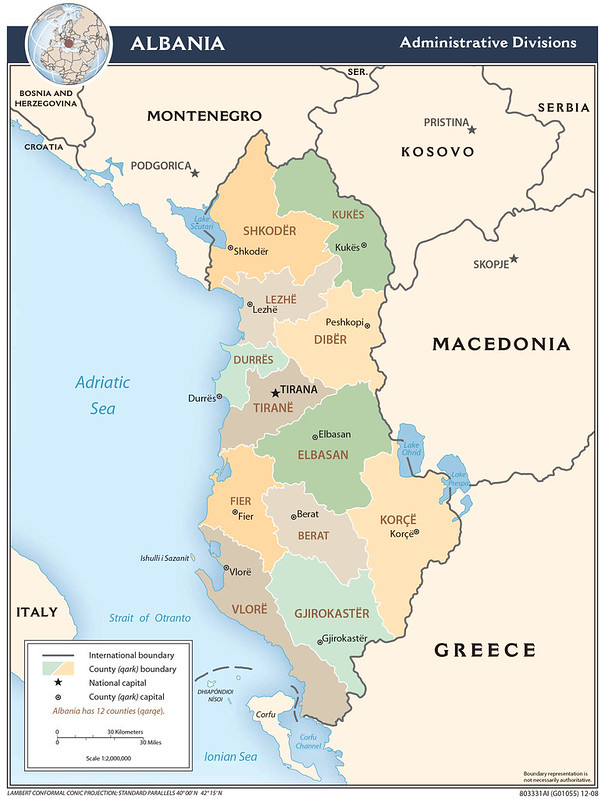
This 2008 CIA map of Albania focuses on the country’s administrative structure rather than terrain or military geography.
It divides Albania into its twelve counties, known in Albanian as qarqe, each centered around a major regional city such as Tirana, Shkodër, Korçë, or Vlorë.
The map was produced during a period when Albania was increasingly integrating into Euro-Atlantic institutions and modernizing its internal governance after the instability of the 1990s.
The map reflects Albania’s highly centralized nature. Although the counties are shown clearly, political and economic power remains heavily concentrated around Tirana and the coastal corridor linking the capital with the port city of Durrës.
The coastal west is more densely populated and economically connected, while many eastern and northern counties remain mountainous and historically isolated.
The regional context shown on the map is also significant.
Albania borders Montenegro, Kosovo, North Macedonia, and Greece, placing it at the center of several major Balkan political and ethnic questions.
The inclusion of Kosovo as a separate entity is notable because the map was produced the same year Kosovo declared independence in 2008, an event strongly supported by Albania but opposed by Serbia.
Stylistically, the map uses the clean pastel administrative style common in late-2000s CIA cartography.
Unlike earlier Balkan maps focused on war, ethnic conflict, or NATO operations, this one presents Albania as a normalized modern European state with clearly defined administrative institutions and borders.
Also see: Map Of Albania Created By The CIA
2008 Albania Physiography Map
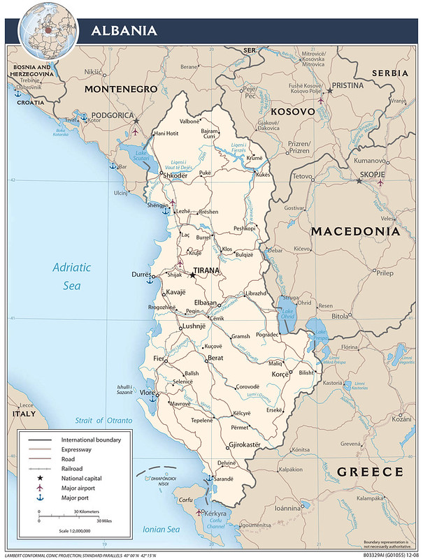
This 2008 CIA reference map of Albania is a good example of the agency’s transition from Cold War strategic mapping toward cleaner, modern geographic reference cartography.
Unlike many CIA maps focused on conflict or intelligence issues, this one is primarily a national infrastructure and physiography map, intended to provide a broad overview of Albania’s terrain, transportation links, and regional position in the Balkans.
The map emphasizes Albania’s geography as a mountainous Adriatic state squeezed between the sea and the rugged Balkan interior.
Most of the population and infrastructure are concentrated along the western lowlands near the Adriatic coast, where cities such as Tirana, Durrës, and Vlorë are located.
In contrast, the eastern and northern parts of the country are dominated by steep mountain terrain and river valleys, historically making internal transportation and economic integration more difficult.
The map also highlights Albania’s strategic position bordering Kosovo, Montenegro, North Macedonia, and Greece.
By 2008, this regional context was especially important because Kosovo had just declared independence earlier that year, making Albania an increasingly significant NATO-aligned state in the western Balkans.
The inclusion of ports, airports, railroads, and expressways reflects Albania’s growing integration with European transportation and security networks after decades of communist isolation under Enver Hoxha.
Visually, the map uses the clean pastel style common in late-2000s CIA cartography: muted earth tones, simplified terrain shading, crisp typography, and minimal clutter. Compared to older Balkan intelligence maps from the 1990s wars, this one feels much more administrative and developmental rather than overtly military.
Also see: Air Albania Flight Route Destinations Map
2009 Golan Heights 3D Map
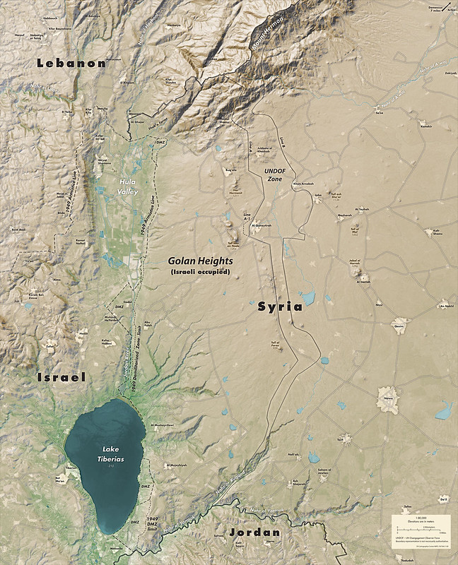
This 2009 CIA map of the Golan Heights was designed to show why the region is strategically important rather than simply where borders are located.
Using detailed 3D terrain shading, the map emphasizes that the Golan is a high volcanic plateau overlooking northern Israel, southern Syria, and parts of Lebanon and Jordan.
The steep drop toward the Sea of Galilee helps explain why the area has been militarily contested for decades.
The map marks several historically important boundaries, including the 1949 Armistice Line, the old demilitarized zones created after the first Arab–Israeli war, and the later UN buffer zone monitored by the United Nations Disengagement Observer Force (UNDOF) after the 1973 Yom Kippur War.
It also highlights major valleys, rivers, and mountain ridges that shape movement and defense in the region.
One of the most important features shown is Mount Hermon in the north. Because of its elevation, the mountain provides major surveillance and radar advantages and has long been considered one of the most strategically valuable positions in the Levant.
The map reflects a broader shift in CIA cartography during the 2000s toward highly detailed, satellite-based terrain visualization.
Rather than focusing mainly on political borders, maps like this aimed to visually explain how geography influences military planning, security concerns, and regional power dynamics.
Also see: Map of Israel & Palestine’s Territorial Changes 1920-2008
Camp David 29 Sept 2001 CIA Map

From the description: “President George W. Bush receives a briefing during a meeting with CIA Director George Tenet, right, National Security Advisor Condoleezza Rice, and Chief of Staff Andy Card at Camp David, Saturday, 29 September 2001. —White House photo by Eric Draper”
This photograph is one of the most famous behind-the-scenes images from the immediate post-9/11 period because it captures the core Bush administration national security team in an informal wartime setting at Camp David just weeks after the attacks.
From left to right:
- Andrew Card
- Condoleezza Rice
- George W. Bush
- George Tenet
A few interesting details about the image:
- The large paper spread across the table appears to be a CIA or military terrain map, almost certainly related to Afghanistan planning in late September 2001.
- The timing is significant: this was taken on 29 September 2001, less than two weeks before the beginning of the U.S. invasion of Afghanistan on 7 October 2001.
- The relaxed setting contrasts with the gravity of the discussion. Camp David was frequently used by Bush after 9/11 as a secure retreat for strategic planning.
- The photo reflects how heavily the administration relied on CIA briefings during the early phase of the “War on Terror,” before large-scale conventional military deployment.
- George Tenet became one of the most influential intelligence figures of the era, particularly regarding Afghanistan, Iraq, and counterterrorism operations.
- Visually, the image has the warm domestic aesthetic common in Eric Draper’s White House photography: soft lighting, rustic furniture, and candid composition designed to humanize presidential decision-making.
The map itself is difficult to identify precisely from the image quality, but it resembles the style of CIA topographic or regional operational maps used for Afghanistan and Pakistan in 2001.
Also see: Map Of Terrorist Incidents Since 2000
More Declassified CIA Maps
- 22 Declassified CIA Cartography Maps From The 1940s
- 14 Declassified CIA Cartography Maps From The 1950s
- 16 Declassified CIA Cartography Maps From The 1960s
- 19 Declassified CIA Cartography Maps From The 1970s
- 12 Declassified CIA Cartography Maps From The 1980s
- 16 Declassified CIA Cartography Maps From The 1990s
- 15 Declassified CIA Cartography Maps From The 2010s


Leave a Reply