
The map above is interesting not because it looks beautiful, which it does, but because of where and when it was published.
Making Sense Of The World, One Map At A Time
The map above is interesting not because it looks beautiful, which it does, but because of where and when it was published.

The map above shows how bad winters are around the United States using the The Accumulated Winter Season Severity Index. The circles on the map represent the weather stations used to collect the data.

Why are there there so many immigrants in France & the UK, so many Irish in Portugal and Portuguese in Luxembourg, so many dashcams in Russia and so many cats everywhere?
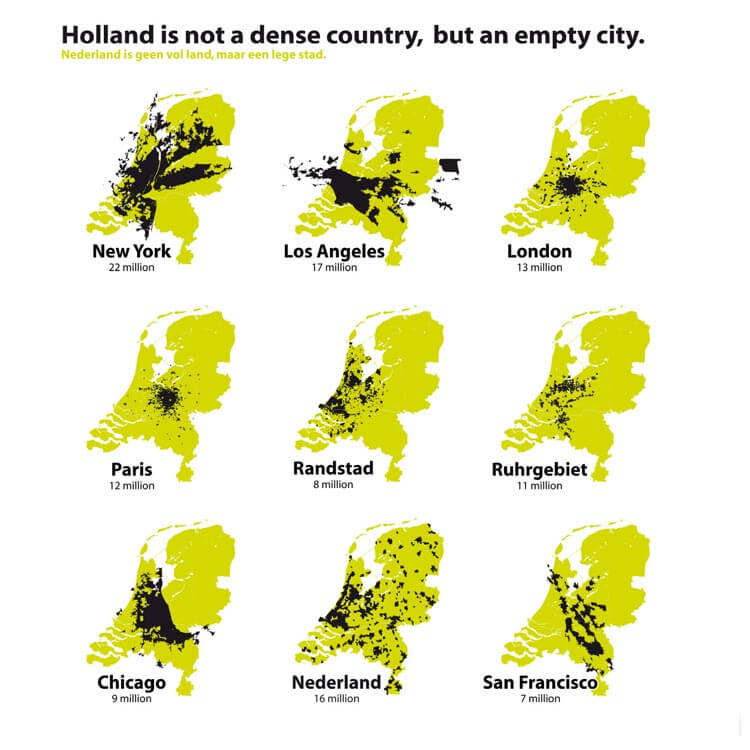
The Netherlands (aka Holland) is the 30th most densely populated country or territory in the world and the densest country in Europe with a over 10 million people. So it’s understandable that the Dutch might think that their country is a little bit crowded.
However, the map above flips this idea on its head.

The map above is possibly one of the least useful (and also vaguely racist) ethnic maps ever created. Titled “Present Distribution of Europeans, Chinese, Japanese and Negroes,” it was published in William R. Shepherd’s 1911 Historical Atlas.

The map above shows the relative position of major European cities if they were suddenly moved to Texas. Depending on your point of view, it either shows that Texas is really big or Europe is very small.

The map above tells a few interesting stories. On the surface it shows that the US is the clear leader in higher education, with 146 out of the world’s top 500 universities (29.2%). This is over 3 times more than China, the next closest country.
However, that’s not the only thing that’s interesting.

Basically, Islam dominates the North and East of the continent, while Christianity dominates the South and West, with other native and folk religions being scattered throughout.

If you’ve never used Map Stack you should. Like right now! It’s a map lover’s dream tool for creating brilliant maps in only a matter of minutes.
You can use it to create really cool maps like the London watercolour map above or the maps of just London’s parks or just London’s water below.

The 3 areas in blue above, contain roughly 50% of Australia’s population, which means that the area in white contains the other 50%.
For those that don’t know their Australian geography the 3 areas are: