Brilliant Maps

Making Sense Of The World, One Map At A Time

  • BOOK!
  • Newsletter
  • Board Games
  • Posters
  • Scratch Maps

The Truth About Immigration & Foreigners In Europe

August 10, 2015 28 Comments

foreign citizens by European country

Map created by reddit user Bezbojnicul based on data from Eurostat

Think immigration is too high in Europe? If so, do you know how many foreigners do you think live in your country? The numbers may be far lower than you think.

The map above shows the percentage of the foreign citizens (split between EU and non-EU nationals) living in many European countries. While the media loves to portray the continent as being overrun with foreigners, the truth is quite different.

Below are the percentage of foreign citizens by country, based off data from Eurostat:

[Read more…]

Filed Under: Europe Tagged With: immigration

Most Common Country of Origin of New Immigrants To The United States

June 8, 2015 1 Comment

most-common-country-immigrants-US

Map crated by Giorgio Cavaggion

Inspired by Ben Blatt’s What are the biggest immigrant groups in your state?, Giorgio Cavaggion created two flag maps of the most common country of origin of new legal immigrants to the United States.

[Read more…]

Filed Under: United States Tagged With: immigration

Most Common Foreign Citizenship In Each German District

June 7, 2015 2 Comments

German foreign citizenship

Map created by reddit user Szwab

The map above shows the country of citizenship for the largest group of foreigners by German district. However, it doesn’t show the absolute or even relative numbers. So even districts with very few foriegners will still have one group that’s the largest.

In total, Germany had 6,180,013 people with non-German citizenship living there in 2011, according to zensus2011.de.

[Read more…]

Filed Under: Germany Tagged With: immigration

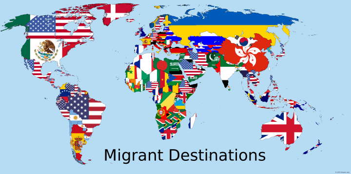
Flags Of The Most Popular Migrant Destination By Country

March 24, 2015 6 Comments

Flags of the most popular migrant destination country

Map by Devinn Jani found via reddit

The map above shows the flag of the country people who move abroad are most likely to move to. So for example, Australians are most likely to move to the United Kingdom (and vice versa), Canadians are most likely to move to the United States, Mainland Chinese to Hong Kong, etc.

[Read more…]

Filed Under: World Maps Tagged With: immigration, population

Most Popular Migrant Destinations By Country

March 4, 2015 23 Comments

Most Popular Migrant Destinations By Country

Map by reddit user DMan9797, click for higher resolution

The UN estimates that there were 232 million people living outside their country of birth in 2013, roughly 3.2% of the world’s population. To put this in perspective, if migrants formed one country, it would be the world’s 5th most populous.

The map above uses the UN’s Trends in International migrant stock: By destination and origin report to look at the most popular destination for migrants FROM each country.

[Read more…]

Filed Under: World Maps Tagged With: immigration, population


World Atlas · Settlers of Catan · Risk · Game of Thrones · Coloring Books · Globes
Monopoly · Star Wars · Game of Life · Pandemic · Ticket To Ride · Drinks Cabinets
Copyright © 2023 · Privacy Policy · Fair Use, Attribution & Copyright · Contact Us
Follow Us: E-mail · Twitter · Facebook · Pinterest · Flipboard