
The map above shows the relative position of major European cities if they were suddenly moved to Texas. Depending on your point of view, it either shows that Texas is really big or Europe is very small.
Making Sense Of The World, One Map At A Time
The map above shows the relative position of major European cities if they were suddenly moved to Texas. Depending on your point of view, it either shows that Texas is really big or Europe is very small.

The map above tells a few interesting stories. On the surface it shows that the US is the clear leader in higher education, with 146 out of the world’s top 500 universities (29.2%). This is over 3 times more than China, the next closest country.
However, that’s not the only thing that’s interesting.

Basically, Islam dominates the North and East of the continent, while Christianity dominates the South and West, with other native and folk religions being scattered throughout.

If you’ve never used Map Stack you should. Like right now! It’s a map lover’s dream tool for creating brilliant maps in only a matter of minutes.
You can use it to create really cool maps like the London watercolour map above or the maps of just London’s parks or just London’s water below.

The 3 areas in blue above, contain roughly 50% of Australia’s population, which means that the area in white contains the other 50%.
For those that don’t know their Australian geography the 3 areas are:

The map above shows a potential 9,125 mile (14,685 km) road trip around the United States that would maintain a constant 70°F (21°C) normal daytime high temperature outside.

The map above is a more accurate reflection of the economic territory of each of the world’s countries. It includes not only land and territorial waters but also Exclusive Economic Zones (EEZ), which extend up to 200 nautical miles (370 kilometres) off a country’s coast.
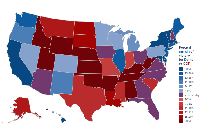
The map above shows what the 2016 presidential election results could look like based on the increase in the number of Hispanic and Asian voters who will be voting for the first time 2016.
The interactive version allows you to make some assumptions and see what the results would be. Some interesting findings include:

Think immigration is too high in Europe? If so, do you know how many foreigners do you think live in your country? The numbers may be far lower than you think.
The map above shows the percentage of the foreign citizens (split between EU and non-EU nationals) living in many European countries. While the media loves to portray the continent as being overrun with foreigners, the truth is quite different.
Below are the percentage of foreign citizens by country, based off data from Eurostat:
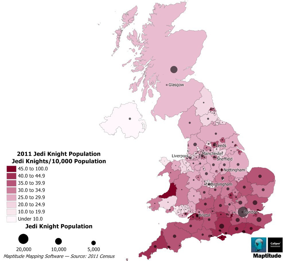
The map above shows how many self-proclaimed Jedi currently live in the UK. The Jedi census phenomenon can be found around the world, but has been particularly popular with the English and Welsh.