
The Truth About The Legality Of Owning A Kangaroo In The US

From the map author:
7 New Oxford Wall Maps of Australia

The map above is a 1920 New Oxford Map of Australia created by by geographer Thomas Griffith Taylor and Beckit, H. O showing where you can and can’t find sheep.
The categories are very helpfully divided into either no sheep or some sheep. No categories are listed for wheat.
All has a very Settlers of Catan feel to it don’t you think?
They also created the following maps in the same series:
The 24 States of Australia If All Statehood Proposals Had Succeeded

The map above shows what Australia might have looked like if all statehood proposals had succeeded.
In total, it would have 24 states which would include not only the Australian mainland, but New Zealand (split into North and South islands), Fiji, New Hebrides, East Timor(?), and the states of Papua and New Guinea.
However, Sasha did one better and even estimated each state’s population, area and GDP.
Just keep in mind the following figures are from 2014, but give an idea of the relative size and economic importance of each proposed state:
The Biggest Postcode in Australia (& The World?)

The map above shows the 0872 postcode in Australia which is the largest in the country and by extension the world.
As the map author states:
[Read more…]
Just 243,000 (0.9%) Of People In Australia Live In The Red Area

The map uses color-coding to represent various levels of remoteness and includes a legend explaining the percentage of the population living in each area.
Here’s a detailed explanation:
Kangaroo vs Human Population Of Australia

The map highlights that most Australian states have a higher population of kangaroos compared to humans, except for Victoria and Tasmania where the human population exceeds the kangaroo population.
Here is the information for each Australian state:
Climate Analogues of Australia
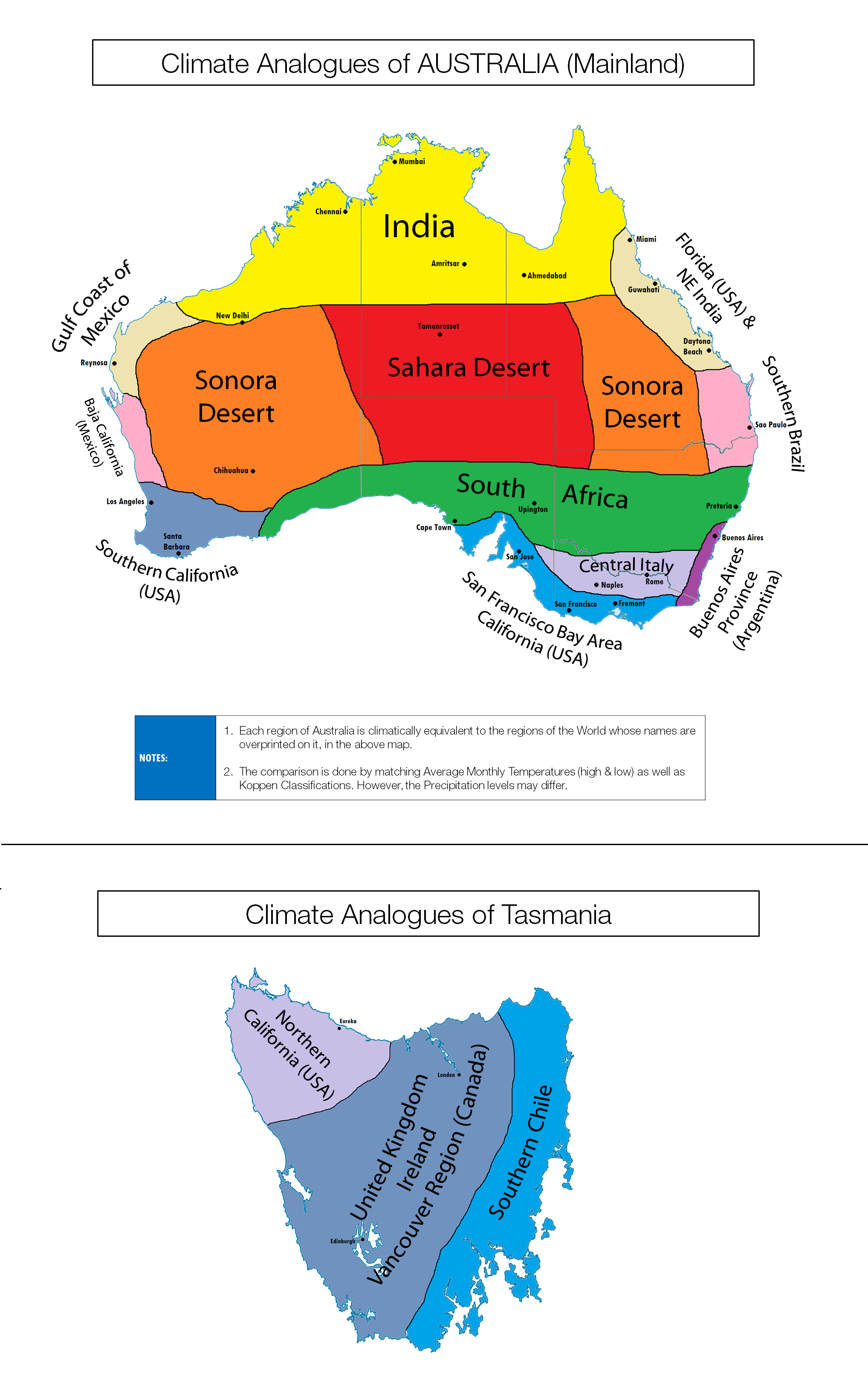
You probably already know Australia is a relatively hot country, but the map above shows how the clinate of its various regions compares to other places on earth (including cities).
Habitability Map of Australia From 1946

The map above shows how habitable various parts Australia are with respect to agriculture and livestock. The scale goes from good agricultural and pastoral lands to the rather direct ‘useless.’
Half of Australia Lives Here

The 3 areas in blue above, contain roughly 50% of Australia’s population, which means that the area in white contains the other 50%.
For those that don’t know their Australian geography the 3 areas are: