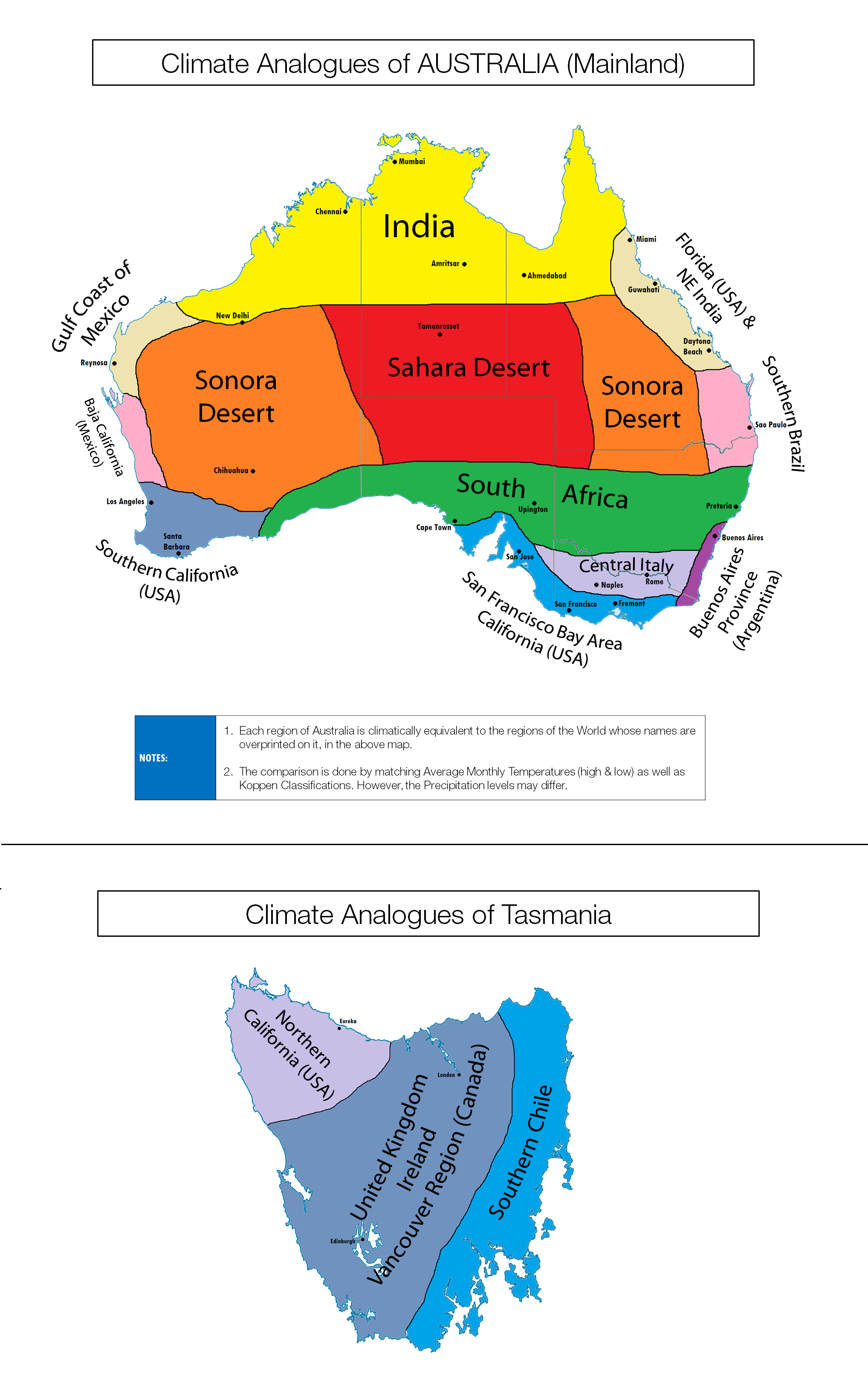
You probably already know Australia is a relatively hot country, but the map above shows how the clinate of its various regions compares to other places on earth (including cities).
For example, northern Australia has a similar climate to India (an admittedly vague reference point) and the middle of Australia is similar to the Sahara Desert.
The map takes into account not only average annual temperatures (high and lows) but also Köppen Climate Classifications. Precipitation levels may vary.
Other regions include:
- North Western Australia – Gulf Coast of Mexico
- Western Australia – Baja California (Mexico)
- South Western Australia – Southern California
- Eastern and Western Central Australia – Sona Desert
- North Eastern Australia – Florida and NE India
- Eastern Australia – Southern Brazil
- South Central Australia – South Africa
- South South Central Australia – Central Italy
- Eastern South Eastern Australia – Buenos Areas Province
- Western South Eastern Australia – San Francisco Bay Area
- Central Tasmania – UK & Ireland or Vancouver Canada
- North Eastern Tasmania – Northern California
- Western Tasmania – Southern Chile
To lean more about the weather and climate of Australia have a look at the following books:
- The Weather and Climate of Australia and New Zealand
- How to Understand Australian Weather: The Essential Guide for all Visitors and Travellers in Australia
- A Reef in Time: The Great Barrier Reef from Beginning to End
Enjoy this map? Then please share it with a friend:


Mark Duffett says
I suspect some confusion about Tasmania (east vs west) – my bet is the description is correct
“North Eastern Tasmania – Northern California
Western Tasmania – Southern Chile” and the map is wrong.
byblos says
The blue area of coastal South Eastern Australia of Victoria and South Australia are NOT similar to the San Francisco bay area (which is somewhat more cooler) A better comparison would be to the Portugal’s atlantic coast stretching from Lisbon ( like Adelaide) to Porto (like Melbourne)
Randy says
I agree that San Francisco itself is way too cold. But they are a cold spot locally. There are other cities close by that might be better choices, such as Redwood City, 25 miles South.
I live in Fremont, and I was aware of the similarity in temperatures to Melbourne and Porto, Portugal before ever seeing this map. It’s very striking.
Randy says
I just got the numbers, using the monthly temperatures that goggle provides. So calculating the sum of monthly differences, divided by 12 months. Fremont vs. Melbourne:
Average monthly difference over the year (shifted by 6 months):
High temperature: 0.8 degrees C
Low temperature: 1.5 degrees C
The Porto, Portugal comparison to Melbourne is similarly amazing (as : byblos mentions): 0.9 C difference in highs, 0.75 C in lows.
Renato Picinini says
São Paulo is not southern Brazil :p
Southern would be Paraná Santa Catarina or Rio Grande do Sul.
Thiago says
‘The South’ — official name for a region (nowadays) comprising the three southernmost States in Brazil. It used to include São Paulo, by the way, and it might see changes again some day in the future.
‘Southern Brazil’ — anything towards the southern third, or even the southern half, of Brazil. It obeys common-sense logic, instead of dry official categories.
The map is indeed brilliant and São Paulo city is indeed very much like Brisbane, climate-wise.