Brilliant Maps is now just over 1 year old. Since launching we’ve made a total of 167 posts. So we thought now was as good a time as any to look back at what the 15 best and most popular maps were for 2015 (based on the number of visitors).
If you were one of them, then a huge thank you! It means a huge amount to everyone at Brilliant Maps that you obviously love maps as much as we do.
We’re continually doing our best to bring you maps we think tell interesting stories. We’ve obviously gotten that right many times over the past year, but perhaps more interesting are the maps that didn’t quite find an audience.
So to give them one final push, we’ve included 10 honourable mentions at the end of this post as well.
Finally, many of the most popular maps of 2015, had their highest traffic month several months after the original post was made. This was often due to to the right person sharing the map with the right audience at the right time.
So if you’ve shared any of our maps with a friend an extra special thank you to you!
15. Incredibly Detailed Map Of The World’s Religions
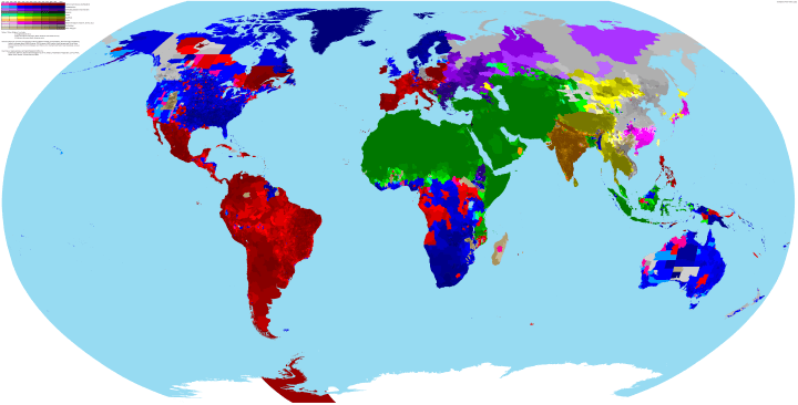
Published On: April 21, 2015
Most Popular Month: April
Comments: A truly fascinating and nuanced look at religion around the world today.
Full Post: Incredibly Detailed Map Of The World’s Religions
14. Roman Empire GDP Per Capita Map Shows That Romans Were Poorer Than Any Country in 2015
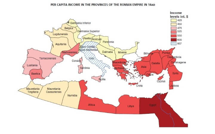
Published On: May 4, 2015
Most Popular Month: November
Comments: A really interesting map and post about how far human beings have progressed economically since Roman times.
Full Post: Roman Empire GDP Per Capita Map Shows That Romans Were Poorer Than Any Country in 2015
13. Fastest Growing Religion In Each Country Around The World
Published On: June 10, 2015
Most Popular Month: June
Comments: This map looks at the largest relative increases in religions around the world. Some suprising and some not so surprising results.
Full Post: Fastest Growing Religion In Each Country Around The World
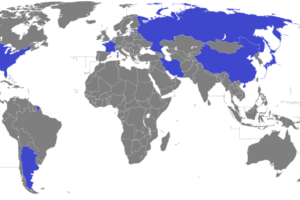
12. The Largest Source Of Imports By Country

Published On: March 19, 2015
Most Popular Month: September
Comments: The definition of a brilliant map. Shows the largest import supplier countries (e.g. the US imports more from China than any other country).
Full Post: The Largest Source Of Imports By Country
11. The Many Disgusting Dishes & Culinary Horrors of Europe
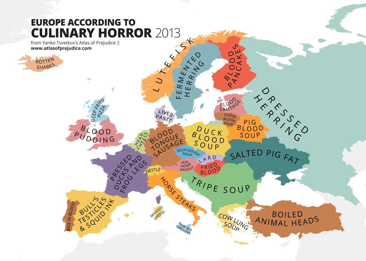
Published On: February 24, 2015
Most Popular Month: June
Comments: The first humorous map and the first map from Yanko Tsvetkov to make our list. His maps have been incredibly popular whenever we’ve published them.
Full Post: The Many Disgusting Dishes & Culinary Horrors of Europe
10. European Food According to Italians
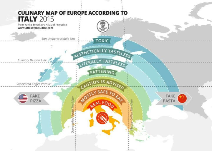
Published On: September 7, 2015
Most Popular Month: September
Comments: A second humorous map from Yanko Tsvetkov.
Full Post: European Food According to Italians
9. Most Popular Migrant Destinations By Country

Published On: March 4, 2015
Most Popular Month: March
Comments: Migration was a key theme to many of our most popular maps. This maps shows where migrants go when they leave their home country.
Full Post: Most Popular Migrant Destinations By Country
8. Holland Is Not A Dense Country, But An Empty City
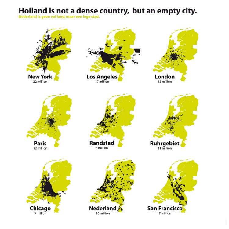
Published On: September 2, 2015
Most Popular Month: September
Comments: It struck a chord with users in the Netherlands who seemed to either love or loathe it.
Full Post: Holland Is Not A Dense Country, But An Empty City
7. Percentage of Young Adults In Europe, aged 25-34, Who Still Live With Their Parents

Published On: June 24, 2015
Most Popular Month: July
Comments: An interesting map that focuses on a very topical issue for many of Europe’s young adults.
Full Post: Percentage of Young Adults In Europe, aged 25-34, Who Still Live With Their Parents
6. Countries With The Most Venomous Animals
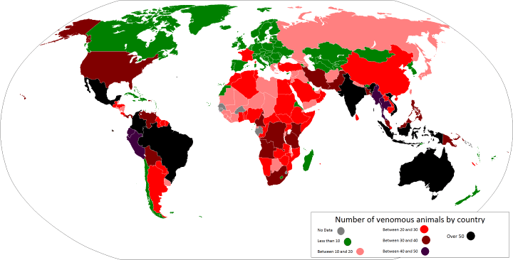
Published On: May 6, 2015
Most Popular Month: August
Comments: This post was a bit of a slow burner. However, a tweet from Canadian astronaut Chris Hadfield and ongoing popularity on Stumbleupon were almost enough to put it in the top 5.
Full Post: Countries With The Most Venomous Animals
5. What If Nazi Germany Won World War II? Fictional & Historical Scenarios
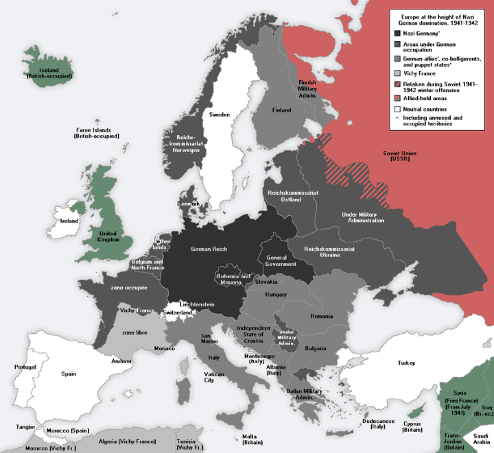
Published On: January 19, 2015
Most Popular Month: November
Comments: This post has had incredible staying power, which is likely due in part to Amazon’s brilliant The Man in the High Castle TV show.
Full Post: What If Nazi Germany Won World War II? Fictional & Historical Scenarios
4. The Genetic Map Of Europe
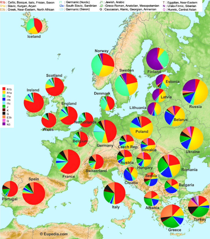
Published On: April 21, 2015
Most Popular Month: April
Comments: This map has arguably been our most controversial, with everything from the map design to the underlying data being criticized. Nevertheless, that didn’t seem to stop people sharing it in droves on social media.
Full Post: The Genetic Map Of Europe
3. An Incredibly Detailed Map of the Roman Empire At Its Height in 211AD
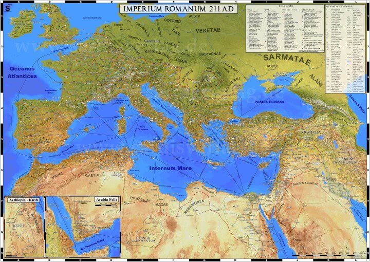
Published On: September 24, 2015
Most Popular Month: September
Comments: An absolutely amazing map that got picked up on reddit. Be sure to read the post to see close-ups of the map.
Full Post: An Incredibly Detailed Map of the Roman Empire At Its Height in 211AD
2. How North Londoners View The Rest Of The UK Or Why The Rest of The UK Hates London
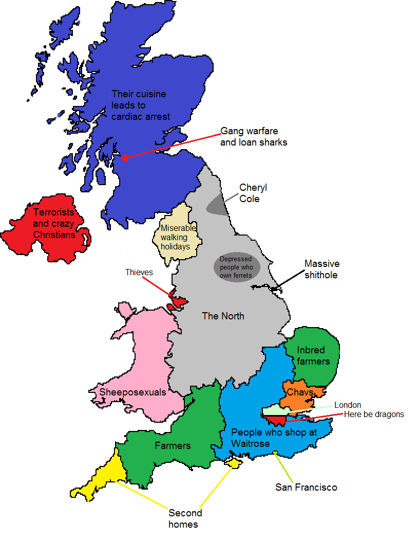
Published On: February 10, 2015
Most Popular Month: February
Comments: Pretty much the only time we totally nailed a post title. Of course it doesn’t hurt that everyone outside of London seems to hate it or that Londoners have no idea that there’s an entire country beyond the M25.
Full Post: How North Londoners View The Rest Of The UK Or Why The Rest of The UK Hates London
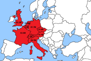
1. 2nd Largest Nationality Living In Each European Country
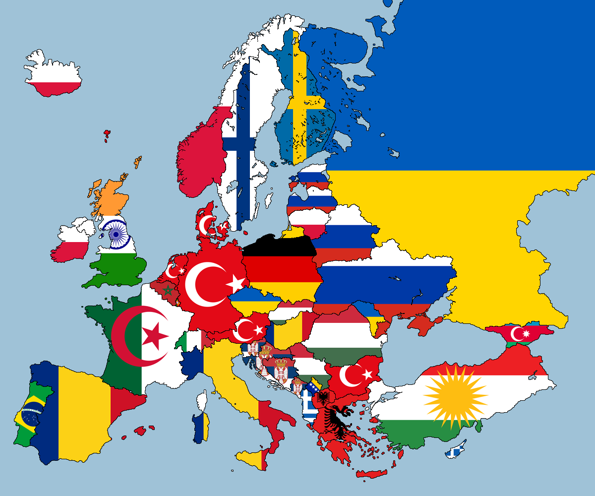
Published On: March 7, 2015
Most Popular Month: March
Comments: This map was an absolute monster. 25% of all the visitors we got in 2015, came in via this post. Very simple presentation, combined with a focus on nationality and immigration, which were both extraordinarily hot topics in Europe last year, meant that this map really hit a nerve.
There was also a lot of debate about how accurate it was, with many commenters providing alternative data sources, which you can read in the comment section of the full post.
Full Post: 2nd Largest Nationality Living In Each European Country
Honourable Mentions
The following 10 maps were all ones we really loved, but for one reason or another just didn’t resonate with our readers when they were published. It might be the titles we chose or the time of day they were published or maybe they’re just not very interesting.
We’ll let you be the judge.
10. Pangaea With Current International Borders
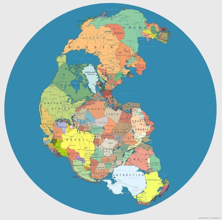
Why we like it: A really cool concept for a map. However, given that it was originally created a few years ago, many people have likely already seen it before.
Full Post: Pangaea With Current International Borders
9. European & North American Cities Transposed Onto The Opposite Continent At The Same Latitude
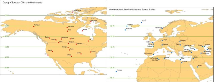
Why we like it: Another really cool idea for a map that clearly shows how much further north major European cities (or how much further south North American cities) are compared to what most people think. Similar maps such as Which Countries Are Due East And West Of The Americas? and Counterintuitive Comparison Of Relative Population Latitudes Of US, Canada & Europe have also not been very popular, so we’ve taken the hint that you likely already know all about this phenomenon.
Full Post: European & North American Cities Transposed Onto The Opposite Continent At The Same Latitude
8. Sharks Vs Humans – Who Really Kills Who?

Why we like it: A very simple map that gives a bit of perspective on the relative danger of sharks.
Full Post: Sharks Vs Humans – Who Really Kills Who?
7. What Does London Smell Like? These Maps Have The Answer
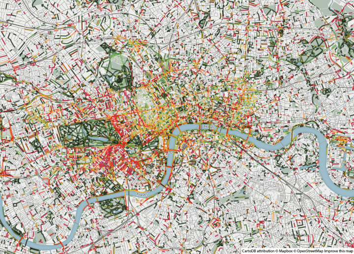
Why we like it: A totally bonkers idea for a map that actually reveals a lot about London.
Full Post: What Does London Smell Like? These Maps Have The Answer
6. Kiribati & Interesting Facts About Its Geographic Anomalies
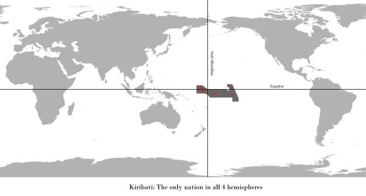
Why we like it: A series of 4 maps that show some interesting geographical features of this little-known country.
Full Post: Kiribati & Interesting Facts About Its Geographic Anomalies
5. The Pacific Ocean is Larger Than All Land On Earth

Why we like it: A mind blowing fact.
Full Post: The Pacific Ocean is Larger Than All Land On Earth
4. The European Diaspora: European Ancestry Worldwide

Why we like it: This was one of those posts we thought would really resonate with people, but turns out we were wrong. Nevertheless, an interesting look at where European colonialism totally reshaped human geography.
Full Post: The European Diaspora: European Ancestry Worldwide
3. French Mandate for Syria and The Lebanon In 1922

Why we like it: Given the current Syrian Civil War, it’s a fascinating look at how Syria was originally divided following the Ottoman Empire’s collapse at the end of World War 1.
Full Post: French Mandate for Syria and The Lebanon In 1922
2. Dog Vs Cat Map Of The United States

Why we like it: A really simple map that shows that, with a few exceptions, the US is a nation of dog lovers.
Full Post: Dog Vs Cat Map Of The United States
1. The Japanese Surprise Attack They Didn’t Teach You In School

Why we like it: An in-depth look at the ill-remembered Russo-Japanese War (1904-05), which had huge long range consequences for Asia and the World. The lessons Japan took from the war would help steer it to attempt the much better known surprise attack on Pearl Harbour 37 years later.
Full Post: The Japanese Surprise Attack They Didn’t Teach You In School
We hope you enjoyed looking back at these amazing maps from last year. We’ll aim to bring you even more in 2016.
And if you’d like to help us at all, please consider sharing this post with a friend.


Leave a Reply