Conflict in Eastern Congo Mapped
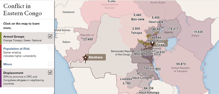
The map above shows the location of armed groups (in green) and the areas with the number of internally displaced people (in purple) in the Eastern Congo.
The map was put together by the Council on Foreign Relations as part of their Eastern Congo InfoGuide Presentation.
The First Proposed Map of Pakistan & The Partition of India
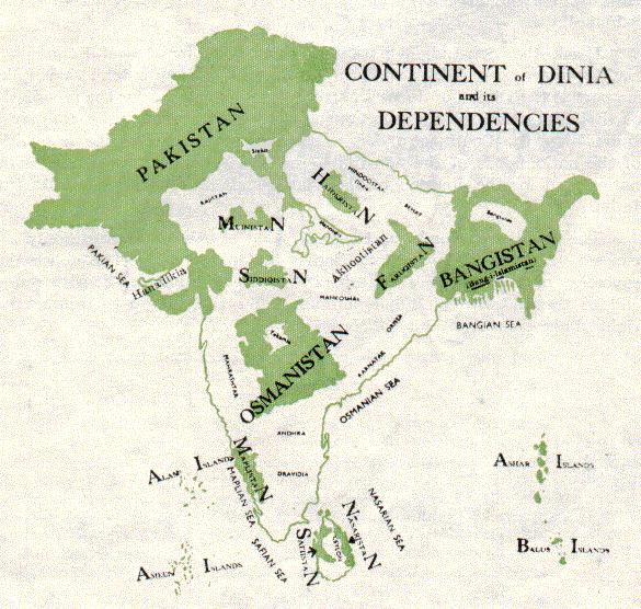
The map above was created by Choudhry Rahmat Ali, who was a Pakistani nationalist and is often credited with coming up with the name ‘Pakistan.’
Travel Times From London in 2016 vs 1914

The brilliant isochrone world map above shows how long it takes to get from London to any other point in the world in 2016.
And reimagining of the original isochrone map: Travel Times From London In 1881: The First Known Isochronic Map By Francis Galton
It was created by the team at Rome2rio, who specialise in helping people get anywhere on earth, and is an update to the famous 1914 map by cartographer and geographer John George Bartholomew (see below)
60+ Reasons To Stay: UK Would Lose EU Free Trade Deals

The map above was created by the Britain Stronger in Europe campaign and highlights the huge risk to the British economy if it votes to leave the EU.
At risk are EU signed free trade deals with 60+ countries (covering an area far larger than the British Empire). If the UK were to leave, it would have to start from square one and renegotiate new free trade deals with each and every one.
The Situation in Syria

While the Jackson Pollock style map of The Situation in Syria above is obviously not meant to be taken literally, it does a illustrates just how chaotic the situation remains.
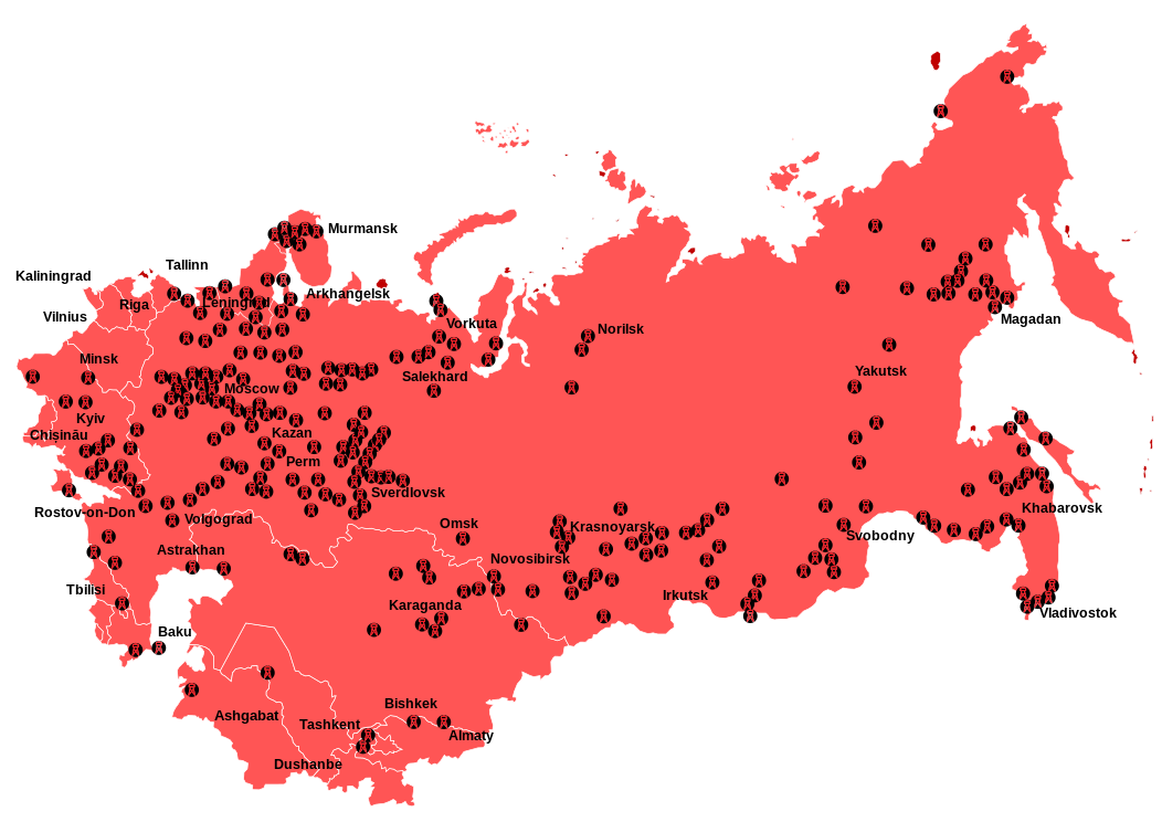
Don’t Look At This Map If You Have A Fear Of Flying: Major Plane Crash Sites 1985-2015

If you have a fear of flying you should skip this map because it shows the locations of the largest plane crashes between 1985-2015.
Short History of Colonialism Since 1492 In One GIF
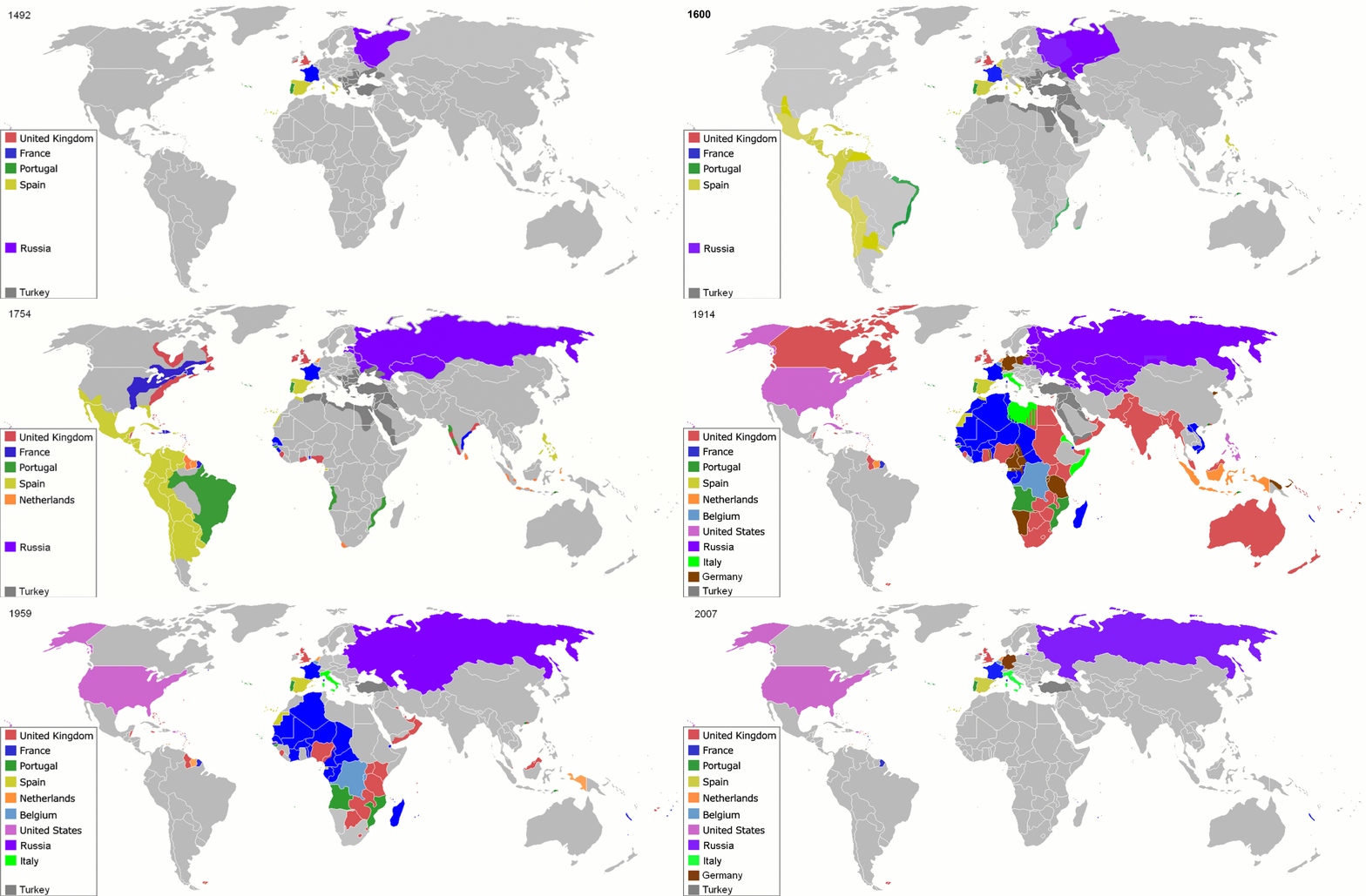
The map above presents a very short history of colonialism around the world from 1492-2008 in one simple GIF. Interestingly, it doesn’t limit itself to European colonialism but also includes the colonial empires of the United States, Russia/Soviet Union and Japan.
Top 15 Best Maps Of 2015 (Plus 10 Honourable Mentions)
Brilliant Maps is now just over 1 year old. Since launching we’ve made a total of 167 posts. So we thought now was as good a time as any to look back at what the 15 best and most popular maps were for 2015 (based on the number of visitors).
If you were one of them, then a huge thank you! It means a huge amount to everyone at Brilliant Maps that you obviously love maps as much as we do.
We’re continually doing our best to bring you maps we think tell interesting stories. We’ve obviously gotten that right many times over the past year, but perhaps more interesting are the maps that didn’t quite find an audience.
Adam’s Bridge Between India and Sri Lanka Before 1480

The map above shows what Adam’s Bridge (aka Rama’s Bridge or Ram Setu) in the Palk Strait might have looked like prior to 1480 when it connected India and Sri Lanka.
- « Previous Page
- 1
- …
- 136
- 137
- 138
- 139
- 140
- …
- 155
- Next Page »