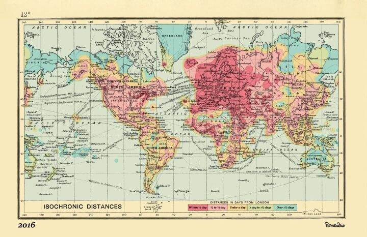
The brilliant isochrone world map above shows how long it takes to get from London to any other point in the world in 2016.
And reimagining of the original isochrone map: Travel Times From London In 1881: The First Known Isochronic Map By Francis Galton
It was created by the team at Rome2rio, who specialise in helping people get anywhere on earth, and is an update to the famous 1914 map by cartographer and geographer John George Bartholomew (see below)
The most noticeable difference is how much less time it takes to get anywhere in 2016 vs 1914. In 1914, the quickest journeys could be completed within 5 days, whereas in 2016 the slowest journeys take just over 1.5 days.
Journey times to both Asia and America have plummeted. In 1914 it might have taken you up to 20 days to reach California you can now be there in less than 3/4 of a day. And if you wanted to visit Tokyo it could take up to 30 days and now takes no more than a 3/4 of a day as well.
However, a few of the more remote areas in 1914 remain in 2016, such as the Canadian Arctic, Siberia, the Sahara desert and the Australian Outback. Nevertheless, if the original 1914 within 5 days scale was used for the 2016 map, virtually the entire world would be red.
For those curious about how the map was created, Miles from Rome2rio commented on reddit (in response to areas not included) that:
I developed the algorithm that generated an image which Andrew (from our front-end team) used to overlay the map.
You are correct in that the algorithm only considers airports. I routed from London Heathrow to roughly 3,500 airports around the world, and for each map pixel generated a colour based on the duration to the closest airport plus the duration to London.
This was limited to a maximum of 500km (311 miles) from the airport at an average travel speed of 50kph (31mph), which could explain some of the missing areas you’re seeing.
Think this map is brilliant? Please leave your comments below and help us by sharing it:






Nicolas Dietrich says
I would be curious to look at the 2016 map *without airplanes*!
Louisa Bainbridge says
Hi Nicolas you can do this search without airplanes (driving / public transport / walking / cycling) using the TravelTime API http://www.igeolise.com/2016/06/isochrone-map-driving-travel-time/
mP says
One thing I always wondered, was a World that was 10 or 20 times its size, perhaps something approaching Jupiter but with Earth conditions. I dont like a small world joined by planes and people always travelling but actually getting nowhere.
Diane Atkinson says
How can I buy a copy of an isochrone map which shows travel times around the world in 1914?