
Given how popular the Probability of a White Christmas Across Europe map turned out to be, we were happy to find that the National Oceanic and Atmospheric Administration has created a similar map for the United States.
Making Sense Of The World, One Map At A Time
Given how popular the Probability of a White Christmas Across Europe map turned out to be, we were happy to find that the National Oceanic and Atmospheric Administration has created a similar map for the United States.

The map above shows the probability of a white Christmas, defined as having snow on the ground on December 25th, across Europe. The map was created by Finish reddit user Haayoaie who states that:

The map above shows East Asia (aka The Far East) in 1932. It’s interesting both because of what is and what is not included.

The map above shows the initial 6 states created by the French Mandate for Syria and the Lebanon granted by the League of Nations in 1922.
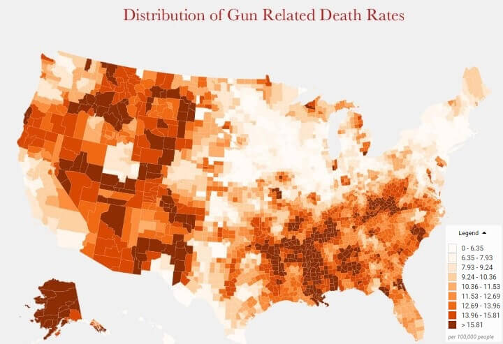
According to the Centers for Disease Control and Prevention a total of 33,169 people were killed by guns in the US in 2013. However, the rates at which people were killed by guns varied widely between states and regions.
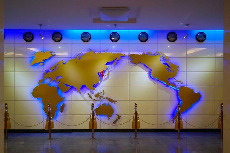
The photo above, allegedly shows a North Korean (Democratic People’s Republic of Korea; DPRK) world map.
It takes several cartographical liberties, most notably showing the entire Korean peninsula as a single unified country.
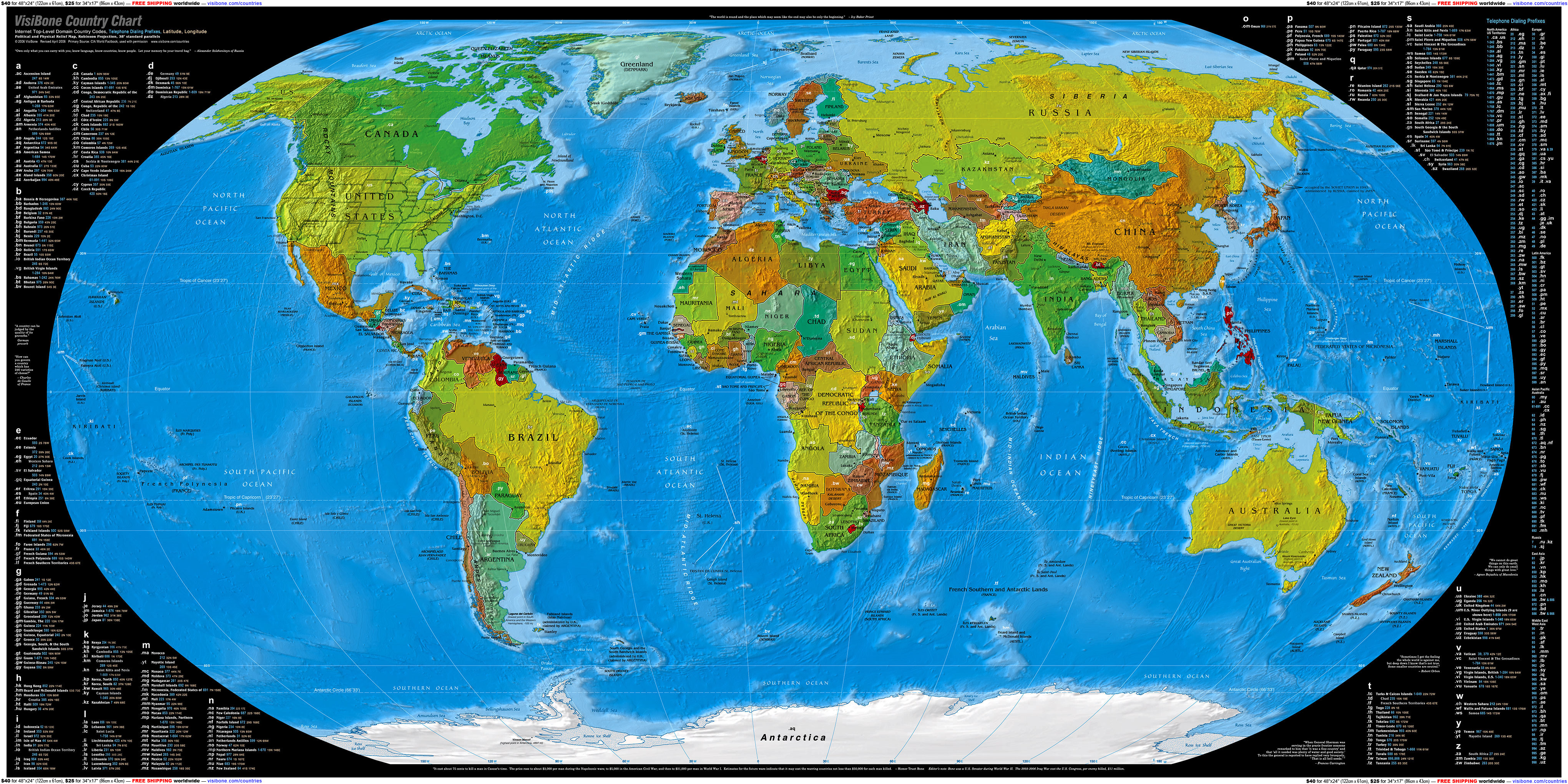
The map above shows (just about) every country code top-level domain (ccTLD) extension and the country it corresponds to.
You might already know that .ca is for Canada and .uk is for the United Kingdom, but do you know where .tv, .ly, or io are located?

The map above shows which states require front and rear license plates vs those that only require rear license plates across the US. Overall, the majority of US states (62.75%) and a majority of people (62.73%) live in states that require both.
And in case you’re wondering about the two exceptions they are:

The map above shows global terrorist attacks with more than 20 fatalities over the last 15 years.
While there have been several tragic attacks in Europe and North America, it’s the people of Asia, Africa and especially the Middle-East who have been the primary victims.
In 2014, deaths from terrorism increased by 80% from 2013, with a total of 32,658 victims.
78% of all deaths and 57% of all attacks occurred in just five countries: Afghanistan, Iraq, Nigeria, Pakistan and Syria. With Iraq continuing to be the country most impacted by terrorism with 9,929 terrorist fatalities, the highest ever recorded in a single country.
To understand the timeline of these attacks watch the time-lapse video below:

The European Union’s (EU) 28 member states vary enormously in population. From tiny Malta with just 425,000 people to Germany with 81 million. But what if they all had the same population? How would the map look?