Brilliant Maps

Making Sense Of The World, One Map At A Time

  • BOOK!
  • Newsletter
  • Board Games
  • Posters
  • Scratch Maps

Indian Borders According To Google Maps India vs USA

Last Updated: March 3, 2023 1 Comment

Click To Get My 10 Best Brilliant Maps For Free:

Indian Borders According To Google.co.in vs Google.com

Map found via reddit

The map above shows how Google.co.in shows India’s borders compared to how Google.com shows them.

[Read more…]

Filed Under: Asia Tagged With: India

Travel Time from Ancient Rome

Last Updated: March 3, 2023 1 Comment

Click To Get My 10 Best Brilliant Maps For Free:

Travel Time from Ancient Rome

Map created by Stanford University’s ORBIS project

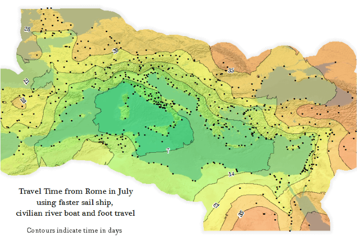
The map above is an Isochrone map which shows how long it would have taken someone to travel from Rome to the farthest reaches of the Roman Empire at its peak (roughly 200 CE/AD).

Travelling within the core of the Empire could have be done in under a week, but travelling all the way to the fringes would have taken someone more than a month.

[Read more…]

Filed Under: Europe, History Tagged With: rome

The First Ordnance Survey Map

Last Updated: March 3, 2023 1 Comment

Click To Get My 10 Best Brilliant Maps For Free:

The First Ordnance Survey Map

The map above, titled An Entirely New & Accurate Survey Of The County Of Kent, With Part Of The County Of Essex was created by William Mudge in 1801 and is regarded at the first official Ordnance Survey map.

[Read more…]

Filed Under: United Kingdom Tagged With: Ordnance Survey

European Places With “Saint” or “Holy” In Their Names

Last Updated: November 27, 2024 19 Comments

Click To Get My 10 Best Brilliant Maps For Free:

European Places With

Map created by Szymon Pifczyk, Marcin Gębala, Aleksander Deryło, & Bartosz Chyż via BIQData.pl
The map above shows European cities, towns and villages that have the term “saint” or “holy” in their names. The data comes from the US National Geospatial-Intelligence Agency (NGA).

[Read more…]

Filed Under: Europe Tagged With: religion

Most Recurring Word On Each Country’s Wikipedia Page

Last Updated: March 3, 2023 5 Comments

Click To Get My 10 Best Brilliant Maps For Free:

Most Recurring Word On Each Country's Wikipedia Page

Map created by reddit user Amiantedeluxe

The map above shows which word appears most often on each country’s English language Wikipedia page. For example, on the Wikipedia page about Canada, the word ‘Quebec’ appears more often than any other.

[Read more…]

Filed Under: World Maps Tagged With: language, wikipedia

Drive Time To See The Total Solar Eclipse on August 21, 2017

Last Updated: March 3, 2023 Leave a Comment

Click To Get My 10 Best Brilliant Maps For Free:

Drive Time To See The Total Solar Eclipse on August 21, 2017

Map created by Michael Zeiler, www.GreatAmericanEclipse.com

The map above shows how long it takes to drive to the centerline of the total solar eclipse that will occur on August 21, 2017. This of course assumes normal driving conditions on the day.

[Read more…]

Filed Under: United States Tagged With: eclipse

Every Bomb Dropped By The British & Americans During WW2

Last Updated: March 17, 2025 22 Comments

Click To Get My 10 Best Brilliant Maps For Free:

Map created by reddit user amazonada

The map above shows every bomb dropped by the British and Americans during World War 2, along with a limited amount of bombs dropped by the Australians, South Africans, and New Zealanders.

[Read more…]

Filed Under: History Tagged With: ww2

Climate Analogues of Australia

Last Updated: March 3, 2023 6 Comments

Click To Get My 10 Best Brilliant Maps For Free:

Climate Analogues of Australia

Map created by reddit user triton1982

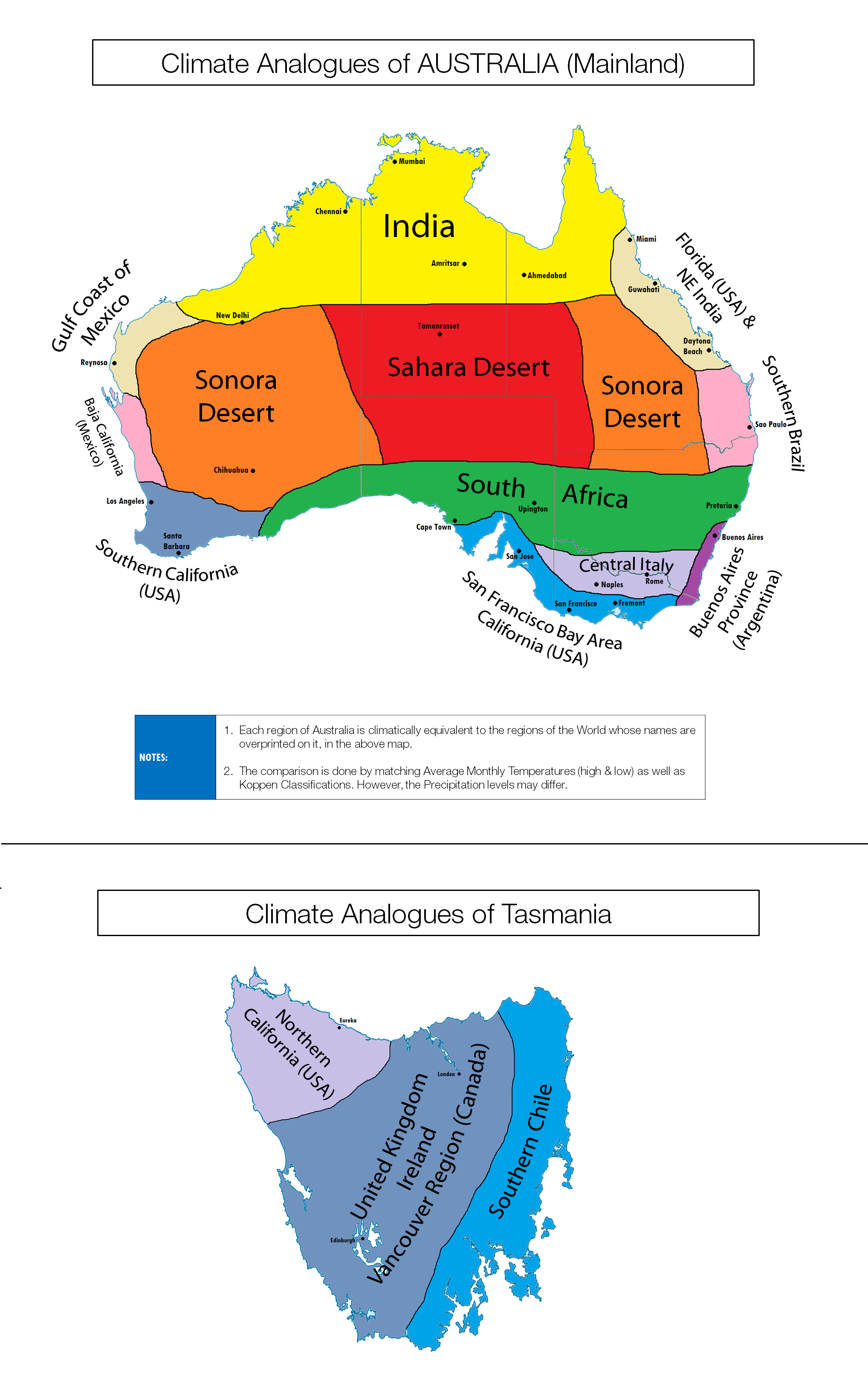
You probably already know Australia is a relatively hot country, but the map above shows how the clinate of its various regions compares to other places on earth (including cities).

[Read more…]

Filed Under: Australia Tagged With: climate

Population Density Represented As Elevation

Last Updated: March 3, 2023 2 Comments

Click To Get My 10 Best Brilliant Maps For Free:

Population Density Represented As Elevation

Map created by Marnix Hamelberg at Cartoma

The map above shows what Asia would look like if population density corresponded to physical elevation.

Perhaps one of the most interesting things to note, is that the Himalayas are still there, they’ve just moved south a little bit, as these regions of Indian and Bangladesh have extremely high population densities.

[Read more…]

Filed Under: population

Population Density Of The 13 American Colonies In 1775

Last Updated: March 3, 2023 8 Comments

Click To Get My 10 Best Brilliant Maps For Free:

13 colonies population

Map, courtesy of U.S. Military Academy via AwesomeStories

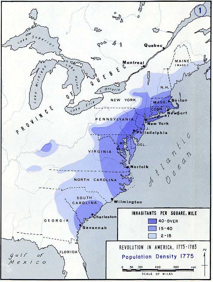
The map above shows the population density of the original thirteen American colonies, the year before they declared independence. Even back then, what would become the Boston–Washington Corridor was clearly evident.

[Read more…]

Filed Under: History, United States

  • « Previous Page
  • 1
  • …
  • 124
  • 125
  • 126
  • 127
  • 128
  • …
  • 152
  • Next Page »


Product Reviews · World Atlas · Settlers of Catan · Risk · Game of Thrones · Coloring Books
Globes · Monopoly · Star Wars · Game of Life · Pandemic · Ticket To Ride · Drinks Cabinets
US Locations · UK Locations· Fleet Management
Copyright © 2026 · Privacy Policy · Fair Use, Attribution & Copyright · Contact Us
Follow Us: Newsletter · Facebook · Youtube · Twitter · Threads · BlueSky · LinkedIn · Instagram · Pinterest · Flipboard