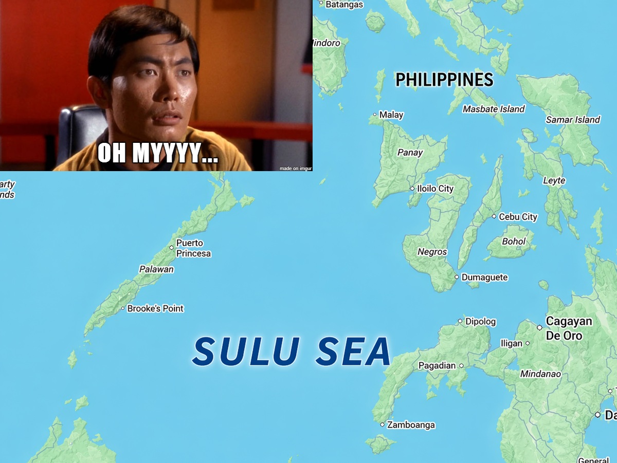
Above is a map the Sulu Sea between the Philippines and Borneo.
More about the Sea and its connection to Star Trek below:
Making Sense Of The World, One Map At A Time
Above is a map the Sulu Sea between the Philippines and Borneo.
More about the Sea and its connection to Star Trek below:

All the maps on this page are the product of the wonderful GEO.Universe Instagram page, which you should totally follow.
Here are the 4 maps on their own:

That small strip of land in north-eastern Afghanistan that separates Pakistan from Tajikistan is called the Wakhan Corridor.
More about it below:

The map above shows one history’s forgotten economic geography facts. Today we tend to think of South Korea as a economic miracle and North Korea as an economic basket case.
However, from the division of the Korean peninsula in 1948 up until the early 1970s, the North was actually richer than the South in per capita terms.


The full list is below:


The map above shows where and how much rice North Korea produces in each region. From 2019-2023 North Korea produced an average of 1,482,000 tons of rice per year.

The image above of the Korean peninsula was taken by NASA in 2016 and perfectly sums up why capitalism, for all it’s faults, is still a far, far better system than the communist alternative.
Capitalist South Korea takes up the bottom half of the peninsula, and you can clearly see all the bright lights of Seoul and other South Korean cities on the map.

They are: