Shocking Men Vs Women Differences In Years Of Education
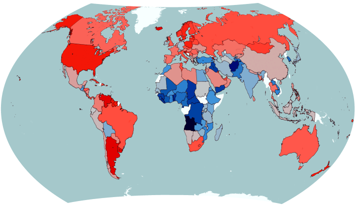
The map above reveals a somewhat shocking fact if you haven’t been paying attention. In the majority of the world’s countries (including virtually all of the richest) women, not men, stay in education longer.
World War 1 Casualties As A Percentage of Pre-War Population

The map above reveals a rather shocking aspect of the First World War. While most people in Western Europe and North America focus on the trench warfare in Northern France and Belgium, it shows that Western European countries were nowhere close to suffering the worst casualty rates in the war.
Where Tesla Supercharger Stations Could Replace Gas/Petrol Stations By 2016
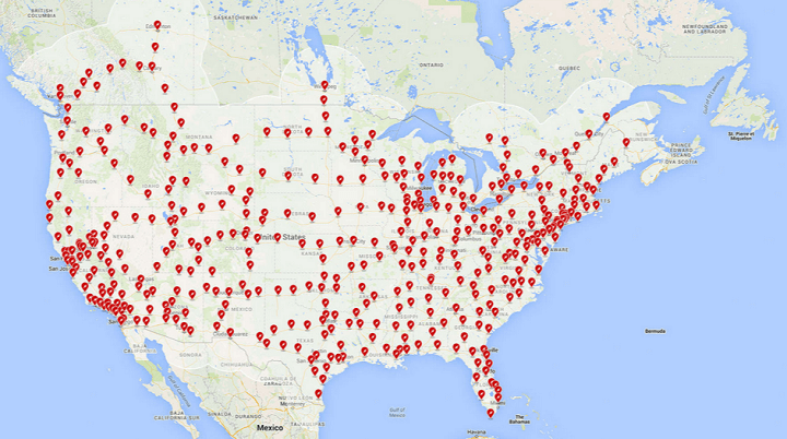
Tesla Motors has quietly been creating a giant network of Supercharger stations that can quickly extend the range of their best selling Model S electric car. Here are a few maps showing how big that network could grow to by the end of next year.
Blood Borders: A Proposal To Redraw A “New Middle East”
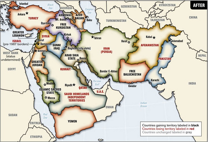
The map above is a 2006 proposed plan to redrawn the borders of the Middle East by Ralph Peters, a retired United States Army lieutenant colonel, author, and Fox News commentator.
It was original published in the Armed Forces journal in an article titled Blood borders: How a better Middle East would look.
The map would make sweeping changes throughout the region such as:
Fastest Growing Religion In Each Country Around The World

The map above shows which religion is the fastest growing in each country around the world based on data from Pew Research Center’s The Future of World Religions: Population Growth Projections, 2010-2050.
The colours are as follows:
The State Of The Kurds
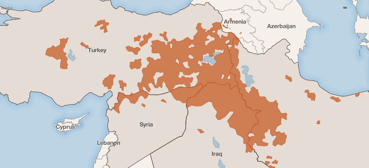
The map above shows the parts of the Middle East with Kurdish populations and which could make up some or all of a future state of Kurdistan. In a recent article titled The Time of the Kurds, the Council on Foreign Relations explains that:
Most Common Country of Origin of New Immigrants To The United States

Inspired by Ben Blatt’s What are the biggest immigrant groups in your state?, Giorgio Cavaggion created two flag maps of the most common country of origin of new legal immigrants to the United States.
What Does London Smell Like? These Maps Have The Answer
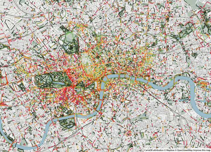
Smelly Maps: The Digital Life of Urban Smellscapes is the amazing title of this series of maps that look at how London smells. The smelly maps project involves Daniele Quercia, Rossano Schifanella (University of Torino), Luca Maria Aiello (Yahoo Labs) and Kate McLean (Royal College of Art).
Most Common Foreign Citizenship In Each German District

The map above shows the country of citizenship for the largest group of foreigners by German district. However, it doesn’t show the absolute or even relative numbers. So even districts with very few foriegners will still have one group that’s the largest.
In total, Germany had 6,180,013 people with non-German citizenship living there in 2011, according to zensus2011.de.
- « Previous Page
- 1
- …
- 142
- 143
- 144
- 145
- 146
- …
- 152
- Next Page »