The maps below all come this CIA album on Flicker. They describe the maps in the following ways:
CIA Cartography Center has been making vital contributions to our Nation’s security, providing policymakers with crucial insights that simply cannot be conveyed through words alone.
2010 Afghan Pakistan North Border Map
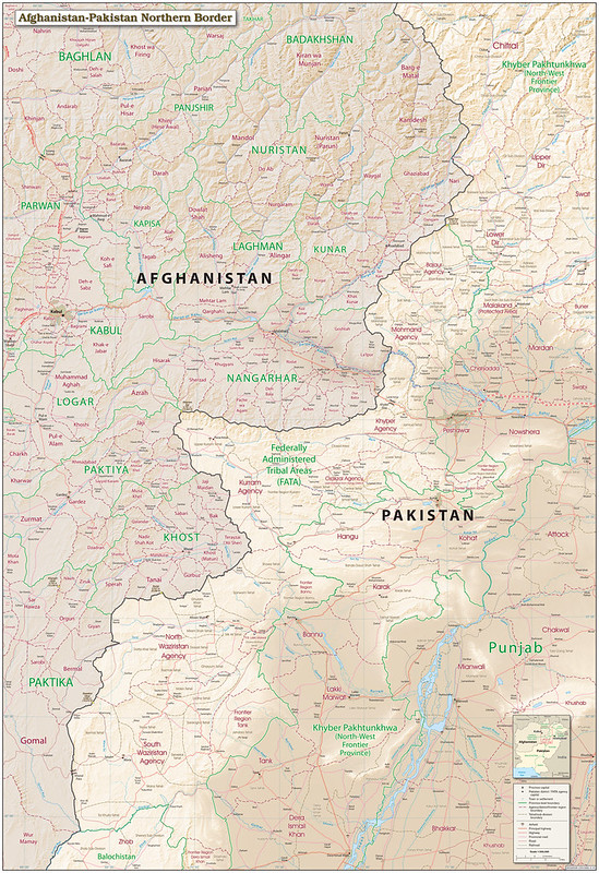
This 2010 map of the Afghanistan–Pakistan border region depicts one of the most strategically significant and historically contested frontier zones in modern geopolitics.
Covering eastern Afghanistan and north-western Pakistan, the map details provinces, tribal agencies, transportation routes, mountain terrain, and major settlements along the frontier historically associated with the Durand Line.
The map emphasizes key Afghan provinces including:
- Kunar Province,
- Nangarhar Province,
- Khost Province,
- Nuristan Province,
- and Paktika Province,
as well as Pakistan’s former Federally Administered Tribal Areas (FATA), including:
- Khyber Agency,
- North Waziristan,
- and South Waziristan.
Produced during the height of the post-9/11 Afghanistan War, the map reflects the intense strategic focus on cross-border insurgent movement between Afghanistan and Pakistan.
By 2010, Taliban and associated militant networks were using the mountainous frontier and semi-autonomous tribal areas as staging grounds, supply corridors, and sanctuary zones. U.S., NATO, Afghan, and Pakistani military operations were heavily concentrated in the regions shown here, particularly around the Khyber Pass and Waziristan.
The map is especially important today because it documents the geopolitical landscape before major administrative and military changes in the region.
Pakistan later dissolved the FATA system and integrated the tribal agencies into Khyber Pakhtunkhwa, while the Taliban’s return to power in Afghanistan in 2021 renewed international attention on border security, militant safe havens, and regional instability.
Cartographically, the map combines detailed terrain shading with transportation and administrative data, emphasizing how geography shaped military operations and political control along one of the world’s most difficult border regions.
Also see: Timeline Map Of 9/11 Shutdown of North American Airspace
2012 Afghanistan Country Profile Map
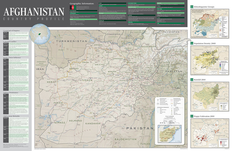
This 2012 CIA Afghanistan Country Profile presents a comprehensive strategic overview of Afghanistan during a critical phase of the post-9/11 conflict.
Combining political geography, infrastructure, demographics, environmental data, and historical timelines, the profile was designed as a concise intelligence reference for policymakers, military planners, and analysts monitoring conditions in the region.
At the center is a detailed national map showing Afghanistan’s provincial boundaries, transportation corridors, terrain, rivers, and major cities, emphasizing how geography shaped governance, trade, and military operations.
Surrounding thematic panels provide additional intelligence layers, including ethnolinguistic composition, population density, rainfall distribution, and poppy cultivation. Together, these maps illustrate the complex relationship between ethnicity, resource distribution, agriculture, insurgency, and state control.
The profile was produced at a pivotal moment in the Afghanistan War.
By 2012, NATO and U.S. forces were preparing for a gradual withdrawal while Afghan security forces assumed increasing responsibility.
The map reflects major strategic concerns of the era: cross-border insurgency along the Pakistan frontier, weak transportation infrastructure, uneven population distribution, and the persistence of opium production as a major economic and political force.
The inclusion of timelines covering colonial conflict, Soviet intervention, Taliban rule, and post-2001 reconstruction places contemporary instability within a longer historical framework.
Today, the document remains important because it captures Afghanistan immediately before the major geopolitical shifts that culminated in the Taliban’s return to power in 2021.
Many structural realities depicted in the profile, ethnic fragmentation, rugged terrain, weak centralized authority, and dependence on regional trade corridors, continue to shape Afghanistan’s political landscape.
The map also demonstrates the CIA’s cartographic approach during the Global War on Terror era: integrating physical geography, demographic intelligence, and historical context into a single analytical product intended to support strategic decision-making.
2012 Africa Population Density Map
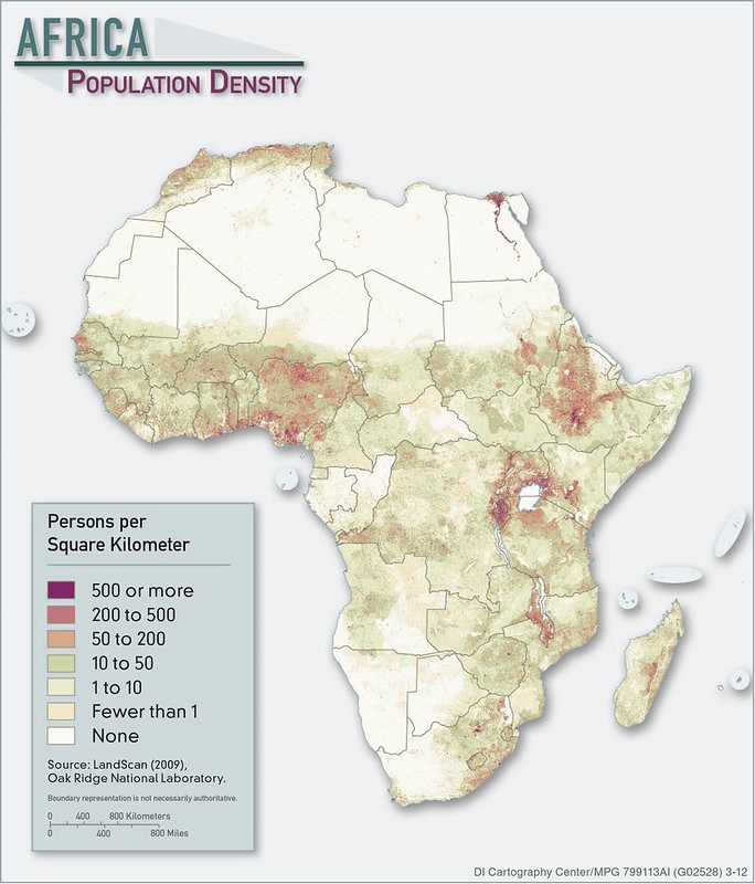
This 2012 CIA Africa Population Density map visualizes the distribution of population across Africa using high-resolution LandScan demographic data compiled by Oak Ridge National Laboratory.
Rather than depicting population by country totals, the map emphasizes where people actually live, revealing the strong relationship between settlement patterns, climate, water access, agriculture, transportation corridors, and historical urban development across the continent.
The map highlights several major demographic concentrations.
Dense population belts appear along the Nile River in Egypt, the Gulf of Guinea corridor stretching through Nigeria and neighboring states, the Ethiopian Highlands, the Great Lakes region of East Africa, and parts of South Africa.
By contrast, vast portions of the Sahara, Namib, and Kalahari deserts remain sparsely inhabited.
The visualization also demonstrates the growing importance of coastal urbanization, with large metropolitan regions emerging around Lagos, Cairo, Nairobi, Kinshasa, Johannesburg, and other rapidly expanding cities.
Produced during a period of accelerating demographic change, the map reflects Africa at the beginning of the twenty-first century’s major population boom.
By 2012, the continent was already experiencing some of the world’s fastest urban growth rates, rising migration pressures, and expanding infrastructure demands.
Intelligence and policy institutions closely monitored these trends because population density affects food security, political stability, energy demand, transportation planning, disease transmission, and conflict risk.
Today, the map remains highly relevant because many of the demographic patterns it identifies continue to shape Africa’s geopolitical and economic future.
Population growth in the Sahel, the Nile Basin, and major coastal cities has intensified debates over water resources, governance, urban planning, and migration.
The map also illustrates the evolution of modern intelligence cartography: combining satellite-derived terrain, demographic modeling, and digital geographic information systems to produce detailed strategic assessments that support humanitarian analysis, development planning, and security forecasting.
Also see: A similar CIA map from 1979 can be found here
2012 Area & Projection Comparisons Calendar Map
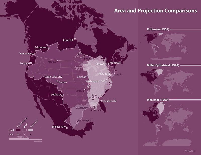
This 2012 CIA Area and Projection Comparisons map is both a cartographic demonstration and an educational critique of how world maps distort geographic reality.
Using layered comparisons between North America, Brazil, and Greenland, the map illustrates how different projections alter the apparent size and shape of landmasses.
The accompanying panels compare three major world map projections, Robinson, Miller Cylindrical, and Mercator, highlighting how projection choice fundamentally changes visual interpretation of the world.
At the center of the map, Brazil and Greenland are superimposed against North America to demonstrate true relative scale.
The visualization shows that Greenland, commonly perceived as enormous on traditional classroom maps, is actually far smaller than North America and comparable in size to regions of Brazil.
This distortion is most exaggerated in the Mercator projection, originally designed in 1569 for maritime navigation because it preserves compass bearings, but which greatly enlarges land areas near the poles.
Historically, the map reflects growing twenty-first-century awareness within cartography and geographic education about projection bias and spatial perception.
By 2012, digital mapping technologies and GIS systems had made it easier to compare projections dynamically, encouraging institutions like the CIA Cartography Center to create educational graphics explaining how maps influence geopolitical understanding.
The Robinson projection, widely adopted in atlases during the late twentieth century, attempted to balance size and shape distortion, while the Miller Cylindrical projection offered a modified alternative to Mercator.
Today, the map remains important because projection distortion still shapes public perceptions of geography, geopolitics, and global importance.
Misleading visual scale can subtly affect how people perceive the relative significance of regions such as Africa, Greenland, or Russia.
The map also demonstrates the CIA’s broader cartographic mission beyond intelligence analysis: producing educational and analytical visualizations that improve geographic literacy and help viewers critically interpret how maps represent the world.
Also see:
- Map Projections: Mercator Vs The True Size of Each Country
- Map Projections & What They Say About You
- 8 Really Bad Map Projections From XKCD
2013 Afghan Border 3D Terrain Map
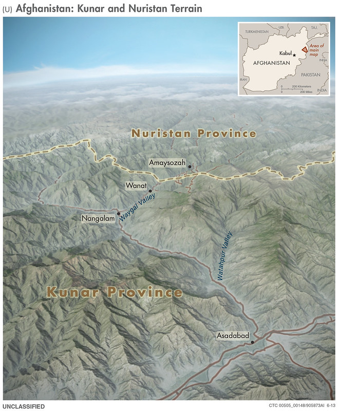
This 2013 CIA terrain map of Afghanistan’s Kunar and Nuristan provinces provides a highly detailed three-dimensional visualization of one of the most strategically difficult regions of the Afghanistan–Pakistan border.
Using shaded relief and satellite-derived elevation modeling, the map emphasizes the extreme mountainous terrain surrounding the Waygal and Watapur valleys, as well as settlements such as Wanat, Nangalam, and Asadabad. Rather than focusing primarily on political borders, the map highlights how geography itself shapes movement, communication, and military operations.
Produced during the later years of the Afghanistan War, the map reflects the intense strategic focus on eastern Afghanistan, where rugged terrain and porous mountain passes allowed insurgent groups to move between Afghanistan and Pakistan’s tribal regions.
Kunar and Nuristan had become major areas of conflict for U.S., NATO, Afghan, and Taliban-aligned forces.
The region was notorious for difficult logistics, isolated outposts, and ambush-prone valleys, including the area around Wanat, site of a major 2008 battle involving U.S. troops.
The terrain shown on the map explains why centralized state authority historically remained weak in these provinces and why insurgent networks were able to exploit natural cover and limited infrastructure.
The map was created at a time when U.S. strategy increasingly relied on detailed geospatial intelligence and terrain analysis to support counterinsurgency operations. Three-dimensional visualization helped military planners understand line-of-sight limitations, transportation chokepoints, helicopter access, and the defensive advantages held by fighters operating in elevated terrain.
Today, the map remains important because the same geography continues to shape security and governance in eastern Afghanistan.
Mountain barriers, isolated valleys, and cross-border tribal connections still influence militant activity, smuggling routes, and regional politics.
More broadly, the map demonstrates how modern intelligence cartography evolved beyond traditional flat political maps into immersive terrain analysis tools designed to support military planning, operational awareness, and strategic decision-making in some of the world’s most geographically challenging environments.
Also see: Countries That Lost Citizens On 9/11
2013 Africa Education Map
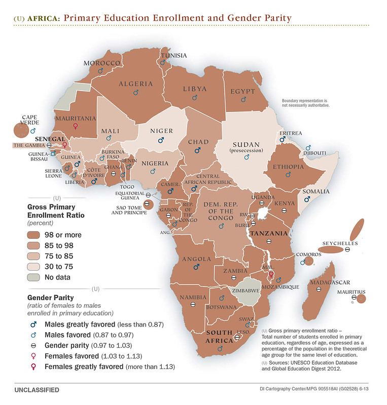
This 2013 CIA map of Africa visualizes two closely linked indicators across the continent: primary school enrollment rates and gender parity in education.
Countries are shaded according to gross primary enrollment ratios, while symbols indicate whether boys or girls were more likely to be enrolled in primary school.
Much of North and Southern Africa shows relatively high enrollment levels and near gender parity, while parts of the Sahel and Central Africa display lower enrollment rates and stronger educational disparities.
The map combines demographic, social, and development data into a single visual snapshot of educational access across Africa in the early 2010s.
Historically, the map reflects the aftermath of decades of uneven post-colonial development, civil conflict, rapid population growth, and international development campaigns.
By 2013, many African governments, supported by organizations such as UNESCO and the UN, were pursuing the Millennium Development Goals, particularly universal primary education and improved access for girls.
Significant gains had been made since the 1990s, especially in countries recovering from conflict or expanding public education systems.
However, major barriers remained, including poverty, weak infrastructure, rural isolation, child labor, and insecurity in regions affected by war or insurgencies. Gender gaps in schooling were especially pronounced in some conservative or conflict-affected societies, where girls often faced cultural and economic obstacles to attending school.
The map remains important today because educational inequality continues to shape economic development, political stability, and demographic trends across Africa.
Areas with lower enrollment rates frequently overlap with regions facing persistent poverty, instability, or humanitarian crises. The gender component is especially significant, as female education is strongly linked to lower child mortality, economic growth, and political participation.
Beyond its educational data, the map also demonstrates how intelligence and policy agencies increasingly used thematic cartography in the 21st century, not just for military purposes, but to analyze social development, governance challenges, and long-term regional stability through visual geographic data.
Also see: Shocking Men Vs Women Differences In Years Of Education
2013 Asia World Fact Book Map
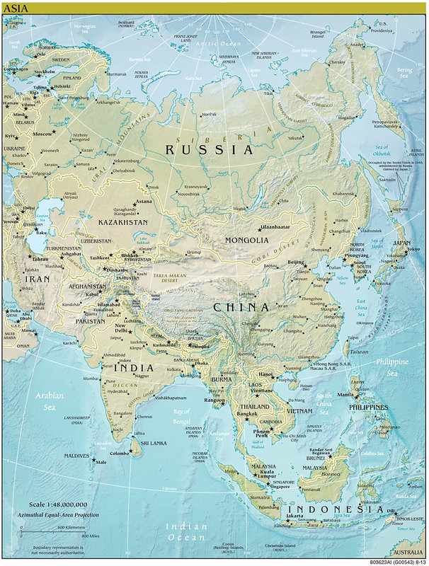
This 2013 CIA World Factbook map of Asia presents a broad physical and political overview of the world’s largest and most populous continent.
Using shaded relief and bathymetric coloring, it highlights Asia’s immense geographic diversity, from the Siberian Arctic and Central Asian steppes to the Himalayas, Southeast Asian archipelagos, and densely populated coastal plains of China, India, Japan, and Korea.
Major cities, rivers, deserts, mountain ranges, and national boundaries are all emphasized, making the map both a geopolitical and geographic reference tool.
Historically, the map reflects Asia in the early 2010s, a period defined by rapid economic transformation and shifting global power balances.
China had emerged as the world’s second-largest economy, India was experiencing sustained growth, and East and Southeast Asia were increasingly central to global manufacturing and trade.
At the same time, the map captures unresolved geopolitical tensions that still shape the region today: the divided Korean Peninsula, disputed territories in the South China Sea, Taiwan’s contested status, the Afghanistan-Pakistan frontier during the War on Terror, and Russia’s continued strategic presence across Siberia and the Arctic.
The inclusion of detailed Arctic geography also reflects growing interest in northern shipping routes and energy resources as climate change accelerated polar ice melt.
The map remains highly relevant because Asia has become the central arena of 21st-century geopolitics, economics, and demographic change.
It visually demonstrates how geography influences modern trade corridors, military strategy, population distribution, and resource competition. Chokepoints like the Strait of Malacca, the mountainous barriers around Afghanistan, and the maritime routes of the western Pacific continue to shape global security and commerce.
Beyond its practical use, the map also shows how CIA cartography evolved into highly polished public-facing geographic intelligence products designed not just for analysis, but for education, diplomacy, and strategic understanding of complex world regions.
Also see: 4 Maps Showing East Asia’s Demographic Collapse
2013 Elephant Population Map
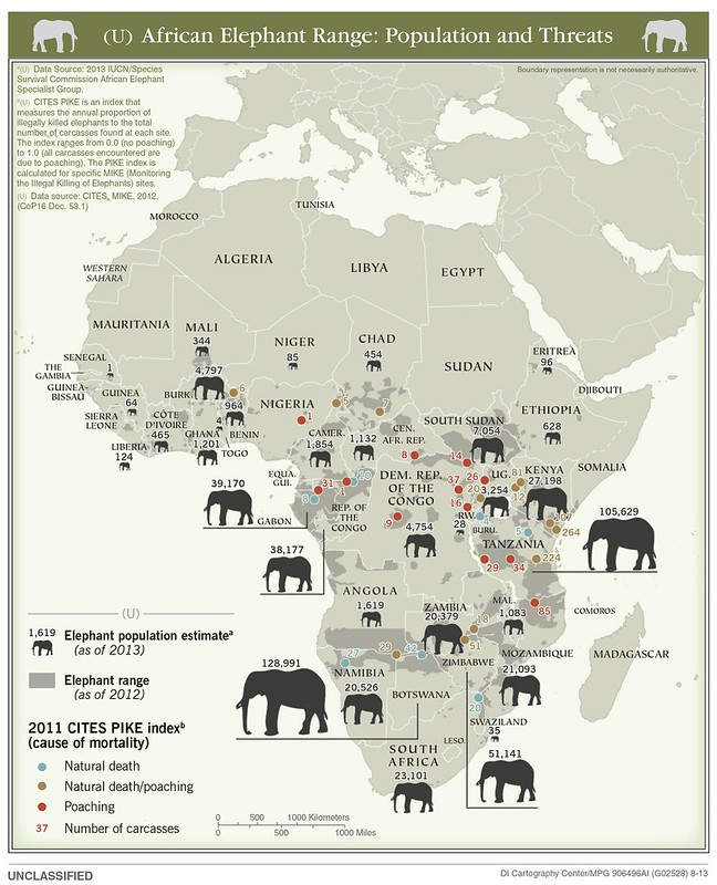
This 2013 CIA map of African elephant illustrates the distribution, estimated populations, and major threats facing African elephant herds across sub-Saharan Africa.
Shaded areas show the elephant’s remaining geographic range, while large elephant icons indicate estimated national populations as of 2013.
Colored markers identify causes of elephant mortality using the CITES PIKE index, distinguishing between natural deaths and poaching-related killings.
The map makes clear that the continent’s largest elephant populations were concentrated in Southern Africa, especially Botswana, Tanzania, Zimbabwe, and South Africa, while populations in West and Central Africa were generally smaller and under heavier pressure from illegal hunting.
Historically, the map reflects a major conservation crisis unfolding in the early 2010s.
Demand for ivory, particularly in Asian markets, had driven a dramatic increase in poaching networks linked to organized crime and, in some regions, armed militias.
Countries such as the Democratic Republic of the Congo, Central African Republic, and parts of East Africa experienced severe elephant losses amid weak governance, corruption, and ongoing conflict.
At the same time, some southern African states had built more effective wildlife management systems and protected areas, allowing elephant populations there to recover more successfully than elsewhere on the continent.
The map remains important today because it demonstrates how wildlife conservation is deeply tied to politics, economics, and security.
Elephant populations often thrive or collapse depending on state stability, anti-poaching enforcement, and international cooperation. The uneven distribution shown on the map also foreshadowed current debates over conservation policy, ivory bans, habitat fragmentation, and human-wildlife conflict as Africa’s population continues to grow.
Beyond conservation, the map highlights the expanding role of CIA and U.S. government cartography in environmental intelligence.
By combining ecological data with indicators of criminal activity and governance, the map treats wildlife decline not just as a biological issue, but as part of a broader geopolitical and security challenge.
Also see: Historic vs Present Geographical Distribution of Lions
2013 Ivory Transportation Map
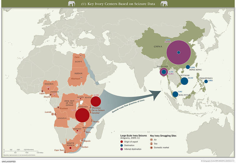
This companion 2013 CIA map traces the international ivory trafficking networks that connected African elephant poaching hotspots to major smuggling and consumer markets in Asia.
Using seizure data from 2009–2011, the map identifies major export hubs in East and Central Africa, especially Tanzania, Kenya, Uganda, the Democratic Republic of the Congo, and Nigeria, and shows the movement of ivory toward destinations such as China, Thailand, Vietnam, Malaysia, Hong Kong, and the Philippines.
Large circles represent the scale of ivory seizures, visually emphasizing the enormous volume of the illegal trade during the early 2010s.
The map directly complements the earlier elephant population and threat map.
Together, the two maps show both sides of the crisis: the first demonstrates where elephant populations were concentrated and where poaching pressures were highest, while this second map reveals the international trafficking infrastructure driving those killings.
Regions with severe poaching activity in Central and East Africa correspond closely to the export corridors highlighted here, particularly around ports such as Mombasa, Dar es Salaam, Zanzibar, and Lagos.
The maps collectively illustrate how elephant declines were not isolated local events, but part of a transnational criminal economy linking African conflict zones and weak states to booming ivory demand in Asia.
Historically, the map reflects a peak period in the global ivory trade after years of rising demand for carved ivory products, luxury goods, and investment items, especially in China’s rapidly growing middle and upper classes.
Criminal syndicates increasingly used commercial shipping routes, corrupt port systems, and fragile governance structures to move ivory at industrial scale. In some areas, armed militias and insurgent groups reportedly used poaching profits to finance operations, turning wildlife trafficking into a broader international security concern.
The map remains important today because it demonstrates how environmental crime operates through globalized supply chains much like narcotics or weapons trafficking.
Although international ivory bans and Chinese restrictions later reduced parts of the trade, poaching networks and illegal markets continue to exist. Together, these CIA maps show how conservation, organized crime, economics, and geopolitics became deeply interconnected in the 21st century.
Also see: Map Of Africa in 1880: 5 Years Before the Scramble
2013 NE India Groups Separatist Demands Map
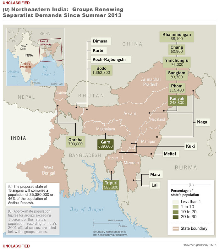
This 2013 CIA map highlights the complex patchwork of ethnic and separatist movements across northeastern India, one of the country’s most politically and culturally distinct regions.
The map identifies numerous ethnic groups including the Bodo, Naga, Tripuri, Gorkha, Kuki, Meitei, and others, that had renewed or ongoing demands for autonomy, new states, or outright independence as of 2013.
Shading indicates each group’s approximate share of a state’s population, while labels connect movements to specific geographic areas across Assam, Nagaland, Manipur, Meghalaya, Mizoram, Tripura, and neighboring regions.
Historically, the map reflects decades of ethnic tension rooted in colonial-era boundaries, post-independence nation-building, migration, and uneven economic development.
North-eastern India is geographically isolated from the rest of the country by the narrow Siliguri Corridor and contains hundreds of ethnic and linguistic communities with close cultural ties to Tibet, Burma (Myanmar), Bangladesh, and Southeast Asia rather than mainland India.
After independence in 1947, many groups feared political domination by larger ethnic communities or the central government in New Delhi.
This led to waves of insurgencies beginning in the 1950s, particularly among Naga, Mizo, Assamese, and Bodo nationalist movements. By 2013, many conflicts had declined from their Cold War-era peaks, but demands for autonomy and identity-based statehood remained politically potent.
The map remains highly relevant today because north-eastern India continues to be strategically important both domestically and geopolitically.
The region borders China, Myanmar, Bangladesh, Bhutan, and Nepal, making it central to India’s security concerns and its “Act East” policy toward Southeast Asia.
Ethnic tensions, migration disputes, and insurgent networks still influence politics in states like Manipur and Assam, while debates over citizenship, language, and tribal rights continue to spark unrest.
More broadly, the map demonstrates how CIA thematic cartography increasingly focused on internal political fragmentation and identity politics, treating ethnic geography as a key factor in regional stability, border security, and long-term geopolitical risk.
Also see: India Has More People Than All Of These Countries Combined
2013 South Asia Malaria Map
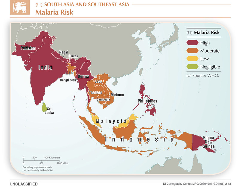
This 2013 CIA map illustrates malaria risk levels across South and Southeast Asia using World Health Organization data.
Countries are categorized from negligible to high malaria risk, with the darkest shading concentrated across India, Pakistan, Burma (Myanmar), the Philippines, and Papua New Guinea.
Moderate-risk zones dominate much of mainland Southeast Asia and Indonesia, while wealthier or more urbanized states such as Sri Lanka and parts of Malaysia show far lower transmission levels.
The map simplifies a highly complex public health issue into a broad regional overview of where malaria remained most dangerous in the early 2010s.
Historically, the map captures a period when malaria was still one of the world’s deadliest infectious diseases, particularly in tropical and rural regions with weak healthcare infrastructure.
Although global anti-malaria campaigns had significantly reduced mortality since the 1990s through mosquito nets, insecticides, and antimalarial drugs, many parts of South and Southeast Asia continued to face persistent outbreaks.
Environmental conditions such as monsoon climates, jungle terrain, standing water, and dense rural populations created ideal breeding grounds for mosquitoes carrying the parasite.
Conflict zones and poorly governed border regions, especially around Myanmar and parts of northeastern India, were especially difficult for governments and aid organizations to reach.
The map remains important today because malaria continues to influence development, healthcare planning, and regional stability.
While several countries shown on the map, including Sri Lanka and China, later achieved dramatic reductions or elimination of local malaria transmission, others still struggle with drug-resistant strains and uneven healthcare access.
The map also highlights how disease geography often overlaps with poverty, conflict, migration, and environmental change.
Beyond public health, the map demonstrates the expanding scope of CIA and U.S. government cartography in the 21st century.
Rather than focusing solely on military or political intelligence, these maps increasingly analyzed epidemiology, demographics, and development risks, reflecting the view that disease outbreaks and healthcare disparities could have major geopolitical, economic, and humanitarian consequences.
Also see: Map Of The Columbian Exchange
2013 West Bank Reference Map
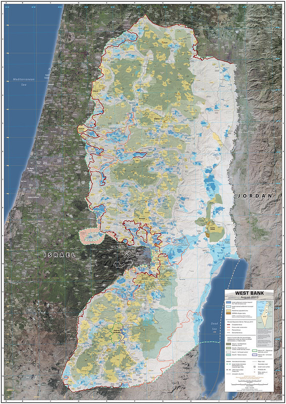
This detailed 2013 CIA reference map of the West Bank provides a highly granular overview of one of the world’s most politically contested territories.
Combining satellite imagery with administrative overlays, the map shows Palestinian municipal areas, Israeli settlements and outposts, road networks, checkpoints, security barriers, terrain, and jurisdictional divisions established under the Oslo Accords.
The map distinguishes between Areas A, B, and C, the fragmented system of Palestinian and Israeli administrative control that has defined governance in the West Bank since the 1990s.
Major Palestinian cities such as Nablus, Ramallah, Bethlehem, and Hebron are shown alongside Israeli settlement blocs and transportation corridors.
Historically, the map reflects the territorial realities that emerged after the 1993–1995 Oslo peace process between Israel and the Palestine Liberation Organization.
Under those agreements, the West Bank was divided into zones with varying levels of Palestinian self-rule and Israeli military control.
By 2013, however, the peace process had largely stalled, while Israeli settlement expansion, security infrastructure, and fragmented Palestinian enclaves had created an increasingly complex territorial landscape.
The map captures this fragmentation visually: Palestinian-controlled areas appear as disconnected islands surrounded by territory under broader Israeli authority. It also reflects the security concerns of the Second Intifada era, including bypass roads, barriers, and checkpoints intended to restrict militant movement.
The map remains highly important today because the territorial patterns it depicts continue to shape the Israeli–Palestinian conflict.
Questions surrounding settlements, borders, freedom of movement, annexation, and the viability of a future Palestinian state are all directly tied to the geography shown here. The dense layering of jurisdictions and infrastructure demonstrates why negotiations over sovereignty and borders remain extraordinarily difficult.
More broadly, the map exemplifies modern intelligence cartography at its most sophisticated.
Also see: Palestine’s West Bank Archipelago
2014 Lebanon Battle 3D Map
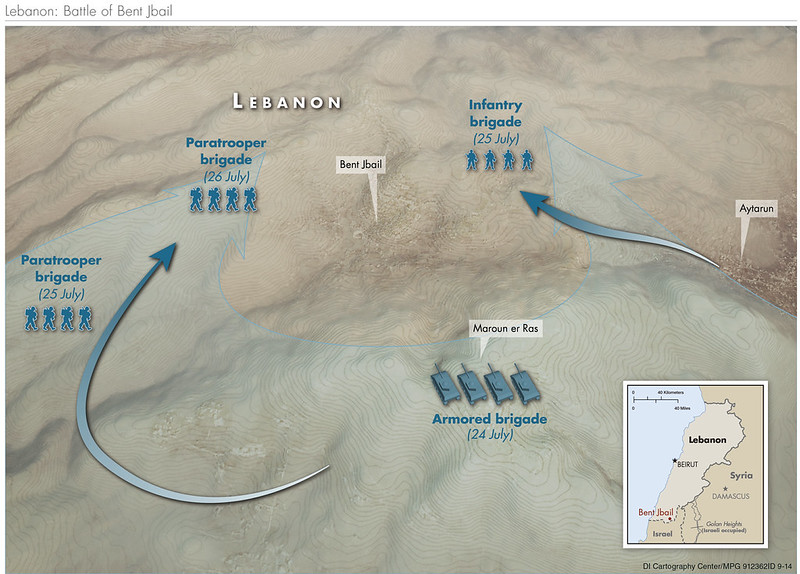
This striking 2014 CIA 3D terrain map depicts the Battle of Bint Jbeil during the 2006 Lebanon War between Hezbollah and Israel.
Using shaded relief and military movement arrows, the map illustrates how Israeli infantry, paratrooper, and armored brigades advanced toward the southern Lebanese town of Bint Jbeil from multiple directions in late July 2006.
The terrain-focused design emphasizes the steep valleys, ridgelines, and rugged hills that made the battle exceptionally difficult for mechanized forces and ideal for defensive guerrilla warfare.
Historically, the battle occurred after Hezbollah captured two Israeli soldiers in a cross-border raid in July 2006, triggering a month-long war.
Bint Jbeil carried enormous symbolic importance because Hezbollah leader Hassan Nasrallah had previously called it the “capital of resistance” following Israel’s 2000 withdrawal from southern Lebanon.
Israeli planners expected a rapid seizure of the town, but Hezbollah fighters used fortified positions, anti-tank missiles, tunnels, and intimate knowledge of the terrain to inflict heavy resistance on advancing Israeli forces. The fighting became one of the most intense urban engagements of the war and exposed weaknesses in Israeli operational planning and preparedness.
The map is important today because the battle fundamentally shaped modern military thinking about hybrid warfare, conflicts where non-state militant groups combine guerrilla tactics with sophisticated weapons and entrenched defensive networks.
Many of the tactical lessons seen at Bint Jbeil later influenced conflicts in Gaza, Syria, and Ukraine, particularly regarding drone reconnaissance, anti-armor weapons, decentralized command structures, and urban combat in rugged terrain.
The visualization also highlights the growing sophistication of intelligence cartography in the 2010s.
Rather than a conventional battlefield map, it combines topography, operational movement, and strategic geography into a cinematic military overview.
The heavy emphasis on terrain demonstrates a core reality of Middle Eastern warfare: mountains, valleys, and urban density often shape battles as much as troop numbers or technology.
Also see: Religious Demographics of Lebanon Map
2015 Colombia Coca Cultivation Map
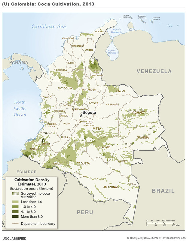
This 2015 CIA map visualizes the distribution of coca cultivation across Colombia in 2013, highlighting the geographic foundations of the global cocaine trade.
Shaded regions indicate coca-growing density, with the heaviest concentrations located in Colombia’s remote southern and western departments, particularly Nariño, Putumayo, Cauca, Guaviare, and parts of the Pacific coastal region.
The map reveals how coca cultivation was concentrated in isolated jungle, mountain, and border regions where weak state control, difficult terrain, and long-running insurgencies allowed illegal economies to flourish.
The historical context is tied directly to Colombia’s decades-long internal conflict involving groups such as FARC, right-wing paramilitaries, drug cartels, and the Colombian government.
By the early 2010s, Colombia had spent more than a decade implementing “Plan Colombia,” a massive US-backed anti-narcotics and counterinsurgency campaign involving aerial fumigation, military operations, and rural security programs.
Although cultivation declined from peak levels in the early 2000s, coca production remained deeply embedded in regions where armed groups taxed or protected growers and traffickers. The map captures the period just before peace negotiations with FARC culminated in the 2016 peace agreement.
The map remains important today because coca cultivation continues to shape politics, violence, migration, and organized crime across Latin America.
Many of the same regions shown here are still centers of narcotics production and armed group activity, even after FARC’s demobilization. The map also demonstrates a broader geopolitical reality: drug economies often emerge where state authority is weakest and economic alternatives are limited.
Visually, the map reflects the CIA’s focus on linking geography to security threats.
Rather than simply showing drug production totals, it emphasizes terrain, remoteness, and regional concentration, illustrating how mountains, jungles, and borderlands became critical infrastructure for one of the world’s most valuable illicit trades.
Also see: Map Of Colombia Created By The CIA
Mexico Water Allocation Map
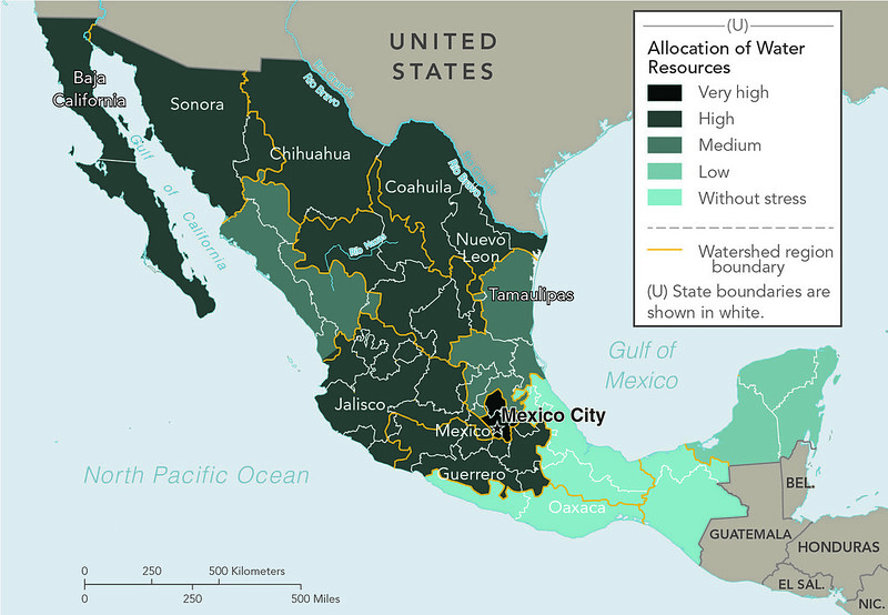
This CIA-produced map of Mexico’s water allocation highlights the growing imbalance between water supply and demand across the country.
Using watershed regions rather than state borders, the map categorizes areas by levels of water stress, ranging from “without stress” in the wetter southeast to “very high” stress across much of northern and central Mexico.
The darkest regions including Baja California, Sonora, Chihuahua, Nuevo León, and the Mexico City region, represent areas where water resources are heavily overallocated, meaning consumption is approaching or exceeding sustainable supply.
The map reflects one of Mexico’s defining geographic challenges: population and industry are concentrated in some of the driest parts of the country.
Northern Mexico contains major manufacturing centers, irrigated agriculture, and rapidly growing border cities tied closely to the US economy, while central Mexico includes the enormous urban concentration around Mexico City.
At the same time, southern states such as Oaxaca and the Yucatán Peninsula receive far greater rainfall and face comparatively lower stress levels. This uneven distribution has long shaped Mexican economic development, migration, and infrastructure policy.
The map remains highly relevant today because water scarcity has become one of North America’s most serious environmental and political issues.
Prolonged droughts, climate change, aquifer depletion, and disputes over the Rio Grande and Colorado River systems have intensified tensions between Mexican states, agricultural users, cities, and the United States.
Major urban areas, including Monterrey and Mexico City, have experienced severe water shortages in recent years, bringing national attention to aging infrastructure and unsustainable groundwater extraction.
Visually, the map demonstrates the CIA’s interest in environmental pressures as national security concerns.
Rather than focusing purely on climate or rainfall, it emphasizes allocation stress, the relationship between available resources and human demand.
In doing so, it presents water scarcity not simply as an environmental issue, but as a driver of economic instability, migration pressures, agricultural vulnerability, and regional political tension across Mexico and the broader US–Mexico border region.
Also see: The Gulf of Mexico’s (Gulf of America’s) EEZ: Who Owns More?
More Declassified CIA Maps
- 22 Declassified CIA Cartography Maps From The 1940s
- 14 Declassified CIA Cartography Maps From The 1950s
- 16 Declassified CIA Cartography Maps From The 1960s
- 19 Declassified CIA Cartography Maps From The 1970s
- 12 Declassified CIA Cartography Maps From The 1980s
- 16 Declassified CIA Cartography Maps From The 1990s
- 16 Declassified CIA Cartography Maps From The 2000s


Leave a Reply