The maps below all come this CIA album on Flicker. They describe the maps in the following ways:
CIA Cartography Center has been making vital contributions to our Nation’s security, providing policymakers with crucial insights that simply cannot be conveyed through words alone.
1989 Worldwide Coca Cultivation Map
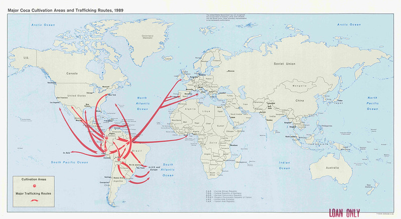
This 1989 CIA map titled “Major Coca Cultivation Areas and Trafficking Routes” illustrates the global cocaine trade network centered in South America during the late Cold War era.
The map identifies major coca-growing regions in countries such as Colombia, Peru, and Bolivia, while large red arrows trace international trafficking routes moving cocaine toward North America, Europe, Africa, and other global markets.
The cultivation zones are concentrated along the Andes mountain region, especially in remote jungle and highland areas where coca plants could be grown with limited government control. From these areas, trafficking routes spread through the Caribbean, Central America, Brazil, and across the Atlantic Ocean toward Spain, Portugal, and other European entry points.
The map reflects the growing concern within the U.S. government during the 1980s over international narcotics trafficking and the rise of powerful drug cartels. Colombia appears as the central distribution hub, highlighting its role in refining and exporting cocaine through organizations such as the Medellín and Cali cartels.
Unlike traditional political or military maps, this map focuses on illicit economic networks and transnational movement. The sweeping directional arrows emphasize how cocaine trafficking had become a worldwide system involving maritime shipping, air transport, and covert smuggling corridors.
Produced in 1989, the map demonstrates how intelligence agencies increasingly treated narcotics trafficking as a national security issue tied to organized crime, insurgencies, corruption, and international finance. The CIA and other agencies used maps like this to visualize the scale of the drug trade and identify critical transportation routes, transit countries, and vulnerable border regions.
Overall, the map provides a striking visual representation of how coca cultivation in isolated parts of the Andes connected to a rapidly expanding global narcotics market at the end of the Cold War.
Also see: Map of Drug Cartels in Mexico
1991 Republic of Soviet Union Map
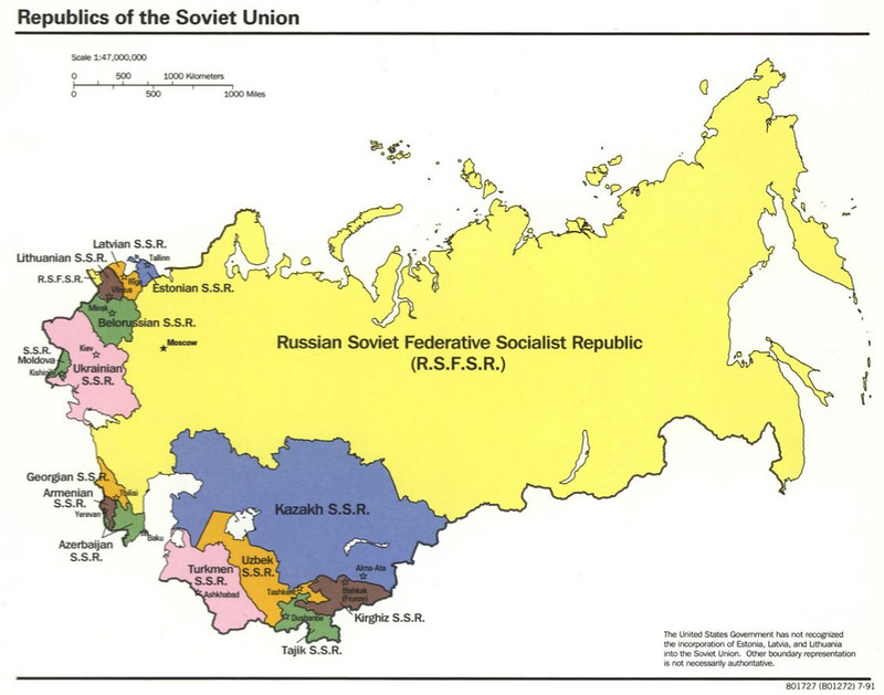
This 1991 CIA map of the Soviet Union shows the internal republics of the USSR during its final year before dissolution.
Each Soviet republic is color-coded and labeled, including the Russian SFSR, Ukrainian SSR, Byelorussian SSR, the Baltic republics, the Caucasus republics, and the Central Asian republics.
The map emphasizes the enormous size of the Russian Soviet Federative Socialist Republic (RSFSR), which dominates most of northern Eurasia, while also showing the distinct national republics that made up the Soviet federation. Capitals such as Moscow, Kiev, Minsk, Tbilisi, Baku, Alma-Ata, and Tashkent are identified, highlighting the political centers of the union.
A notable feature is the disclaimer stating that the United States did not recognize the incorporation of Estonia, Latvia, and Lithuania into the Soviet Union. This reflects longstanding U.S. Cold War policy regarding the Baltic states, which had been annexed by the USSR during World War II.
Produced in 1991, the map captures the Soviet Union at a historic turning point.
Nationalist movements, political unrest, and economic crisis were rapidly weakening central Soviet authority under Mikhail Gorbachev. Within months of this map’s publication, the USSR would formally dissolve, and the republics shown here would become independent states.
Unlike military-focused Cold War maps, this map centers on political geography and federal structure. It illustrates how the Soviet Union was organized administratively into republics with their own capitals, identities, and nominal autonomy, even though power was heavily centralized in Moscow.
In retrospect, the map serves as a snapshot of the final territorial arrangement of one of the twentieth century’s superpowers just before its collapse reshaped global politics and ended the Cold War.
More about this map: Final Map Of The Republics of the Soviet Union Published By The CIA In 1991
1992 Central Asia Ethnic Groups Map
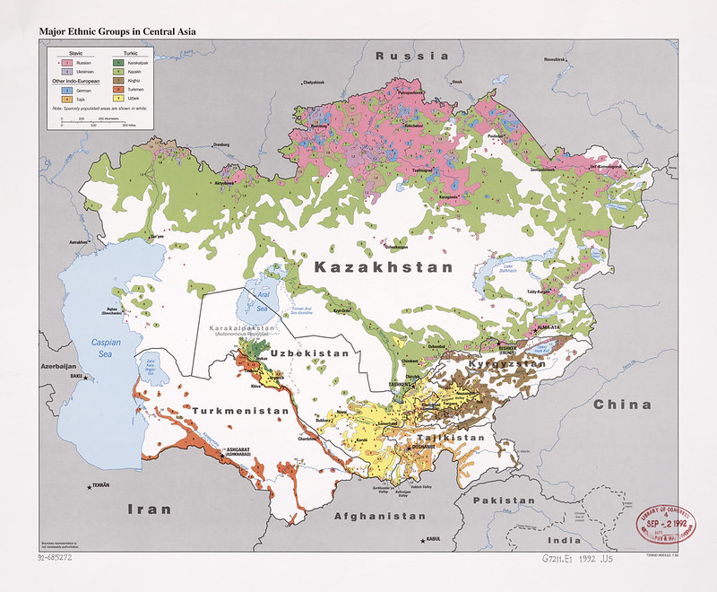
This 1992 ethnic map of Central Asia was produced just after the collapse of the Soviet Union and reflects one of the most important geopolitical realities facing the newly independent republics: ethnicity did not align neatly with political borders.
The map covers Kazakhstan, Uzbekistan, Turkmenistan, Kyrgyzstan, and Tajikistan, showing major ethnic distributions across the region.
It highlights Slavic groups (primarily Russians and Ukrainians), Turkic peoples (Kazakhs, Kyrgyz, Turkmen, Uzbeks, Karakalpaks), Tajiks, and smaller European minorities such as Germans.
Several major patterns stand out:
- Northern Kazakhstan contains extensive Russian-majority and mixed Slavic settlement zones. This reflected decades of Russian migration during the imperial and Soviet periods, especially the Virgin Lands agricultural campaigns under Nikita Khrushchev.
- The densely populated Ferghana Valley appears as a highly fragmented ethnic mosaic shared between Uzbekistan, Kyrgyzstan, and Tajikistan. This region would later become one of the most sensitive ethnic flashpoints in post-Soviet Central Asia.
- Tajik populations extend beyond Tajikistan into major cities of Uzbekistan such as Samarkand and Bukhara.
- Turkic peoples dominate the steppe and desert regions, but large minority enclaves are scattered throughout the republics.
- White areas indicate sparsely populated deserts, mountains, or steppe terrain, emphasizing how geography shaped settlement.
The map captures the immediate post-Soviet transition era, when borders that had once been internal Soviet administrative lines suddenly became international frontiers.
Many of these boundaries had originally been drawn in the 1920s and 1930s by Soviet planners under Joseph Stalin, often deliberately mixing ethnic groups to prevent unified nationalist movements.
By 1992, these demographic patterns had major implications for:
- nationalism and state-building,
- language policy,
- migration,
- border disputes,
- and fears of separatism or Russian intervention.
The Russian-heavy north of Kazakhstan, in particular, was widely viewed as strategically sensitive after independence. Meanwhile, the complicated ethnic geography of the Ferghana Valley contributed to recurring tensions and violence during the 1990s and later decades.
Historically, this map is valuable because it documents Central Asia at the precise moment it transformed from a Soviet interior region into an independent geopolitical zone between Russia, China, Iran, and Afghanistan.
Also see: What If The Stans United
1992 China Coal Map
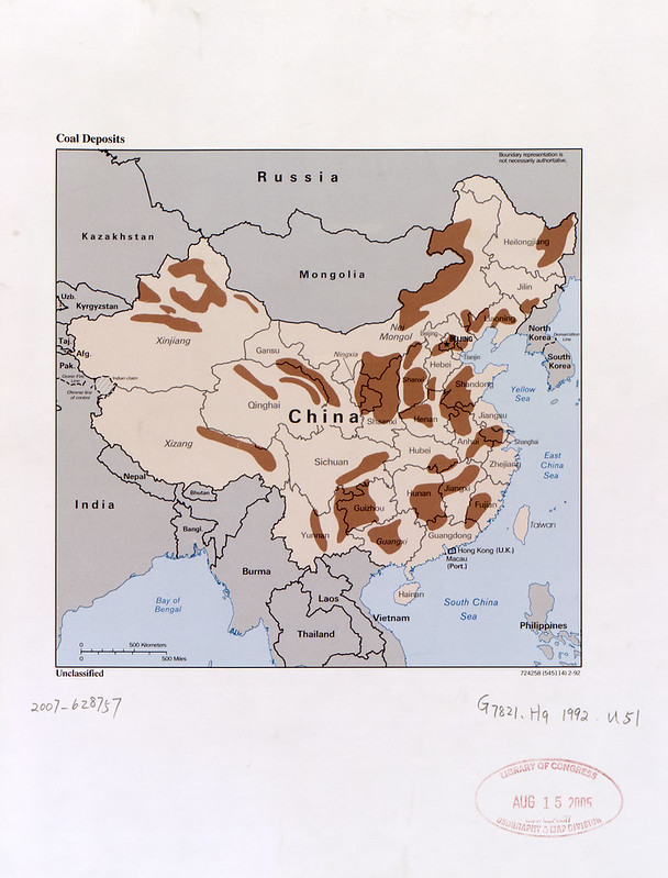
This 1992 coal deposits map of China captures the geographic foundation of the country’s industrial rise just as the post-Cold War world was emerging.
The shaded brown regions mark major coal-bearing areas across China, revealing why coal became the backbone of Chinese industrialization and energy production during the late 20th century.
Several major features stand out:
- The densest concentration lies in northern China, especially around Shanxi, Shaanxi, and Inner Mongolia (labeled Nei Mongol). These regions contain some of the largest coal reserves in the world.
- North-eastern industrial provinces such as Liaoning and Heilongjiang also show extensive deposits, reflecting the old heavy-industrial base inherited from the Mao era and earlier Japanese occupation in Manchuria.
- Southwestern provinces like Guizhou and parts of Yunnan contain important but geographically difficult mountain coalfields.
- Western China, including Xinjiang, shows very large but sparsely developed deposits that would become strategically important decades later.
- Coastal industrial provinces generally have fewer deposits, meaning massive rail transport systems became necessary to move coal from inland mining regions to eastern manufacturing centers.
This map was produced during a pivotal moment in Chinese history.
In 1992, Deng Xiaoping had just completed his famous “Southern Tour,” accelerating market reforms and export-driven industrial growth. Coal was the energy source powering that transformation.
At the time:
- China was rapidly expanding steel production,
- electrification,
- cement manufacturing,
- and heavy industry.
Coal fueled nearly all of it.
The map also hints at several long-term geopolitical and environmental consequences:
- Northern coal dominance encouraged the development of huge rail corridors linking inland mines to eastern ports and cities.
- Dependence on coal contributed heavily to the severe urban air pollution that later became associated with Chinese industrialization.
- Large western deposits in Xinjiang later became central to Beijing’s energy-security strategy.
- Heavy coal use helped make China the world’s largest carbon emitter by the 21st century.
Cartographically, the map has the clean, analytic style typical of late Cold War U.S. intelligence and reference mapping:
- muted base colors,
- simplified political boundaries,
- strategic resource emphasis,
- and minimal decorative elements.
It reflects how resource geography was viewed not just economically, but strategically. In the early 1990s, American analysts increasingly understood that China’s enormous domestic coal reserves gave it a powerful industrial advantage despite relatively limited oil resources.
Also see: China GDP Per Capita By Decade From 1950 To 2020
1993 Caucasus Ethnoreligious Map
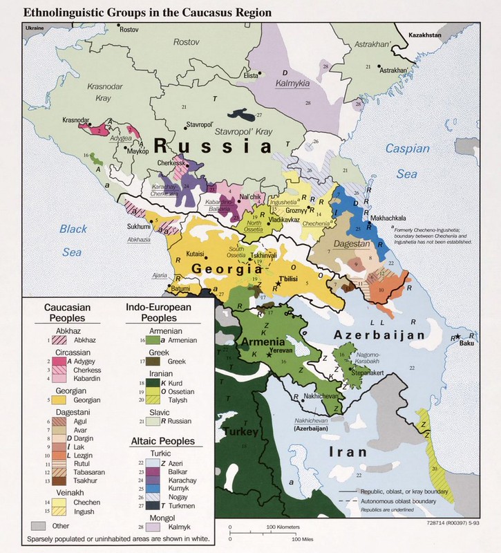
This 1993 ethnolinguistic map of the Caucasus is a revealing post-Dissolution of the Soviet Union regional intelligence-style maps.
It visually explains why the Caucasus became one of the most volatile regions of the former Soviet space in the early 1990s.
The map captures the extraordinary fragmentation of peoples across:
- Georgia
- Armenia
- Azerbaijan
- and the North Caucasus republics within Russia.
What makes it so striking is the density of tiny ethnolinguistic enclaves, especially in:
- Dagestan
- Chechnya
- Ingushetia
- Kabardino-Balkaria
- and Karachay-Cherkessia.
The map divides populations into major linguistic/cultural families:
- Caucasian peoples:
- Georgians
- Chechens
- Ingush
- Circassian groups
- Dagestani peoples like Avars, Lezgins, Dargins, and Laks
- Indo-European peoples:
- Armenians
- Ossetians
- Kurds
- Russians
- Altaic/Turkic peoples:
- Azeris
- Kumyks
- Karachays
- Balkars
- Nogays
This was an exceptionally consequential moment to publish such a map.
By 1993:
- the USSR had collapsed,
- the Nagorno-Karabakh conflict was raging,
- War in Abkhazia was underway,
- South Ossetia was unstable,
- and Chechen separatism was escalating toward the First Chechen War.
The map essentially visualizes fault lines.
Several especially important regions stand out:
- Nagorno-Karabakh appears as an Armenian-majority enclave inside Azerbaijan.
- Abkhazia is shown as ethnically mixed rather than purely Georgian.
- South Ossetia appears embedded inside Georgia but populated by Ossetians related to North Ossetians across the Russian border.
- Dagestan appears as perhaps the most fragmented ethnolinguistic region on Earth.
The map is also important because it demonstrates how Soviet internal borders often ignored ethnic geography. Many autonomous republics contained multiple rival populations, creating instability once centralized Soviet control disappeared.
Cartographically, this is classic early-1990s strategic ethnographic mapping:
- heavy use of color coding,
- simplified terrain,
- emphasis on administrative boundaries,
- and highly compressed ethnic detail.
One of the most fascinating aspects is how accurate many of its implied tensions proved to be:
- Chechnya erupted into war in 1994,
- Nagorno-Karabakh remained contested for decades,
- Russia later intervened in Georgia in 2008,
- and ethnic fragmentation continues to shape Caucasus geopolitics today.
In many ways, this map is a visual forecast of the post-Soviet Caucasus conflicts that followed.
Also see: Wild West vs Wild East: American vs Russian Expansion 1300 to 1914
1996 Ukraine Oil and Gas Map
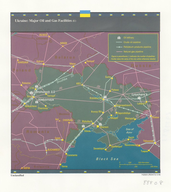
This 1996 oil and gas infrastructure map of Ukraine is remarkably prescient when viewed from today’s geopolitical perspective. It captures Ukraine not primarily as an energy producer, but as one of the most strategically important energy transit states in the world during the post-Soviet era.
The map focuses on:
- crude oil pipelines,
- petroleum product pipelines,
- natural gas pipelines,
- and refinery locations.
Several critical strategic patterns immediately stand out:
East-to-West Transit System
The dominant structure is the massive Soviet-era pipeline network running westward from Russia through Ukraine into Europe.
The most important line shown is the:
- Druzhba (“Friendship”) pipeline system,
which carried Soviet and later Russian oil into:
- Poland,
- Hungary,
- Slovakia,
- and beyond into Central Europe.
By the mid-1990s, Ukraine controlled the transit routes for a huge percentage of Russian gas exports to Europe.
That gave Kyiv enormous geopolitical leverage.
Strategic Nodes
The map highlights several major infrastructure hubs:
- Kyiv — administrative and pipeline coordination center.
- Kremenchuk — major refinery area.
- Odessa — Black Sea export/import hub.
- Lviv and western Ukraine — gateway into Europe.
- Luhansk and eastern industrial areas — tied closely to Russian energy systems.
- Sevastopol and Crimea — strategically positioned on Black Sea maritime routes.
The map also visually foreshadows future geopolitical flashpoints:
- Donbas industrial zones,
- Crimea,
- Black Sea infrastructure,
- and Russian-Ukrainian energy interdependence.
Post-Soviet Context
This map comes from only five years after the:
Dissolution of the Soviet Union.
At that moment:
- Ukraine had inherited a massive Soviet energy transit system,
- Russia still depended heavily on Ukrainian pipelines,
- Europe depended heavily on Russian energy,
- and the long-term geopolitical consequences were not yet fully understood.
The map reflects an era before:
- Nord Stream,
- TurkStream,
- or major bypass pipelines.
In the 1990s, Ukraine was effectively unavoidable for Russian gas exports to Europe.
Why This Map Became Historically Important
Looking backward from the 2000s–2020s, nearly every major Russia-Ukraine energy dispute relates directly to infrastructure shown here:
- gas cutoff crises in 2006 and 2009,
- disputes over transit fees,
- Russian efforts to bypass Ukraine,
- Crimea’s annexation in 2014,
- and the broader energy dimension of the ongoing war.
This is why the map feels so consequential today: it documents the infrastructure architecture underlying decades of Eurasian geopolitics.
Cartographic Style
This has a very characteristic mid-1990s intelligence/reference aesthetic:
- dark background palette,
- bright pipeline symbology,
- simplified political geography,
- infrastructure-centric presentation,
- and minimal terrain detail.
Unlike Cold War military maps focused on troop positions or ideology, this reflects the post-Cold War shift toward:
- energy security,
- economic geography,
- and strategic infrastructure analysis.
Also see: Ukraine Between Two Octobers (2012-2025)
1997 Afghan Ethnolinguistic Map
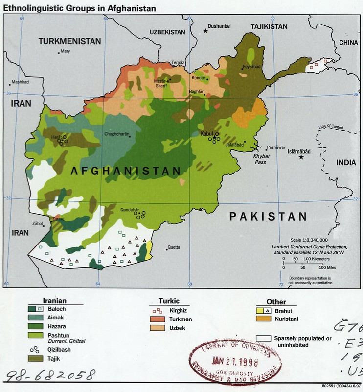
This 1997 CIA-produced ethnolinguistic map of Afghanistan depicts the country’s major ethnic and linguistic population zones during the period of Taliban consolidation following the Soviet-Afghan War and subsequent Afghan civil war.
The map identifies the geographic distribution of major groups including Pashtuns, Tajiks, Hazaras, Uzbeks, Turkmen, Aimaq, Baloch, Nuristanis, and smaller minority communities. It also highlights the fragmented ethnic mosaic of northern and central Afghanistan, contrasted with the predominantly Pashtun south and east.
The map was created at a pivotal moment in Afghan history.
By 1997, the Taliban had captured most of the country, including Kabul, while opposition forces of the Northern Alliance retained strongholds in the north and northeast.
Ethnic geography had become deeply tied to military control and political allegiance. Pashtun-majority regions largely formed the Taliban heartland, while Tajik, Uzbek, and Hazara regions became centers of anti-Taliban resistance under leaders such as Ahmad Shah Massoud and Abdul Rashid Dostum.
The map is especially significant today because many of Afghanistan’s enduring political and security dynamics still follow the same ethnic and regional patterns shown here.
The Taliban’s return to power in 2021, ongoing tensions between central authority and regional groups, and continued instability in border areas all reflect divisions visible on this map decades earlier.
It also illustrates how Afghanistan’s mountainous terrain historically reinforced regional isolation and local identities, complicating efforts to build centralized state control.
Cartographically, the map reflects the CIA’s late-Cold War and post-Cold War emphasis on ethnographic intelligence analysis, using simplified terrain and color-coded population regions to visualize political and strategic fault lines.
Also see: Countries That Lost Citizens On 9/11
1997 Bosnia Map
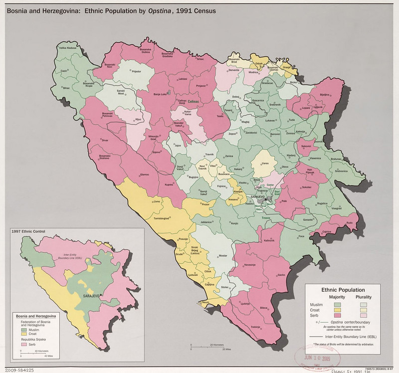
This 1997 CIA map compares the ethnic geography of Bosnia and Herzegovina before and after the Bosnian War, using data from the 1991 census alongside the post-war territorial divisions created by the Dayton Accords.
The main map shows the ethnic majority or plurality of each municipality before the conflict, with Bosniaks (Muslims), Serbs, and Croats heavily intermixed across the country.
The inset map then shows the 1997 political reality after the war, divided between the Federation of Bosnia and Herzegovina and Republika Srpska along the Inter-Entity Boundary Line (IEBL).
The map captures one of the most important geopolitical transformations in post–Cold War Europe.
Before the breakup of Yugoslavia, Bosnia was one of the federation’s most ethnically mixed republics, with many towns containing no overwhelming majority group.
When Bosnia declared independence in 1992, nationalist militias backed by Serbia and Croatia fought to carve out ethnically controlled territory.
The war became infamous for ethnic cleansing, sieges, concentration camps, and atrocities including the Srebrenica massacre. By 1995, hundreds of thousands had been killed or displaced, fundamentally reshaping Bosnia’s demographic landscape.
The map is especially important because it visually demonstrates how dramatically the war altered Bosnia’s ethnic distribution.
Areas that had once been highly mixed became more homogenized through forced displacement and violence. The inset showing 1997 ethnic control reveals how wartime front lines evolved into internationally recognized political boundaries under the Dayton Peace Agreement.
Today, the map remains highly relevant because Bosnia’s modern political system is still structured around these wartime divisions.
The country continues to operate under a fragile power-sharing arrangement between Bosniaks, Serbs, and Croats, while ethnic identity remains central to elections, governance, and regional politics.
More broadly, the map stands as one of the clearest visual examples of how nationalism and ethnic conflict reshaped Europe after the collapse of communism.
Also see: Did You Know Bosnia & Herzegovina Isn’t Divided Into ‘Bosnia’ and ‘Herzegovina’?
1997 Map of Korean Airlines Flight 007 In 1983
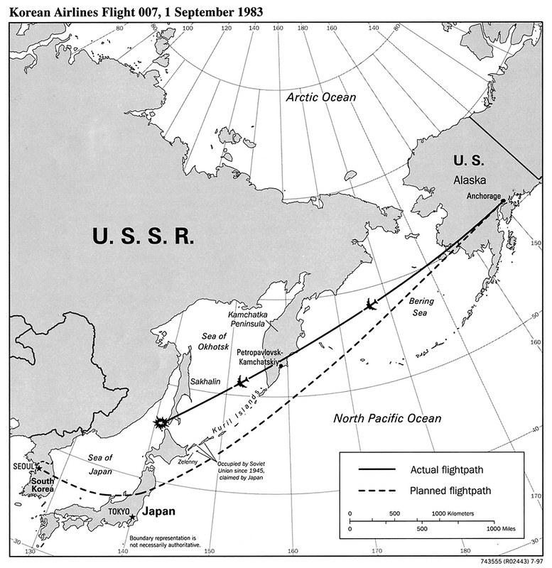
This 1997 CIA map reconstructs the flight path of Korean Air Lines Flight 007 shootdown in 1983, the civilian air disaster that became one of the most dangerous international incidents of the late Cold War.
The map compares the aircraft’s intended route from Anchorage to Seoul with its actual path after the Boeing 747 gradually drifted hundreds of miles off course into sensitive Soviet airspace over Kamchatka and Sakhalin Island.
The solid line shows the fatal deviation that brought the aircraft into areas heavily monitored by the Soviet military, while the dashed line marks the planned commercial corridor across the North Pacific.
The incident occurred on 1 September 1983 during one of the tensest periods of US–Soviet relations since the Cuban Missile Crisis.
Soviet air defense forces, believing the aircraft could be an American reconnaissance plane, scrambled interceptors and ultimately shot down the airliner near Sakhalin Island.
All 269 passengers and crew were killed, including US Congressman Larry McDonald. The Soviet Union initially denied responsibility and later justified the attack as a defense of national airspace, while the United States condemned it as a massacre and used the incident to highlight Soviet secrecy and militarism.
The map is historically important because the shootdown dramatically escalated Cold War tensions and reshaped international aviation policy.
In response, the United States accelerated the opening of GPS technology for civilian navigation, arguing that more accurate positioning could prevent similar disasters. The crisis also intensified global fears about miscalculation between nuclear superpowers during the early 1980s.
Visually, the map emphasizes how geography and military paranoia intersected in the Cold War Pacific.
The flight crossed some of the Soviet Union’s most strategically sensitive territory, including regions associated with submarine bases, missile defenses, and military radar installations.
Also see: Korean Air Flight Route Destinations Map
1998 Central America Hurricane Mitch Damage Map
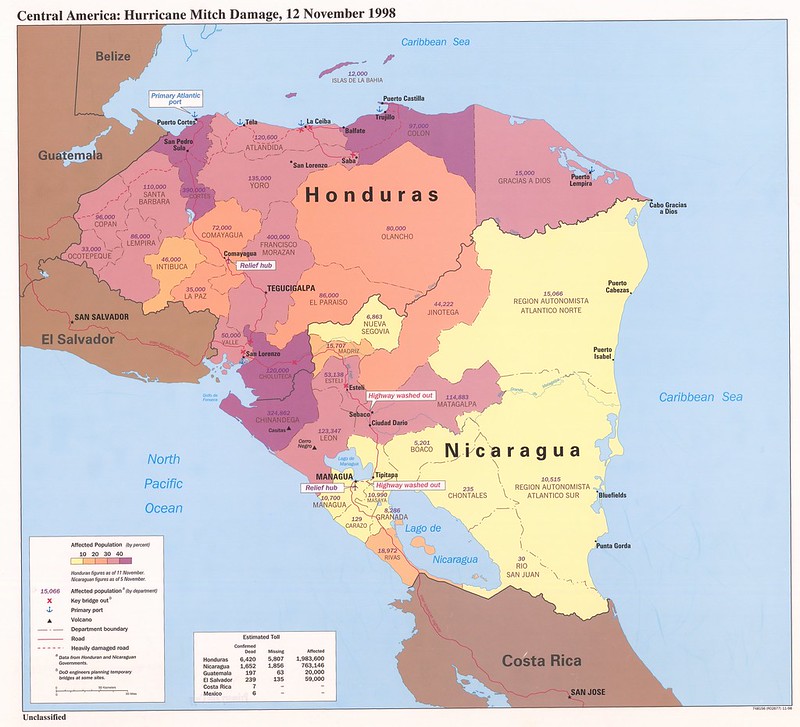
This 1998 CIA disaster map documents the devastating impact of Hurricane Mitch across Central America, particularly in Honduras and Nicaragua.
Using color-coded departments, infrastructure symbols, and casualty estimates, the map illustrates the scale of flooding, transportation collapse, and human displacement caused by one of the deadliest Atlantic hurricanes in modern history.
Areas shaded in darker purple represent regions where over 40 percent of the population was affected, especially along Honduras’s Caribbean coast and Nicaragua’s Pacific-facing departments.
Hurricane Mitch struck Central America in late October 1998 after rapidly intensifying into a Category 5 storm in the Caribbean.
Although the hurricane weakened before moving inland, its slow movement caused catastrophic rainfall, flash flooding, and landslides across mountainous terrain.
Entire villages were buried, roads and bridges were destroyed, and key infrastructure including ports, highways, and relief routes collapsed.
Honduras suffered especially severe devastation, with some regions effectively cut off from the rest of the country for days. The disaster killed more than 11,000 people across the region and displaced millions, making Mitch one of the deadliest hurricanes ever recorded in the Western Hemisphere.
The map remains important today because it demonstrates how geography and poverty magnify natural disasters.
Many of the hardest-hit regions were vulnerable due to weak infrastructure, deforestation, hillside settlements, and limited emergency capacity. Hurricane Mitch became a turning point in regional disaster planning and international humanitarian response, leading to major investments in flood monitoring, reconstruction, and climate resilience.
Visually, the map reflects the CIA’s broader strategic interest in environmental crises as security and stability concerns.
Rather than showing only the storm’s track, it emphasizes population impact, transportation bottlenecks, washed-out highways, damaged ports, and relief hubs. The result is not simply a weather map, but a portrait of how natural disasters can destabilize governments, economies, and entire regions long after the storm itself has passed.
Also see: No Hurricane or Typhoon Has Ever Crossed The Equator Map
1998 Kosovo Map
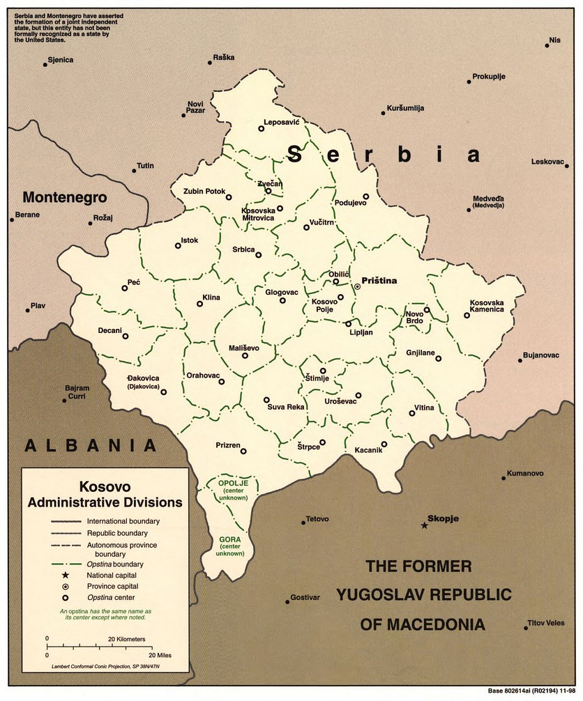
This 1998 CIA map of Kosovo captures the territory on the eve of the Kosovo War, showing its municipal divisions, major towns, and position within the collapsing remnants of Yugoslavia.
At the time, Kosovo was formally an autonomous province within Serbia, although its autonomy had been heavily reduced by Serbian leader Slobodan Milošević during the late 1980s.
The map’s administrative focus reflects growing international concern over rising ethnic tensions between Kosovo’s Albanian majority and Serbian authorities.
Historically, the map represents one of the final stages of the Yugoslav breakup wars of the 1990s.
After conflicts in Croatia and Bosnia, Kosovo became the next flashpoint as ethnic Albanian resistance intensified through the Kosovo Liberation Army (KLA).
Serbian security forces responded with increasingly harsh crackdowns, leading to mass displacement, village destruction, and allegations of ethnic cleansing.
By 1998, the region had become a major international crisis, eventually prompting NATO intervention in 1999 through an extended bombing campaign against Serbia.
Following the war, Kosovo was placed under UN administration before later declaring independence in 2008, a status still disputed by Serbia and several other countries.
The map remains important today because Kosovo continues to be one of Europe’s most politically sensitive territorial disputes.
Northern Kosovo, particularly around Kosovska Mitrovica and Leposavić, still contains significant Serb populations and remains a source of periodic tensions between Belgrade and Pristina.
The boundaries and municipalities shown here continue to influence modern governance, elections, policing, and ethnic representation.
Visually, the map reflects the CIA’s emphasis on administrative geography during emerging conflicts.
Unlike battlefield maps, it focuses on municipal divisions and settlement patterns because these local boundaries became critical during the war for ethnic control, refugee movements, and post-war negotiations.
Also see: Map Of Kosovo Created By The CIA
1998 Military Geography of Former Yugoslavia Map
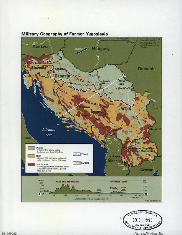
This 1998 “Military Geography of Former Yugoslavia” map is a classic example of how terrain shaped the wars that followed the breakup of Yugoslavia in the 1990s.
Rather than focusing on ethnicity or politics, the map emphasizes plains, hills, mountains, forests, and transportation corridors, all crucial factors in military planning during the conflicts in Croatia, Bosnia and Herzegovina, and Kosovo.
The geography explains much about how the wars unfolded.
Northern Serbia and Croatia sit on relatively flat plains connected to the Danube and Sava river systems, allowing easier troop movement, armored operations, and logistics.
In contrast, Bosnia, Montenegro, and much of inland Croatia are dominated by rugged mountains and narrow valleys.
These conditions favored defensive warfare, guerrilla tactics, ambushes, and long sieges. Cities like Sarajevo became notoriously difficult battlegrounds because surrounding mountains gave artillery positions commanding views over urban areas.
The map also highlights why Bosnia was particularly hard to unify militarily.
Its fractured terrain naturally isolated communities and created defensible ethnic enclaves. Roads and valleys became strategically vital chokepoints, while mountainous areas enabled smaller forces to resist larger armies. This geographic fragmentation contributed to the war’s decentralized and brutal character.
Kosovo and Macedonia are shown as heavily mountainous as well, foreshadowing later insurgencies and ethnic conflicts in those regions.
NATO planners during the Kosovo War closely studied this type of terrain data because mountainous landscapes complicated air campaigns and ground operations alike.
The cross-section at the bottom, running from Split on the Adriatic coast to Novi Sad in Serbia, visually demonstrates the dramatic shift from steep Dinaric mountain ranges to the flat Pannonian plain. That contrast was strategically decisive throughout the Yugoslav Wars.
Overall, the map reflects a core military principle: geography often shapes conflict as much as ideology or politics. In the Balkans, mountains, valleys, and transport routes heavily influenced front lines, ethnic partition, refugee flows, and the eventual postwar borders that still define the region today.
Also see: 20 Similarities & Differences Between The Countries Of The Former Yugoslavia
1999 Afghanistan Map
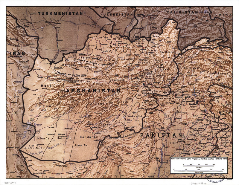
This 1999 map of Afghanistan is striking because it visually explains why the country has historically been so difficult to conquer, govern, or unify.
Unlike many political maps, this one emphasizes terrain, mountain systems, passes, deserts, and transportation corridors, the features that have shaped Afghan history for centuries.
The most dominant feature is the Hindu Kush, which cuts across central and north-eastern Afghanistan.
These mountains divide the country into isolated valleys and regions, making communication and centralized control extremely difficult. Historically, armies could capture cities like Kabul or Kandahar while still lacking control over surrounding rural and mountain areas.
The map also highlights Afghanistan’s strategic position between major regional powers: Iran to the west, Pakistan to the south and east, Central Asia to the north, and China through the narrow Wakhan Corridor in the northeast.
This geography made Afghanistan a historic crossroads for trade, migration, and empire from Alexander the Great to the British, Soviets, and Americans.
You can also see how few major roads existed in 1999.
Most routes funnel through narrow valleys and mountain passes like the Khyber Pass. Control of these chokepoints has always been militarily crucial. During the Soviet–Afghan War and later conflicts, guerrilla fighters used the terrain for ambushes, concealment, and cross-border movement into Pakistan’s tribal areas.
The southern deserts including the Registan and Dasht-e Margo are comparatively empty and harsh, limiting settlement and logistics. Meanwhile, the northern plains near Mazar-i-Sharif are more accessible and historically easier to hold militarily.
The timing of this map is notable as well: 1999 was during Taliban rule, before the September 11 attacks and the U.S.-led invasion in 2001.
In hindsight, the map foreshadows many of the geographic challenges NATO forces would later encounter, rugged terrain, fragmented infrastructure, isolated populations, and a country where geography strongly favors local resistance over centralized power.
Also see: Timeline Map Of 9/11 Shutdown of North American Airspace
1999 KFOR Sectors Map
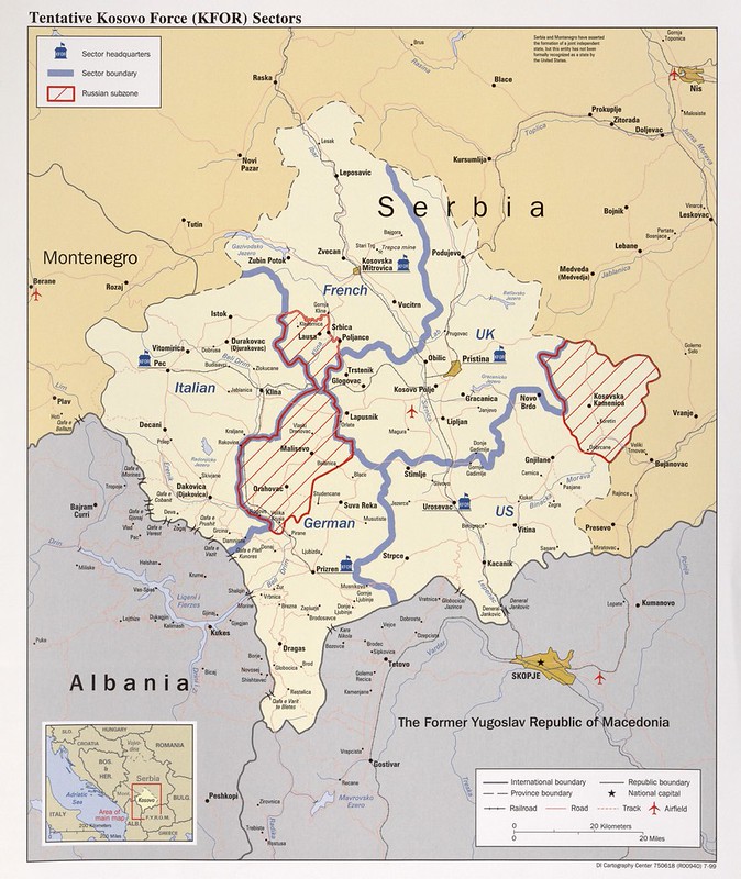
This 1999 map of the NATO-led Kosovo Force sectors captures one of the most important geopolitical moments of the post–Cold War era: the international occupation and stabilization of Kosovo after the Kosovo War.
The map shows how Kosovo was divided into separate military sectors controlled by different NATO countries after the 1999 intervention against Serbia (then part of the Federal Republic of Yugoslavia).
Rather than one unified occupation zone, NATO distributed responsibility among major alliance members:
- The United States controlled the south-eastern sector around Uroševac.
- The United Kingdom controlled the central-eastern sector including Pristina.
- France held the north around Kosovska Mitrovica.
- Germany controlled the southwest.
- Italy held the western zone around Peć.
One of the most fascinating features is the striped “Russian subzone.” Although Russia was not part of NATO, Moscow demanded participation in the peacekeeping force to preserve influence in the Balkans and protect Serbian interests.
This led to a tense diplomatic standoff including the famous dash by Russian troops to seize Pristina International Airport ahead of NATO forces.
The sector boundaries also reveal the ethnic and strategic realities of Kosovo. T
he northern region near Mitrovica contained large Serb populations and would remain politically unstable for decades. Even today, northern Kosovo is the main flashpoint between Kosovo’s Albanian-majority government and Serbia.
This map also reflects the high-water mark of post-Cold War Western interventionism.
In 1999, NATO acted without explicit UN Security Council authorization, arguing humanitarian necessity after ethnic cleansing during the Kosovo conflict. The operation became a major precedent later cited in debates over humanitarian intervention, sovereignty, and NATO expansion.
Also see: Animated Map Of The Breakup of Yugoslavia 1989 – 2008
2001 Chechnya Map
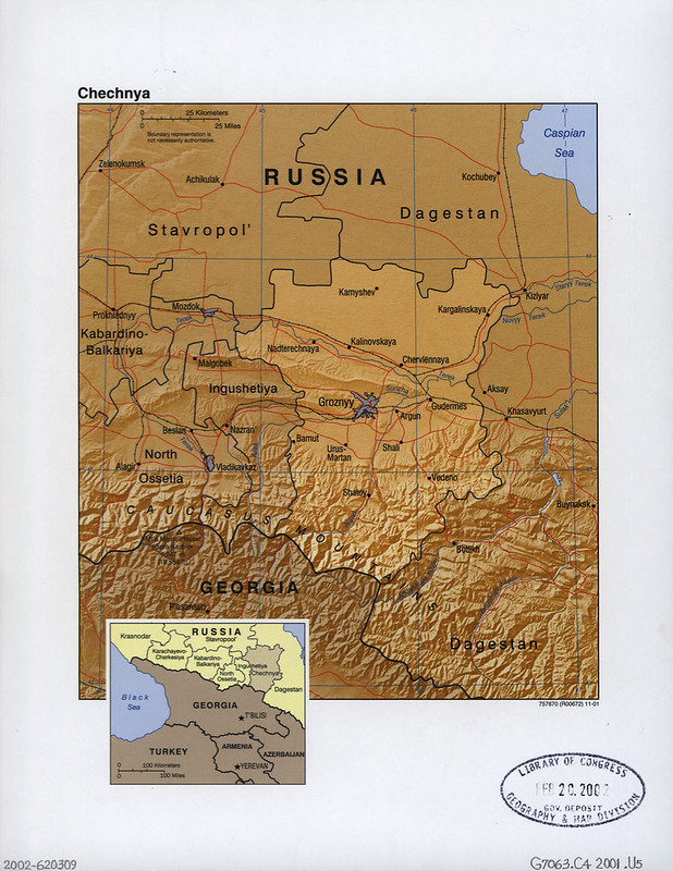
This 2001 map of Chechnya captures one of the most violent and strategically important conflicts of post-Soviet Russia: the Second Chechen War.
The geography shown here explains much of the conflict. Northern Chechnya around Grozny and the Terek River valley is relatively flat and accessible. This is where Russian conventional military power was strongest, allowing Moscow to retake Grozny after devastating urban warfare in 1999–2000.
But the southern half of Chechnya is dominated by the rugged Caucasus Mountains.
These steep valleys and forested highlands became ideal terrain for guerrilla warfare. Chechen fighters repeatedly withdrew into the mountains around places like Vedeno and Shatoy, using ambushes, tunnels, and local knowledge to counter Russia’s superior firepower.
The map also shows why the broader North Caucasus was so unstable. Chechnya sits amid a patchwork of republics and ethnic regions:
- Dagestan to the east
- Ingushetia to the west
- North Ossetia nearby
- Georgia directly south across the mountains
Instability frequently spilled across these borders. The 1999 Islamist incursion into Dagestan was one of the triggers for the Second Chechen War, while refugee flows and insurgent movement affected the entire Caucasus region.
The timing of the map is important. By 2001, Vladimir Putin had built much of his early political reputation on restoring Russian control over Chechnya after the chaos of the 1990s. The war became central to the reassertion of Russian state power after the Soviet collapse.
This map also unintentionally foreshadows modern geopolitics.
Many military methods, propaganda techniques, and centralized security structures later associated with Putin-era Russia were refined during the Chechen wars. At the same time, the conflict became an early example of post-Cold War counterinsurgency fought in mountainous terrain against decentralized militant networks.
Geographically, Chechnya is small, but strategically it sits at the crossroads of Russia, the Caucasus, oil transit routes, and multiple ethnic fault lines, making it disproportionately important in Russian history.
Also see: Soviet Union In 1990 vs Russia In 2025
Chairman Joint Chiefs Of Staff Colin Powell With CIA Map 1991
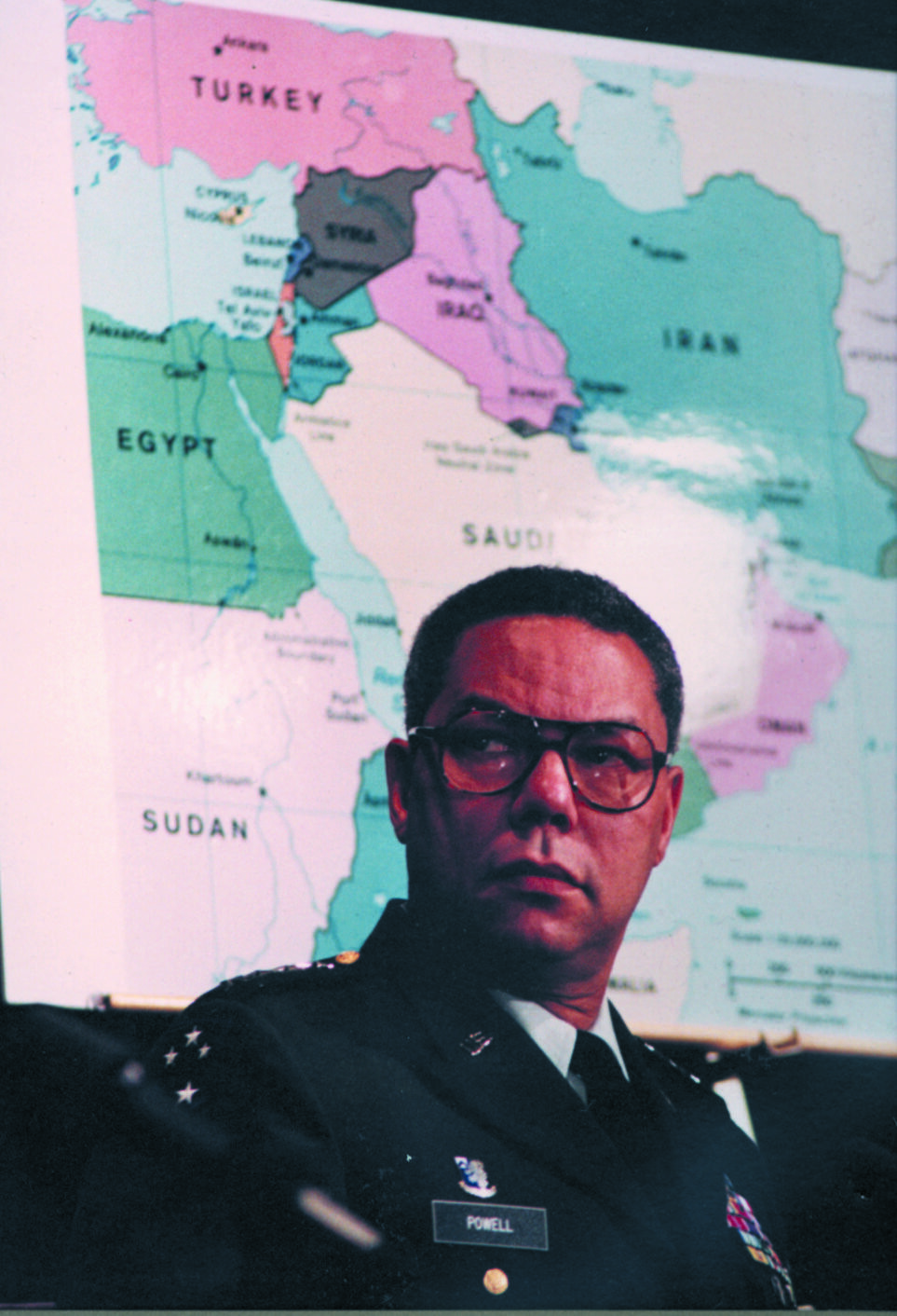
This photo of Colin Powell in front of a Middle East map is a fascinating snapshot of late–Cold War and early post–Cold War U.S. military strategy.
The image was likely taken around 1989–1991, when Powell served as Chairman of the Joint Chiefs under Presidents George H. W. Bush and Ronald Reagan. The map behind him focuses on the Middle East especially Iraq, Iran, Syria, Saudi Arabia, and the eastern Mediterranean.
That timing matters because the region was becoming the central focus of U.S. military planning after the Cold War.
The Iran–Iraq War had just ended in 1988, Iraq under Saddam Hussein was heavily armed and deeply indebted, and the U.S. was increasingly concerned about Gulf oil security and regional stability.
Within a year or two, Powell would become one of the principal architects of Operation Desert Storm following Iraq’s invasion of Kuwait in 1990. His military doctrine, later called the “Powell Doctrine” emphasized overwhelming force, clear objectives, and strong public support before military intervention.
In retrospect, the image almost symbolizes the moment when U.S. strategic attention shifted from Europe and the Soviet Union toward the Middle East, a focus that would dominate American foreign policy for the next three decades.
Also see: Iran’s Size Compared To 5 Other Countries The US Has Invaded
More Declassified CIA Maps
- 22 Declassified CIA Cartography Maps From The 1940s
- 14 Declassified CIA Cartography Maps From The 1950s
- 16 Declassified CIA Cartography Maps From The 1960s
- 19 Declassified CIA Cartography Maps From The 1970s
- 12 Declassified CIA Cartography Maps From The 1980s
- 16 Declassified CIA Cartography Maps From The 2000s
- 15 Declassified CIA Cartography Maps From The 2010s


Leave a Reply