The maps below all come this CIA album on Flicker. They describe the maps in the following ways:
CIA’s Cartography Center has been making vital contributions to our Nation’s security, providing policymakers with crucial insights that simply cannot be conveyed through words alone.
1950 Africa Administrative Divisions Map
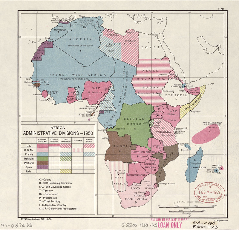
This map titled “Africa: Administrative Divisions”, shows how most of Africa was still controlled by European colonial powers shortly after World War II. Different colours identify the colonial empires that ruled African territories:
- Blue = France
- Pink = United Kingdom
- Green = Belgium
- Brown = Portugal
- Purple = Spain
- Yellow-striped areas = former Italian colonies
The map also distinguishes different political arrangements such as colonies, protectorates, mandates, trust territories, and self-governing dominions.
For example, South Africa is marked as a self-governing dominion, while areas like Tanganyika, Libya, and Somaliland had special international or temporary administrative status after the war.
This map captures Africa just before the great wave of decolonization of the 1950s and 1960s.
At the time, only a few African countries, such as Ethiopia and Liberia, were fully independent.
Within the next two decades, most of the territories shown under European rule would become independent nations, dramatically reshaping global politics during the Cold War.
Also see: African Countries Never Colonized By Europeans
1950 International Trade Map
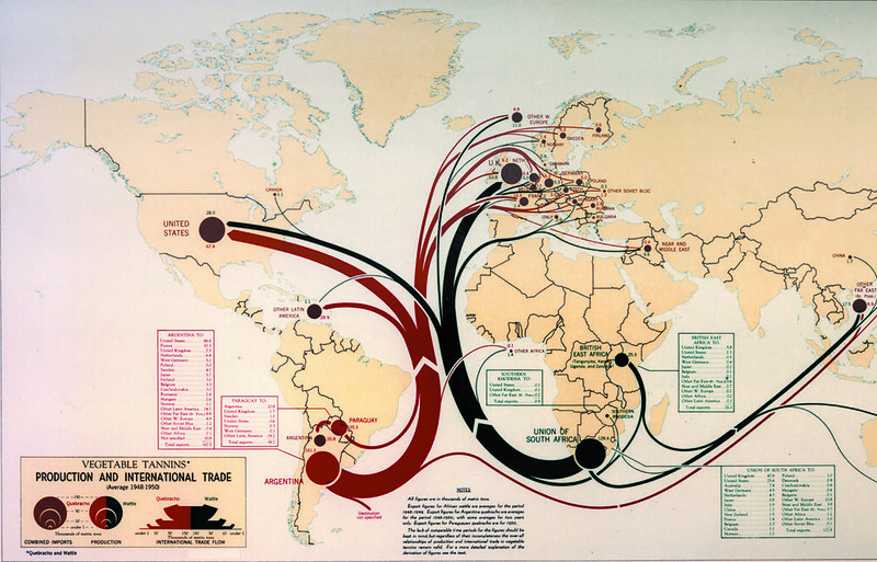
This map shows the global production and trade of vegetable tannins between 1948 and 1950.
Vegetable tannins are natural chemicals extracted from plants and tree bark that are mainly used in the leather industry to turn animal hides into durable leather through a process called tanning.
Before synthetic chemicals became widespread, vegetable tannins were extremely important for making shoes, belts, saddles, military gear, and industrial leather products.
The two main tannin products shown are:
Quebracho — extracted mainly from hardwood trees in Argentina and Paraguay
Wattle — produced mainly from acacia trees in South Africa
The thick colored flow lines show international trade routes:
Red lines represent quebracho exports from South America
Black lines represent wattle exports from South Africa
The map demonstrates how industrial economies such as the United States and countries in Western Europe imported huge quantities of tanning materials for their leather industries after World War II.
Large circles indicate the scale of imports or production, with the United States and parts of Europe shown as major consumers.
This map also reflects the global economic structure of the early Cold War era: many raw materials were produced in agricultural or colonial regions in Africa and South America, then exported to industrial countries for manufacturing.
It is both an economic geography map and a visualization of worldwide trade networks in the mid-20th century.
Also see: A Brilliantly Detailed Map Of Medieval Trade Routes & Networks
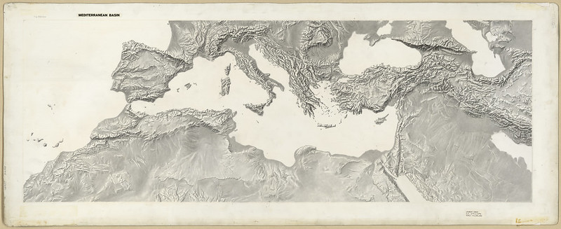
1950s Mediterranean Basin Terrain Map
Also see:
- Europe & The Mediterranean From A Different Perspective
- Have You Ever Heard of This Mysterious Mediterranean Island That Has Only Appeared 4 Times Since 264 BC?
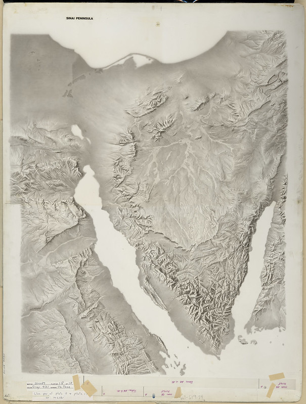
1950s Sinai Peninsula Terrain
Also see: Israel’s Territory Before & After The Six-Day War In 1967
1951 Costa Rica Map
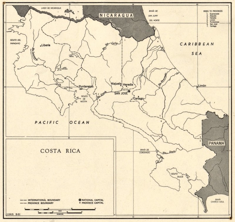
Also see: South North America vs North South America
1951 Indochina Map
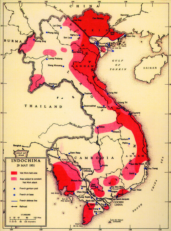
This 1951 CIA map of French Indochina shows the military situation during the early years of the First Indochina War.
The war was fought between French colonial forces and the communist-led Viet Minh movement led by Ho Chi Minh, who sought independence for Vietnam.
The map uses color to show areas of control and conflict:
- Dark red = territories controlled by the Viet Minh
- Light red/pink = areas under frequent Viet Minh attack
- Blue symbols = French military garrisons and air bases
- Blue lines = French defense lines and transportation routes
The map demonstrates how widespread the insurgency had become by 1951.
Although the French still controlled major cities such as Saigon and Hanoi, large rural areas, especially along the borders with China and in the Mekong Delta, were under Viet Minh influence or constant attack.
The strong Viet Minh presence near China became especially important after the communist victory in China in 1949, which allowed supplies and support to flow across the border.
This map reflects a major Cold War concern for the United States.
By 1951, American policymakers increasingly viewed the conflict not just as a colonial war, but as part of the global struggle against communism.
The United States began providing financial and military aid to France, laying the groundwork for deeper American involvement in Vietnam during the following decades.
Also see: Watch The Entire Vietnam War Using Google Earth
1951 Middle East Oil Map
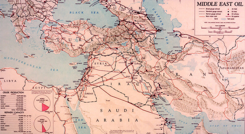
This 1951 map titled “Middle East Oil” shows the major oil-producing regions, pipelines, refineries, and transportation networks of the Middle East during the early Cold War.
It emphasizes how strategically important oil had become after World War II, when industrial economies and modern militaries became heavily dependent on petroleum.
The map highlights major oil fields in countries such as Saudi Arabia, Iran, Iraq, and Kuwait.
Red lines mark important oil pipelines carrying crude oil to Mediterranean ports and global shipping routes. Symbols identify oil fields, refineries, roads, and railroads, showing how energy infrastructure connected the Persian Gulf to Europe and world markets.
The charts in the lower left corner compare Middle Eastern oil production and refinery capacity to world totals.
They show that by 1951 the Middle East already accounted for a very large share of global petroleum production and refining. Saudi Arabia and Iran were especially significant producers.
This map reflects growing American and British concern over energy security during the early Cold War.
Control of Middle Eastern oil was considered vital for Western economies and military power.
The region soon became a center of international rivalry, coups, and political conflict, including disputes over oil nationalization such as the crisis involving Mohammad Mosaddegh in Iran in 1951–1953.
Also see: The Entire History of Iran: Every Year
1953 USSR GDP Map
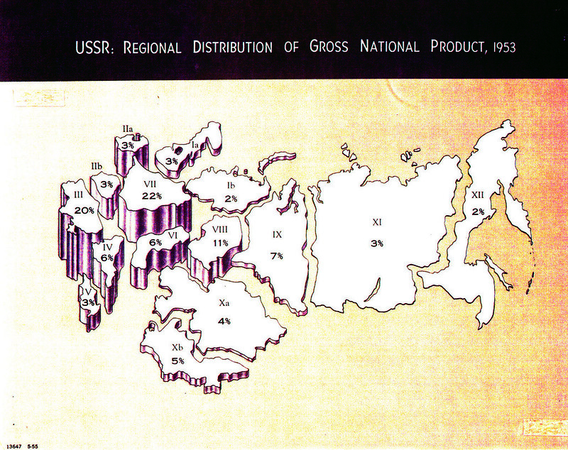
This map is an attempt to show the economic geography of the Soviet Union during the early Cold War.
The percentages on the map represent each region’s estimated contribution to the Soviet gross national product (GNP), or total economic output.
The unusual vertical “block” shapes visually emphasize how much economic weight each region carried within the Soviet economy.
The map shows that the western Soviet Union was overwhelmingly the economic core of the country. R
egions in European Russia and Ukraine contributed the largest shares, especially Region VII (22%) and Region III (20%), reflecting the concentration of population, industry, transportation, and agriculture in western areas near Europe.
These regions included major industrial centers such as Moscow, Leningrad, the Donbas, and the Volga region.
By contrast, enormous eastern territories in Siberia and the Far East contributed relatively small percentages despite their huge size.
Regions XI and XIII together covered vast areas of Siberia and the Pacific coast but produced only a small share of total Soviet output in 1953.
However, these eastern regions were strategically important because they contained major natural resources such as oil, coal, timber, and minerals, and Soviet leaders were increasingly trying to industrialize them.
This map reflects a major concern of American intelligence analysts after the death of Joseph Stalin in 1953: understanding the true economic strength of the Soviet Union.
Since reliable Soviet statistics were often secret or manipulated, the CIA used maps like this to estimate industrial capacity, regional productivity, transportation networks, and the Soviet ability to sustain military power during the nuclear age.
Also see: Soviet Union In 1990 vs Russia In 2025
1956 Antarctica Claims Map
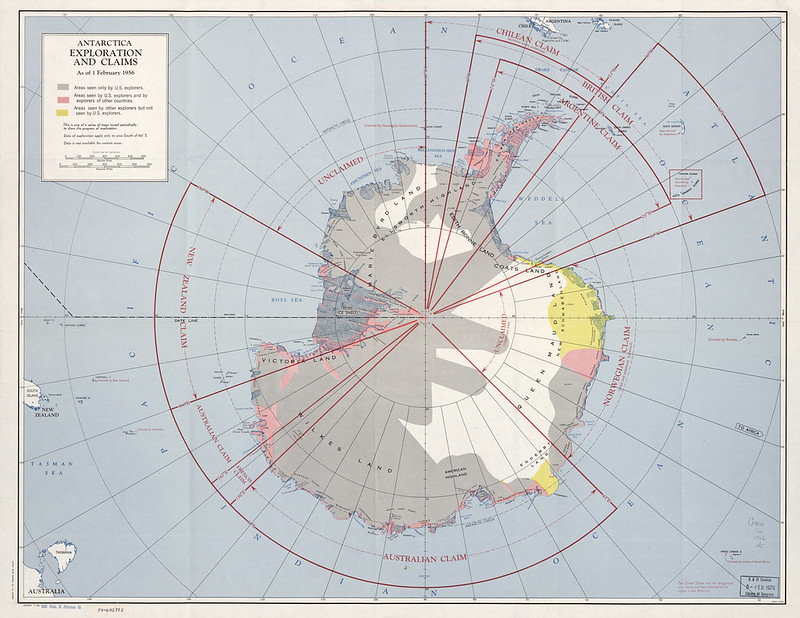
This 1956 map titled “Antarctica: Exploration and Claims” shows both the territorial claims made in Antarctica and the areas explored by different countries up to February 1, 1956.
The colored sectors radiating outward from the South Pole represent national claims by countries including United Kingdom, Argentina, Chile, Australia, New Zealand, France, and Norway.
Some of these claims overlapped, especially on the Antarctic Peninsula, creating diplomatic tensions.
The shading on the continent indicates which regions had been explored by Americans, by explorers from other countries, or by both.
Large parts of the interior were still poorly mapped in the 1950s, so exploration and scientific expeditions were important ways for nations to strengthen their territorial claims.
The map reflects the intense geopolitical interest in Antarctica during the early Cold War, when countries feared that control of the continent might eventually have military or resource value.
At the time this map was made, the United States and the Soviet Union had not officially recognized any Antarctic territorial claims.
Instead, both powers maintained the right to make claims in the future.
The growing competition for influence in Antarctica eventually led to the Antarctic Treaty, signed in 1959, which froze territorial disputes and reserved Antarctica for peaceful scientific research rather than military conflict.
Also see: Population of Antarctica Summer vs Winter
1957 China Rails Map
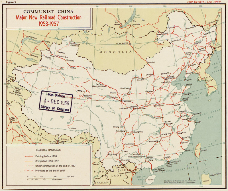
This map, titled “Communist China: Major New Railroad Construction, 1953–1957,” shows the rapid expansion of the rail network in China during the first years of communist rule under Mao Zedong.
The different line styles show railroads that already existed before 1953, lines completed between 1953 and 1957, railroads still under construction, and projected future routes.
The map reflects the goals of China’s First Five-Year Plan, which emphasized industrialization, state control, and national integration with strong Soviet assistance.
New rail lines linked major industrial and political centers such as Beijing, Shanghai, Wuhan, and Lanzhou, while also extending transportation into remote frontier regions like Xinjiang and Inner Mongolia.
Several strategic themes stand out:
- Strengthening political control over distant border regions
- Moving coal, steel, grain, and military supplies across the country
- Connecting China more closely to the Soviet Union through Mongolia and Manchuria
- Supporting industrial growth in inland China rather than relying only on coastal cities
The railroads also had major military importance during the early Cold War.
After the Korean War, American intelligence agencies closely monitored Chinese transportation infrastructure because railroads were essential for moving troops and supplies.
This is why maps like this were valuable to the CIA and other Western analysts trying to understand China’s growing industrial and military capabilities in the 1950s.
Also see: The Insane Growth of China’s High-Speed Rail Network Between 2008 & 2024
1957 Indonesia Map
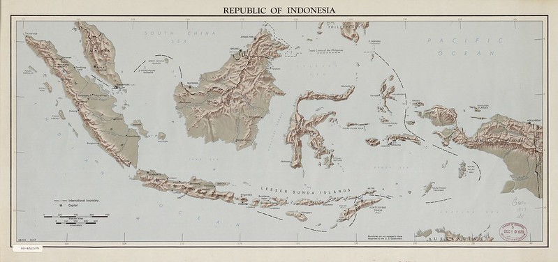
Also see: 1 In 50 People In The Whole World Live On This Island
1958 Chinas Offshore Islands Map
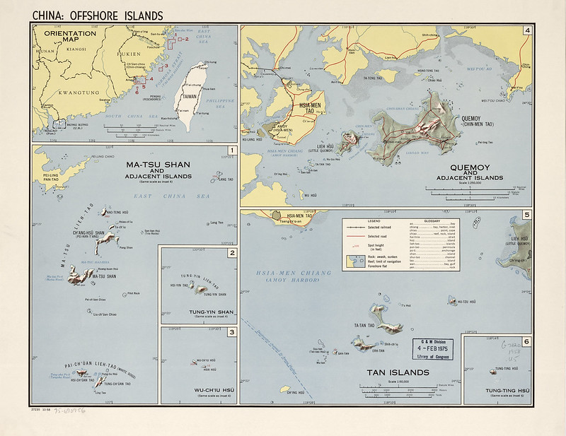
This 1958 map titled “China: Offshore Islands” focuses on small island groups controlled by the Republic of China (ROC) near the coast of mainland People’s Republic of China.
The United States and the CIA in 1958 officially recognized the Republic of China (ROC) government on Taiwan as the legal government of “China,” which is why the map labels reflect Nationalist Chinese terminology and perspectives.
The map highlights strategically important island groups such as:
- Quemoy (Kinmen / Chin-men Tao)
- Matsu (Ma-tsu Shan)
- nearby smaller island chains close to Fujian Province on the mainland
These islands were controlled by the ROC under Chiang Kai-shek after the Chinese Civil War, even though they lay only a few miles from the mainland controlled by the communists.
This map was created during the period of the Second Taiwan Strait Crisis.
In 1958, the PRC heavily bombarded Quemoy and Matsu with artillery in an attempt to pressure or weaken ROC control.
The crisis became extremely dangerous because the United States supported Taiwan militarily and considered defending the islands as part of its Cold War strategy against communism in Asia.
The detailed inset maps show beaches, roads, reefs, elevations, and airfields because these islands had major military importance. American intelligence analysts studied them closely to evaluate:
- possible invasion routes,
- artillery range and defensive positions,
- naval access,
- and the likelihood of escalation into a wider war.
The map also reflects the geopolitical ambiguity of the era.
In 1958, many Western governments still recognized the ROC in Taiwan as “China,” while the PRC controlled the mainland.
That situation continued until the 1970s, when most countries, including the United States in 1979, shifted diplomatic recognition to the PRC government in Beijing.
Also see: Map Of Taiwan’s Shiyu Islet Just 4km (2.5 miles) Offshore From Mainland China
1958 Iceland Map
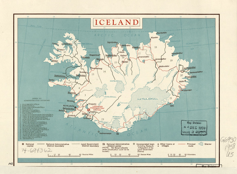
This 1958 map of Iceland is a general administrative and transportation map showing the country’s districts, towns, roads, glaciers, and major infrastructure during the Cold War era.
It identifies Iceland’s administrative divisions, principal travel routes, and settlements, with Reykjavík marked as the national capital. The map also highlights major natural features such as glaciers like Vatnajökull and Langjökull, emphasizing how much of Iceland’s interior remained sparsely populated and difficult to cross.
One especially notable feature is the marking of the Ljósafoss Hydroelectric Station near Reykjavík.
In the 1950s, hydroelectric power was strategically important because Iceland had very limited domestic fuel resources but abundant renewable energy from rivers and geothermal activity. The development of electrical infrastructure helped modernize Iceland’s economy after World War II.
Although this looks like a simple reference map, Iceland had enormous strategic importance during the Cold War.
Located between North America and Europe in the North Atlantic, Iceland became a critical NATO position for monitoring Soviet naval and air movements.
The U.S. military maintained major facilities at Keflavík, shown near Reykjavík, which served as an important base for anti-submarine patrols and transatlantic defense.
The map also reflects Iceland’s transportation reality in the 1950s.
Most settlements were located along the coast because the rugged volcanic interior and glaciers made inland travel difficult. The “Ring Road” system that later connected the island more fully was still incomplete, so coastal routes and ports remained essential for communication and trade.
Also see: Map Of Iceland The CIA No Longer Wants You To See
1959 Horn of Africa Map
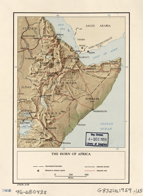
This 1959 map of the Horn of Africa captures a region that looked very different politically from today, just before the great wave of African decolonization transformed the map of the continent.
It shows the strategic crossroads between Africa, the Middle East, and the Indian Ocean during the late Cold War.
Several territories on the map no longer exist in the same form today:
- French Somaliland later became Djibouti in 1977. The city of Djibouti was already important as a port and rail link to Ethiopia.
- British Somaliland merged with former Italian Somaliland in 1960 to form modern Somalia. Today, Somaliland operates as a self-governing region but is not widely internationally recognized as independent.
- Somalia (Italy) refers to the former Italian-administered UN trust territory in southern Somalia before full independence in 1960.
- The Aden Protectorate (U.K.) around the port of Aden was under British control. It later became part of South Yemen and eventually modern Yemen. Aden itself was one of the world’s most important refueling and shipping ports because of its location near the entrance to the Red Sea and the Suez Canal route.
- Ethiopia appears much larger because it controlled Eritrea at the time. Eritrea would not become independent until 1993 after a long war.
The map also highlights transportation networks, roads, railroads, and ports, which were strategically important. During the Cold War, the Horn of Africa became increasingly significant because it overlooked vital sea routes connecting Europe, the Middle East, and Asia.
Both the United States and the Soviet Union later competed for influence in the region through military aid, naval access, and alliances.
This map captures the Horn of Africa at a transitional moment: colonial rule was weakening, nationalist movements were rising, and the political borders of modern East Africa were about to change dramatically in the 1960s.
Also see: Map Of Somalia The CIA No Longer Wants You To See
More Declassified CIA Maps
- 22 Declassified CIA Cartography Maps From The 1940s
- 16 Declassified CIA Cartography Maps From The 1960s
- 19 Declassified CIA Cartography Maps From The 1970s
- 12 Declassified CIA Cartography Maps From The 1980s
- 16 Declassified CIA Cartography Maps From The 1990s
- 16 Declassified CIA Cartography Maps From The 2000s
- 15 Declassified CIA Cartography Maps From The 2010s


Leave a Reply