
The text states:
Making Sense Of The World, One Map At A Time
The text states:

The map above shows how much houses cost in 1950 in each US state in 2024 inflation adjusted US dollars, compared to what the average cost actually is in 2024.
In every single US state the increase was at at least double the rate of inflation from a low in Ohio of just 107% above inflation to a high in Alaska of 675% above inflation.
The following map shows the percentage increase above inflation:

The map above comes from Ookla® Speedtest Intelligence® and shows where in the world you can 5G mobile phone coverage and when the infrastructure was first built.
The really big standout is India which seems to have blanked the country in 5G coverage within just the last 2 years.

The Heartbrand logo, recognized for its distinctive heart shape, represents the majority of Unilever’s ice cream business.
As the world’s largest ice cream manufacturer, Unilever has consolidated most of its offerings under this global brand umbrella.
In the US it is sold under the Good Humor brand, here are the various names in Europe:

And it pokes some fun at some stereotypes of various regions of the Netherlands.
It’s in a very similar comedic vein as the 20 Ways To Divide Europe By Stereotype.

It’s well know that continent is ageing, but in at least a few Millennials remain the largest group, although many of us are no longer consider ourselves “young”. More surprisingly none have Gen-Z as the largest group.
The data comes from the European Commission.
List of countries in each group:
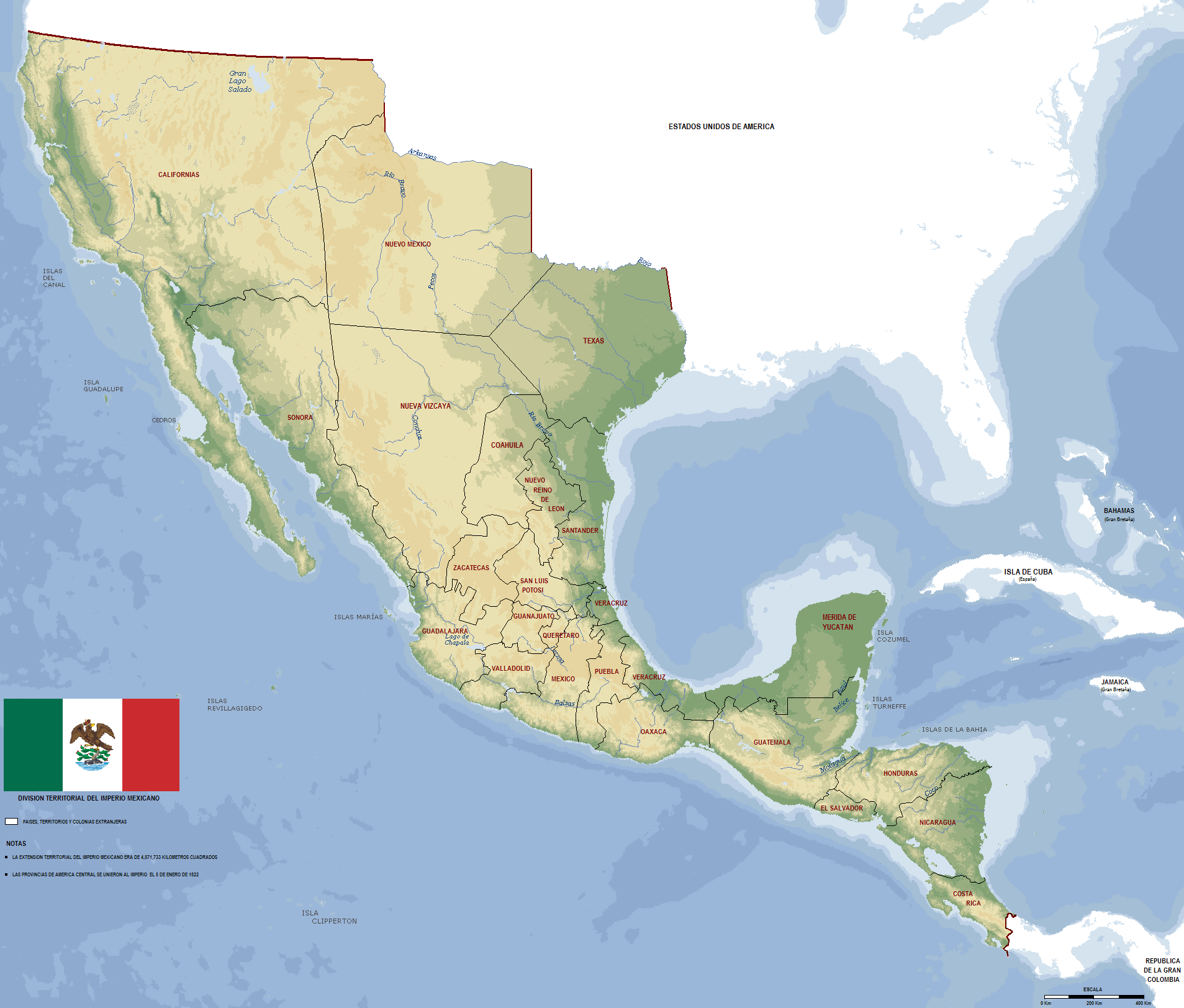
The map above shows the short lived First Mexican Empire [Imperio Mexicano (Spanish) / Imperium Mexicanum (Latin)] at its greatest extent between 1821 and 1823.
Not only did it include modern day Mexico, but also the area now occupied by some or all of California, Texas, Nevada, Utah, Arizona, New Mexico, Colorado, Wyoming, Oklahoma and Kansas.
And the following Central American countries: Guatemala, El Salvador, Honduras, Nicaragua and Costa Rica.
Here’s a breif history of the First Mexican Empire (1821–1823):

The 4 maps here were all created by Alexis Huet and shows that the Moon, Venus, Mars & Mercury might look if they if they were 70% water like the Earth.
Above you can see Venus:

The map above shows the percentage of single mother run households with children there are in each state. It ranges from a low of 9% in Utah to a high of 24% in Mississippi and 29% in Washington DC.
The data comes from the 2022 American Community Survey 5-year estimates from US Census Bureau.
Here is the full data by state:

The map above shows which countries have more or less people than Uttar Pradesh, India’s most populous state with an estimated population of 235 million in 2023.
Currently, only 5 other countries have a great population they are: