Brilliant Maps

Making Sense Of The World, One Map At A Time

  • BOOK!
  • Newsletter
  • Tourist Maps
  • Quizzes
  • Polls
  • Tools

Map Of Trump’s Peace Plan For Israel & Palestine aka Peace to Prosperity: A Vision to Improve the Lives of the Palestinian and Israeli People

Last Updated: January 9, 2025 Leave a Comment

Click To Get My 10 Best Brilliant Maps For Free:

Map Of Trump's Peace Plan For Israel & Palestine aka Peace to Prosperity: A Vision to Improve the Lives of the Palestinian and Israeli People

The map above shows what Trump’s failed peace plan for Israel & Palestine called the Peace to Prosperity: A Vision to Improve the Lives of the Palestinian and Israeli People would have looked like.

From the map:
[Read more…]

Filed Under: Middle East

The “Natural” Borders Of France

Last Updated: January 9, 2025 Leave a Comment

Click To Get My 10 Best Brilliant Maps For Free:

The

Map found on reddit
The map above shows one interpretation of the “natural” borders of France. Here’s a bit more about the concept and where they should be:

[Read more…]

Filed Under: France

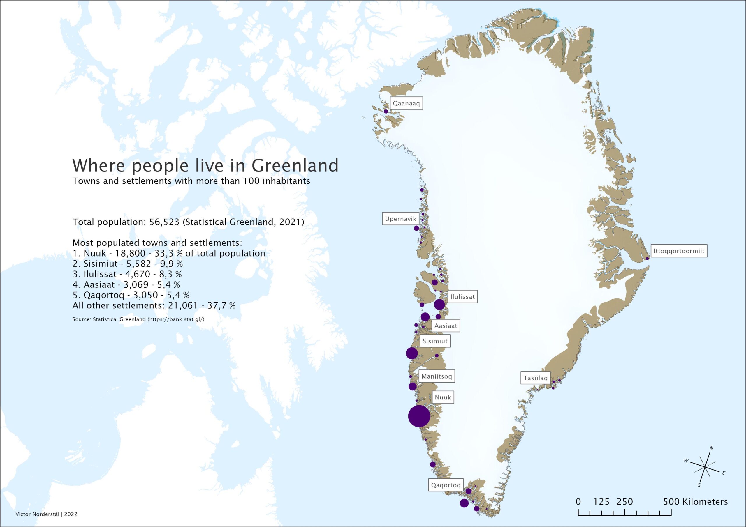
Where People Live in Greenland: Towns & Settlements With More Than 100 Inhabitants

Last Updated: January 15, 2026 3 Comments

Click To Get My 10 Best Brilliant Maps For Free:

where people live greenland scaled

Map created by Victor Norderstål
The map above shows where Greenland’s 56,523 people live.

Here’s what you need to know:

[Read more…]

Filed Under: Other

War Plan Red: A 1930s Plan For a US Invasion of Canada & War With The British Empire

Last Updated: January 9, 2025 3 Comments

Click To Get My 10 Best Brilliant Maps For Free:

War Plan Red

Map created by OwenBlacker
The map above shows the US War Plan Red:

[Read more…]

Filed Under: World Maps

Map of Canada’s “Defense Scheme No. 1” From The 1920s & 30s

Last Updated: January 9, 2025 Leave a Comment

Click To Get My 10 Best Brilliant Maps For Free:

Map of Canada’s

Map found on reddit
The map above show’s the plans for Canada’s “Defense Scheme No. 1” based on a hypothetical surprise invasion of the US in the 1920s and 30s.

The plan was to buy time to secure defenses before the US could strike back.

Ultimately the plan assumed that help from the United Kingdom and the rest of the Empire would come.

From the map:

[Read more…]

Filed Under: Canada

Income & Inequality in the Nordic Countries

Last Updated: January 8, 2025 Leave a Comment

Click To Get My 10 Best Brilliant Maps For Free:

Income & Inequality in the Nordic Countries

Map created by Linda Randall and Gustaf Norlén at Nordregio

The map above provides a detailed geographic overview of income inequality across the Nordic Region, illustrating differences in both income levels and distribution patterns.

Some regional variations, such as border effects, are attributed to incomplete income data from neighboring countries.

[Read more…]

Filed Under: Europe

The Blue & Red Areas Have The Same Number of Murders Each Year

Last Updated: January 8, 2025 Leave a Comment

Click To Get My 10 Best Brilliant Maps For Free:

The Blue And Red Areas Have The Same Number of Murders Each Year

Map created by reddit user bezzleford
The map above shows a rather shocking fact.

The countries in red: South Africa, Lesotho and Eswatini (formerly Swaziland) have the same number of murders (22,071) each year than all the areas in blue (22,069).

This includes all of Europe, Canada, Australia, Japan, South Korea, Indonesia, Vietnam, Saudi Arabia as well as several Western and Midwest US Sates and a few other places to get the totals to match.

However, there’s something even more more shocking.

[Read more…]

Filed Under: World Maps

Railway Lines In the United States On The Eve Of The Civil War

Last Updated: January 8, 2025 Leave a Comment

Click To Get My 10 Best Brilliant Maps For Free:

Railway Lines In the United States On The Eve Of The Civil War

Map found on reddit
This map shows the United States’ railway network and urban population distribution around 1860, just before the Civil War.

Here are the key observations:

[Read more…]

Filed Under: United States

14 Maps Showing Population Concentrations In Various Countries

Last Updated: September 24, 2026 1 Comment

Click To Get My 10 Best Brilliant Maps For Free:

The maps below show how skewed population concentrations are in various countries around the world from Egypt to China to Canada and the United States (at the bottom).

But before continuing I’m not exactly sure who created the original maps, so if you know please leave a comment and let me know so I can give proper credit.

Also the population figures are slightly too low for most countries so I suspect the maps are a few years old.

1. Egypt

Population Concertation of Egypt

  • Orange Area: 104 million people
  • Green Area: 1.7 million people

[Read more…]

Filed Under: Other

Europe According To Ireland

Last Updated: January 7, 2025 Leave a Comment

Click To Get My 10 Best Brilliant Maps For Free:

Europe According To Ireland

Map created by @atlasmapper

The map above is a humour look at how the Irish view the rest of Europe.

Basically everyone a Great bunch of lads except one group in particular for some unknown reason….

Oh and they are fond of the aul wine, beer and vodka.

What do you think?

Filed Under: Europe

  • « Previous Page
  • 1
  • …
  • 63
  • 64
  • 65
  • 66
  • 67
  • …
  • 161
  • Next Page »


Product Reviews · World Atlas · Map Posters · Settlers of Catan · Risk · Game of Thrones · Coloring Books · Globes · Monopoly · Star Wars · Game of Life · Pandemic · Ticket To Ride · Drinks Cabinets
Size Comparisons · US Locations · Flight Maps · Fleet Management
Copyright © 2026 · Privacy Policy · Fair Use, Attribution & Copyright · Contact Us
Follow Us: Newsletter · Facebook · Youtube · Twitter · Threads · BlueSky · LinkedIn · Instagram · Pinterest · Flipboard