
The map above shows the 3,209 bars which primarily serve alcohol in mainland France. This compares to 34,669 “mixed establishments”, such as restaurants, night clubs, etc. which also sell alcohol across France.
Making Sense Of The World, One Map At A Time
The map above shows the 3,209 bars which primarily serve alcohol in mainland France. This compares to 34,669 “mixed establishments”, such as restaurants, night clubs, etc. which also sell alcohol across France.

9/11 was by far the worst terrorist attack in American history with 2,977 victims (excluding the 19 perpetrators). While the attacks were aimed at the United States, 372 foreign nationals from 61 countries were also victims.
Here’s a list of casualties by country based on data from Wikipedia:
Please note this map was made in 2014:
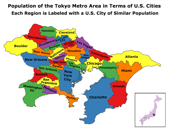
According to the UN, Tokyo is the world’s most populous metropolitan area with an estimated 37.8 million people in 2014 (38,140,000 in 2026).
The next closest is the Seoul National Capital Area with a population of 25.6 million people or over 10 million fewer than Tokyo!
So how does this compare to US cities?

While it doesn’t look it, Africa is big, really big. In fact, Africa’s true size is 30 million square km, just under twice the size of Russia or bigger than Canada, the United States and China put together!


The map above is interesting not because it looks beautiful, which it does, but because of where and when it was published.

The map above shows how bad winters are around the United States using the The Accumulated Winter Season Severity Index. The circles on the map represent the weather stations used to collect the data.

Why are there there so many immigrants in France & the UK, so many Irish in Portugal and Portuguese in Luxembourg, so many dashcams in Russia and so many cats everywhere?
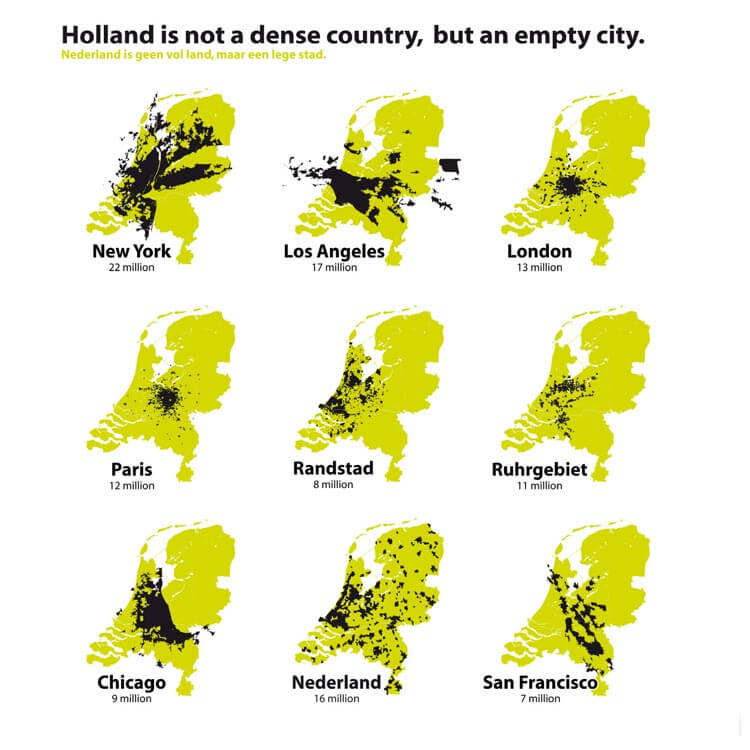
The Netherlands (aka Holland) is the 30th most densely populated country or territory in the world and the densest country in Europe with a over 10 million people. So it’s understandable that the Dutch might think that their country is a little bit crowded.
However, the map above flips this idea on its head.

The map above is possibly one of the least useful (and also vaguely racist) ethnic maps ever created. Titled “Present Distribution of Europeans, Chinese, Japanese and Negroes,” it was published in William R. Shepherd’s 1911 Historical Atlas.