
The map above shows how long it takes to drive to the centerline of the total solar eclipse that will occur on August 21, 2017. This of course assumes normal driving conditions on the day.
Making Sense Of The World, One Map At A Time
The map above shows how long it takes to drive to the centerline of the total solar eclipse that will occur on August 21, 2017. This of course assumes normal driving conditions on the day.
The map above shows every bomb dropped by the British and Americans during World War 2, along with a limited amount of bombs dropped by the Australians, South Africans, and New Zealanders.
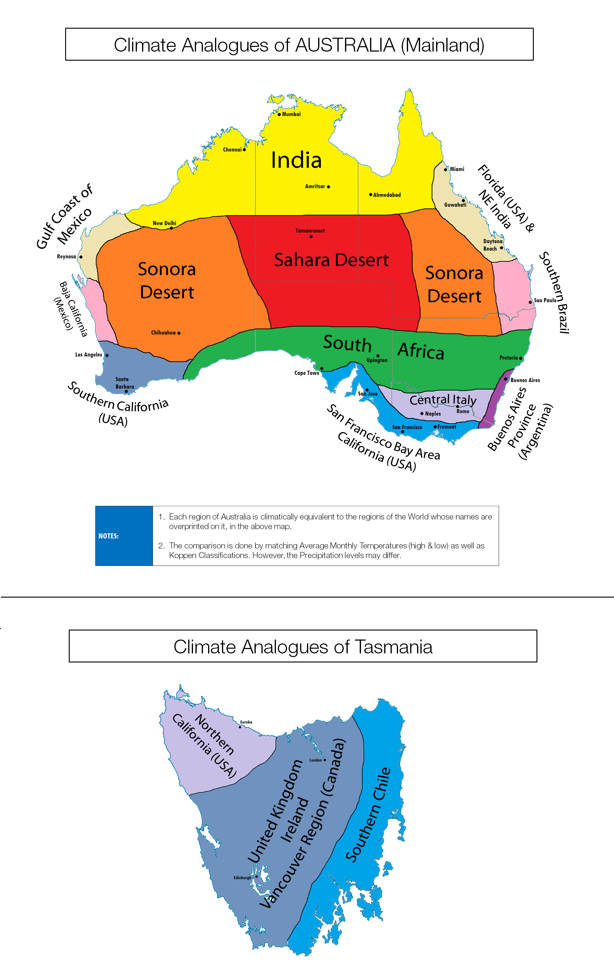
You probably already know Australia is a relatively hot country, but the map above shows how the clinate of its various regions compares to other places on earth (including cities).

The map above shows what Asia would look like if population density corresponded to physical elevation.
Perhaps one of the most interesting things to note, is that the Himalayas are still there, they’ve just moved south a little bit, as these regions of Indian and Bangladesh have extremely high population densities.
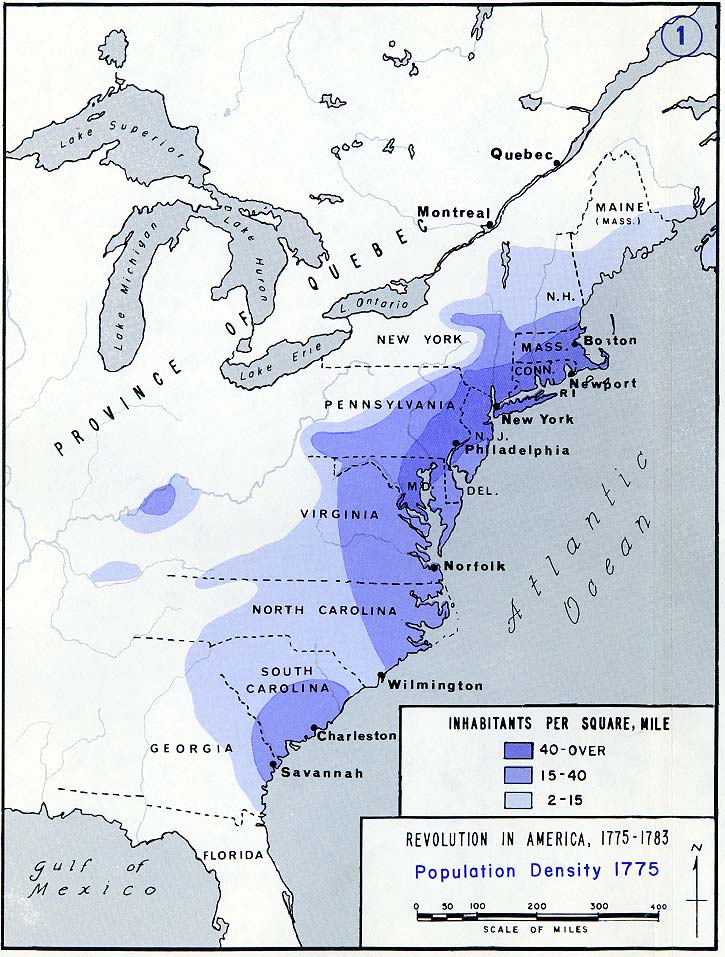
The map above shows the population density of the original thirteen American colonies, the year before they declared independence. Even back then, what would become the Boston–Washington Corridor was clearly evident.

This is largely due to the long lasting effects of The Holocaust, when over six million European Jews were systematically murdered by Hitler and the Nazis.
Emigration to both Israel and the United States after World War 2 and again after the collapse of Communism in Eastern Europe in 1989, also contributed somewhat to the decline.
However, not all countries saw their Jewish population decrease.
The map above shows which countries Americans consider their allies and friends and those they consider unfriendly or even their enemy.
The data is based off a YouGov poll conducted between January 28 – February 1, 2017, which asked 7,150 adults living in the United States the question:
“Do you consider the countries listed below to be a friend or an enemy of the United States?”

Note you can see the 2025 version here.
