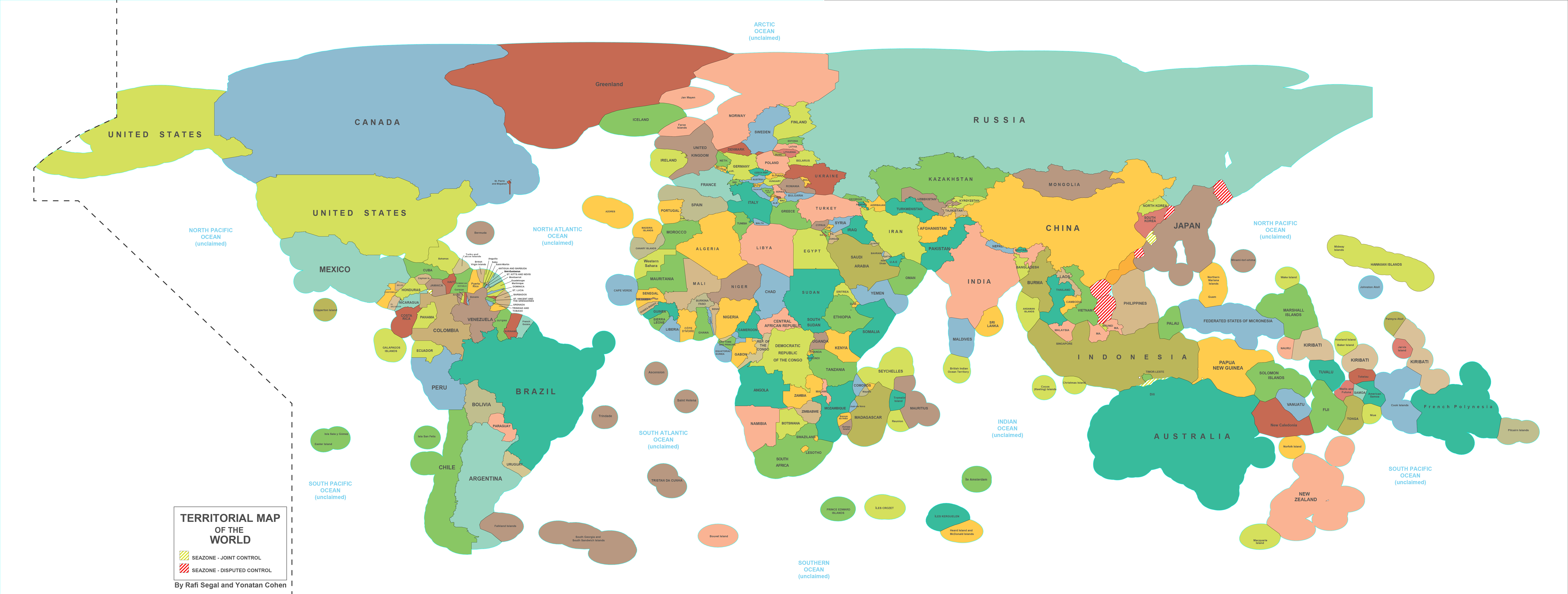
The map above is a more accurate reflection of the economic territory of each of the world’s countries. It includes not only land and territorial waters but also Exclusive Economic Zones (EEZ), which extend up to 200 nautical miles (370 kilometres) off a country’s coast.
All Countries That Have Ongoing Territorial Disputes With Others
The map map above shows all countries (in red) that have territorial disputes with at least one other country. Those in white have no ongoing territorial disputes. The data used for the map came from Wikipedia’s List of territorial disputes.
A few of the more interesting disputes include:
European & North American Cities Transposed Onto The Opposite Continent At The Same Latitude


As with our previous look at the Counterintuitive Comparison Of Relative Population Latitudes Of US, Canada & Europe, there are quite a few interesting things to note.
The European Diaspora: European Ancestry Worldwide
The map above shows the percentage of each country’s population that has some claim to European ancestry. Taken together, it could be argued that Europeans are the world’s largest diaspora, with an estimated population of over 480 million people.
However, just what constitutes European ancestry is highly controversial.
Foreign Travel Advice of the British Foreign and Commonwealth Office
The map above shows areas where The UK Foreign and Commonwealth Office (FCO) is advising people against all travel (red), against all but essential travel (yellow) or to see travel advice before travelling (green).
Like most foreign travel advisories, there are the expected and unexpected.
Where Woolly Mammoths Used To Roam – Range At Their Peak
The map above shows the range of Woolly Mammoths at their peak in the Late Pleistocene era which ended roughly 11,700 years ago.
The map is a Dymaxion projection with the blue regions showing where they roamed (note light blue regions were land during this period).
You can see a more standard map projection below:
Just The World’s Time Zones
The map above shows the world’s time zones, nothing more, nothing less. It was created by Branden Rishel over at Cartographers without borders, another really awesome map site.
Decimal Point vs Decimal Comma vs Other Decimal Separators
Bitcoin Map Shows Use Largely Limited To Europe & North America
The Bitcoin heat map above shows the locations of 6,683 business where you can use bitcoins to pay. As you can clearly see, businesses are almost exclusively located in Western Europe and the Eastern United States.
The Astounding Drop in Global Fertility Rates Between 1970 And 2014
The map above shows one of history’s most astounding global shifts; the drop in fertility rate between 1970 and 2014. The total fertility rate (TFR) is the average number of children born to each woman in a country. It’s important because, it’s an easy way to tell if a country is growing or not, excluding immigration/emigration.
- « Previous Page
- 1
- …
- 32
- 33
- 34
- 35
- 36
- …
- 38
- Next Page »