
The map above shows 74 countries and territories that have a ban on corporal punishment for children.
The map below shows countries by where they are in terms of banning corporal punishment for children and was created by End Corporal Punishment.
Making Sense Of The World, One Map At A Time
The map above shows 74 countries and territories that have a ban on corporal punishment for children.
The map below shows countries by where they are in terms of banning corporal punishment for children and was created by End Corporal Punishment.
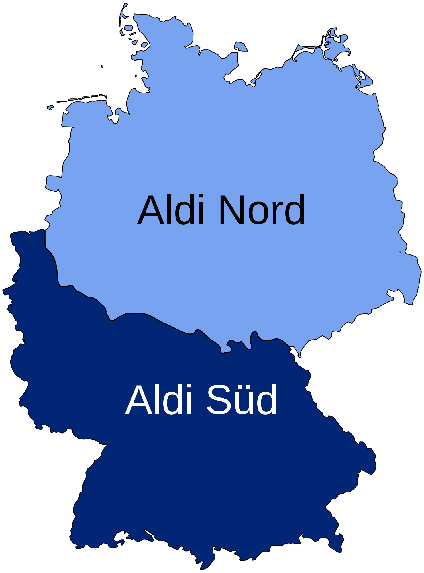
And in case you were wondering, this is not some sort of regional division. The two companies are legally separate entities that both use the Aldi name.
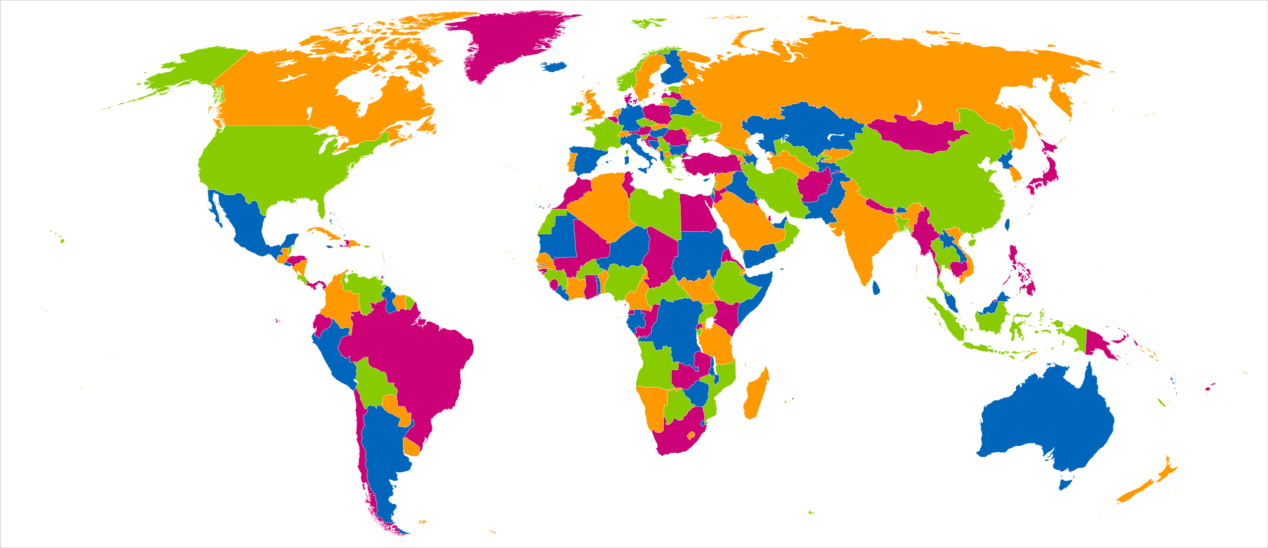
The map shows the four colour theorem in practice.
The theorm states that:
The map above shows when women got the right to vote in each country around the world.
2018 marks the centenary of Women’s suffrage in the UK and even then only with several restrictions (had to be over the age of 30 and meet property qualifications).
Women in the UK would not get get to vote on equal terms as men until the passage of the Representation of the People (Equal Franchise) Act 1928.
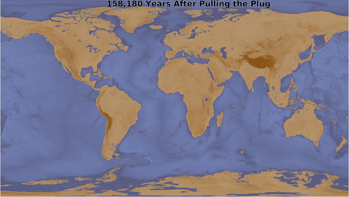
The map above shows what the earth would look like 158,180 years after someone pulled a 10m plug in the Mariana Trench allowing all the water to drain away.
It was inspired by a map that appeared in What If? by Randall Munroe. And also posted here:

You can watch the full animation below:
The deceptively simple map above shows which countries qualified for the 2010, 2014 and 2018 FIFA World Cups respectively.
The genius lies in the use of colour, which allows you to very quickly and easily see which countries qualified and in what year(s).
The map above shows just about every country that has been invaded by France one way or another.
The various ways include:
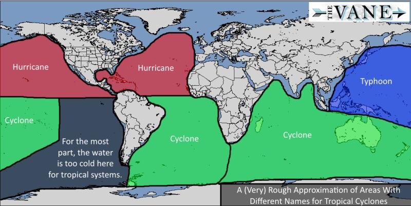
Did you know that hurricanes, typhoons, and tropical cyclones are basically just different names for the same weather event.
The map above shows where each name is used around the world.
One of our most popular maps is Pangaea With Current International Borders.
However, while it’s without a doubt an amazing map, many users have commented that they wished that you could see the whole world.
Fortunately, Massimo Pietrobon via Tomas Slavkovsky from Melown, has done just that, creating a fully interactive Pangaea map with modern international borders that allows you to explore the whole earth.
You can have a play around with it below:

The map above shows which word appears most often on each country’s English language Wikipedia page. For example, on the Wikipedia page about Canada, the word ‘Quebec’ appears more often than any other.