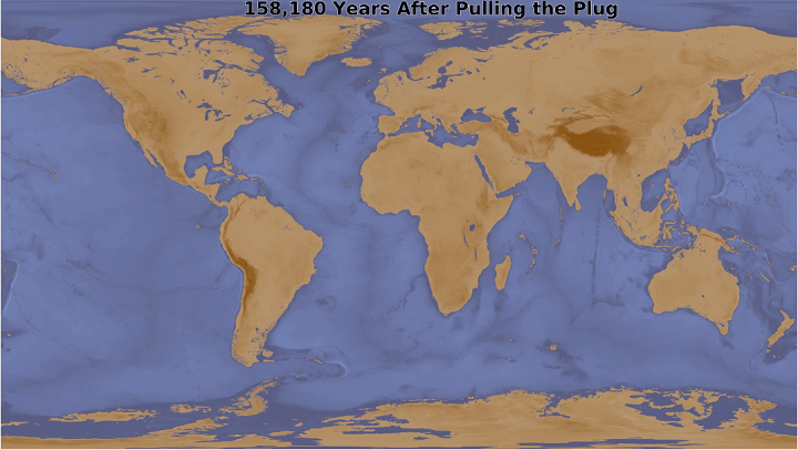
The map above shows what the earth would look like 158,180 years after someone pulled a 10m plug in the Mariana Trench allowing all the water to drain away.
It was inspired by a map that appeared in What If? by Randall Munroe. And also posted here:

You can watch the full animation below:
In case you don’t know the, The Mariana Trench is the deepest part of the world’s oceans. It’s located in the western Pacific Ocean, an average of 200 kilometres (124 mi) to the east of the Mariana Islands, in the Western Pacific East of Philippines.
It’s about 2,550 km (1,580 mi) long and 69 km (43 mi) wide on average. It reaches a maximum-known depth of 10,994 metres (36,070 ft) at a small slot-shaped valley in its floor known as the Challenger Deep.
For comparison: if Mount Everest were dropped into the trench at this point, its peak would still be over 1.6 kilometres (1 mi) underwater.
In 2009, Mariana Trench was established as a United States National Monument.
Reddit user Vinnytsia, who made the animation above explains:
A few years ago I bought the book What If? by Randall Munroe of XKCD fame, which included a map showing what would be left of the world’s oceans if you pulled a 10m plug in the Marianas Trench. He did a post about it online here as well. I decided to build a model (likely similar to what he built, given the similarity of the final result) that would allow me to animate it.
I used the ETOPO1 Global Relief Model, which has a pixel size of about 1.8km across. It’s the equivalent of a 233MP photograph in size and includes of the earth’s elevation and bathymetry (i.e. ocean elevation). I also used the Natural Earth Oceans and Lakes + Reservoirs data sets from here. Much of this data was combined or converted between vector and raster using various GDAL tools, whose scripts you can see here.
Most of the processing was done using GeoTrellis in Scala. Full source is here. The key was a scanline flood fill algorithm (a fancy term for the paint bucket tool you might have used in MS Paint) that was adapted from Lode Vandevenne‘s work, which was modified to support wrapping at the edges so that it could be used on a globe. It’s here in the source.
The math for calculating the time is based on a simplified version of the Bernoulli incompressible flow equation. Basically, the volume of the water that drained divided by the flow rate calculated from this equation. It can be seen here. It slows down near the end because each frame represents a 10m drop in the ocean, which takes less time as the volume of accessible water decreases.
Also, for those asking:
- It’s going to Mars
- Other oceans aren’t necessarily deeper than the Pacific, they just get landlocked and stop draining
- Many lakes will likely stick around since they are fed from rivers and direct rainfall
- Other oceans aren’t necessarily deeper than the Pacific, they just get landlocked and stop draining
- Many lakes will likely stick around since they are fed from rivers and direct rainfall
- The continents drift, but not that much, over this time span
- The plug is 10m in diameter (that’s metres, for the Americans)
- No, there’s not actually a plug
Like the map above? Then have a look at the following books:
More XKCD maps:
- The World According to Americans (Who Really Know Their Geography)
- How To “Improve” The Map of The United States By Cleaning Up Some State Borders
- How To Date An Undated World Map
- 8 Really Bad Map Projections From XKCD
- Map Projections & What They Say About You
- Now Time Map
- XKCD Explains The Cause Of Landscape Features Of The United States
You can buy Randall Munroe’s books here:
- What If?
- What If? 2
- How To: Absurd Scientific Advice for Common Real-World Problems
- Thing Explainer: Complicated Stuff in Simple Words
- xkcd: volume 0
Enjoy our post? Please help us by sharing it:


Oliver Schofield says
The Mediterranean would have emptied at the beginning of the 10m hole in the Mariana Trench Due to my below calculations. Others too.
Net freshwater loss (order of magnitude): studies put Mediterranean evaporation around ~0.93–1.18 m/yr, and the excess of evaporation over precipitation is substantial. Modern mass-balance estimates also imply a net atmospheric freshwater loss (evaporation minus precipitation) that today is compensated by inflow through Gibraltar..
American Meteorological Society Journals
os.copernicus.org
If you assume a net drop of ~0.5 m/year averaged over the basin (a common ballpark once you account for rain + rivers partly offsetting evaporation):
Annual volume loss ≈ area × drop
= (2.5×10⁶ km²) × (0.0005 km/yr)
≈ 1,250 km³/yr
Time to lose 3.75×10⁶ km³:
3.75×10⁶ / 1,250 ≈ 3,000 years
If the net drop were closer to 1.0 m/year, you’re more like ~1,500 years.