A World Map Centered on Argentina
Ever wondered, what would a world map look like if it were centered on Argentina? Well wonder no more. Just have a look at the map above. Of course everything else is incredibly distorted because of the Mercator projection used.
What do you think? Leave your comments below:
How The World Might Look In 250 Million Years With Current International Borders
The map is a fun look at what the world might look like in 250 million years time assuming no international borders change between now and then.
Where You Can & Can’t Flush Toilet Paper Around The World

The map above shows where in the world you can and can’t flush your toilet paper in a toilet. The data comes from Where do I put the paper? which describes itself as A handy guide to the world’s toilets.
World Toilet Paper Map Showing Spending On Tissue & Hygiene

The map above shows the estimated incremental value growth in the tissue and hygiene industry between 2013 and 2018. This includes toilet paper,
Sanitary Protection, nappies/diapers/pants and incontinence products.
The Roman Empire vs. The Mongol Empire At Their Respective Peaks
The Countries In Red Have As Many Murders Combined As The US
The map above shows a rather surprising fact, the US (population: 327 million) has roughly the same number of murders as all the countries in red combined (total population: over 2.3 billion): 17,250 vs 17,324.
The Known World According To Herodotus In The 5th Century BC
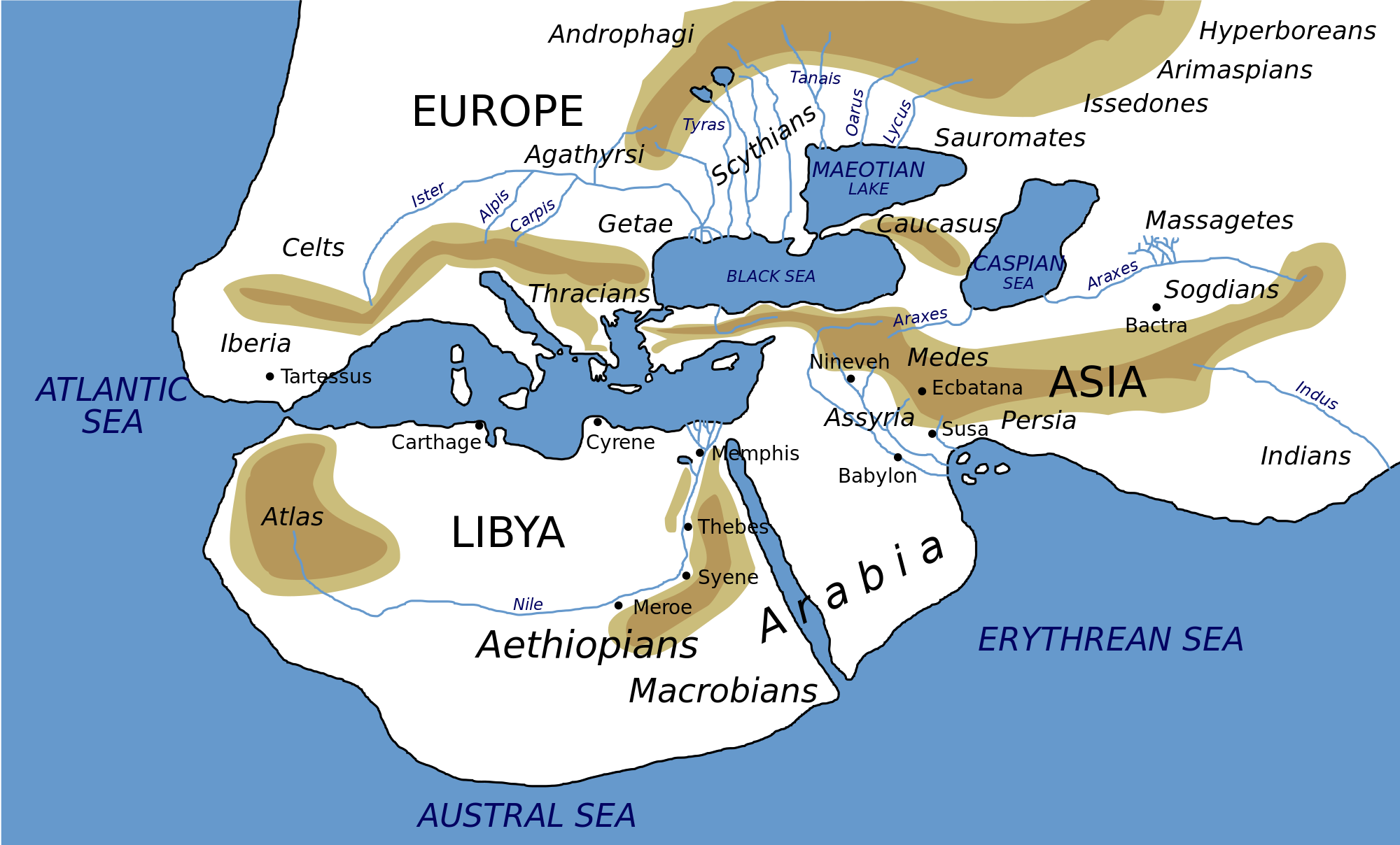
The map above is a modern depiction of ancient Greek historian Herodotus’ view of the Ecumene (or oecumene), literally the the known or the inhabited world, in the 5th Century BC.
And while obviously far from fully accurate it clearly shows Europe, Africa and Asia.
Building The World Country By Country In Order of Population Density [Lowest to Highest]
The map above shows the world being build one country at time starting with Greenland (0.03 people per square KM) all the way to up to Bangladesh (1,251 people per square KM). And while, it’s really neat it’s not 100% complete.
Global Warming at Different Latitudes By Year Vs 1961-90 Average
The map above shows the range of global temperatures at different latitudes in 11 year windows starting in 1948-1958 ending in 2008-2018.
Anything to the left of the black line is cooler than the 1961-1990 average at that latitude and anything to the right is warmer.
- « Previous Page
- 1
- …
- 26
- 27
- 28
- 29
- 30
- …
- 38
- Next Page »