
Given how popular the Probability of a White Christmas Across Europe map turned out to be, we were happy to find that the National Oceanic and Atmospheric Administration has created a similar map for the United States.
Making Sense Of The World, One Map At A Time
Given how popular the Probability of a White Christmas Across Europe map turned out to be, we were happy to find that the National Oceanic and Atmospheric Administration has created a similar map for the United States.
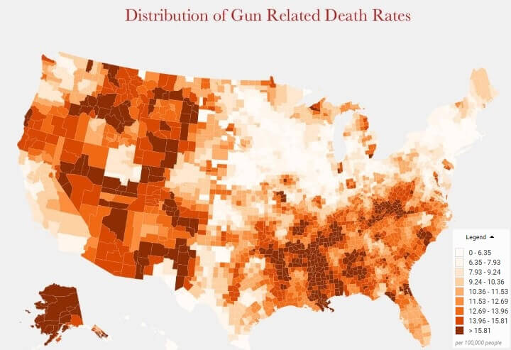
According to the Centers for Disease Control and Prevention a total of 33,169 people were killed by guns in the US in 2013. However, the rates at which people were killed by guns varied widely between states and regions.

The map above shows which states require front and rear license plates vs those that only require rear license plates across the US. Overall, the majority of US states (62.75%) and a majority of people (62.73%) live in states that require both.
And in case you’re wondering about the two exceptions they are:
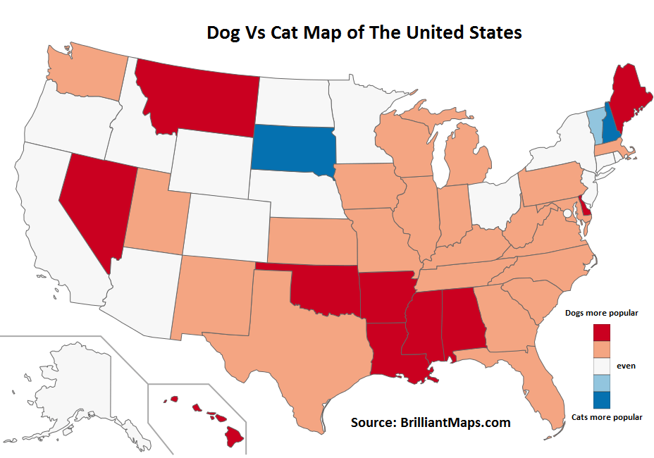
It’s official (well at least if Google can be trusted) the US prefers dogs over cats. We arrived at this conclusion simply by comparing monthly Google searches for the term ‘dog’ compared to ‘cat.’
However, the map above does not tell the whole story.

9/11 was by far the worst terrorist attack in American history with 2,977 victims (excluding the 19 perpetrators). While the attacks were aimed at the United States, 372 foreign nationals from 61 countries were also victims.
Here’s a list of casualties by country based on data from Wikipedia:

The map above shows how bad winters are around the United States using the The Accumulated Winter Season Severity Index. The circles on the map represent the weather stations used to collect the data.

The map above shows a potential 9,125 mile (14,685 km) road trip around the United States that would maintain a constant 70°F (21°C) normal daytime high temperature outside.
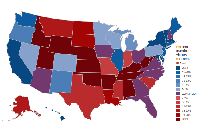
The map above shows what the 2016 presidential election results could look like based on the increase in the number of Hispanic and Asian voters who will be voting for the first time 2016.
The interactive version allows you to make some assumptions and see what the results would be. Some interesting findings include:
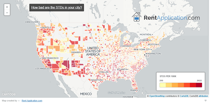
The STD map of America above shows which areas of the country are not practising safe sex.
Perhaps somewhat stereotypically, 7 of the top 10 cities are located in the South with 3 of them containing military bases (Norfolk Naval Base, Ft. Hood and Ft. Bragg).
Want to explore what STD rates are like in your part of the country? Then have a look at the interactive version of the map below.

Inspired by Ben Blatt’s What are the biggest immigrant groups in your state?, Giorgio Cavaggion created two flag maps of the most common country of origin of new legal immigrants to the United States.