
Here is a list of mythical creature by state:
Making Sense Of The World, One Map At A Time
Here is a list of mythical creature by state:
The map above shows the world being build one country at time starting with Greenland (0.03 people per square KM) all the way to up to Bangladesh (1,251 people per square KM). And while, it’s really neat it’s not 100% complete.
The map above shows the percentage of voters in each state who voted in the 2016 presidential election but didn’t vote for either Hillary or Trump.
The map above shows the range of global temperatures at different latitudes in 11 year windows starting in 1948-1958 ending in 2008-2018.
Anything to the left of the black line is cooler than the 1961-1990 average at that latitude and anything to the right is warmer.

The illustration above shows just how big the British Empire was at its territorial peak in the early 1920s. At that time it covered 35.5 million sq km (13.71 million sq mi), which represents 23.84% of the Earth’s land area or equivalent to 93.67% of the Moon’s surface area (37.9 million sq km).
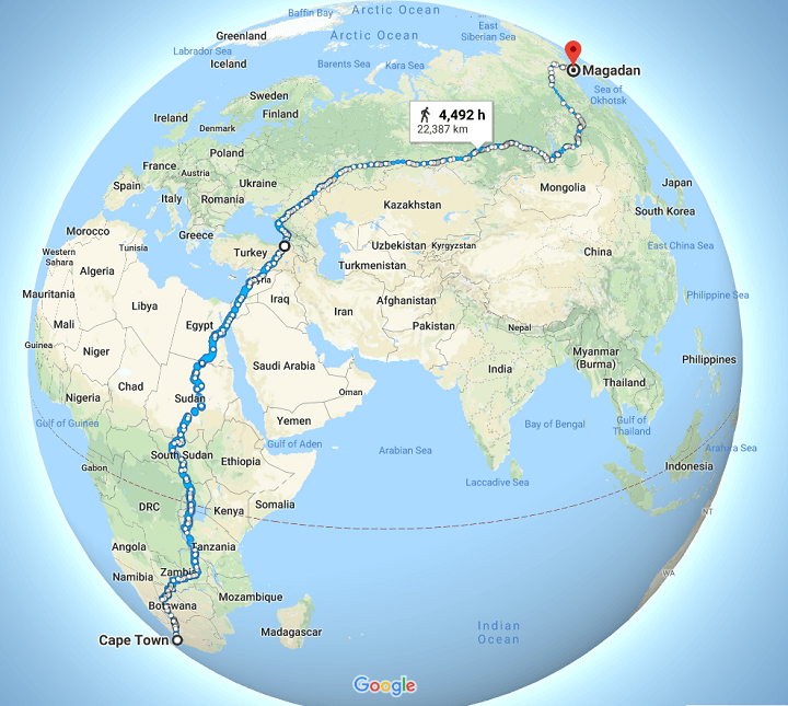
The map above potentially shows one of the world’s longest uninterrupted walks from Cape Town, South Africa to Magadan, Russia a distance of 22,387km (13,910 miles).

The maps are all the work of climate data scientist @neilrkaye.
You can see an animation below:

The map above shows the largest self-reported national identity group by share of population for each local authority area of the United Kingdom in the 2011 Census.
