The map above clearly shows when Egypt has and hasn’t been ruled by Egyptians. Overall, it’s been ruled by Egyptians for 2,194 years (42.8% of the time) and non-Egyptians for 2,930 years (57.2%) of the time.
Making Sense Of The World, One Map At A Time
The map above clearly shows when Egypt has and hasn’t been ruled by Egyptians. Overall, it’s been ruled by Egyptians for 2,194 years (42.8% of the time) and non-Egyptians for 2,930 years (57.2%) of the time.

The map above shows a rather stunning fact, 95% of the plastic found in the ocean comes from just 10 rivers. The data comes from a 2017 research paper titled: Export of Plastic Debris by Rivers into the Sea.

The 7 maps here show how people in the UK and Ireland refer to their mothers. From Mum to Mom and everything in between. Full credit to Star Key comics for creating all of them.
The video above is the first in the Jay Foreman and Mark Cooper-Jones Map Men series. The area they discuss is Bir Tawil. See a map below:

The video titled “Bir Tawil – the land that nobody wants” discusses the unique situation of Bir Tawil, a piece of land between Egypt and Sudan that is unusual because neither country claims it. Here’s a summary of the video:
The video provides an interesting insight into the complexities of territorial disputes and the unusual circumstances that can arise from colonial-era border decisions.
You can visit the Map Men Merch store here.
The map above is the companion to England’s North/South Divide Based Only On Population, expect this time splitting the England and Wales East/West rather than North/South based on 2021 census numbers on official county borders.
The map above show’s England’s North South divide based solely on where 50% of the population live based on the 2021 census using official county border.
The blue areas has 50.25% of the population or 28.3 million people and the red areas have 49.75% of the population or 28.1 million people.
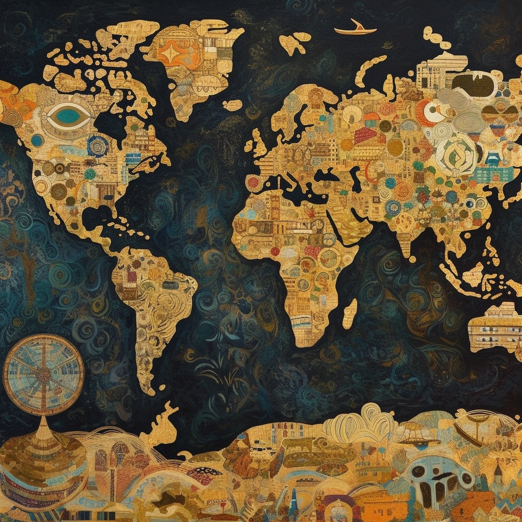
The 19 maps below were all created by AI image tool Midjourney. I asked it to create a world map in the style of each artist and here’s what it came up with: