A mass shooting is defined as any incident in which four or more people are shot and killed.
Since 2009, there have been 306 mass shootings, resulting in 1,710 people shot and killed and 1,087 people shot and wounded.
Leave your thoughts below:
Making Sense Of The World, One Map At A Time
A mass shooting is defined as any incident in which four or more people are shot and killed.
Since 2009, there have been 306 mass shootings, resulting in 1,710 people shot and killed and 1,087 people shot and wounded.
Leave your thoughts below:
The map above shows the number of prisoners in each country around the world per 100,000 people. The data comes from The thirteenth edition of the World Prison Population List for October 2021.
The United States is the outlier at the high-end with 629 prisoners per 100,000 people or 0.629% of Americans are in prison t any given moment. At the other extreme is San Marino which has 0 prisoners per 100,000 people.
The map above doesn’t actually seem to use the latest data available which is as follows:
The map above shows the estimated share of the black population of each European country in 2020. However, the data is not without it’s controversies. Here’s how the results were arrived at:
Estimation Methods Countries with ethnic census (Russia, Ukraine, UK, Ireland) make it straight forwards by merely providing a direct percentage. Another set of countries provide a “migration background” estimate which classifies persons with even one sub-Saharan born grandparent as having “migrant background”, this also provides a near exact ethnic estimate (Germany, Scandinavia, Netherlands, Austria and some Eastern European states).
Now, using the “exact” proportion of sub-Saharan and Caribbean (in the case of Netherlands/UK) descended
blacks to “country of birth” sub-Saharan migrants in the aforementioned countries, we are able to extrapolate a percentage to their neighbours (Italy, Spain, France, Belgium, Portugal, Poland, Czechia, and Hungary) based on the Number of Sub-Saharan born individuals in these respective countries.This provides a near exact estimate with minimal margin of error of the black population in said countries which only have data on individuals who are foreign born or have foreign citizenship.
Sources for the data: Sources and latest available data: UK Census (2011), destatis.de (2019), Eurostat (2019), Russian Registrar (2019), dmsu.gov.ua (2019), scb.se (2019), Irish Census (2016), demo.istat.it (2019), opendata.cbs.nl (2019), ssb.no (2019), statbank.dk (2020), stat.fi (2019), migracje.gov.pl (2018) and ine.es (2019).
Find this map interesting? Please share it using one the sites below:

The map above shows what percentage of people in each EU member state think that the EU has benefited their country. As Landgesit explains:
The exact question in the survey was: “Taking everything into account, would you say that (OUR COUNTRY) has on balance benefited or not from being a member of the EU?”. People could answer this question with “Benefited”, “Not benefited” or “Don’t know”.
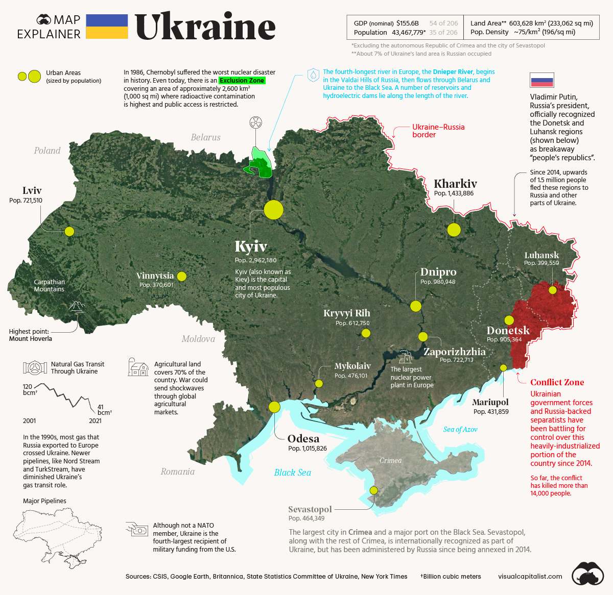
The 2022 map above shows key facts about Ukraine.
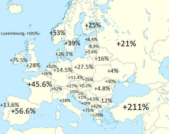
The map above shows the population increase (or decrease of various European countries between 1960 and 2020). Globally world population increased from 3.03 billion to 7.79 billion or a 157% increase.

I’m very please to announce that The Maps for Curious Minds series is back—with 100 vivid infographic maps that transform the way we understand the cultural and historical wonders of North America.
North American Maps for Curious Minds was written by Matthew Bucklan and Victor Cizek and illustrated by Jack Dunnington with a foreword by me (Ian Wright).
Find out the answers to the following questions:
and many, many more.
You can find out more about the book from The Experiment here.
And if you’d like to get your own copy, you can do so from the following stores:
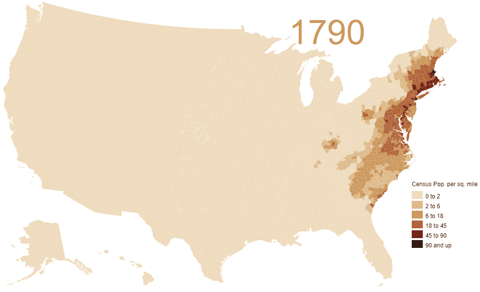
In 1790, population density was just 4.5 people per sq. mile. But by 2010 it had grown to 87.4 people per sq. mile over a much larger area.
From the original map author:
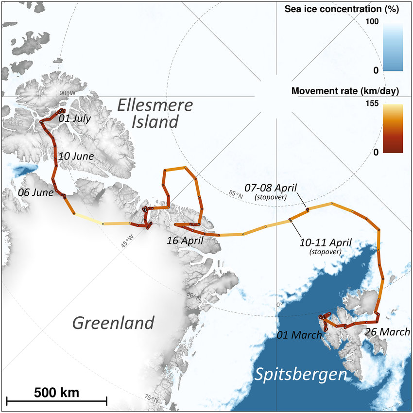
The map above shows the incredible journey of one arctic fox in 2018. Over the course of just a few months she walked up to 155km per day all the way from Svalbard (a Norwegian archipelago) to Canada’s Ellesmere Island via Greenland.
You can read the full story here. And see a picture of the fox here.
Find this map interesting? Please help us by sharing it: