
The color legend is as follows:
Making Sense Of The World, One Map At A Time
The color legend is as follows:

The countries shown include the United Kingdom, Ireland, France, Germany, the Netherlands, Belgium, Switzerland, Austria, Spain, Portugal, Denmark, Sweden and Norway.
Here’s what the numbers look like:

They were created as a result of a reform aimed at providing better representation for French citizens living abroad.
Here’s a brief overview of their history:

Here’s what the author had to say about the map:

The map above shows the most popular Lullaby from every country in the world. You can see a full list of each country’s top song and regional maps below:
Here are some key points about this era:

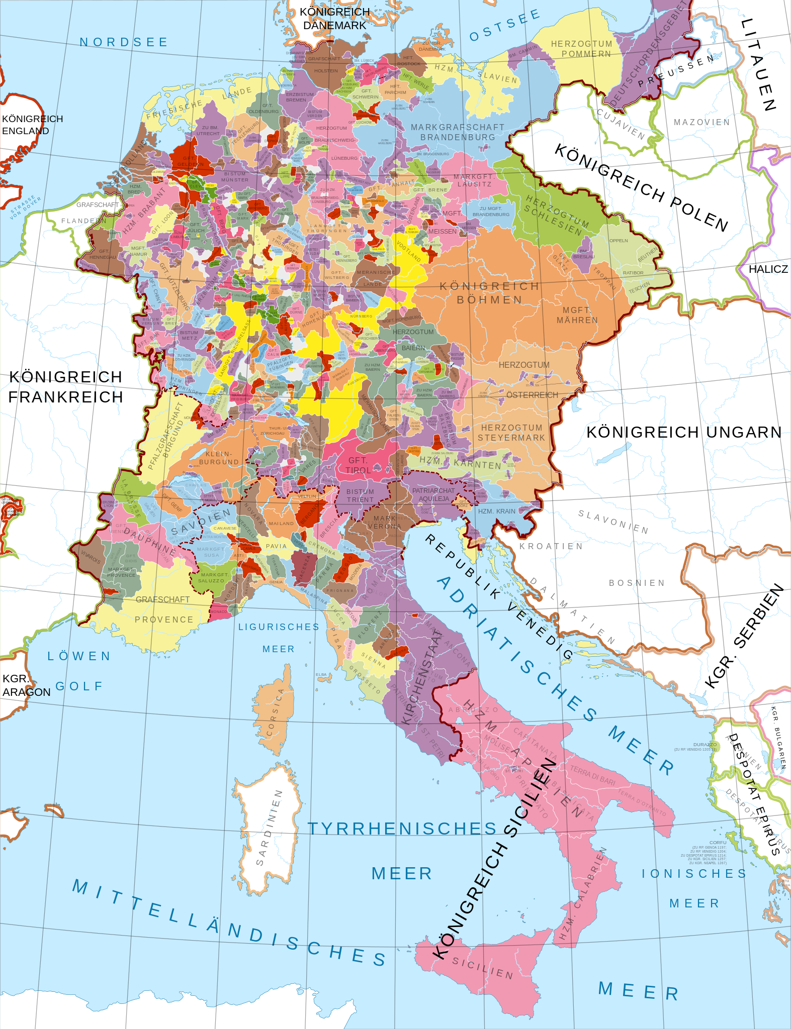
Here’s a brief overview of each of the kingdoms and notable states depicted on the map:

The map above shows the battles of the American Civil War by Year and by theaters.
Here’s an overview of the main theaters:

The map above was created by Honcho and shows which countries use Where’s Waldo, which Use Where’s Wally and which use some other name altogether.
Keep reading for more:

The map show above shows how and when slavery was abolished in the United States and was created by Wikimedia user QuartierLatin1968.
Here are the key dates and things to know: