The maps below all come this CIA album on Flicker. They describe the maps in the following ways:
CIA Cartography Center has been making vital contributions to our Nation’s security, providing policymakers with crucial insights that simply cannot be conveyed through words alone.
President Nixon 1970 CIA Map
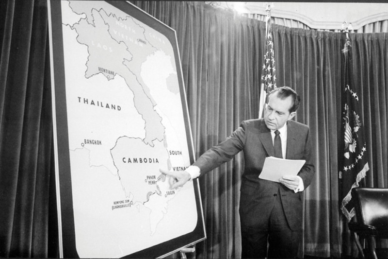
This photograph shows Richard Nixon during a televised White House briefing in 1970, using a large CIA-produced map of mainland Southeast Asia during the Vietnam War. The image captures a key moment in the expansion of the war beyond Vietnam itself.
Nixon is pointing toward the Cambodia–South Vietnam border region, an area that had become strategically important because North Vietnamese and Viet Cong forces used sanctuaries inside officially neutral Cambodia.
These border zones were connected to the famous Ho Chi Minh Trail supply network running through Laos and Cambodia into South Vietnam.
The map itself is very simple and highly political in purpose. Rather than showing detailed geography, it emphasizes:
- Cambodia,
- South Vietnam,
- Saigon,
- Phnom Penh,
- and border regions where communist forces were believed to operate.
This was typical of CIA and White House presentation maps designed for public briefings: clarity and strategic messaging mattered more than cartographic detail.
The photograph was likely taken around the time of the 1970 Cambodian Campaign, when U.S. and South Vietnamese forces entered Cambodia to attack communist base areas.
Nixon presented the operation as necessary to protect American troops and weaken enemy logistics. Critics, however, argued that it widened the war and destabilized Cambodia.
The image reflects how maps became political tools during the Cold War. Intelligence maps were not just internal documents, they were also used to justify military actions, shape public opinion, and visually explain complex geopolitical conflicts to television audiences.
Historically, the expansion of the war into Cambodia contributed to major unrest in the United States, including widespread protests and the Kent State shootings in May 1970.
Also: Watch The Entire Vietnam War Using Google Earth
1970 Khmer Empire Map
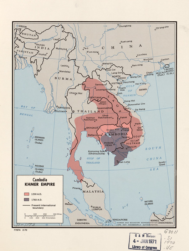
This 1970 CIA-produced map of the Khmer Empire is a historical-political map showing the territorial reach of the medieval Khmer state centered in present-day Cambodia.
It compares two different periods of Khmer influence:
- the empire at its height around 1290 A.D. (shown in pink),
- and its much smaller extent by 1760 A.D. (shown in dark shading).
The map illustrates how the Khmer Empire once dominated much of mainland Southeast Asia, extending into areas that are now:
At its peak, the empire controlled major trade routes and important cities centered around Angkor Wat, the enormous temple complex that served as the heart of Khmer civilization.
The map’s purpose was not only historical but also geopolitical.
Created during the Vietnam War era, it reflects American intelligence interest in Cambodian nationalism and regional tensions. By 1970 Cambodia was becoming deeply involved in the widening Indochina conflict, and historical territorial memory mattered politically.
The shrinking of the Khmer Empire shown on the map reflects centuries of pressure from neighboring Thai and Vietnamese states.
By the 18th century, Cambodia had lost much of its former influence and territory, becoming squeezed between stronger regional powers.
The map also highlights how colonial and modern borders differed sharply from older imperial boundaries. The CIA often produced maps like this to help policymakers understand ethnic, historical, and nationalist issues that could influence modern conflicts.
In essence, this map is both:
- a historical overview of the rise and decline of the Khmer Empire,
- and a Cold War-era intelligence tool showing the historical roots of regional politics in Southeast Asia.
Also see: Map Of Cambodia Created By The CIA
1971 Afghanistan Map
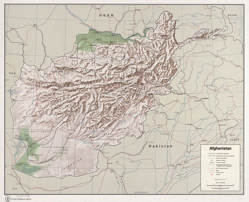
This 1971 CIA map of Afghanistan is primarily a terrain and transportation map, emphasizing the country’s extreme geography and strategic position during the Cold War.
The most striking feature is the dense mountain relief across central and northeastern Afghanistan.
The map highlights major mountain systems including the Hindu Kush, which historically made Afghanistan difficult to invade, govern, or economically unify. Much of the country’s population and transportation routes were concentrated in valleys and passes between these mountains.
The map also shows:
- major roads,
- rivers,
- deserts,
- provincial capitals,
- and Afghanistan’s borders with the USSR, Iran, Pakistan, and China.
In 1971 Afghanistan was still officially a monarchy under King Mohammed Zahir Shah, before the coups, Soviet invasion, and decades of war that would transform the country later in the 1970s and 1980s.
Several geographic features shown here became strategically important during later conflicts:
- the Salang Pass and northern routes connected Afghanistan to the Soviet Union,
- eastern mountain corridors linked Afghanistan with Pakistan,
- and remote valleys later became guerrilla strongholds during the Soviet–Afghan War.
The map also reflects Cold War intelligence concerns. Afghanistan sat between:
- the Soviet sphere to the north,
- U.S.-aligned Pakistan,
- revolutionary pressures in the region,
- and China on the far north-eastern border.
At the time, the CIA viewed Afghanistan as a geopolitical buffer state between major powers. The emphasis on roads and terrain suggests the map was designed partly for strategic and military analysis rather than simply general geography.
Historically, this map captures Afghanistan just before a major turning point.
Within a decade:
- the monarchy would collapse,
- the Soviet Union would invade,
- and Afghanistan would become one of the central battlegrounds of the late Cold War.
1971 East China Sea Map
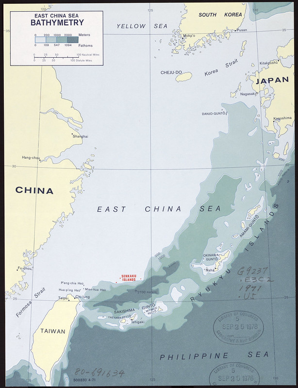
This 1971 CIA map of the East China Sea is a bathymetric map, meaning it focuses on the depth and underwater topography of the sea rather than political borders or land features.
The shaded colors represent ocean depth:
- lighter areas = shallow continental shelf waters,
- darker areas = much deeper ocean zones.
The map’s most important feature is the chain of islands running from southern Japan through Okinawa toward Taiwan:
- the Ryukyu Islands,
- including Okinawa,
- Sakishima,
- and the highlighted Senkaku Islands.
The Senkaku Islands are marked in red because by the early 1970s they were becoming strategically important due to:
- territorial disputes,
- nearby shipping lanes,
- and possible offshore oil and gas reserves discovered beneath the seabed.
At the time:
- Japan controlled the islands,
- Taiwan (ROC) claimed them,
- and the People’s Republic of China also began asserting claims.
The map reflects Cold War strategic concerns as much as geography. The East China Sea was a major naval zone between:
- communist China,
- U.S.-allied Japan,
- South Korea,
- Taiwan,
- and American military bases in Okinawa.
Bathymetry mattered greatly for:
- submarine operations,
- naval navigation,
- antisubmarine warfare,
- and undersea resource exploration.
The map also shows how shallow continental shelf waters extend far from the Chinese coast before dropping sharply into deeper Pacific waters near the Ryukyu island chain. That underwater geography remains geopolitically important today because maritime claims in the region are often connected to continental shelf boundaries and exclusive economic zones.
Overall, this is both:
- a scientific ocean-depth map,
- and a strategic Cold War naval-intelligence map focused on one of East Asia’s most contested maritime regions.
Also see: The World According To Ancient China
1973 Bantustans Map
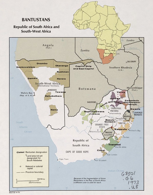
This 1973 CIA map of the “Bantustans” in South Africa and South-West Africa shows one of the central geographic features of the apartheid system.
The colored territories are the so-called Bantustans or “homelands,” fragmented areas assigned to different Black African ethnic groups by the apartheid government.
Examples on the map include:
- Transkei,
- KwaZulu,
- Bophuthatswana,
- Venda,
- Lebowa,
- Ovambo,
- Herero,
- and Tswana territories.
The apartheid government claimed these areas were separate national homelands where Black South Africans supposedly belonged politically rather than in “white” South Africa.
In reality, the system was designed to:
- strip Black South Africans of citizenship rights,
- enforce racial segregation,
- and preserve white minority political control.
The map visually demonstrates how fragmented and economically weak many of these territories were. Most consisted of disconnected parcels of land scattered across the country, often located in poorer rural areas with limited infrastructure and resources.
The map also includes South-West Africa (modern Namibia), which South Africa still controlled in 1973 despite growing international opposition. Similar ethnic homeland policies were applied there as well.
Historically, several Bantustans, especially Transkei, Bophuthatswana, Venda, and Ciskei, were later declared “independent” by the apartheid regime, but almost no other countries recognized them.
This map is important because it shows apartheid geographically:
- not simply as social segregation,
- but as a territorial system intended to reorganize southern Africa along racial and ethnic lines.
After the end of apartheid in 1994 under Nelson Mandela and democratic reforms, all Bantustans were dissolved and reintegrated into modern South Africa.
Also see: Map Of South Africa The CIA No Longer Wants You To See
1974 An-Shan Map
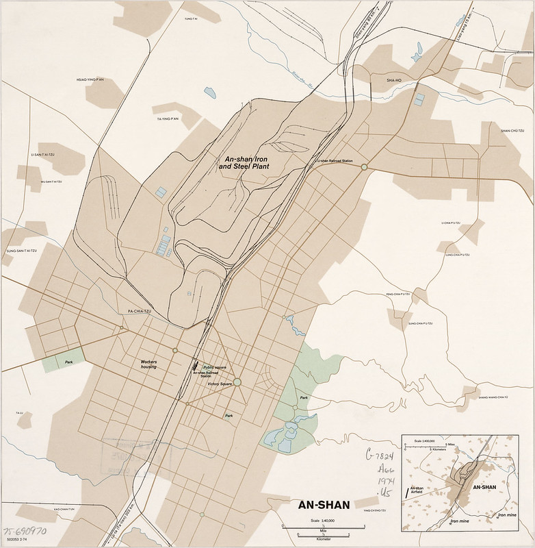
This 1974 CIA map of An-shan (modern Anshan) is a highly detailed industrial city map focused on one of communist China’s most important heavy industrial centers during the Cold War.
The central feature is the massive An-shan Iron and Steel Plant, labeled prominently near the top center of the map.
Anshan was the heart of China’s steel industry and one of the largest industrial complexes in East Asia. O
riginally developed under Japanese control before 1945, it became a major priority for both Soviet and later Chinese communist industrialization programs.
The map emphasizes:
- steel and iron production facilities,
- rail infrastructure,
- workers’ housing,
- transportation routes,
- industrial sidings,
- and urban layout.
The dense railway lines are especially important. Heavy industry depended on moving:
- coal,
- iron ore,
- steel,
- machinery,
- and workers efficiently through the city.
The inset map in the lower-right corner places An-shan within the broader industrial region of north-eastern China (Manchuria), showing nearby iron mines and the surrounding industrial network. This region was strategically critical because it contained much of China’s heavy manufacturing base.
The CIA’s interest in Anshan reflected Cold War concerns about Chinese industrial and military capacity. Steel production was considered a key indicator of:
- economic strength,
- military-industrial capability,
- infrastructure growth,
- and wartime production potential.
Unlike political maps, this is essentially an intelligence-economic map. It was designed to help analysts understand how China’s industrial system functioned physically on the ground.
The map also reflects the priorities of the Mao-era economy during the 1970s:
- centralized industrial planning,
- heavy industry over consumer production,
- and large state-run industrial cities built around steel, mining, and rail transport.
In short, this map is a Cold War intelligence snapshot of one of the industrial engines of communist China.
1974 Libya Map
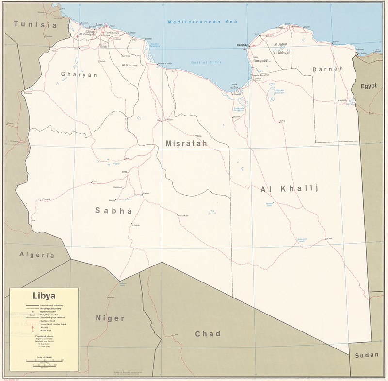
This 1974 CIA map of Libya is a political-administrative map showing the country’s provincial divisions, transportation routes, population centers, and the geographic structure of Libya shortly after the rise of Muammar Gaddafi.
The map emphasizes how much of Libya is sparsely populated desert. Most major cities and infrastructure are concentrated along the Mediterranean coast, including:
- Tripoli,
- Benghazi,
- Misrata,
- and coastal transport corridors.
Large interior regions show few roads and settlements, reflecting the harsh Sahara environment.
The legend highlights:
- roads and tracks,
- administrative boundaries,
- ports,
- airports,
- and populated places.
This was strategically important because Libya’s geography strongly shaped both politics and economics.
Oil fields discovered in the 1950s transformed Libya into one of Africa’s major petroleum exporters, even though much of the population remained concentrated near the coast.
By 1974 Libya had recently undergone the 1969 coup in which Gaddafi overthrew King Idris. During the Cold War, the CIA and U.S. intelligence closely monitored Libya because:
- of its growing oil wealth,
- anti-Western politics,
- military expansion,
- and increasing Soviet connections.
The map reflects a transitional period:
- Libya was modernizing rapidly due to oil revenues,
- while still lacking dense infrastructure outside coastal areas.
In essence, this map is a Cold War-era strategic overview of Libya’s geography, regional structure, and transportation network during the early Gaddafi era.
Also see: Map Of Libya The CIA No Longer Wants You To See
1975 Israel Map
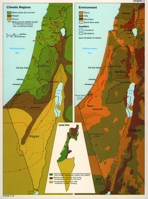
This 1975 CIA map of Israel is a thematic geography map showing how climate, terrain, water resources, and land use shaped the country and the territories it controlled after the Yom Kippur War.
The map is divided into three major themes:
- Climatic Regions (left),
- Environment and aquifers (right),
- Land Use (bottom inset).
The climate section shows the dramatic transition from the wetter Mediterranean coast and northern highlands to the arid Negev desert in the south.
Rainfall lines illustrate how precipitation declines sharply moving southward, which helps explain why most agriculture and population were concentrated in northern and coastal areas.
The environmental map highlights:
- plains,
- hills,
- mountains,
- deserts,
- and especially underground aquifers.
Water was one of the most strategically important issues in the region, and the map emphasizes limestone and sandstone aquifer zones that supplied much of Israel’s freshwater. Control of upland water regions in the West Bank had major political and strategic importance.
The map also reflects the post-1967 territorial situation. It labels:
- the “Gaza Strip (Israeli-occupied),”
- “Jordan (Israeli-occupied)” for the West Bank,
- and “Egypt (Israeli-occupied)” near the Sinai region.
This terminology reflects the geopolitical reality after Israel captured these territories in 1967 but before later peace agreements and territorial withdrawals.
The land-use inset shows:
- intensive agriculture along the coast and north,
- olive and fruit cultivation in hill regions,
- and sparsely populated desert zones in the Negev.
Overall, this map is less about political borders and more about the physical geography underlying the Arab–Israeli conflict, especially water, agriculture, settlement patterns, and strategic terrain during the Cold War era.
Also see: Map of Israel & Palestine’s Territorial Changes 1920-2008
1977 Bophuthatswana Map
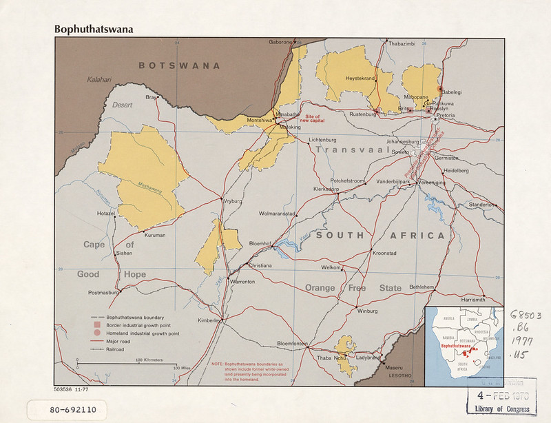
This 1977 CIA map shows Bophuthatswana, one of the so-called “homelands” or Bantustans created under apartheid-era South Africa.
The map focuses on the fragmented territory assigned to Tswana-speaking Black South Africans.
Instead of being one continuous region, Bophuthatswana consisted of scattered enclaves spread across northern South Africa near the border with Botswana.
The yellow areas show the homeland territories, while surrounding gray areas remained under direct South African administration.
The map highlights:
- homeland boundaries,
- transportation networks,
- railroads,
- major roads,
- industrial growth points,
- and the planned capital at Mmabatho near Mafikeng.
This reflects the apartheid government’s policy of “separate development,” where Black South Africans were assigned nominal ethnic homelands rather than citizenship in South Africa itself. In 1977, Bophuthatswana had recently been declared “independent” by Pretoria, although almost no other country recognized it internationally.
The inset map in the lower-right corner places Bophuthatswana within the broader network of Bantustans across South Africa and South-West Africa (Namibia).
The fragmented geography shown here demonstrates one of the major criticisms of the Bantustan system: the territories were economically dependent, geographically disconnected, and designed around political segregation rather than viable statehood.
The map is also notable for showing the strategic economic dimension of apartheid policy. Industrial zones and transport corridors near Johannesburg and Pretoria are emphasized because many homeland residents worked in nearby white-controlled urban and mining economies while officially being classified as citizens of the Bantustans instead of South Africa itself.
Overall, the map is a Cold War-era intelligence and reference map documenting how apartheid South Africa reorganized territory and population through the Bantustan system in the late 1970s.
1977 Cuba Country Profile Map
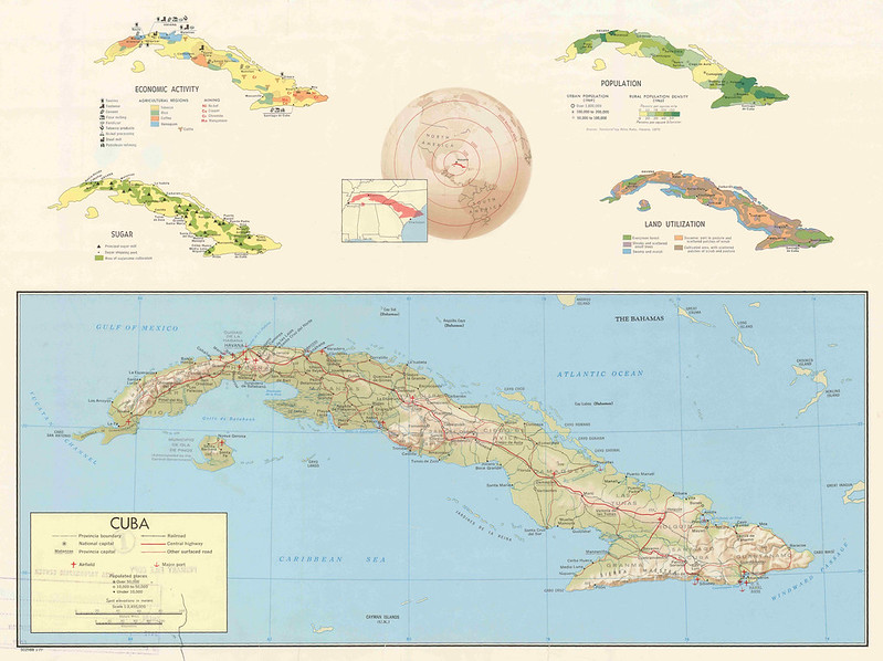
This 1977 CIA “Country Profile” map of Cuba is a broad strategic overview of the island, combining geography, economy, population, agriculture, and transportation into a single reference map.
The large central map shows Cuba’s physical and transportation infrastructure:
- railroads,
- highways,
- ports,
- airfields,
- major cities,
- provincial boundaries,
- and terrain elevations.
Around it are thematic inset maps focused on different aspects of the Cuban state and economy after nearly two decades of Communist rule under Fidel Castro.
The upper-left inset labeled “Economic Activity” maps key industries and resources, including:
- sugar production,
- tobacco,
- coffee,
- nickel mining,
- petroleum refining,
- cattle,
- and fishing.
The “Sugar” inset highlights how central sugar cultivation still was to the Cuban economy in the 1970s, despite diversification efforts after the revolution.
The “Population” inset shows population density concentrated around:
- Havana,
- central urban corridors,
- and eastern industrial areas.
The “Land Utilization” inset categorizes farmland, pasture, forests, swamps, and less-developed areas, especially in eastern Cuba.
One especially interesting feature is the circular azimuthal projection near the top center. It places Cuba in relation to the Americas and emphasizes the island’s strategic location between:
- the United States,
- the Caribbean,
- the Gulf of Mexico,
- and Atlantic shipping lanes.
That strategic position was a major reason Cuba remained a central Cold War concern for the CIA after the 1962 Missile Crisis.
The map is also notable for what it reflects politically:
- the continued U.S. focus on Communist Cuba,
- the importance of economic intelligence,
- and the CIA’s effort to understand Cuba not just militarily, but as a functioning state with infrastructure, agriculture, industry, and population distribution.
Overall, the map serves as a compact Cold War intelligence reference guide to Cuba in the late 1970s.
Also see: Map Of Cuba Created By The CIA
1977 South Lebanon Map
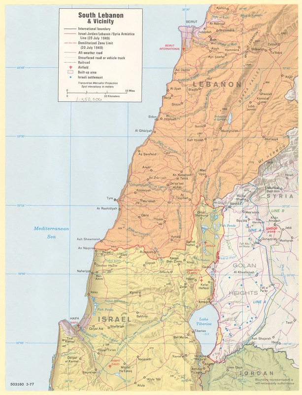
This 1977 CIA map of southern Lebanon and northern Israel focuses on one of the most militarily and politically sensitive regions in the Middle East during the Lebanese Civil War.
The map shows:
- the Israel–Lebanon border,
- the occupied Golan Heights,
- southern Lebanese towns and roads,
- Israeli settlements,
- armistice and demilitarized lines from 1949,
- and transportation and terrain features important for military planning.
It was produced shortly after the outbreak of the Lebanese Civil War (1975) and during a period of growing conflict involving:
- Palestinian militant groups in southern Lebanon,
- Israeli cross-border operations,
- Syrian military involvement,
- and Lebanese factional fighting.
The map highlights the strategic corridor running from:
- Haifa northward through Galilee,
- toward Tyre and Sidon in Lebanon,
- and eastward toward the Golan Heights and Syria.
Particular attention is given to:
- roads,
- settlements,
- airfields,
- and elevation contours, because southern Lebanon’s mountainous terrain made mobility and military positioning extremely important.
The “Line A” and “Line B” markings in the Golan area refer to post-1948 armistice and demilitarized boundaries between Israel and Syria. The map also still reflects the territorial realities after the 1967 Six-Day War, when Israel captured the Golan Heights from Syria.
Blue dots marking Israeli settlements demonstrate another major strategic concern of the period: the defense of northern Israeli communities from raids and rocket attacks originating in southern Lebanon.
Overall, the map is a Cold War-era intelligence reference document showing the geopolitical complexity of the Israel–Lebanon–Syria frontier in the late 1970s, just before Israel’s large-scale 1978 invasion of southern Lebanon and the later 1982 Lebanon War.
Also see: Religious Demographics of Lebanon Map
1978 Central African Empire Map
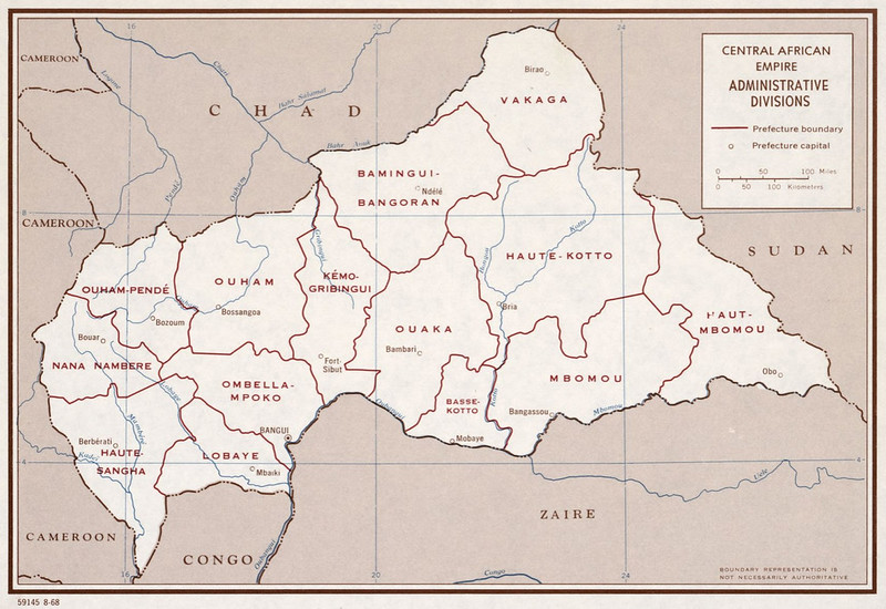
This 1978 CIA map shows the administrative divisions of the Central African Empire, the short-lived monarchy established by Jean-Bédel Bokassa.
The map is relatively simple and focuses on:
- prefecture boundaries,
- prefecture capitals,
- major rivers,
- and neighboring states.
It shows the country bordered by:
- Chad,
- Sudan,
- Zaire,
- Congo,
- and Cameroon.
The capital, Bangui, is shown near the Ubangi River in the southwest. The map divides the empire into prefectures such as:
- Vakaga,
- Haute-Kotto,
- Ouaka,
- Lobaye,
- Ombella-Mpoko,
- and Haute-Sangha.
The most historically significant aspect of the map is the name itself: “Central African Empire.” From 1976 to 1979, Bokassa transformed the former republic into a self-proclaimed empire modeled partly on Napoleon’s France.
He crowned himself emperor in an extravagant ceremony that became internationally infamous for its enormous cost in one of the world’s poorest countries.
The map captures that unusual political moment during the Cold War when the country officially ceased being a republic. Despite the imperial title, the internal administrative structure remained largely the same as under the earlier republic.
Like many CIA reference maps of the era, it emphasizes political geography and administrative control rather than economics or military detail. The understated design contrasts sharply with the dramatic political situation behind it.
In 1979, only about a year after this map, Bokassa was overthrown in a French-backed operation, and the country reverted to the Central African Republic.
This makes maps labeled “Central African Empire” relatively rare historical snapshots of a brief and unusual African monarchy during the Cold War.
Also see: Map Of Central African Republic Created By The CIA
1979 Afghanistan Ethnic Groups Map
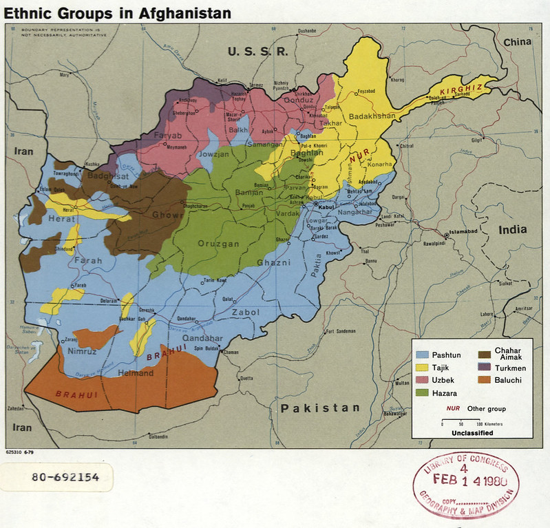
This 1979 CIA map of Afghanistan shows the country’s major ethnic groups on the eve of the Soviet–Afghan War, making it one of the most historically important demographic maps of Cold War Afghanistan.
The map divides Afghanistan into broad ethnic regions, including:
- Pashtuns,
- Tajiks,
- Hazaras,
- Uzbeks,
- Turkmens,
- Baluchis,
- Chahar Aimaks,
- and Nuristanis (“NUR”).
The largest area shown is the Pashtun region (blue), stretching across southern and eastern Afghanistan around:
- Kandahar,
- Helmand,
- Ghazni,
- and toward Kabul and the Pakistani frontier.
Tajik populations (yellow) are concentrated in the northeast around Badakhshan and Takhar, while Uzbek and Turkmen populations dominate much of the northern borderlands near the Soviet Union. The Hazara regions (green) occupy much of the mountainous central highlands.
The timing of the map is especially significant. It was produced in 1979, the same year:
- the communist PDPA government struggled to maintain control,
- insurgencies spread across the countryside,
- and the Soviet Union invaded Afghanistan in December.
For the CIA, ethnicity was strategically important because many Afghan political loyalties, tribal structures, militia networks, and resistance movements followed ethnic and regional lines.
Understanding these divisions became crucial during the coming decade-long war between Soviet-backed forces and the mujahideen.
The map also reflects Cold War geopolitical language. Pakistan’s border with Afghanistan is shown normally despite Afghanistan’s long-standing refusal to fully recognize the Durand Line.
Although simplified, the map captures the extraordinary ethnic diversity of Afghanistan and helps explain why centralized rule has historically been difficult there.
Many of the same ethnic and regional patterns shown on this 1979 CIA map continued to shape Afghan politics through the Soviet war, civil war, Taliban era, and into the 21st century.
Also see: Map Of Afghanistan Created By The CIA
1979 Africa Population Map
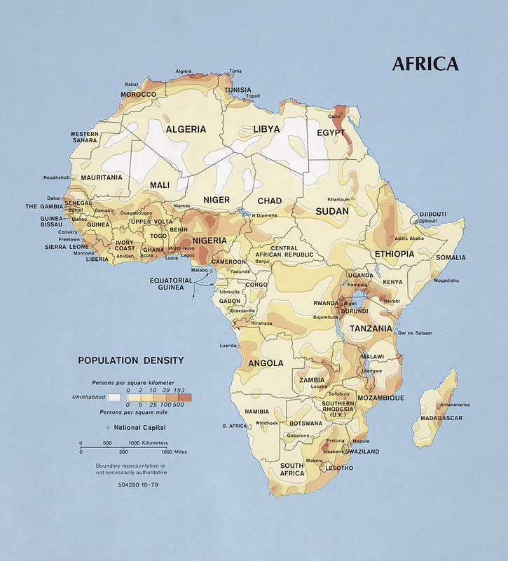
This 1979 CIA population density map of Africa provides a continent-wide view of where people were concentrated at the end of the 1970s and where large areas remained sparsely populated or nearly empty.
The color shading represents population density, ranging from:
- virtually uninhabited regions,
- to heavily populated agricultural and urban zones.
Several major demographic patterns stand out clearly:
- The Sahara Desert appears mostly empty, stretching across:
- Algeria,
- Libya,
- Mali,
- Niger,
- and Chad.
- Dense populations cluster along the Nile River in Egypt, showing how dependent Egyptian settlement was on the river valley and delta.
- West Africa shows major concentrations around:
- Nigeria,
- the Gulf of Guinea coast,
- and older colonial/commercial centers such as Dakar, Accra, and Lagos.
- The Great Lakes region around:
- Rwanda,
- Burundi,
- Uganda,
- and western Kenya
appears as one of the continent’s densest inland population zones.
- Southern Africa highlights concentrations near:
- Johannesburg and Pretoria in South Africa,
- and parts of Mozambique and Zimbabwe.
The map also preserves several historical names from the late 1970s, including:
- “Upper Volta” (now Burkina Faso),
- “Southern Rhodesia (U.K.)” during Zimbabwe’s transition period,
As a CIA reference map, it was useful for understanding:
- urbanization,
- economic potential,
- agricultural pressure,
- migration patterns,
- and political stability during the Cold War.
Overall, the map captures Africa at a major transitional moment, shortly before the rapid population growth and urban expansion that transformed the continent in the late 20th and early 21st centuries.
Also see: 14 Maps Showing Population Concentrations In Various Countries
1979 Sinai lines Map
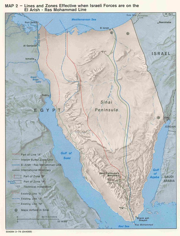
This 1979 CIA map of the Sinai Peninsula shows the phased military withdrawal and security zones created after the Camp David Accords between Egypt and Israel.
The map focuses on the “lines and zones” that would take effect when Israeli forces withdrew to the El Arish–Ras Mohammad line during the staged Israeli evacuation of Sinai after the 1973 Yom Kippur War and subsequent peace negotiations.
Several important features are shown:
- withdrawal lines,
- interim buffer zones,
- demilitarized areas,
- international boundaries,
- and technical monitoring installations.
The colored lines represent different phases of Israeli withdrawal and security arrangements:
- “Line A,”
- “Line B,”
- and the El Arish–Ras Mohammad line.
These reflected the carefully negotiated security framework designed to prevent another large-scale Arab–Israeli war.
The map also marks:
- major Sinai airfields,
- monitoring stations,
- and strategic locations such as:
- Sharm el-Sheikh,
- Gulf of Suez,
- and Gulf of Aqaba.
Particular emphasis is placed on central Sinai and the approaches to the Suez Canal because those areas had been major battle zones in:
- the 1956 Suez Crisis,
- the 1967 Six-Day War,
- and the 1973 Yom Kippur War.
The map is historically significant because it documents one of the most important diplomatic shifts of the Cold War in the Middle East: Egypt becoming the first Arab state to formally make peace with Israel.
The Sinai withdrawal process fundamentally changed regional geopolitics and reduced the likelihood of another full-scale Egyptian–Israeli war.
Overall, the map is both a military planning document and a visual representation of how diplomacy translated into territorial and security arrangements on the ground after decades of conflict.
Also see: 1967 “Greater Israel” Propaganda Map
1979 Sinai Zones Map
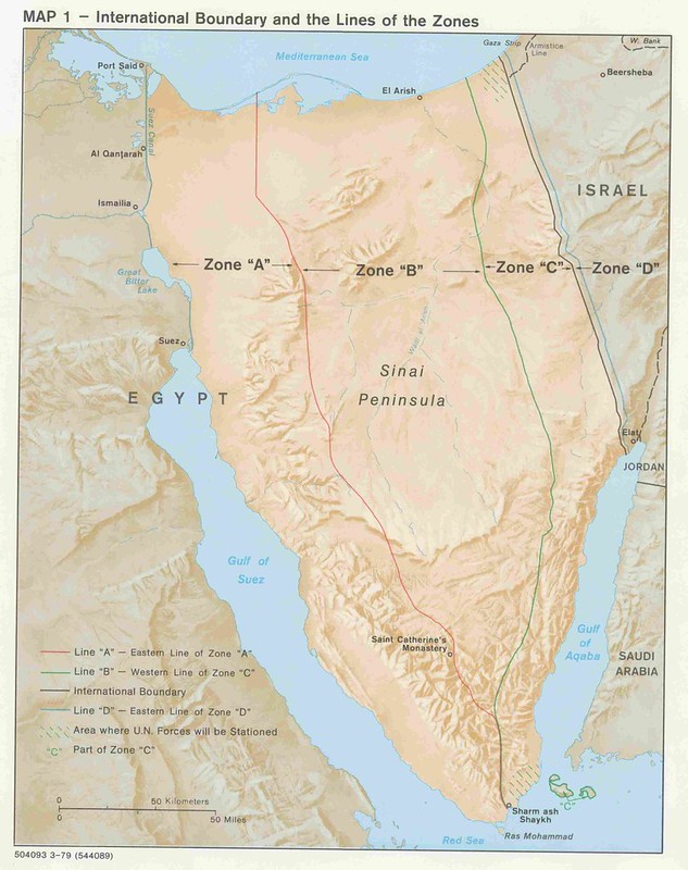
This companion 1979 CIA map of the Sinai Peninsula shows the final security zones established under the Egypt–Israel Peace Treaty after Israel’s withdrawal from Sinai.
Unlike the previous map, which focused on withdrawal lines and transitional phases, this one emphasizes the permanent division of Sinai into Zones A, B, C, and D, each with different military restrictions.
The zones were designed to create strategic depth and reduce the chance of another Egyptian–Israeli war:
- Zone A (closest to the Suez Canal) allowed Egypt to maintain the largest military presence.
- Zone B permitted only limited Egyptian security forces.
- Zone C, near the Israeli border and around Sharm el-Sheikh, was heavily demilitarized and monitored by international peacekeepers.
- Zone D, inside Israel near the border, also restricted Israeli troop deployments.
The map also marks:
- the international boundary,
- U.N. force deployment areas,
- and the strategic corridor from El Arish to Ras Mohammad.
A key feature is the shaded area where international monitoring forces would be stationed. Although the map references U.N. forces, the eventual monitoring body became the Multinational Force and Observers (MFO) after political disagreements at the United Nations.
The geography shown explains why Sinai mattered so much militarily:
- it forms a land bridge between Africa and Asia,
- controls approaches to Israel’s southern border,
- and overlooks the Gulf of Aqaba and Red Sea shipping routes.
Historically, this map captures one of the most successful Cold War peace arrangements.
The zone system established in 1979 largely remains in effect today and has helped preserve the longest-lasting peace treaty between Israel and an Arab state. The map is therefore not just military geography—it is a visual blueprint for the post-1973 Middle Eastern security order.
Also see: Israel’s Territory Before & After The Six-Day War In 1967
CIA Hand Rendered Terrain Map
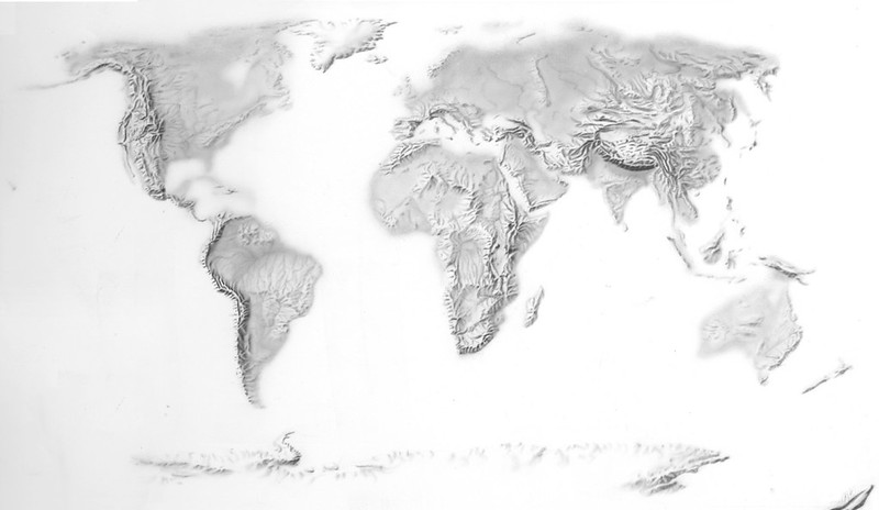
This striking CIA hand-rendered terrain map from the 1970s is a shaded-relief depiction of the world focused entirely on physical geography rather than political boundaries.
Instead of borders, cities, or labels, the map emphasizes mountain ranges, plateaus, river basins, and continental landforms through careful grayscale shading and relief modeling.
The map highlights Earth’s major geographic features:
- the Rocky Mountains and Andes in the Americas,
- the Alps and Atlas Mountains,
- the massive Himalayas stretching across Asia,
- and the Rift Valley system running through eastern Africa.
The soft airbrushed appearance was created using traditional cartographic illustration techniques before digital terrain modeling became common.
CIA cartographers often used manually engraved relief shading and photographic methods to create maps that were both analytically useful and visually dramatic. The result resembles a three-dimensional sculpture of the Earth’s surface.
Maps like this were valuable during the Cold War because terrain strongly influenced military planning, logistics, aviation routes, missile trajectories, and intelligence analysis. Mountain barriers, deserts, and river systems all affected troop movement and strategic calculations.
By stripping away political detail, the map allows viewers to focus entirely on the physical structure of the planet.
The projection also creates an almost seamless global view, emphasizing how connected major landforms are across continents. The Himalayas and Tibetan Plateau dominate Asia visually, while Antarctica appears as a long icy ridge at the bottom edge of the map.
Historically, this map represents the peak era of analog intelligence cartography.
Before satellite-based digital elevation models became widespread, maps like this demonstrated the extraordinary artistic and technical skill of CIA and government cartographers who transformed raw geographic data into highly readable visual intelligence products.
DCI Bush President Ford Lebanon Beirut CIA Maps
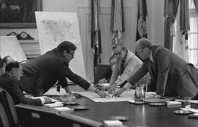
This photograph shows senior U.S. officials, including future President George H. W. Bush and President Gerald Ford, examining CIA-produced maps related to the crisis in Lebanon during the mid-1970s.
Bush served as Director of Central Intelligence from 1976 to 1977, placing the image during a period of growing instability in the Middle East.
The maps spread across the table were likely operational or intelligence briefing maps focused on Beirut and southern Lebanon during the early years of the Lebanese Civil War, which began in 1975.
At the time, Lebanon had become a highly complex conflict zone involving Christian militias, Palestinian organizations, Syrian intervention forces, Muslim factions, and Israeli strategic concerns. Beirut itself was increasingly divided into rival sectors, making detailed cartography critical for intelligence analysis and diplomatic decision-making.
The image captures how heavily Cold War policymakers relied on physical maps during high-level national security meetings.
Before digital GIS systems and satellite visualization software, large printed CIA maps were essential tools for tracking military positions, political boundaries, transportation routes, and urban control zones. Intelligence officers and policymakers often stood directly over maps during briefings, using them to discuss troop movements, cease-fire lines, evacuation routes, and regional risks.
Visually, the photograph also reflects the atmosphere of 1970s intelligence culture: paper maps, annotated briefing materials, and close in-person collaboration between CIA analysts and White House officials.
The formal setting, combined with the intense focus on the maps, emphasizes how geography and intelligence were deeply intertwined in U.S. foreign policy during the Cold War.
Historically, the photo represents a moment when Lebanon’s conflict had become an important strategic concern for Washington amid broader tensions involving the Soviet Union, Israel, Syria, and the wider Middle East.
DCI Colby 1975 CIA Map
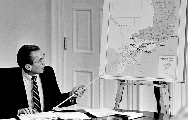
This photograph shows William Colby, who served as Director of Central Intelligence from 1973 to 1976, presenting a CIA-produced map during a briefing in 1975.
The map behind him appears to depict administrative and military regions in South Vietnam during the final phase of the Vietnam War.
The image was taken at a critical moment in U.S. foreign policy.
By 1975, South Vietnam was collapsing under major North Vietnamese offensives, and Washington was closely monitoring the rapidly changing military situation.
The map itself appears to focus on the southern coastal regions of South Vietnam, showing provinces, military regions, and major cities such as Phan Rang, Phan Thiết, and Xuân Lộc, locations that became strategically important during the final campaigns leading to the fall of Saigon in April 1975.
Colby was deeply associated with CIA operations in Vietnam, having previously directed the controversial Phoenix Program before becoming DCI. As intelligence chief, he frequently briefed senior officials and Congress using maps like this to explain battlefield developments, territorial control, refugee flows, and the deteriorating position of the South Vietnamese government.
The photograph illustrates how central maps were to Cold War intelligence work. Before digital displays and satellite visualization systems, large printed CIA briefing maps were essential analytical tools. Officials used them to track military advances, infrastructure, transportation corridors, and political control in real time.
Visually, the scene captures the formal atmosphere of 1970s intelligence briefings: paper documents spread across the desk, a mounted easel map, and Colby physically pointing to strategic areas with a long briefing stick.
It reflects the hands-on style of intelligence presentations during the era, when geographic analysis played a direct role in shaping U.S. national security decisions at the highest level.
DCI Richard Helms Kudos early 1970s
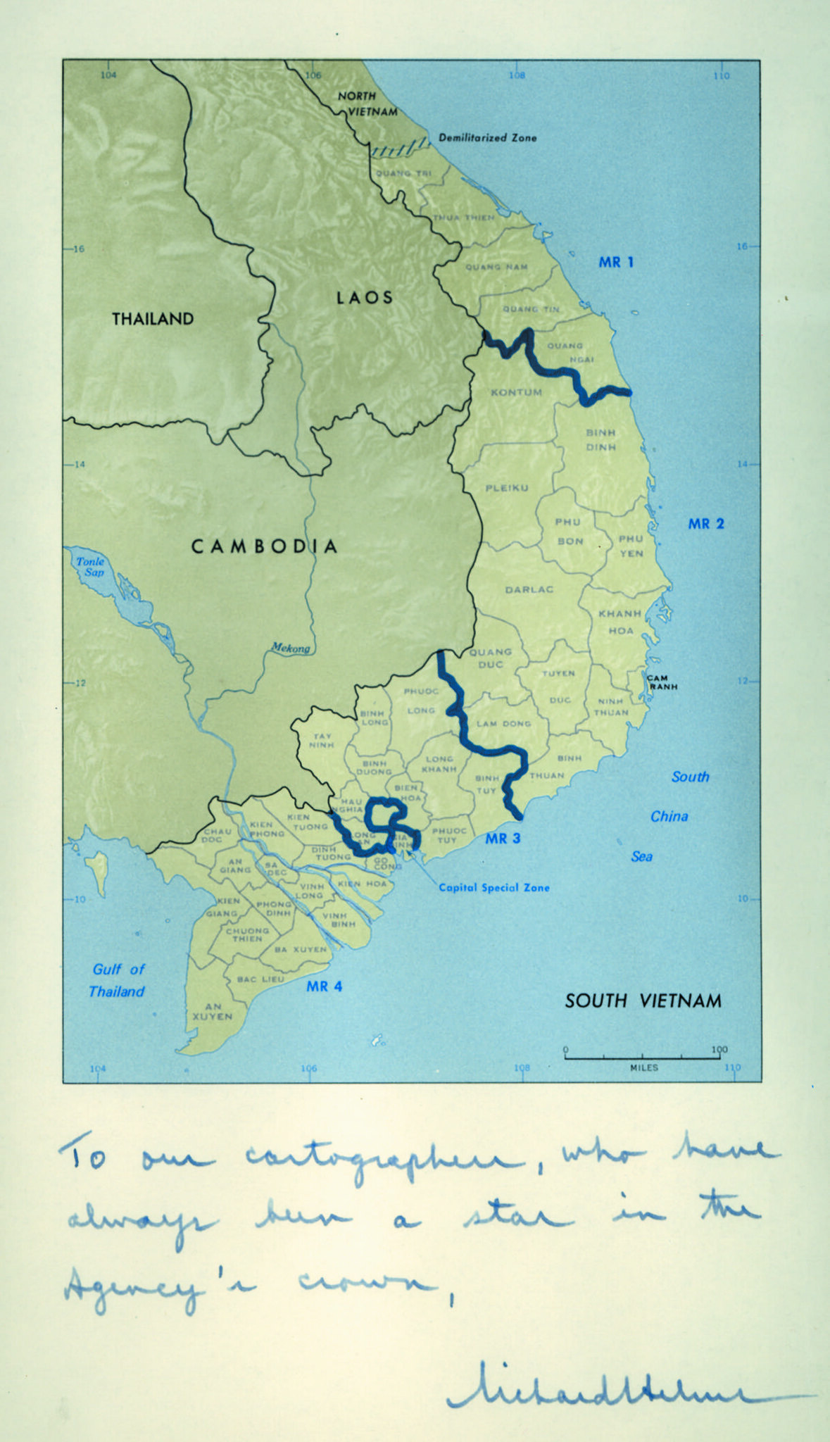
This is CIA-produced map of South Vietnam from the early 1970s that was personally presented to Director of Central Intelligence Richard Helms as a tribute to CIA cartographers.
The handwritten note at the bottom reads like a commendation: “To our cartographers, who have always been a star in the Agency’s crown,” followed by Helms’s signature.
The map itself shows South Vietnam divided into its four military regions (MR 1–MR 4) and highlights key operational areas in dark blue.
These regions were central to U.S. and South Vietnamese military planning during the Vietnam War. The map emphasizes the geography of the conflict rather than tactical detail, showing borders with Laos and Cambodia, the Demilitarized Zone near North Vietnam, and the major administrative structure of South Vietnam.
What makes this image especially interesting is that it recognizes the importance of CIA cartographers during the Cold War.
Intelligence maps were not simply illustrations, they were essential analytical tools used by presidents, generals, diplomats, and intelligence officers. CIA mapmakers transformed raw military, geographic, and political data into visual products that could quickly communicate complex situations during fast-moving crises.
Richard Helms was known for valuing professional intelligence analysis, and this inscription suggests that the Agency’s cartographic division was highly respected internally.
During the Vietnam era, CIA cartographers produced thousands of briefing maps covering troop movements, insurgent activity, infiltration routes, bombing targets, and regional political conditions.
The image therefore serves both as a Vietnam War intelligence map and as a rare tribute to the often-overlooked cartographers whose work helped shape U.S. decision-making throughout the Cold War.
More Declassified CIA Maps
- 22 Declassified CIA Cartography Maps From The 1940s
- 14 Declassified CIA Cartography Maps From The 1950s
- 16 Declassified CIA Cartography Maps From The 1960s
- 12 Declassified CIA Cartography Maps From The 1980s
- 16 Declassified CIA Cartography Maps From The 1990s
- 16 Declassified CIA Cartography Maps From The 2000s
- 15 Declassified CIA Cartography Maps From The 2010s






Leave a Reply