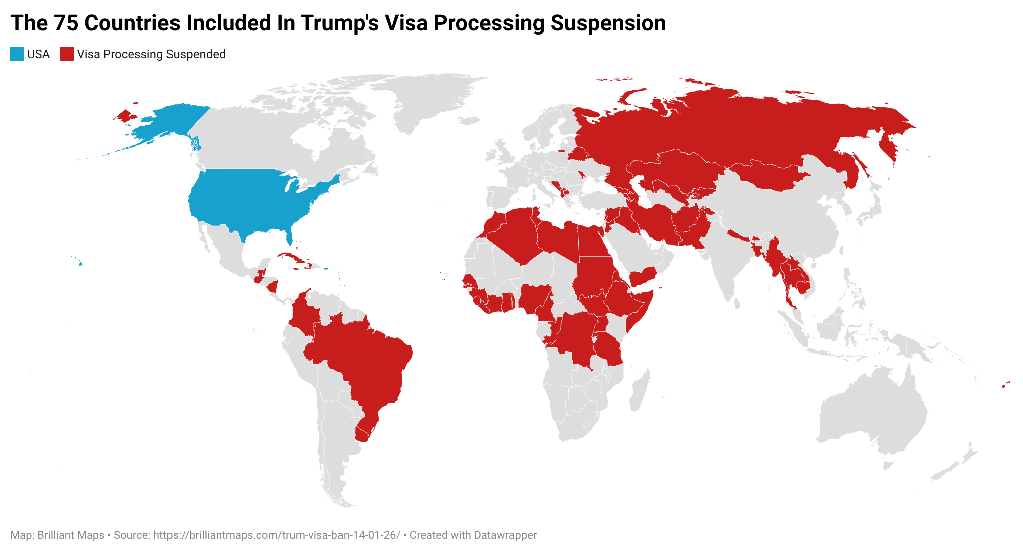
Brilliant Maps

Making Sense Of The World, One Map At A Time

  • BOOK!
  • Newsletter
  • Board Games
  • Posters
  • Scratch Maps

Map of The Most Popular Pie By State

Last Updated: November 25, 2025 Leave a Comment

Click To Get My 10 Best Brilliant Maps For Free:

Map of The Most Popular Pie By State 2024

The two maps here both come from @Mapstream and show Pumpkin Pie’s attempt to take over the United States.

[Read more…]

Filed Under: United States

Falling Iguanas Map of Florida

Last Updated: November 25, 2025 Leave a Comment

Click To Get My 10 Best Brilliant Maps For Free:

Falling Iguanas Map of Florida

Map created by WINK News
The map above highlights an odd but real Florida phenomenon of Iguanas Falling out of trees once the temperature falls below 45F (7C).

Below is short description about how and why it happens:

[Read more…]

Filed Under: United States

Map Supposedly Showing The Second Most Spoken Language In Each European Country

Last Updated: November 28, 2025 Leave a Comment

Click To Get My 10 Best Brilliant Maps For Free:

The Second Most Spoken Language In Each Europe Country

Credit: nazar.data
The map above supposedly shows the second most commonly spoken language in each European country, and comes from this article from MSN, which in turn lists the source as “Information from national censuses and surveys.”

However, I think the data for some countries is rather suspect.

There is no way that 49% of people in France speak Arabic, or that 23% of people in the UK speak French (at least beyond ordering a pain au chocolat).

Similarly for Ireland, far more people know how to speak a few words in Irish than they do French. And if we’re going by native speakers then Polish has far more speakers than French.

That said many other countries do seem right.

Anyway here’s the data as reported:

[Read more…]

Filed Under: Europe

7 Maps Comparing US GDP In 1820 vs 2025

Last Updated: November 21, 2025 Leave a Comment

Click To Get My 10 Best Brilliant Maps For Free:

The United States has been the world’s largest economy for well over a century.

However, if you go all the way back to 1820, the US economy was only ranked as the 8th largest in the world.

Using the Maddison Project Database for 1820 and the IMF data for 2025, we look at the size of the US economy relative to the other 7 economies which were larger in 1820 and what happened over the course of 200 years.

[Read more…]

Filed Under: United States

The 15 Countries Richer Than The US In 1980 & How They Are Doing In 2025

Last Updated: November 21, 2025 3 Comments

Click To Get My 10 Best Brilliant Maps For Free:

The maps below all show countries that were richer than the United States in inflation adjusts GDP per capita terms in 1980 based on the IMF’s Gross domestic product (GDP), Constant prices, Per capita, purchasing power parity (PPP) international dollar, ICP benchmark 2021.

More about it at the bottom of the page.

The year was rather unique due to the 1979-80 oil crisis.

This temporarily increased inflation adjusted GDP per capita in some countries such as the UAE, Qatar, Bahrain, Saudi Arabia and Libya to levels higher than they are today.

Overall, in 1980 there were 15 countries that were richer than the US in $PPP inflation adjusted terms and today there are only 10.

Countries Richer Than The US in 1980 & Still Richer Today

[Read more…]

Filed Under: United States

Does Your State Have More Jews or Muslims?

Last Updated: January 21, 2026 3 Comments

Click To Get My 10 Best Brilliant Maps For Free:

Does Your State Have More Jews or Muslims?

The map above shows which states have more Jews than Muslims living in them and vice versa.

But, it should be noted that in absolute terms New York state has the most Jews and the most Muslims living there.

In total, 7.7 million Jews live in the United States (more than in Israel) compared to just 4.5 million Muslims (slightly less than in Palestine).

Below are the numbers for each state, the % of the state population that is Jewish or Muslim as well as the difference in numbers.

[Read more…]

Filed Under: United States

First, Second & Third World Countries Based On GDP Per Capita In 1950, 1975, 2000 & 2022

Last Updated: November 14, 2025 Leave a Comment

Click To Get My 10 Best Brilliant Maps For Free:

First, Second & Third World Countries Based On GDP Per Capita In 1950, 1975, 2000 & 2022

The map above shows how the richest, middle and poorest income countries have changed from 1950 until today.

And to be clear, the maps are not showing what was regarded as the First, Second & Third Worlds during the Cold War but instead split countries purely based on income.

Data, maps and explanation below:

[Read more…]

Filed Under: World Maps

Why Is The UK So Obsessed With Their Electrical Plus & Sockets?

Last Updated: November 13, 2025 1 Comment

Click To Get My 10 Best Brilliant Maps For Free:

Why Is The UK So Obsessed With Their Electrical Plus & Sockets?

Ok maybe the UK isn’t necessarily “obsessed,” but their plug-and-socket system is unusually robust, safe, and deeply embedded in the national psyche, which makes it look like an obsession from the outside.

Here’s why they’re so proud of them:

[Read more…]

Filed Under: World Maps

Global Change In Population Between 1500 & 1600AD

Last Updated: November 27, 2025 4 Comments

Click To Get My 10 Best Brilliant Maps For Free:

Global Change In Population Between 1500 & 1600AD by continent

The map above shows the global change in world population between 1500 and 1600AD. Overall, world population increased by 13 million people (+3%) from 503 million to 516 million people. However, where those people lived radically changed.

The data comes from the HYDE database, which you learn more about from this post.

Here’s why:

[Read more…]

Filed Under: World Maps

US Annual Precipitation vs Rain In London & The UK

Last Updated: November 12, 2025 1 Comment

Click To Get My 10 Best Brilliant Maps For Free:

US Annual Precipitation vs Rain In London

Map credit PRISM Weather Data
The map above shows average annual precipitation in the United States over a 30-year period (1991–2020), produced by PRISM Climate Group at Oregon State University.

It shows long-term “normal” precipitation totals, measured in inches per year.

More about it:

[Read more…]

Filed Under: United States

  • « Previous Page
  • 1
  • …
  • 7
  • 8
  • 9
  • 10
  • 11
  • …
  • 152
  • Next Page »


Product Reviews · World Atlas · Settlers of Catan · Risk · Game of Thrones · Coloring Books
Globes · Monopoly · Star Wars · Game of Life · Pandemic · Ticket To Ride · Drinks Cabinets
US Locations · UK Locations· Fleet Management
Copyright © 2026 · Privacy Policy · Fair Use, Attribution & Copyright · Contact Us
Follow Us: Newsletter · Facebook · Youtube · Twitter · Threads · BlueSky · LinkedIn · Instagram · Pinterest · Flipboard