
Here’s more about the project:
Making Sense Of The World, One Map At A Time
Here’s more about the project:

The map above shows what Australia might have looked like if all statehood proposals had succeeded.
In total, it would have 24 states which would include not only the Australian mainland, but New Zealand (split into North and South islands), Fiji, New Hebrides, East Timor(?), and the states of Papua and New Guinea.
However, Sasha did one better and even estimated each state’s population, area and GDP.
Just keep in mind the following figures are from 2014, but give an idea of the relative size and economic importance of each proposed state:
 Source: Ian Bremmer
The map above shows an interesting feature of Canada’s population density.
Not only does almost everyone live very close to the US border (see: 50% of Canadians Live South of The Red Line), but a small area stretching from the Greater Toronto Area (GTA) to Quebec city holds half the country’s population.
Vancouver, Calgary, Edmonton and the areas connected to them next to the US border contain a further quarter of the population.
And the last quarter live in the remaining 90%+ of the land mass.
The numbers today would be slight different as Canada’s population has zoomed past 41 million people, so each group would have to be over 10 million people. But if anything it’s likely to have become even more concentrated in an even smaller area.
So maybe Toronto really is the centre of the Canadian universe (only joking).

It shows union (Soviet Socialist) republics with area tints, republic names, and capital cities.
However, the USSR itself would be relegated to the dustbin of history that same year on December 25th (the final map would look like this).
Also interesting to note about this map is following quote from the map: [Read more…]

The map above shows the 10 most overworked countries in the World based on Average annual hours worked by employees in 2023.
One big country missing from the list is the United States (and even more notably China).
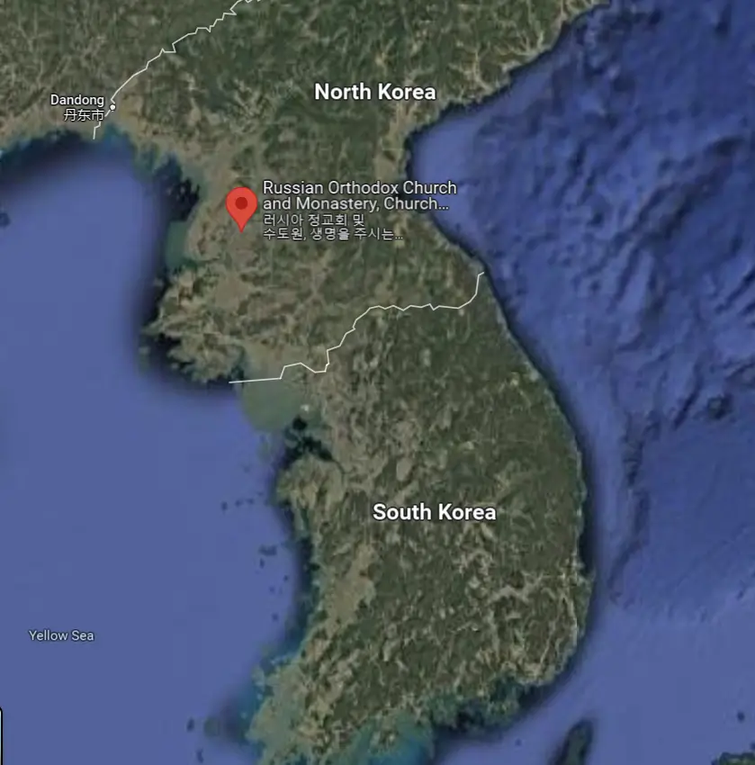
The Church of the Life-Giving Trinity (Pyongyang) is presently the only Russian Orthodox Church in all of North Korea.
Here’s more about it:

And the answer of course is the DMZ (The Demilitarized Zone), and as the ABC (Australian Broadcasting Corporation) states:

The map above comes from CashNetUSA and shows the most common question Americans ask about each US state.
From the map:

The maps here all look at the most common questions Americans ask about other countries.
They come from CashNetUSA with a good mix of serious and not so serious questions.

The map above shows an interesting geographical fact. Hawaii’s nearest neighbor is actually the state of Alaska. As Sasha explains: