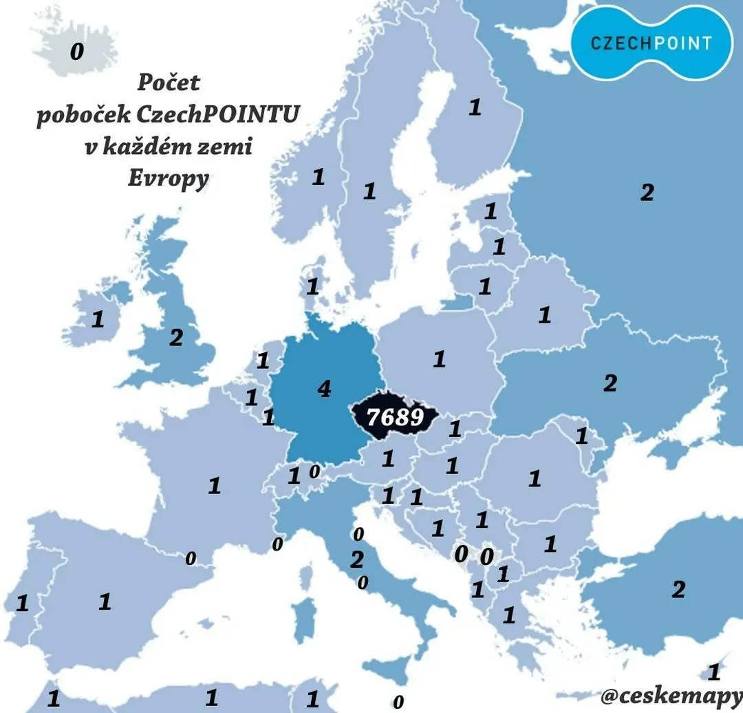
And, It should be noted that a CzechPOINT and checkpoint are two different things.
So what is CzechPOINT?
Making Sense Of The World, One Map At A Time
Last Updated: Leave a Comment

And, It should be noted that a CzechPOINT and checkpoint are two different things.
So what is CzechPOINT?
Last Updated: Leave a Comment

Last Updated: Leave a Comment

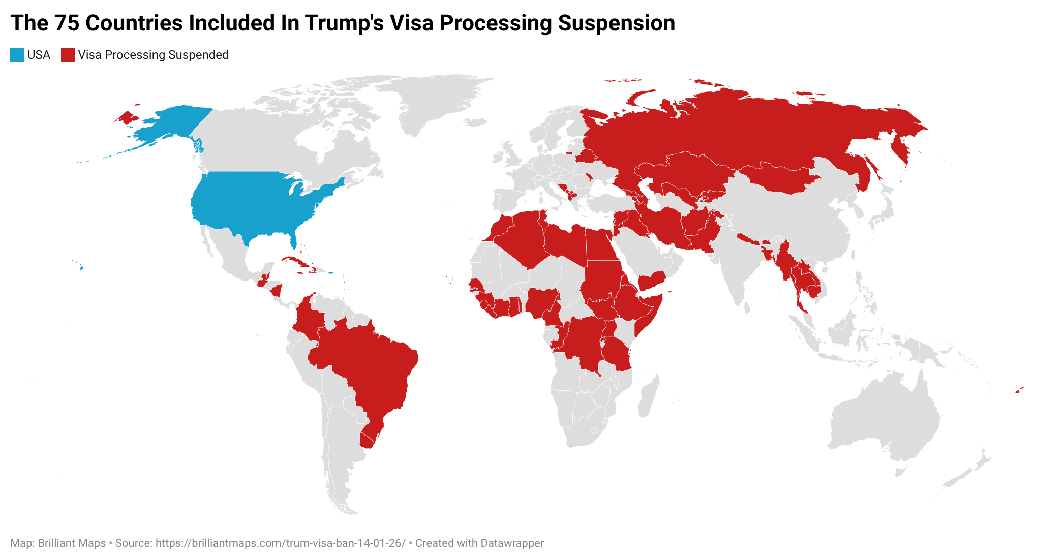
On January 14, 2026, the U.S. State Department, under President Donald Trump’s administration, announced it would indefinitely suspend processing of immigrant visas (permanent/residency visas) for citizens of 75 countries, effective January 21, 2026.
The map above shows which countries are affected. The Full list:
Last Updated: Leave a Comment

Last Updated: Leave a Comment
The inspiration for these maps comes from Donald Trump’s repeated stated desire to make Canada a part of the United States.
Yet, a poll from 2024 showed 82% of Canadians oppose any such the plan!
And that was before the whole boycott US movement and elbows up campaigns got going.
Moreover, before continuing I will state I’m a proud Canadian who has zero interest in seeing the US annex Canada.
However, I’m sure that doesn’t matter to Trump or his MAGA supporters.
Last Updated: 6 Comments
At this stage you’ve no doubt seen the meme that Trump only wants Greenland because of how much bigger it looks using the Mercator Projection:
Last Updated: Leave a Comment
Last Updated: Leave a Comment

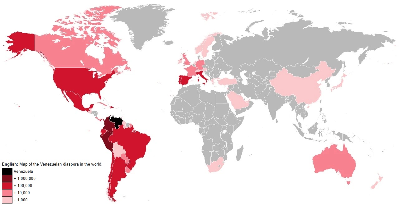
The map above shows the estimated number of Venezuelan’s living in other countries around the world. The table below gives an estimate by country:
Last Updated: Leave a Comment

From the author of the map:
Last Updated: Leave a Comment
The short video above shows Jason Girouard’s amazing run around all of Manhattan’s Streets. You can read the full story here, and here’s the main details: