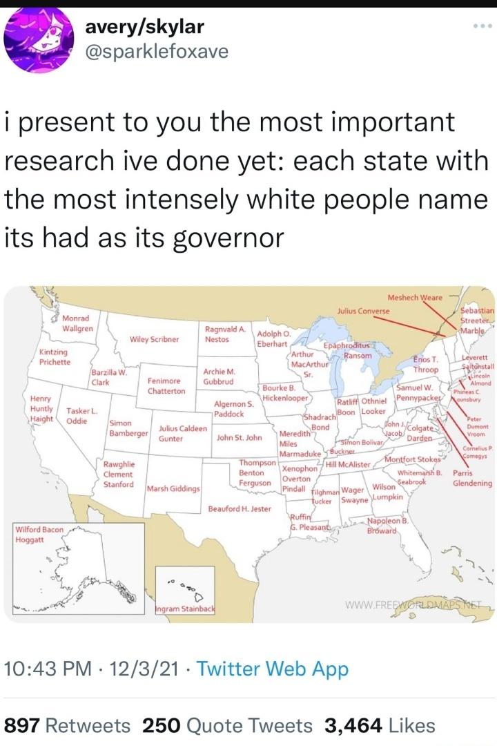
The tweet above, shows of the funniest (or as the tweet states whitest) names for governors from each US state.
Here is the map in slightly larger size below with a summary of each of them:
Making Sense Of The World, One Map At A Time
The tweet above, shows of the funniest (or as the tweet states whitest) names for governors from each US state.
Here is the map in slightly larger size below with a summary of each of them:
More about the story below:
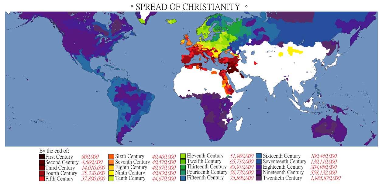
And the overall number of Christians in each century.
The source for the population numbers comes from:
Here is a full list:
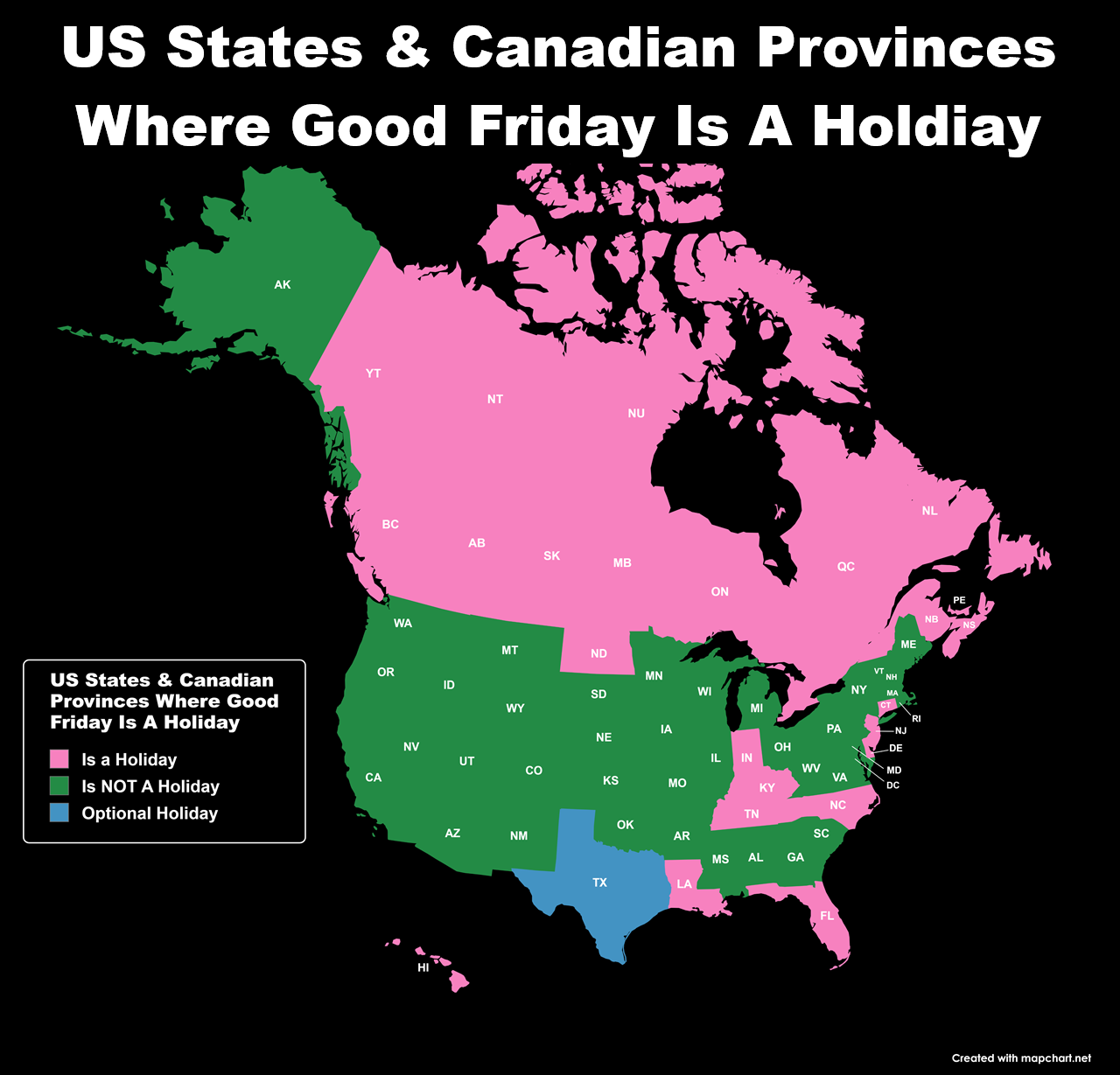
The map above shows the 12 states where Good Friday is a state holiday as well as being holiday in all 10 Canadians provinces and 3 territories.
The 12 states are:
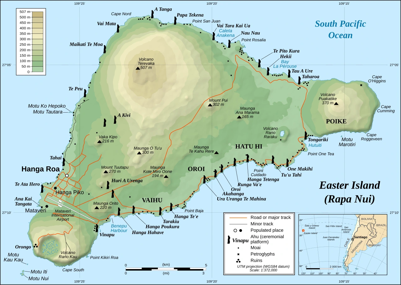
It’s famous for its monumental stone statues called the moai and has a fascinating history of rise, transformation, and resilience.
The maps below compare Europe’s 5 biggest countries (outside of Russia). They were created by the wonderful geo.universe who you should 100% go and follow.
Now for the maps:
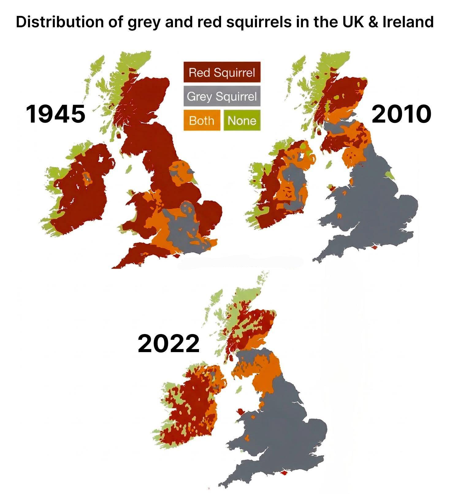
The map above shows the distribution of Grey vs Red Squirrels In The UK & Ireland Between 1945 & 2022.
I’m not 100% sure of the original source of the map a version with 1945 & 2010 can be found on Research Gate here, and I found this version on reddit.
If you created this version of the map please do get in touch so I can provide proper credit.
In the meantime here’s what happened and why:
The maps below look at how long each state has voted for the same party in US Presidential elections. The maps come from 270toWin and I highly recommend you visit to play around with all their tools.
It should be noted that the states show the current number of electoral college votes as of 2024, not the number of votes they had that year.
Now on to the maps:

The map above shows the rapidly shifting alliances during the 1910s in the Balkans. Over the course of the decade three different wars were fought there with very different alliances and outcomes.
More about them below: