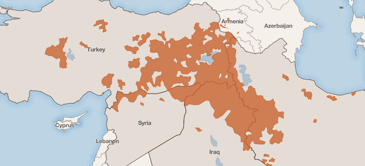
The map above shows the parts of the Middle East with Kurdish populations and which could make up some or all of a future state of Kurdistan. In a recent article titled The Time of the Kurds, the Council on Foreign Relations explains that:
Making Sense Of The World, One Map At A Time
The map above shows the parts of the Middle East with Kurdish populations and which could make up some or all of a future state of Kurdistan. In a recent article titled The Time of the Kurds, the Council on Foreign Relations explains that:

Inspired by Ben Blatt’s What are the biggest immigrant groups in your state?, Giorgio Cavaggion created two flag maps of the most common country of origin of new legal immigrants to the United States.
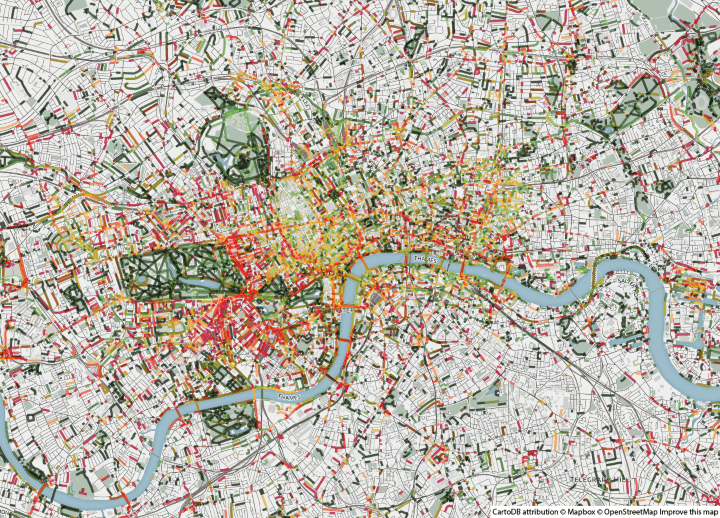
Smelly Maps: The Digital Life of Urban Smellscapes is the amazing title of this series of maps that look at how London smells. The smelly maps project involves Daniele Quercia, Rossano Schifanella (University of Torino), Luca Maria Aiello (Yahoo Labs) and Kate McLean (Royal College of Art).

The map above shows the country of citizenship for the largest group of foreigners by German district. However, it doesn’t show the absolute or even relative numbers. So even districts with very few foriegners will still have one group that’s the largest.
In total, Germany had 6,180,013 people with non-German citizenship living there in 2011, according to zensus2011.de.
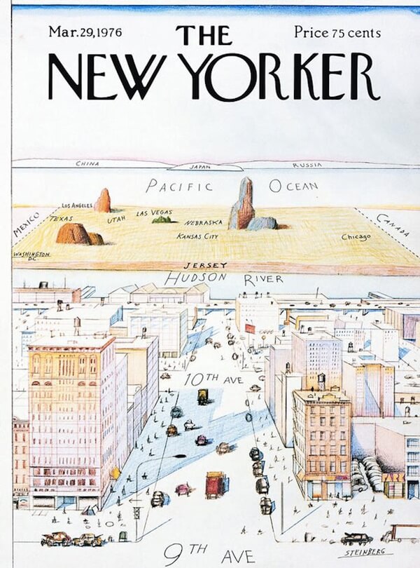
View of the World from 9th Avenue is a classic map/illustration showing how New Yorkers see the rest of the world. Designed by Saul Steinberg, it was first published as the cover for the March 29, 1976, edition of The New Yorker.

Most maps of the United States focus on the lower 48 at the diminishment or exclusion of Alaska and Hawaii. The map above reverses this trend and puts Alaska front and centre.
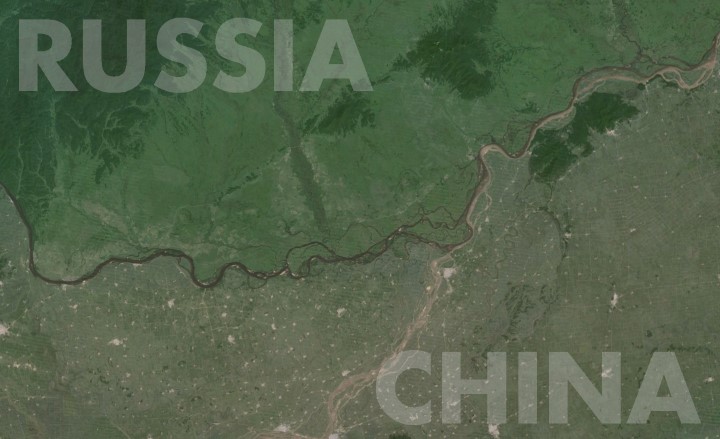
The Amur River (called the Heilong Jiang in Chinese) separates Russia’s Far East from Northeast China. And as the map shows, the contrast could not be much more striking.
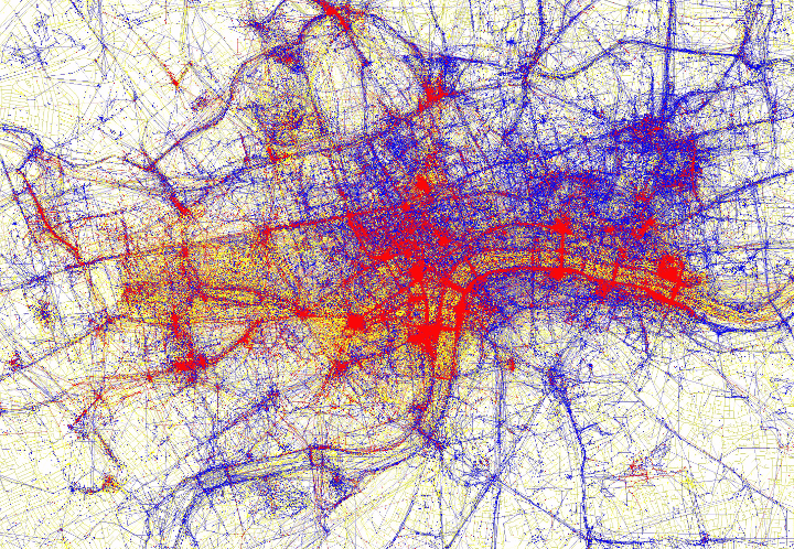
Tourists and locals experience cities in strikingly different ways. For example, in London most tourists will visit Buckingham Palace, the Houses of Parliament, St. Paul’s Cathedral, Oxford Street, etc. but will probably not end up visiting East Croydon, Hendon, Dagenham or any of the other parts of London outside of Zone 1.
Conversely, Londoners can go years without ever visiting the tourist traps of central London. To see just how different these two worlds are, have a look at the map of London above based on where people take photos.

While WW1 ended nearly a century ago, its scars can still be found across Northern France and Belgium. Zone Rouge (French for Red Zone) is perhaps the ultimate example of this.

Maps are brilliant, but wouldn’t it be nice to get one that’s personal to you?
That’s the idea behind J.Peters Fine Mapping Co. Joshua Peters founded the company to offer bespoke, hand-drawn maps to people. Above you can see his relatively minimalist hand-drawn map of London and below you can see his map of Edinburgh along with close-ups of his London map.