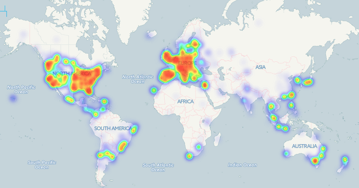
The Bitcoin heat map above shows the locations of 6,683 business where you can use bitcoins to pay. As you can clearly see, businesses are almost exclusively located in Western Europe and the Eastern United States.
Making Sense Of The World, One Map At A Time
The Bitcoin heat map above shows the locations of 6,683 business where you can use bitcoins to pay. As you can clearly see, businesses are almost exclusively located in Western Europe and the Eastern United States.

The map above shows one of history’s most astounding global shifts; the drop in fertility rate between 1970 and 2014. The total fertility rate (TFR) is the average number of children born to each woman in a country. It’s important because, it’s an easy way to tell if a country is growing or not, excluding immigration/emigration.

The map above shows that between the establishment of the British penal colony of New South Wales in 1788 and the mid-1960s, Indigenous Australians were deprived and dispossessed of virtually all their land.
According to Jon Altman, who created the map, this theft was justified using a number of reasons including:

The map above shows what Westeros (from Game of Thrones) might look like at night if it could be viewed from space. In the North you can see the lights along The Wall.
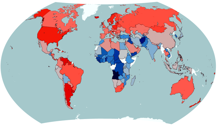
The map above reveals a somewhat shocking fact if you haven’t been paying attention. In the majority of the world’s countries (including virtually all of the richest) women, not men, stay in education longer.

The map above reveals a rather shocking aspect of the First World War. While most people in Western Europe and North America focus on the trench warfare in Northern France and Belgium, it shows that Western European countries were nowhere close to suffering the worst casualty rates in the war.
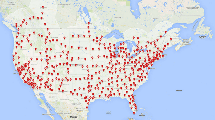
Tesla Motors has quietly been creating a giant network of Supercharger stations that can quickly extend the range of their best selling Model S electric car. Here are a few maps showing how big that network could grow to by the end of next year.
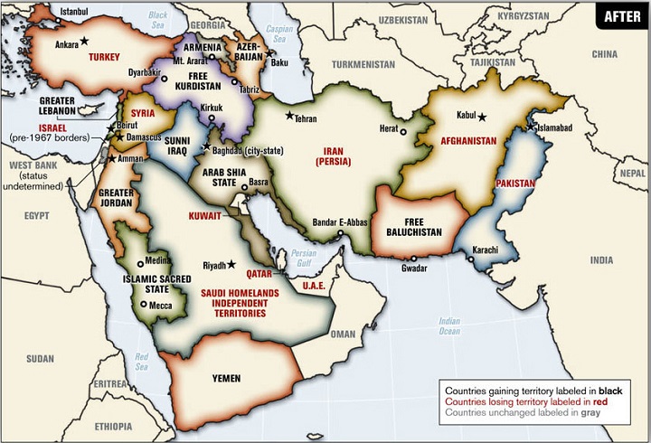
The map above is a 2006 proposed plan to redrawn the borders of the Middle East by Ralph Peters, a retired United States Army lieutenant colonel, author, and Fox News commentator.
It was original published in the Armed Forces journal in an article titled Blood borders: How a better Middle East would look.
The map would make sweeping changes throughout the region such as:

The map above shows which religion is the fastest growing in each country around the world based on data from Pew Research Center’s The Future of World Religions: Population Growth Projections, 2010-2050.
The colours are as follows: